Speak UpA Former Division of UnderConsideration
The Archives, August 2002 – April 2009
advertise @ underconsideration
---Click here for full archive list or browse below
  
Above the Fray: Bayer’s Notgeld and Designing in Crisis
Guest Editorial by Aaron Carámbula

In 1923 the German economy was devastated by World War I and reparations made for rampant inflation. Hyperinflation set in and, as prices rose exponentially, common currency became worthless. To meet the demand, paper notes were printed almost nightly in every region, jumping from thousands to millions to billions. These marks are known as notgeld, or “emergency money.” In a normal economy currency design says little about social climate and nothing about individual opinion, but notgeld gave designers a platform at a volatile time.

The design of most notgeld, particularly in rural areas, drew on historic messages and heraldic imagery, slipping quickly into romanticized nationalism, and ultimately the seeds of Blut und Boden (examples can be found on flickr). The typography drew heavily on the past with blackletter and elaborate scripts. National iconography was rendered in any manner from delirious flourish to self-righteous idealizations in colors either dreary or fiery. The values of many of these bills — up to 100 trillion marks — were often written long-hand, sometimes without digits at all.

These sentiments of blind nationalism, catalyzed by visual language, would ultimately be adopted and manipulated by Nazi leadership. Indeed, the design of notgeld serves as documentation of the prevailing attitudes in pre-Nazi Germany. One series of notgeld, however, shows a different allegiance.

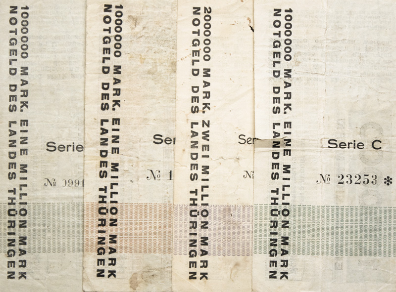
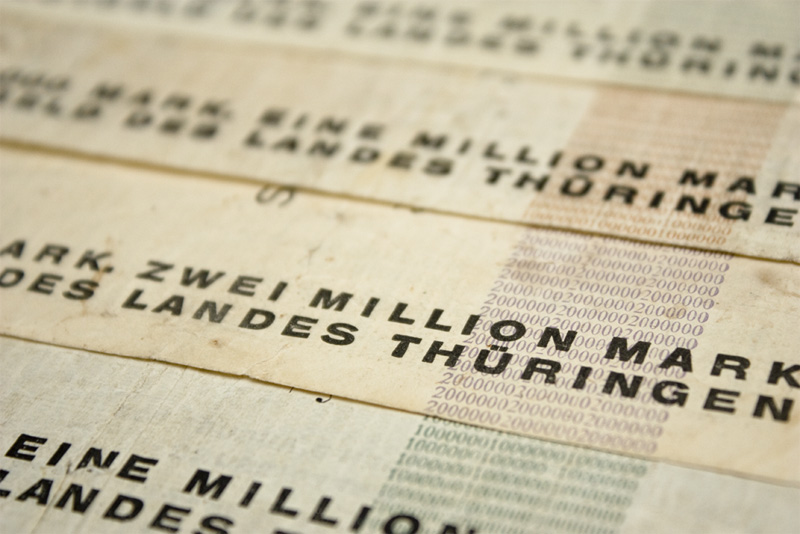
At just 23 years of age, Herbert Bayer was called upon to design a series of notgeld for Thuringia, a liberal stronghold and then capital of Germany. Virtually overnight (accounts vary from one to three days), Bayer created a full range of bank-notes. The results are stunning examples of modernist design, shining the light of rational thinking forward rather than seeking comfort in the past.

Herbert Bayer Notgeld

Front.

Herbert Bayer Notgeld

Front, detail.

Clarity and immediacy are the first priority of the system. The typography — selected from whatever the printer had on hand — is dominated by sans-serif. In big, beautiful arabic numerals the value of each note is the most prominent element, awash in a field of optimistic color, reprising rather playfully as patterning on each side. The content is blocked in an orderly grid, rotating 90° to allow the text to fit naturally, given the form.

Socialist, nationalist, or protectionist imagery? None.

The only non-typographic element present is a modestly scaled crest of the Weimar Republic, with the sole functional purpose to serve as the official seal. No other work in the canon of modernist design so clearly delivers on the principles of Bauhaus modernism: honesty, functionality, and beauty.

Herbert Bayer Notgeld

Back.

Herbert Bayer Notgeld

Back, detail.

It is said that the moment these bills were printed, they were best used as wallpaper, as they immediately lost their value. Their worth, however, was intrinsic and timeless; a message of promise in hard times, innovation over regression, the modernist ethos over wanton pathos.

Aaron is a partner at design office Objective Subject in Brooklyn and writes for The Scout. Written with thanks to Erik Marinovich and David Jalbert-Gagnier.

Maintained through our ADV @ UnderConsideration Program
ENTRY DETAILS
ARCHIVE ID 5872 FILED UNDER Review
PUBLISHED ON Mar.05.2009 BY Speak Up
WITH COMMENTS
Comments
Analog Bass’s comment is:

Brilliant writing, brilliant photos, brilliant subject matter - thanks for this!

On Mar.05.2009 at 01:00 PM
kelly’s comment is:

awesome!

On Mar.05.2009 at 01:18 PM
John Rudolph’s comment is:

I had a profound respect for Herbert Bayer and his work before, and this article only helps to augment that. The wall paper analogy is great—on several levels—as design you would hang on your wall must be worth a damn. I suppose a couple of commas might have helped with all those zeros, but since the actual value did not amount to much anyway, who's counting? To me, these bank-notes represent a radical shift in design that seams to underscore an interesting political/economic statement—both with paradigms that are often worth rethinking. Thank you for sharing.

On Mar.06.2009 at 11:32 AM
tinabeans’s comment is:

while i really enjoyed this look at a courageous alternative to the tropes of traditional currency design, i also don't totally agree with the offhand dismissal of "romanticized nationalism" in traditional currency. money in all its forms has always been deeply vested with the symbolism and the ideals of a time and place, whether right OR wrong, and i don't think that the functionalist ideology of modernism is any more appropriate to such an important vehicle of history and identity than "delirious flourish" and "self-righteous idealization." surely this purist (i would argue, even fascistic) Le Corbusian Modernist attitude towards design is a tad outdated by now?

On Mar.09.2009 at 10:39 AM
Aaron Carambula’s comment is:

@Tina—

I would contrast the perspective given by most currency—government issued in times of moderate stability—to the notgeld I called out. The former is only as inflammatory as the current regime with imagery and illustration asserting the heritage and strength of the government and, in turn, the value of the currency. The incendiary examples of notgeld, some of which I've linked to, contain messages challenging the government of the time, slandering neighboring nations, and promoting insular ideals (to put it gingerly). Notgeld is a rare opportunity to hear a multitude of voices, particularly those of artists and designers, through currency.

Bayer's work didn't simply pose as an alternative to traditional currency design, it refused to follow the tragic flow of history. He uniquely rejected the opportunity to editorialize and incite, opting instead to put forth progressive and rational thought at a time that needed it.

I assert that in 1923 Germany the aesthetic was quite timely, and, as you put it, courageous. I suppose the call is not for design of that style but for designers of that fortitude.

On Mar.09.2009 at 11:34 PM
tinabeans’s comment is:

@Aaron, thanks for your thoughtful response -- i see your point now. i just wished that your article had expressed this with just as much clarity. my main concern was that parts of it sounded like it were expounding the ideals of mid-century modernism instead of celebrating the skill and caliber of notgeld designers. =) thank you for introducing us to notgeld.. this made me want to hit up the library!

On Mar.12.2009 at 12:49 PM