I can still remember the Saturday afternoon I discovered Speak Up. I spent hours reading the archives. I felt as if I had come late to a party — casual, good natured, sometimes a little rowdy — but it was filled with people who weren't afraid to be passionate about graphic design and weren't afraid to, yes, speak up about that passion. I felt right at home. There was so much I didn't know then. I really didn't know what a blog was, exactly. I didn't know that I would meet Armin and Bryony and end up working with Armin for two wonderful years. Nor did I know that some of the other names I read on Speak Up for the first time would become colleagues and, eventually, friends. And of course I didn't know that one day I'd help start another blog, one that for a long time would be unfavorably compared to its predecessor.
There was so much I didn't know that afternoon six years ago. Thanks to Speak Up, there is so much I've learned since.
And so it goes.
Whatever one can say about Speak Up it is undeniable that the effort put in by Armin and Bryony to create this forum is commendable and exemplary. The work involved in keeping up a public forum such as this must be overwhelming, and they did it with a combination of professionalism, spunk, wit, and pure passion for graphic design, yet without any significant monetary compensation.
We all love the internet, not only because there you can find great information and entertainment, but because you can get it often for free. But free is not a simple function of the internet. It's people like Bryony and Armin who do all the hard work and who make it the great place that it is. And by putting Speak Up to rest it will be just a little less great.
Wishing you all the best in your future ventures.
Truth be told, I said my own good-byes to Speak Up a few years ago. Things change, people change, places change ... but in its time and place, Speak Up was both a groundbreaking forum for design, and a formative part of my current career. It's hard to imagine now that Speak Up was once the only blog devoted to graphic design, and that it was influencial enough to shake some timbers in the American design establishment, and forge some careers. Blogs are everywhere now; there are so many all chattering away that it's hard to concentrate from the din. And while we made a lot of noise on Speak Up from 2003–2006, we were, for a while, the only noise.
"Noise" is what many would have said of the discussions, arguments and brawls that took place during that time, and while much has been made over what was or was not publishable or valid, there is no doubt in my mind that Speak Up opened doors previously nailed shut, broke down walls, and looked into cupboards and under floorboards. The discussions which happened there opened things up between the major players in design and the single practitioners, and created a previously unheard of environment to openly question the how and why of the way we practice design.
I have said it many times before, I will say it again: Speak Up was not an online journal with commentary: it was a place for gathering. The articles written were never meant to be definitive or pedantic: they were like bones tossed to the crowd, and it was the ensuing discussion which contained the meat. That discussion was sometimes informed and erudite, often funny, frequently embattled, sometimes ascerbic, and yes, silly or just plain stupid. But we were there for the experience, not for the result. In 2005, Speak Up was my local speak-easy where I went to meet my best friends, laugh and brawl late into the night. And all done on local time, with people scattered all across North America and sometimes the world. In this, I miss it.
I was an author for Speak Up because it gave me an opportunity to write about things that would help others see the world a little differently. I started as a brat, with caustic critique, and moved into more playful modes of writing. As time went on, I spent more and more hours on my posts, and I frequently wondered why I was "wasting" so much time on this endeavor. It's only in retrospect that I realized that my presence on Speak Up is probably responsible for half of my current success in the design world. I wrote and people noticed my name; many of my friends now first heard of me or read me on Speak Up. This was most certainly a case of doing the right thing, in the right place at the right time. Speak Up was those three things in a way that is just not possible today, a mere 3 or 4 years later. I owe it a lot.
Thankfully, this eulogy is not for Armin & Bryony, those bravesters who started and maintained the site for so many years. Another testimony to the site is that real friendships were formed, and I hold them close, A&B, along with Debbie Millman, Tan Le, Mark Kingsley and others who I never would have met otherwise.
So this is the death of Speak Up. While a digital archive lives on (and I encourage you all to peruse it and read the articles and ensuing discussions), the speak-easy become a diorama of a speak-easy. There we all are, frozen in time with glasses and fists raised to each other and to you, our audience behind the glass.
p.s. Will the REAL DesignMaven please stand up?

Listen to song before reading Commentary.

Beginning Title Song, Where Every Knows Your Name, by Gary Portnoy and Judy Hart Angelo.
Alternative websites, one and two.
When Arm initially asked me to write a Eulogy for Speak Up, April 2, 2009, I thought it was an April Fools joke.
I murmured to myself. I wish it were Brand New getting the axe not Speak Up. (Private Joke)
Thinking to myself what to expound on. I decided not to write a Eulogy on Speak Up, per se. Instead immortalize Speak Up in discourse, with Saul Bass Design and song. Both Design and song by different Artist. Indeed appropriate for Speak Up Condolences.
It's difficult to fathom and accept the notion Speak Up is Dead, rather in a coma on Life Support.
In brief, Speak Up was as much a part of my family and life in the five (5) yrs or more I participated on a daily basis.
Speak up nearly destroyed the fabric of my family.
My wife and kids accused me of devoting more time to Speak up than my Identity Practice and family.
Waking up every morning to read the Editorials. Spending the remainder of day(s), week(s) 24/7 posting comments, debating comments, and editorial content between author, patrons, and Design luminaries.
At the same time, providing research, to include visuals and discourse to support commentary was equivalent to Olympic Triathlons, Iron Man Competitions, Mosh Pits and Heavyweight Championship Bouts, such as, The Fight of the Century, The Thriller in Manila, and The Rumble in the Jungle.
Not all confrontational disagreements were civil, clean or governed by good sportsmanship. Someone was bound to hit below the belt, through a sucker punch or an audience member playing signifying monkey.
There always wasn't a recognized winner.
What was certain, should you survive a grudge match; you and your combatant gained a mutual respect for each other.
In some instances disdain for each other if no common ground was reached.
If no common ground was obtained, you became bloodthirsty bitter enemies until your issues were resolved, either by talking offline or mutual interest of like-mindedness in a future Editorial.
My fondest memories of Speak Up are the beginning circa 2002. I was writing on another Identity website which pre-date Speak Up, by a year and several months, Brand Channel.com.
In the beginning, Speak Up was unknown to the masses sort of a cottage Design Blog between friends and acquaintances.
The beauty of Speak Up then, there was always interesting discourse and good conversation related to Editorial content.
2002 you could find Design personalities such as, Nick Shinn, Norbert Florendo, and Hrant H. Papazian amongst others contributing to Speak Up.
An aside, credit where it's due:
Those unaware, Hrant H. Papazian is the most Famous and Renowned Design blogger in History.
Whatever reason, I'm generally mistakenly credited as number 1. It's Hrant H. Papazian.
Always has been, always will, as long as Hrant continue to write.
Historically, I rank amongst the top 5.
I write very long commentary of factual information.
Hrant write short commentary of factual information writing on several Design Blogs in a day, as many as five (5) often more.
Hrant always signed his commentary at the end, hhp in lower caps.
I knew that was unique. I borrowed his signature style ending my commentary with Bold Caps DM and added an italicized slogan making my moniker more unique and memorable.
Nick, Norbert and Hrant found their niche providing research and writing on Typophile, typophile.com.
Typophile is an Eminent Design Blog devoted to Typography; never receiving the Kudos and Accolades it deserved.
Typophile is Superior to Speak Up on many levels in reference to Civility and Respect to fellow Designer(s). Albeit, being a better moderated Design Blog in tolerant to Blaspheme and Desecration.
Do I have any criticism of Speak Up?!
More an observation than critique, Speak Up became too BIG too FAST. Receiving an enormous amount of Publicity, Notoriety and Fame publicly critiquing 1st Tier Corporate Identity in an online public forum.
The 1st Design Blog to undertake such a monumental task. Which put Speak Up on everybody's radar and entry into Design History books.
We didn't always get it right in Editorial Content or commentary. Plenty of things were written wrong/commented wrong.
That's the learning curve, process of success governed by failure.
Without failure learning from past mistakes and acknowledging mistakes there's no progress.
Ultimately, we were correct more often than wrong with a ratio of 75% – 25 %
In the midst of Speak Up's Success and Epicurean Lifestyle. No single moment of disaster brought Speak Up to it's knees as the departure of Tan Le.
Speak Up was never the same without Tan Le.
Once Tan Le moved on. Armin operating without Tan was like Sam without Dave, Batman without Robin, Acroyd without Belushi, Cagney without Lacey, and Led Zeppelin without Drummer, Jon Bonham, World Greatest Drummer, Bar None. Jon Bonham put the Ledin Zeppelin.
It’s a known fact Armin and Tan, THE DYNAMIC DUO were the best Good Cop / Bad Cop routine in Design Blog History.
If this is truly the end of Speak Up, I'd like to make a suggestion to The Powers That Be.
Take the BEST of Speak Up, B A Design Group, and Typophile and discuss MERGER!!!!!!!!!!
Larger audience, more topic discussion, more Global Presence and interest in Design.
More Diverse Sponsorship.
I don't BLOG anymore. Haven't blogged in over a year.
Except the rare occasion I posted a comment on another Design blog searching for material I'd written. Couldn't resist writing commentary on the passing of Lou Dorfsman.
Furthermore, commenting on wrong information provided by a noted historian on Art, Illustration and Design, Correspondence Schools.
Other than those two (2) instances, My life is Blog FREE!!!!!!!!!!!
Merging, Speak Up with B A Design Group and Typophile seems like the RIGHT THING TO DO on MANY LEVELS.
Speak Up / Typophile / B A Design Group has a nice ring to it. It's Functional.
To The Powers That Be, Heed the Message!!!!!!!!
Greener pastures lay beyond Speak Up for the truly gifted and unique.
Armin and Bryony left Chicago for New York. Arm was employed by Pentagram. Bryony employed by Addison formerly known as Soyster & Ohrenschall one of the largest Corporate Identity Consultancies in World.
Tan Le, became Design Director at Seattle Landor. Continue to give me nightmares until this day, according to my wife and kids. :-D
Michael Surtees, moved from Canada to find his fame and fortune in New York.
Marian Bantjes, of Canada has become media darling of the Design Industry.
DesignMaven, was not an author of Speak Up. Nevertheless a cast member of Speak Up ensemble. Similar to Richard Pryor's appearances on The Original, Saturday Night Live with Gilda Radner, Jane Curtain, Lorraine Newman, John Belushi, Bill Murray, Dan Acroyd, and Chevy Chase.
Not one to neither talk about my Design Career nor divulge information concerning my success.
I'm more interested in singing the praises of others.
The fruits of my labor writing on Speak Up have garnered enormous opportunity in Corporate Identity, which wouldn't have happened without exposure on Speak Up.
Speak Up was indeed the place Where Everybody Knows Your Name.
Admittedly, It’s So Hard To Say Goodbye To Yesterday.
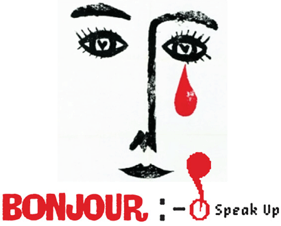
BONJOUR SPEAK UP.
WE CONQEURED THE WORLD.
Most important!!!!!!!!
Armin Vit made me Famous.
DM
The Hostile Takeover of Corporate Identity
End Title Song, It’s So Hard to Say Goodbye to Yesterday, by G.C. Cameron
The two (2) songs I selected, Beginning Title and End Title songs surmise my feelings for Speak Up. The lyrics alone aren't enough. You MUST listen to the in lyric accompanied by music.
Most Baby Boomers already know the songs via Cheers sitcom or radio and/or Cooley High in reference to G.C. Cameron.
Listening to the songs you'll get the Genuine meaning relating the songs to the untimely Demise of Speak Up and my commentary on the Demise of Speak Up.
|
Cheers Theme Song. Where Everybody Knows Your Name, lyrics by Gary Portnoy and Judy Hart Angelo. |
End Title Song by G.C. Cameron |
Goodbye to Speak Up. In spanish and english.
Goodbye to the good diner in our neighborhood. With the long counter and the regulars who like talk.
That was the truth of the place, framed on the wall: don't just sit here, say here.
The comment status beckons you: Laugh, cry, discuss, listen, share. And now finished. As of this writing, I still deny the fact that Speak Up will come to an end. Armin has repeatedly told me, This is not an April Fool's joke. Who knows when the skeptic in me will accept this. Moreover, how will I fill the empty void that Speak Up will leave behind?
I am indebted to Armin & Bryony for the great opportunity they provided me as an author, but I acquired so much more as a reader. Speak Up introduced me to amazing work by talented people; challenged my perspectives on visual culture; and changed the way I thought about design. At the turn of the century, few websites connected you with designers from around the world, allowing dialog to happen instantaneously.
But now you can generate sites and easily publish on-the-fly posts from your computer or your smart phone. Today's website morass has topics ranging from design to typography to socks, even typography designers' favorite socks. With so many of us morphing from readers to writers to bloggers to twits, perhaps this is the perfect time for Speak Up to call it quits. Now if you'll excuse me, I have to finish tapping a 160-word review about my new Gene Meyer socks into my iPhone, and then I'm off to connect with a design group on Facebook, who invited me via SMS.
Things just won't be the same. I will miss Speak Up.
I'm a fan of Speak Up and will be sad to see it put to rest.
I've been using Speak Up as my home page when I log onto the internet since… well I can't remember when. Over 5 years at least. And even though I don't post often, it's the first thing I see when I go to my web browser and so I'm reading and enjoying it every day. I don't know that I'll be able to find another site that will truly replace Speak Up. Other sites didn't quite have the same energy, humor, diversity or je ne sais quoi. Part of the attraction for me was the diverse authors that contribute to Speak Up from all over the United States and abroad. It was the place where I cyber-met some great designers who could also write: Mark Kingsley, Debbie Millman and Marian Bantjes are high on my list of people I respect (I would mention Bryony but don't want to appear like a suck up). Speak Up also reacquainted me with my old friend Tan Le. Even though we live in the same city, Speak Up brought us closer together, giving us lunch fodder on more than one occasion. And through his writing, Speak Up was the place where I got to know Armin Vit. So after all these years, I say "Thank you and I'll really miss you".
A unique transformation happens by adding the suffix "able" to the word "remark".
Suddenly, the straightforward meaning (able to remark or comment on) is trumped by a new translation (something that is extraordinary).
Speak Up embodies this kind of transformation.
As a place where people discuss Graphic Design, the site is built on remarks:

Katie's comment is:
The inspiring design speaks of talent and enrichment.
ON MAR.17.2009 AT 03:17 PM
Katie's comment is:
The elevated (and tireless) discourse speaks of dedication and insight.
ON MAR.18.2009 AT 03:18 PM
Katie's comment is:
The collaboration (of voices and visuals) speaks of democracy and advocacy.
ON MAR.19.2009 AT 03:19 PM
But it's the ability of its creator and co-creators that makes Speak Up remarkable.
Armin Vit can write, edit and design... well!
Such erudition permeates the blog, evidenced by this AV comment: "This is just a joyful, no bullshit, design-is-fucking-great write-up."
Come next week, sadly, we'll refer to Speak Up in the past tense.
From pixel fleurons to pea soup green ‹9E9F0F›, we'll remark no more.
So to Armin and the Speak Up team, I extend these two words:
"Well Spoke".
It has been a few years since my last post and I remember the days when we had conversations. We shared how we did business, how we created the visual landscape and how we spoke with clients. We spoke not simply about design but about being designers. I'm still not sure another site has done that.
Speak Up got me thinking. Speak Up got me reading, arguing, laughing, fuming, joking, researching, defending and learning. SpeakUp got me writing. I will miss it.
My eulogy delivery experience is, I'm happy to say, fairly limited. Unfortunately, I have a fair amount of experience with conversation about the dead and dying. There's no way to get it right, however. One grieving relative's comforting is another's unctuous cliché or cruel dismissal of their loss.
I know that "What a relief" is not always the best thing to say when Uncle Louie's demise is announced but it's the truth more often than not. When my father died, nobody close to him took umbrage at the statement that one is lucky to die aware and without much pain at 86. Plenty of people would think that the sign of real love is the hope that someone might stay with us a bit longer no matter what. I'm happy to report that none of my family shared that view.
So at the risk of seeming callous, Speak Up is probably dying just in time. The dearly departed hasn't become a painfully distant echo of himself. (We can't all go in plane crashes and mountaineering accidents at age 23 so some deterioration is inevitable but "aware and without much pain" applies in this case.) The grieving widow isn't destitute from medical bills from the last horrible years, our memories can be fond ones of vibrancy rather than of wasting away, and (at least if measured in internet years) Speak Up made my octogenarian father seem like a teen.
I've been trying to avoid eulogy platitudes but this is one: Speak Up will live on with many of us. I can thank it for introducing me to friends I have among its authors and readers. It provided me a tool for coming to grips with a variety of design issues. I'm grateful that it answered many questions about the potential of broad conversations (some in the positive, many not) and that it raised even more questions. I suspect that I will not be alone in spending a lot of time and thought trying to answer some of those.
Somehow ending a project always seems a bit like an admission that it wasn't worthy, a demonstration of failure in some Darwinian test given by the divine and holy force of The Market. But the term "vital" comes from the Latin for "life" and life without death is an oxymoron. Death is not failure, it's just the end.
I don't pretend to know how Speak Up will be remembered. Feed magazine and Plastic were central to the development of internet communication and are unknown to the vast majority of eZine and blog readers. Speak Up was a model for much of the internet conversation on graphic design but I'm going to have to leave predicting future history to public relations flacks and George W. Bush's fantasies.
Maybe Speak Up will be largely forgotten, maybe not, but it moved many of us forward in many ways and it was a force of life in the recent world of graphic design. What Armin and Bryony will do now that they're down to five or six full time jobs and a daughter to raise, I don't know but I suspect "force of life" will be a recurring theme.
When we started Design Observer in October 2003, the only inspiration we had beyond Kottke.org and Andrew Sullivan was a design blog called Speak Up. It was engaging and lively. The posts were topically varied and the mix of writers eclectic, albeit with a general focus on graphic design. The comments stream was intense: often instructive and enlightening, sometimes strongly-worded, frequently harsh, occasionally outright rude and nasty. In fact, we were occasionally the subject of not-so-friendly criticism on Speak Up — our first encounter with live, open criticism.
Speak Up represented a community finding its way online. And, as such, it was an early innovator and a precursor to other online design communities. There is a good reason why it achieved the readership and loyalty it did, and it was more than appropriate that it was acclaimed in the 2006 Design Triennial at the Cooper-Hewitt National Design Museum.
Speak Up expanded the conversation about design, and broadened it to whole new audiences. Bryony Gomez-Palacio and Armin Vit deserve our thanks and recognition.
The House That Speak Up Built
I discovered Speak Up in one of its early incarnations, around the same time that I came across Typophile and Typographica. It was late 2002 or early 2003. Here was a forum whose authors wrote and cared passionately about graphic design, typography, illustration, the brands we'd grown up with, movie titles, logos and wordmarks, design conferences, education, portfolios and leave-behinds, heraldry, linguistic theory, and much, much more. The writing was worthwhile and engaging, brash and irreverent — and the authors had a knack for generating spirited discussions, to which readers responded in kind.
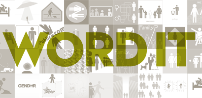
But Speak Up's plucky instigators didn't limit their creation to writing and commenting about design. They were always coming up with more ways for readers to participate: Word It, the T-shirt Design Contest, and the Book Club all came from this willingness to engage the growing community Speak Up was attracting. The High Priority Contest, The Design Encyclopedia, and the spinning off of Quipsologies into its own website, with twin columns for links from authors and readers, are later examples of the same spirit.
Speak Up was proof that the World Wide Web could help you get your message out there ("if you build it, they will come"), but it was also proof that hard work and dedication were just as necessary as ever, along with generous doses of thinking and planning. Armin and Bryony went above and beyond, devoting many hours of labor to their pet project while holding down full-time jobs. And what they built is very much with us, because it keeps growing, branching out in new directions. Maybe, like the subject of last month's Word It, people and things are always in transition. Speak Up is no more, but Bryony and Armin are still launching new projects, contributing to graphic design discourse. And that is very inspiring. Thank you, Speak Up authors: Marian Bantjes, Bryony Gomez-Palacio, Randy J. Hunt, M. Kingsley, Jimm Lasser, Tan Le, Debbie Millman, Jason A. Tselentis, and Armin Vit. Thanks for caring about design, and thanks for your passion and your generosity and your hard work.
Without You I'm Nothing
Speak Up changed my life. I write this without drama, sarcasm or irony, for it is simply a matter of truth.
To wit: Back on May 2, 2003, award-winning illustrator Felix Sockwell posted a discussion on the new weblog that, verbatim, read as follows:
Dear AIGA:
For some odd reason i get a free copy of Graphic Design USA (GDUSA). If youre familiar with it, you know what it is: the equivilent of a high school yearbook packed with photos of designers and bulky paper ads.
LOTS of ads. Its shameful. i weep openly.
Another reason to cry is that Debbie Millman (Sterling Group, NY), your AIGA juror this year, says shes "been in the business 20 yrs and GDUSA has always been the magazine (she) turns to for cultural relevance and design intelligence". (letters to the editor page, march 2003)
Perhaps she is lying simply to see her name in print, or maybe shes actually telling the truth- either way we're doomed!
Year by year, the AIGA gets suckered into deals with these corporate clowns
and it really betrays the trust I have in my profession (and you).
— Felix Sockwell
A heated conversation ensued and a long list of design luminaries, fired up by the questions Felix posed, piled on. In an attempt to make sense of the conundrum, John Bielenberg offered the possibility that I wasn't really invited to judge the competition, but instead was a last minute substitution for someone else who had cancelled. Tan Le proceeded to get into a fight with Felix for what he considered to be illogical assumptions, but referred to me as a she-devil in the process. Not content with level of discourse, Speak Up founder Armin Vit called two of the logos designed by my firm "a pair of turds." Even Emily Oberman, a designer I had admired from afar for over a decade, and someone I considered a hero, weighed in on the discussion (though mercifully not about me). I discovered this online conversation on May 17, 2003. I was mortified, embarrassed, humiliated and I patently considered leaving the design business for good. I remember I cried. And I questioned where this forum came from, who the bullies were that created it, and I wondered whether I would ever be able to hold my head up in the design community again.
What no one contributing to the conversation had any way of knowing was this: Contrary to Felix's opinion, I was not in cahoots with the AIGA. In fact, I had recently been asked to relinquish my seat on the board of the AIGA Brand Design special interest group by the incoming group president. I had worked to help create the group and I was crushed. AIGA Executive Director Richard Grefe subsequently invited me to judge one category of the Annual competition as a way of asking me not to get too discouraged by the turn of events. But on the day of the judging, I nearly got into a fistfight with one of the other package design judges. She was quite well known, and she was so dismissive of my opinions and I was so reluctant to give in to hers, that after an entire day of battling we would only agree on seven winners to include in the Annual, and I considered myself banished by the organization.
With the apparent rejection of both the design cognoscente and this newly formed fringe, I realized I had nothing left to lose. I decided to respond to Felix's charges with what I hoped would be perceived as a logical and non-defensive point of view. It wasn't; I was vehemently challenged and summarily taunted. A rigorous volley ensued. Then something surprising happened: another reader wrote in to support my perspective. And then another! Before long the debate dwindled down. And then something remarkable happened: I received an email from Emily Oberman. She thanked me for contributing to the conversation! I immediately printed out her note and taped it to my office wall, where it still resides today.
A few weeks later, Armin emailed me. He wouldn't apologize for comparing my work to turds, but acknowledged that perhaps his use of language was not as professional as it could have been. After our correspondence, I continued to visit the site and I became increasingly more intrigued by what I was reading. I soon realized that Speak Up was the only place on the Internet conducting real time design discourse. The site not only offered a bold (if not scrappy) new genre of design criticism, it also allowed anyone and everyone to comment. For the first time ever, Speak Up simultaneously held both contributors and designers accountable for what was being discussed or debated, AND for what had been designed. I was hooked.
Armin emailed me again, this time with an invitation to be an author on the site. I jumped at the opportunity. At the AIGA National Conference in Vancouver, Armin and his wife, Bryony, asked Marian Bantjes, also a frequent commenter, to join us. Together, we surreptitiously handed out a small booklet that Armin and Bryony had designed featuring the best writing on the blog that year. We were the only blog in town, and we reveled in this provocative new medium. Looking back on it now, I think we all had a bit of a swagger about us—me most of all. And why not? My cool, new friends accepted me, and I was convinced we were doing something big. And brave. And important!
After that, things got surreal. Emily Oberman invited me to join the New York Chapter of the AIGA and a fellow NY board member, John Fulbrook III, recommended me to Richard Wilde, the Dean of the Graphic Design department at the School of Visual Arts. John thought I might make a good teacher, and Richard gave me a chance. Then Sean Adams, the President of the National AIGA asked me to run for a seat on the National Board. Which I did. Joyce Kaye, then the editor in chief of Print Magazine (who I had met en route to Vancouver), invited me to participate in a conference panel moderated by Steven Heller. Then Steve recommended me to Allworth Press after he passed on their offer to write a book titled How To Think Like A Great Graphic Designer. And in 2002, a producer at the Voice America Internet Radio Network read one of my posts on Speak Up and invited me to create a radio show about design.
None of this—not one blessed thing—would have been possible without the exposure and support I received from Armin and Bryony and the community brought together by Speak Up. According to cultural anthropologist Grant McCracken, "Every little blog is buffeted by the high winds of a dynamic culture even as it has its favorite 'go to' ideas with which it is most comfortable making sense of the world." Speak Up not only helped me make sense of the world, Speak Up helped make my world.
I will be grateful for the rest of my life.
A Sense of Place
For most people, there are just a few people and places that are truly familiar and memorable in their lives. Places that nurture, places where they leave a little piece of themselves, places where they find solace and joy, places where they grow.
For me, Speak Up was one of those places.
Speak Up was one of the first places where a designer like me could go. It was more than a place for design conversation. It was more than a professional resource. It was more than a place where I could find peers, friends, and my design family. It was more than all of that.
But like the house where you grew up, and many other places that endear themselves to you — it is ultimately a finite, temporal place. And like so many of those places, change is inevitable. And so is an end.
To say that SU significantly contributed to my design life and career is an understatement. My involvement and participation on SU enriched both, in ways big and small.
So for that, thank you SU. And thank you to all those who made it what it was for so long. Thanks to the many authors through the years, from the irascible Felix Sockwell, to the poetic but often punch-drunk-while-posting Graham Wood, to my great loves Marian, Debbie, and Bryony. Thanks to the many posters and characters that added color to an otherwise design-grey starkness — Maven, Jonsel, Eric, Pesky, among many others. And most of all — thank you, Armin. Thank you, bro, for everything.
Farewell Speak Up. I'm glad I knew ya.
There's a part of me that thinks it's all my fault. I'll get to that in a bit.
Before Speak Up, my design work was run in partnership with my wife, from our loft in Manhattan. We focussed mainly in music packaging. Both of these facts contributed to my self-identified status as an outsider in relation to the New York design clique orbiting the local AIGA chapter.
I had always wanted to be more involved in the New York design world, and ipso facto, the AIGA — mailing letters (remember those?) offering myself as a volunteer, dutifully attending lectures and openings, etc. — but I always sensed that the fact I hadn't worked my way up in one of the cool studios or a corporate in-house department made me too much of an unknown. All the best record labels — as well as a couple museums, some of the best galleries in the city, cable networks and cosmetic companies — were my clients, and I made many wonderful friends in the process. Some of them would end up on the board of the local chapter and inevitably nominate me for an opening slot. Thus began a 10-year period where I would receive rejection letters along the lines of "thank you for your interest. It was a hard decision, but we've decided on someone else."
This is how I learned that I was even considered.
Fuckers... Yeah, fuck 'em!
Then 9/11 occurred. Markets fell, and in conjunction with the advent of the mp3, the music industry began its long, slow decline. What used to pay $4000-8000 now paid $1500-2500. And with all the excess "graphic designers" (those are ironic quotes) being churned out by colleges across the States, there was always someone willing to do it for $600.
There is a quote by Mike Mills that designing record covers is "the quickest way to the poor house," and man did I know what he was talking about. We did a lot of pro-bono work that year.
Through the intercession of our friend Allen Hori, a truly great designer and great mind, I was able to branch out into advertising and spent a hard couple years designing and illustrating advertisements for HP. This brought our credit rating back up, and opened up opportunities outside the music industry.
But I was still "outside" the New York design world and still feisty.
Being self-employed, I spent way too much time on the internet — much more than the poor slobs working in studios and in-house departments — eventually stumbling upon Speak Up.
At first, I was underwhelmed. Actually, I was annoyed. What music do you listen to while designing? That logo rocks. That logo sucks. What's the best design monograph? Which famous designer do you want to be like? Ugh. But I put it on my blogroll and continued to circle around every once in a while.
Then in October 2003, Armin put up a post touting Charles S. Anderson Design's Halloween work for Target. As the comments rolled on with praise for CSA and for Target's beneficence towards Design, my pissed-off gene kicked in and I began my sisyphean journey as a Speak Up participant.
It quickly became so bad, I could have been depicted in this cartoon of a man at the computer.
A voice off-frame asks "Are you coming to bed?"
"I can't. This is important."
"What?"
"Someone is wrong on the internet."
And so it went. I was strictly a commentator for the first five months, until Armim and Bryony visited New York. They invited me to a meet-and-greet dinner at Florent (one of M&Co's better-known clients).
Soon after, Armin extended an invitation to become an author, explaining how I was invited to dinner in order to suss me out, to determine if I was an up-tight freak or a passionate participant. My first post went up the following month.
The three-plus following years of my tenure gave me great joy. Here was a true meritocracy where you were judged by the quality of your ideas, not by where you went to school or worked. At times it was a parody of Churchill — never have so few fought so hard, for so little — but at least there was passion, piss and vinegar.
"Professionalism is environmental. Amateurism is anti environmental. Professionalism merges the individual into patterns of total environment. Amateurism seeks the development of the total awareness of the individual and the critical awareness of the ground rules of society. The amateur can afford to loose."
— Marshall McLuhan
I took great pleasure in seeing the establishment react. Discussions on the death of Emigre, Rick Poynor's nit-picky incriminations in Print, and me-too blogs like Design Observer and Voice: all indices of Speak Up's effect. These things were, and continue to be the establishment.
And now, so is Speak Up. Armin, Bryony, Marian and Debbie are the new authority. So, let's not be sentimental! Fuck 'em! Fuck the AIGA! Fuck design monographs, fuck all design blogs, fuck show-and-tells disguised as serious design lectures! Burn it down!
Wittgenstein pointed out how the limits of language limit our world. We must destroy in order to create. Creating Medals of Honor, Halls of Fame and lists of Young Guns ossify and diminish. How can we enroll so many people each year, when in reality there are only a scant few who were truly great? Why, oh why, was there so much design-hero worship in the comments on Speak Up?
Thank goodness Armin and Bryony have the courage to kill this beast. It was time. When there's such a gap between the sanctum santorum and the lumpen proles, an exterminating angel is a good thing.
I look back with gratitude and wonder at a special time. At the generosity of Armin and Bryony for creating such a welcome environment. At the generosity of special members of the establishment, like Michael Bierut, for playing along with such humor and grace. At the life-long friends I've been able to make.
I look back with pride at my better rants: on James Joyce's "Ulysses," on the Tiffany ads which, up until last year, appeared on page A3 of the NY Times, on the New York City Olympic branding system and the West Side Stadium, on Christo's "The Gates," on the Gourmet Cookbook, on P. Diddy and the black power salute, on road painting found in the Tour de France, and finally this piece on Sister Corita. (I'll take a wee bit of credit for the minor bit of interest in her work after the post went up).
Now to the part where it's my fault...
I once overheard Bryony comment that my posts helped give Speak Up a degree of credibility. Bryony, I never told you how much that touched me. It motivated me to work harder and push further, and filled me with such pride. Such pride. But sadly, in 2006 my marriage and my business blew up. Turned, shattered and fell away.
I fondly remember the next year and a half as the time I spent with my head firmly up my ass (as if that wasn't already the case). I lost clients, friends, my beloved apartment in Chelsea and unfortunately, my motivation and ability to focus on such triffles as Speak Up. Eventually I put myself back together and ended up with an amazing position at Landor in San Francisco as the global creative lead on the Citi account (which was a byproduct of knowing Armin). In the past year, I've done a good bit of travel across three continents. And now, given the client and what's happening in the world, I find myself with a unique viewpoint at a singular moment in history. I barely have time to do anything, let alone write a post about graphic design.
So my most sincere apologies go to the Speak Up community. I'm so sorry. So very very sorry I wasn't able to maintain the energy required. That the blood on the floor dried up and was scattered to the furthest corner. If Armin and Bryony create a new, better, more feisty community, I hope they'll welcome me back as a contributor. God, how I love to throw brickbats.
But until then, I'll just remain a loyal friend and admirer of everyone who came to play — including my adversaries. It was fun, wasn't it?