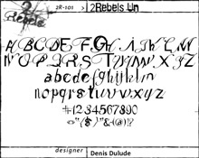
2 Rebels Co-Founder Denis Dulude
December 10, 2002
by Christopher May
Speak Up: I'm sure you have
been asked this many times, but what does the name 2 Rebels signify? Is it a
rebellion against the conventions of type? Or is there any significance to the
name at all?
Denis Dulude: No, not against
something. It's more like "Rebel with a cause". It was just to continue, be
part of, the rebellion or the revolution of the new typography that was happening
in the early 90's. I was and still am a strong believer in the contemporary
typography, even if I have a great respect for what has been done in the past.
The name came from the fact that at the beginning we were 2, I liked very much
the name rebel, (for different reasons too long to mention here) and that the
name "rebel" was already taken in Canada by a web company. I also
liked the fact that it has the same pronunciation as "too rebel".
SU: What is the 2 Rebels manifesto
or philosophy?
DD: I'm not really a philosopher, only a guy
that loves fonts and that I would like to believe that I'm doing a little
something for the world of typography in Quebec (...hopefully in Canada too)
Not only by distributing and selling fonts, but by trying to make people like
and respect fonts and typography. (ouf!! I'm getting serious)

|
 |
|
I was and still am a strong believer in the contemporary typography, even if I have a great respect for what has been done in the past.
|
|
SU: What is your approach to
designing type?
DD: When I have an idea, an
urge, or whatever like that, I start designing.
SU: Do you scan hand-rendered
sketches? Do you start with particular letters first? Which cases do you start
with?
DD: Yes. I always start with
the letter A. Uppercase.
SU: Generally how long does
it take you to complete the character set of one weight?
DD: It depends on the font. KO
dirty was done quite fast. I think it was a bit more than a week. But it was
intended to be like that. A quite fucked up face where the spacing and kerning
is meant to be a bit distressed. On the other hand I have a font that I've started
2 years ago and it's still not finished.
SU: For those who are unaware,
2rebels is also the eminent KO Creations graphic design studio. If you had to
make a choice between fonts or motion graphics, which would you choose and why?
DD: (Just to clarify a bit, KO
and 2Rebels are 2 different companies. KO is a graphic design studio.
2Rebels is a font seller with a home brand called 2Rebels font. We don't sell
any other brand but we are distributed by other distributors of which FontShop
is the main one.)
To answer your question, the winner is... motion graphic. Probably because before
being a graphic designer I was a ballet dancer. I just enjoy making stuff, especially
words, move on music.
|
I explore motion graphic today because type design doesn't give me the motion emotion anymore. |
|
 |
|
SU: Much of your type design
has characteristics including blurs, smears, and motion, similar to your motion
graphic work. Did your motion work open the door to how you approach designing
fonts or vice versa?
DD: Vice versa. I think I explore
motion graphic today because type design doesn't give me the motion emotion
anymore. I do approach font design differently today. Strangely in a more static
way.
SU: After 15 years as an international
ballet dancer, the leap towards type and design would be one that is fairly
uncommon, what was the catalyst for this?
DD: Simply a new passion for
graphic design.
SU: Who or what are the influences
of your work? What do you draw your inspiration from?
DD: It can be anything from a
badly printed fax I received to my 5 year old son hand writing or drawing. From
an old movie poster to rained out lost cat ad on a telephone pole. I try to
be aware of everything around me.
SU: Within the entire 2Rebels
library, what is your favorite font? Why?
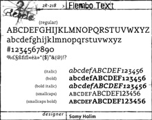
DD: That's a hard one. I had
a few different ones at different periods, now I think it's "Flembo text"
and I don't know why!
|
 |
|
I had a few different ones [favorite fonts] at different periods, now I think it's "Flembo text" and I don't know why!
|
|
SU: Who besides 2Rebels has
help put Montreal on the map of type design, past or present?
DD: That's a hard one. I'm sure
(hopefully) we are not the only one.
SU: Would you say there is
any particular style that is centric to Montreal, Quebec or Canada?
DD: A style, I don't know. Influenced,
probably. By the continent we live in and by the European feel that Montreal
has. Maybe our style is a mix of both world.
SU: As a renowned figure in
the type community and a professor who has taught typography at the University
of Québec in Montréal, is there any particular advice you could
give aspiring students and up-and-coming type designers?
DD: Do it if you love it. If
you design fonts to make money, maybe you should start playing hockey (or golf).

This interview has been conducted exclusively for Speak Up.
Reproduction without our written consent is strictly prohibited. Please if you would like to use it for educational purposes or if you are interested in other means of reproduction. Thank you for your understanding.