


Online
- FPO (For Print Only) / Celebrating the reality that print is not dead by showcasing the most compelling printed projects.
- Art of the Menu / Cataloguing the underrated creativity of menus from around the world.
- Quipsologies / Chronicling the most curious, creative, and notable projects, stories, and events of the graphic design industry on a daily basis.
- Speak Up (2002 – 2009) / Discussing, and looking for, what is relevant in, and the relevance of, graphic design. Archives Only.
- Word It (2003 – 2010) / Encouraging creative diversity in the community through monthly, one-word challenges. Archives Only.
- Brand New Classroom (2010 – 2011) / Providing a space for critique and opinions on student identity work. Archives Only.
Publishing
- The 2010 Brand New Awards / 2011, self-published.
- Flaunt: Designing effective, compelling and memorable portfolios of creative work / 2010, self-published.
Events & Judged Competitions
- Brand New Conference / A one-day event on the development of corporate and brand identity projects by some of today’s most active and influential practitioners from around the world.
- Brand New Awards / Celebrating the best identity work produced around the world.
- FPO Awards / Celebrating the best print work from around the world.
Writing
- Graphic Design, Referenced: A Visual Guide to the Language, Applications, and History of Graphic Design / 2009, Rockport.
- Women of Design: Influence and Inspiration from the Original Trailblazers to the New Groundbreakers / 2008, HOW Books.
- The Word It Book: Speak Up Presents a Gallery of Interpreted Words / 2007, HOW Books.
Graphic Design
- Department of Design / Designing corporate and brand identities and full development of printed and digital matter for clients.

Opinion BY Armin
Moleskine Better Have Some Thick Skin
![]()
First produced in 1997 by Modo & Modo SpA in Milan, Moleskine — produced by the eponymous Italian parent company since 2007 — is an extensive line of pocket-sized, trusted travel companion notebooks with over 14 million units sold in around 23,000 points-of-sale, including nine branded stores, in 90 countries across the globe. Between the classic notebooks and all its variants — small, large, ruled, squared, plain, colored covers — and dozens of special editions Moleskine’s collection includes over 750 products. Earlier this month Moleskine introduced a new monogram and a revised wordmark desiged by Milan-based Achilli Ghizzardi Associati.
Continue reading this entry

DATE: Jun.26.2013 POSTED BY: ArminCATEGORY: Consumer products COMMENTS:


Opinion BY Armin
Tomato with no Expiration Date
![]()
Established in 1892 when it first sold canned peaches, Del Monte is a brand of fruits, vegetables, and, most famously, tomato delivered in cans and jars while also offering broths, sauces and condiments, fruit cup snacks, and frozen treats. Del Monte is owned by Del Monte Foods and, according to their company fact sheet, their fruit and vegetable products own the number one market share position while their tomato and broth products own number two. This summer, Del Monte will begin rolling out new packaging and a revised logo, both designed by San Francisco, CA-based PhilippeBecker.
Continue reading this entry
DATE: Jun.20.2013POSTED BY: ArminCATEGORY: Consumer products COMMENTS:
TAGS: blackletter, packaging,
A B-Side BY Armin
Morrison’s Little Big

About: (Est. 2013) “For such tiny people, babies come with a lot of kit. And now you can bag all the essentials as you do your weekly shop, thanks to the newest addition to the Morrisons family, Little Big. From nappies to baby wipes, bottles to bibs, Little Big’s got all your baby needs covered. Carefully designed for everything parenthood throws at you, it’s great quality at the great prices you expect from Morrisons.”
Design by: Elmwood.
Ed.’s Notes: Cute! Bigger view of the logo and sample packaging below (or after the jump).
Relevant links: Article in The Drum. Article in Prolific North.
Select quote: “With the objective of connecting with second time parents on an emotional and functional level, the design takes a friendly, empathetic approach to parenting, understanding that it’s all about the little things. […] The design by Elmwood features both photography and an illustration of a soft elephant. This, the agency explained, was to convey the ‘humor and frustrations’ that parenting can bring as well as aiding product navigation.”
Continue reading this entry
DATE: Jun.18.2013POSTED BY: ArminCATEGORY: Consumer products The B-Side COMMENTS:
A B-Side BY Armin
Mike and Ike
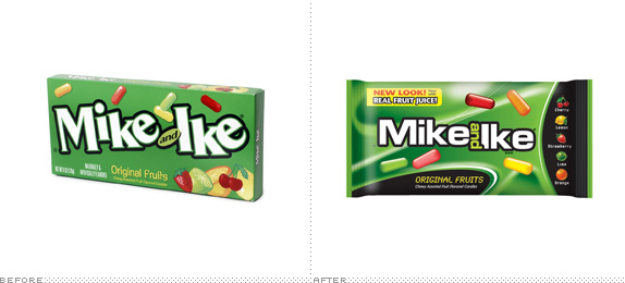
About: (Est. 1940) “Mike and Ike is a brand of fruit-flavored candies by the company Just Born, Inc.. Mike and Ike are oblong, fruit-flavored, chewy candies that come in several colors and varieties including: cherry, orange, lime, lemon and strawberry. In April 2012, the company announced a new ad campaign based on the premise that the characters of Mike and Ike are “splitting up” due to “creative differences”; boxes of the candy will show one or the other name scratched out. The development is intended to capture the interest of younger consumers. In 2013 the company announced Mike and Ike would reunite. In addition to a redesigned logo, the media campaign will also feature a movie style trailer which will appear in national cable TV commercials in June of 2013.” (Source: Wikipedia)
Ed.’s Notes: I wish they hadn’t gone with the futuristic look. It’s a great story line and trailer set-up is fun but the packaging is just too candy-aisle-generic. More images and the Hollywood-style trailer below (or after the jump).
Relevant links: The Shelby Report story.
Select quote: “Last year candy legends Mike and Ike split up because they couldn’t agree on new flavors, colors and packaging for MIKE AND IKE candy. You may have heard the story. If not, watch this short video to see what happened and why they are back together (below). The duo has had quite a year.”
Continue reading this entry
DATE: Jun.17.2013POSTED BY: ArminCATEGORY: Consumer products The B-Side COMMENTS:
Opinion BY Armin
Stanley Nails New Look
![]()
Established in 1857, Stanley is a well-known and popular product line of hand tools, power tools, and stuff-making accessories for consumer and industrial use. In 2010, Stanley and Black & Decker merged to form, well, Stanley Black & Decker and since then the Stanley brand has grown beyond tools into new industries like security, healthcare, infrastructure, and oilfield services. Looking to communicate the breadth of its offering and establish a unified brand, Stanley introduced last week a new logo and identity designed by Lippincott.
Continue reading this entry
DATE: Jun.11.2013POSTED BY: ArminCATEGORY: Consumer products COMMENTS:
TAGS: black, lippincott, packaging, tools, yellow,
Opinion BY Armin
Nine Suns to Brighten Your Day
![]()
This morning I wasn’t very inspired or motivated by any of the tips sitting in my inbox — nothing against our wonderful tip-submitters! It’s not your fault there isn’t much interesting work and stories out there — so I thought I would showcase a preview of my favorite project from the winners of the 2012 Brand New Awards designed by Landor’s San Francisco office: Nine Suns is a new luxury winery in Napa Valley with three-digit dollar bottles available only to registered members. In introducing the wines, the product of a Chinese family, Landor created a name and identity that references and honors their Chinese heritage in a subtle and unexpected manner.
Continue reading this entry
DATE: Jun.03.2013POSTED BY: ArminCATEGORY: Consumer products COMMENTS:
A B-Side BY Armin
Winsor & Newton
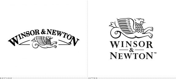
About: (Est. 1832) “Winsor & Newton is the world’s leading brand of fine art materials and has developed an unrivaled reputation for quality, reliability and product innovation. We proudly maintain our pledge of manufacturing ‘The World’s Finest Artist’ Materials.’ We have built our reputation on the quality and reliability of our products, combined with continual product development, improvement and innovation. However, while keeping true to the principles laid down by William Winsor and Henry newton in the 1800’s we actively embrace new ideas, new technologies and search the world for the best raw materials available.”
Design by: Pearlfisher.
Ed.’s Notes: A nice update. Nothing too drastic. A handful of application images below (or after the jump).
Relevant links: Press Release.
Select quote: “The original marque was lost on an information heavy pack. We have strengthened the hierarchy and optimisation on pack by giving the brand a strong and central place at the top — with the logotype redrawn and reformatted. The Griffin has been redefined and removed from the holding device of the arch to give it more status and clarity as a true icon that has more synergy with the brand.”
Continue reading this entry
DATE: May.23.2013POSTED BY: ArminCATEGORY: Consumer products The B-Side COMMENTS:
TAGS: packaging, paint, pearlfisher, serif,
Opinion BY Armin
Destination: Corner of Stuff and Stuff
![]()
In 2005, the MoMA Design Store launched the first of its Destination: Design series that brings products from different cities and countries from around the world to the museum’s store. The project has a couple of benefits: a) more cool stuff to buy at MoMA and b) exposure for local artists who may not otherwise get a chance to sell their work at such large scale. So far, the series has brought products from Finland, Denmark, Buenos Aires, Berlin, Japan, Seoul, Brazil, Portugal, Istanbul, and Mexico. Its latest edition is Destination: NYC, a collection with approximately 200 lifestyle products including home accessories, furniture, paper goods and jewelry — all products are manufactured in the U.S.. Each edition in the series has had its own identity, sometimes designed in-house at MoMA, others in collaboration. This one was designed with the School of Visual Arts Masters in Branding Program under the guidance of Mark Kingsley, who also wrote advertising headlines and copy, designed window and store displays (currently in progress) and product photography.
Continue reading this entry
DATE: May.15.2013POSTED BY: ArminCATEGORY: Consumer products COMMENTS:
TAGS: flexible identity, moma, museum, new york,
A B-Side BY Armin
Louisville Slugger
![]()
About: (Est. 1894) “Louisville Slugger is synonymous with baseball and softball. It is the leading brand in diamond sports. The company makes the #1 Bat in Major League Baseball, bats that are swung by the best of the best - Derek Jeter, Josh Hamilton, Joey Votto, Curtis Granderson and David Wright, among hundreds of other current MLB stars. […] Louisville Slugger also makes industry-leading equipment for youth, high school and college players. It sponsors top-level NCAA Division 1 baseball programs, including the 2012 National Champion Arizona Wildcats.”
Design by: N/A
Ed.’s Notes: Kind of terrible. The logo is now stuck in the 1980s, early 1990s. If they had just let it be another ten years it would be all retro and stuff, even with how mangled that old typography was. Bigger view, and a shot of the logo on bats below (or after the jump).
Relevant links: WFPL story
Select quote: “Hillerich and Bradsby Company Vice-President of Marketing Kyle Schlegel says this is the first new look for the logo since 1980.
‘What we’ve tried to do is hold true to those pieces of the mark that really speak to the legacy, so the oval is still there but we wanted to introduce a lot of new modern elements to it that allow the brand to really come into the present day,’ he said.”
Continue reading this entry
DATE: Apr.12.2013POSTED BY: ArminCATEGORY: Consumer products The B-Side COMMENTS:
Opinion BY Armin
Lucky Strike/s Out
![]()
First chewed and later puffed in 1871, Lucky Strike is a brand of cigarettes originally produced by the R.A. Patterson Tobacco Company and now owned by British American Tobacco. At one point in 1930, Lucky Strike was the leading cigarette brand, selling 40 billion of the little suckers. A success in part attributed to Lucky Strike’s aggressive targeting towards women in the 1920s and later when Raymond Loewy turned the package from green to white to make it more female friendly. Today, well, you can barely find Lucky Strike anywhere except online, in specialty smoking stores, and, apparently, in Germany, where a redesigned logo and packaging designed by G2 has appeared online. There is not much information available, in part because the German website is only accessible to computers in Germany and it’s not clear whether this change will apply to Lucky Strike in all countries or just Germany; all images are taken from Design Tagebuch.
Continue reading this entry
DATE: Apr.11.2013POSTED BY: ArminCATEGORY: Consumer products COMMENTS:
TAGS: cigarettes, circles, packaging, slab serif,


Books about logo design, the designers that create them and the meaning of branding.
