


Online
- FPO (For Print Only) / Celebrating the reality that print is not dead by showcasing the most compelling printed projects.
- Art of the Menu / Cataloguing the underrated creativity of menus from around the world.
- Quipsologies / Chronicling the most curious, creative, and notable projects, stories, and events of the graphic design industry on a daily basis.
- Speak Up (2002 – 2009) / Discussing, and looking for, what is relevant in, and the relevance of, graphic design. Archives Only.
- Word It (2003 – 2010) / Encouraging creative diversity in the community through monthly, one-word challenges. Archives Only.
- Brand New Classroom (2010 – 2011) / Providing a space for critique and opinions on student identity work. Archives Only.
Publishing
- The 2010 Brand New Awards / 2011, self-published.
- Flaunt: Designing effective, compelling and memorable portfolios of creative work / 2010, self-published.
Events & Judged Competitions
- Brand New Conference / A one-day event on the development of corporate and brand identity projects by some of today’s most active and influential practitioners from around the world.
- Brand New Awards / Celebrating the best identity work produced around the world.
- FPO Awards / Celebrating the best print work from around the world.
Writing
- Graphic Design, Referenced: A Visual Guide to the Language, Applications, and History of Graphic Design / 2009, Rockport.
- Women of Design: Influence and Inspiration from the Original Trailblazers to the New Groundbreakers / 2008, HOW Books.
- The Word It Book: Speak Up Presents a Gallery of Interpreted Words / 2007, HOW Books.
Graphic Design
- Department of Design / Designing corporate and brand identities and full development of printed and digital matter for clients.

A B-Side BY Armin
Lark
![]()
About: (Est. 2010) “Lark is a consumer electronic company that makes wearable wellness monitors, most notably the Lark Pro, a personal sleeping trainer that helps consumers analyze sleep patterns while coaching them to improve and assess better sleep behavior. Lark recently released the new LarkLife wristband: a wearable diet, fitness, sleep tracking and coaching system.”
Design by: Ammunition.
Ed.’s Notes: Packaging and actual product (also designed at Ammunition) below (or after the jump).
Relevant links: LarkLife on Gizomodo.
Continue reading this entry

DATE: Nov.30.2012 POSTED BY: ArminCATEGORY: Consumer products The B-Side COMMENTS:

TAGS: ammunition, products, sans serif,

A B-Side BY Armin
Breathe Right
![]()
About: “Breathe Right nasal strips are drug-free and clinically proven to lift nasal passages and open your nose the minute you put them on and work for as long as you have them on, relieving nasal congestion and improving airflow.”
Design by: N/A.
Ed.’s Notes: I’m not usually one to ask “Aren’t the before/after images mistakenly reversed?” but when I got this tip I really thought the new one was the old one. The generic happy script typography of mass packaging isn’t necessarily my thing but this new logo makes me yearn for it. Before/after of the packaging below (or after the jump)
Relevant links: N/A.
Continue reading this entry
DATE: Nov.28.2012POSTED BY: ArminCATEGORY: Consumer products The B-Side COMMENTS:
TAGS: blue, packaging, sans serif,
Opinion BY Armin
Follow-up: Windows 8
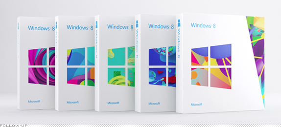
Back in February we reported on the new Windows 8 logo designed by Pentagram partner Paula Scher — a release that got its thunder stolen by the leaking of the logo (not by us) ahead of time (not our fault). Officially, the Windows 8 logo is this and eight months after it was “unveiled,” the actual software behind the new, non-flag-anymore-logo was launched this past Friday to much hoopla around the world. See launch video later in this post. As part of the OS re-launch, which is a major departure from past Windowses, Microsoft is taking this opportunity to kickstart its new branding — after all, Windows is only the most used operating system in the world, so a lot of people are paying attention. The branding effort which now covers Windows but will spread into other Microsoft products has been lead by Wolff Olins, who describe their role to be “to curate all of the components and contributions into one clear, creative brand experience for consumers.” In the case of Windows these contributions include new packaging with structural construction by IDEO, illustrations conceived in collaboration with and created by Colors and The Kids, and brand imagery and video by Todd Selby.
Continue reading this entry
DATE: Oct.29.2012POSTED BY: ArminCATEGORY: Consumer products COMMENTS:
A B-Side BY Armin
Mirácoli
![]()
About: Mirácoli is a popular line of pasta and sauces in Germany. Previously owned by Kraft Foods and now by Mars (the same company that, yes, makes the chocolates).
Design by: Turner Duckworth.
Ed.’s Notes: Worth noting that when the logo is used on packaging it becomes a plate. Before/After of packaging below (or after the jump).
Relevant links: Design Tagebuch (with a few more images).
Continue reading this entry
DATE: Oct.19.2012POSTED BY: ArminCATEGORY: Consumer products The B-Side COMMENTS:
TAGS: germany, packaging, turner duckworth,
A B-Side BY Armin
Jos. Louis
![]()
About: Jos. Louis is a popular and long-standing snack in Canada produced by Vachon. It is officially described as “Delicious sponge cake with vanilla-flavoured creme filling coated in a chocolatey layer.”
Design by: 123Klan.
Ed.’s Notes: Old and new boxes below (or after the jump).
Relevant links: 123Klan project page.
Select Quote: As for the new Jos Louis logo, it’s inspired by the actual cake: it features a creamy fat dark brown outline (chocolate icing), a second outline of a lighter brown (sponge cake), white letters (cream). The crown is a reference to Jos Louis’ status as the best-known/most sold snack cake in Canada.
Continue reading this entry
DATE: Oct.15.2012POSTED BY: ArminCATEGORY: Consumer products The B-Side COMMENTS:
A B-Side BY Armin
Silipint
![]()
About: (Est. 2010) “Silipint offers simple innovative products within a culture that is dedicated to exceptional service and our partners. Providing semi-rigid silicone drinkware through a process aimed at brand growth and profitability.”
Design by: Brand Navigation.
Ed.’s Notes: Dude, it’s a squishy pint glass! See proof below (or after the jump).
Relevant links: Brand Navigation Case Study.
Continue reading this entry
DATE: Oct.11.2012POSTED BY: ArminCATEGORY: Consumer products The B-Side COMMENTS:
TAGS: hand-drawn, smile, yellow,
Opinion BY Armin
Sharapova’s Gummies
![]()
Launched last week, Sugarpova is a new line of twelve premium gummy candies in different, self-described “fun, unexpected” types and shapes imagined and “sold” by tennis superstar Maria Sharapova — hence, the product’s name — who is not just one of the great women tennis players of our time winning 27 WTA singles titles that include four Grand Slam singles titles but, at 25 years old, she is also a very astute business person, ranking 26 in Forbes’ World’s Highest Paid Athletes list that shows that $22 million of her total $27.9M earnings to date come from endorsements. Sugarpova will be sold at fashion store Henri Bendel in New York, available at hotel minibars, and at their own website. The new logo and packaging was designed by Brooklyn, NY-based Red Antler.
Continue reading this entry
DATE: Aug.27.2012POSTED BY: ArminCATEGORY: Consumer products COMMENTS:
Opinion BY Armin
Plaid Beer
![]()
Established in 1997 and located in Cooperstown, NY, Brewery Ommegang specializes in Belgian-style ales, including BPA, Hennepin, wheat, and amber ales among other regular and seasonal brews. Brewery Ommegang is owned by Belgian brewer Brouwerij Duvel Moortgat and is distributed throughout the U.S. and in some European countries. They recently introduced a new look designed by Minneapolis, MN-based Duffy & Partners and the newly packaged product will be available for purchase in early Fall of 2012.
Continue reading this entry
DATE: Aug.13.2012POSTED BY: ArminCATEGORY: Consumer products COMMENTS:
TAGS: beer, duffy and partners, packaging,
A B-Side BY Armin
Polk
![]()
Established in 1972, Polk (née Polk Audio) is a manufacturer of “high quality, great sounding speakers that are accessible to everyone.” In July, to celebrate their 40th year in business, Polk introduced a new logo designed by the San Francisco office of frog design. Press release here.
Thanks to Mark Curtis for the tip.
DATE: Aug.01.2012POSTED BY: ArminCATEGORY: Consumer products The B-Side COMMENTS:
TAGS: frog design, heart, sans serif,
A B-Side BY Armin
Del Sol
![]()
Established in 1994, Del Sol produces color-changing clothing and accessories and sells them in over 100 stores across the world. They recently introduced a new logo. No design credit given or press release issued. Their previous logo looked like it was from the 1980s, the new one from the 1990s, so hopefully in ten years they’ll have a new logo that looks like it belongs in the 2000s, which will be ten years too late. Bigger view of the logo below (or after the jump).
Continue reading this entry
DATE: Jul.23.2012POSTED BY: ArminCATEGORY: Consumer products The B-Side COMMENTS:
TAGS: red, sans serif,


Books about logo design, the designers that create them and the meaning of branding.
