
BY Armin
Scientifically Architectural Building Blocks

Originally established as a children’s museum in 1941 in the city of Fort Worth, Texas, growing in size and popularity to become the Fort Worth Museum of Science and History (FWMSH) is one of a handful of world-class museums in the Fort Worth Cultural District that also happens to boast architecture by Philip Johnson (Amon Carter Museum), Tadao Ando (Modern Art Museum of Fort Worth), and Louis Kahn (Kimbell Art Museum). Slowly deteriorating, and slightly frumpy next to these buildings, the FWMSH is currently undergoing a renovation under the design of Mexico City based Ricardo Legorreta’s Legorreta + Legorreta that will open 202 days from now (according to the web site’s counter).
Continue reading this entry

DATE: May.05.2009 POSTED BY: Armin
 CATEGORY: Culture
  COMMENTS:

TAGS:

BY Christian Palino
The Writer’s Type
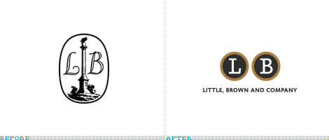
Little, Brown and Company was founded in 1837, publishing fiction and nonfiction titles from great American writers including great names such as Norman Mailer, Gore Vidal and E. L. Doctorow, and brilliant satirists like David Sedaris and Candace Bushnell. They are a publishing group under Hachette Book Group who is a subsidiary of Lagard�re, a communications and media company. The previous identity was primarily an illustration of the Bulfinch Monument —�a not-so-well-known Boston landmark. Hard to reproduce and a bit far from conveying literary notions for those unfamiliar with Little, Brown’s history. The new identity, created by Lance Hidy, employs Silica to craft a couple of typewriter keys, forming a monogram-like mark. Simple, reproducible, and memorable enough to work well on a book spine or in trade ads. Paired with a cleanly set nameplate when needed — this is a successful rebranding. You can read a bit more on the redesign and hear from Hidy over at The New York Observer.

DATE: Apr.30.2009 POSTED BY: Christian Palino
 CATEGORY: Culture
  COMMENTS:

TAGS:

BY Armin
Hello Kitty
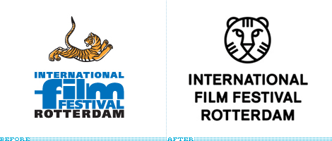
With the growing enterprises of film festivals around the world it’s becoming increasingly important for each to convey their own attitude through their branding and front-runners like The Sundance Film Festival or the Tribeca Film Festival have really strong design executions — and in the case of the big daddy of all film festivals, Cannes, the name alone does all the work, even with paltry design. The International Film Festival Rotterdam (IFFR), running since 1972 and handing prizes since 1995 is one of the top festivals but, unfortunately, you might never know that from their old logo.
Continue reading this entry

DATE: Apr.15.2009 POSTED BY: Armin
 CATEGORY: Culture
  COMMENTS:

TAGS:

BY Armin
The Sound of Italics
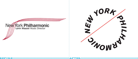
Given the accompanying text in the tips I received about this one, I have the feeling we are up for another heated discussion and I will preemptively ask that any “This sucks.” comments be kept to a minimum. Please expand beyond that, it’s not that hard. With that out of the way, Pentagram partner Paula Scher has redesigned the identity of the New York Philarmonic, another constituent of the redesigns Scher has done for the Lincoln Center.
Continue reading this entry

DATE: Jan.15.2009 POSTED BY: Armin
 CATEGORY: Culture
  COMMENTS:

TAGS:

BY Armin
Down and Town, Crossed

This identity is not necessarily new actually, back in 2007, the Boston Redevelopment Authority — how cool is their logo? — unveiled the plans to roll out a new brand to identify Boston’s Downtown Crossing neighborhood as a vibrant location where more than 230,000 people work, live and play and establish it as “Boston’s Meeting Place.” Philadelphia-based 160over90 has been in charge of the identity, which involves print materials, signage and, most recently, a large wrap for the historic landmark site of Filene�s Department Store as it undergoes construction.
Continue reading this entry

DATE: Nov.17.2008 POSTED BY: Armin
 CATEGORY: Culture
  COMMENTS:

TAGS:

BY Armin
London over Time as a Logo
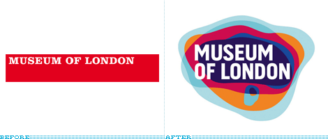
The Museum of London, established in 1976, chronicles the history of the city of London from prehistoric times and from the eighteenth century to today. Currently undergoing a £20.5 million renovation aimed to open in 2010 and, leading up to that moment, the museum has begun phasing a new identity that will brand the main museum, as well as two related institutions, the Museum of London Docklands and the Museum of London Archaeology. The new look has been designed by London-based Coley Porter Bell.
Continue reading this entry

DATE: Oct.30.2008 POSTED BY: Armin
 CATEGORY: Culture
  COMMENTS:

TAGS:

BY Brand New
Music to my Eyes
Guest Editorial by Kosal Sen
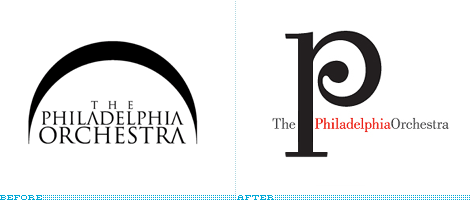
For a world-class organization, the Philadelphia Orchestra had an extremely banal logo. It wasn’t too disappointing, given that the core of their visual presence — event posters, outdoor advertising, banners and such — used this uninspired, “safe” method of art direction. The old logo uses Trajan with the crossbars of the As dropped, probably a nod to musicians familiar with the marcato articulation symbol. This nice little idea would’ve made an okay logotype, but someone thought it was a good idea to improve it with the ever-popular swoosh. But behold, this swoosh had reason, representing the arched roof of the orchestra’s home, the Kimmel Center. Then again, it’s still a swoosh.
Continue reading this entry

DATE: Sep.26.2008 POSTED BY: Brand New
 CATEGORY: Culture
  COMMENTS:

TAGS:

BY Armin
This Way to the Cosmos

Opening this week in Sendai, Japan is a new exhibit space for the 53-year-old Sendai Astronomical Observatory (SAO), with a new identity designed by johnson banks in London. The first element of the identity is the logo, an arrow created from the name of the observatory in Japanase with the English translation hinged at a vertiginous 45-degree angle. What I love about this is the use of the usually cumbersome need of a logo to appear in two languages, into an integrated solution, as opposed to just repeating the name smaller in the second language. I’m also a sucker for hot pink, so I’m really drawn to wherever the arrow is pointing. Which brings us to the second element of the identity.
Continue reading this entry

DATE: Jun.30.2008 POSTED BY: Armin
 CATEGORY: Culture
  COMMENTS:

TAGS:

BY Ryan Hembree
Optima Won’t be Running for President

Update, 06.18.2008: It has been brought to my attention that The Spalding Group’s McCainStore.com “is not authorized by any candidate or candidate’s committee,” and that the merchandise sold is representative of their own version of Sen. John McCain’s campaign logo (and not the official one). I had received an e-mail announcing the new store the day after John McCain’s interview on ABC, and I made the assumption (in part based on a visit to the company web site) that the campaign had indeed updated its brand. I apologize for any confusion that this may have caused.
— Ryan Hembree
Now that the dust has settled on the Democratic Presidential Primaries, the general election for the office of President of the United States has finally begun. Senator Barack Obama, with his populist message of hope and change for America, will challenge Republican senator John McCain for America’s vote. Between now and November, signs, banners and billboards will proliferate across the land, from shop windows to front lawns, pitting neighbors, families and friends against one another as politics take center stage.
Continue reading this entry

DATE: Jun.18.2008 POSTED BY: (Display Name not set)
 CATEGORY: Culture
  COMMENTS:

TAGS:

BY Armin
The Art Gallery of Many Typefaces
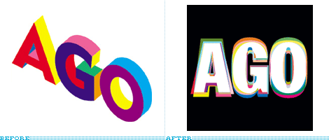
The Art Gallery of Ontario (or, “the AGO” to friends) has been undergoing a revitalization since 2002 that will culminate in a Frank Gehry-designed building and thousands of new works of art sometime in the Fall of 2008, when the AGO reopens its doors, which have been closed since October of last year. In the meantime, and gearing up for the momentous event, the AGO unveiled last week a new logo designed by Bruce Mau Design, who also designed the previous iteration of the logo in 1997.
Continue reading this entry

DATE: May.19.2008 POSTED BY: Armin
 CATEGORY: Culture
  COMMENTS:

TAGS:


