
BY Brand New
Solar Eclipse of the Heart
Guest Editorial by Kosal Sen
The Franklin Institute Science Museum in Philadelphia is a popular tourist attraction that’s within walking distance from the Philadelphia Museum of Art. It’s a funhouse of exploratory hands-on science. Kids can chase each other inside a giant walk-in human heart, gaze in awe at the IMAX screen, or sit and enjoy the planetarium sky. Though the permanent exhibits are meant for kids on field trips, adults are no less fascinated by the traveling exhibits that take place there, such as The Titanic, Gunther von Hagens’ Body Worlds, and King Tut. Through the years The Franklin Institute has maintained its well-respected, non-profit reputation by balancing educational material and fun without being too commercial or juvenile.
Continue reading this entry

DATE: May.08.2008 POSTED BY: Brand New
 CATEGORY: Culture
  COMMENTS:

TAGS:

BY Christian Palino
Dancing With The Stars, Season 9: DIN Stacked
After redesigning the identity for The Metropolitan Opera in 2006, Pentagram’s Paula Scher tackles the New York City Ballet, another resident organizations of the Lincoln Center.
Continue reading this entry

DATE: Jan.23.2008 POSTED BY: Christian Palino
 CATEGORY: Culture
  COMMENTS:

TAGS:

BY Joe Marianek
New Brand for New Museum

A new identity program paying tribute to the the New Museum’s new building, new location, new principles and new international partnerships was newly unveiled to the public just in time for the new year on December 1st, 2007. Gone is the barber-stripe-clad moire mouthful, “New Museum of Contemporary Art.”
Continue reading this entry

DATE: Jan.04.2008 POSTED BY: J. Marianek
 CATEGORY: Culture
  COMMENTS:

TAGS:

BY Christian Palino
Dutch MirrororriM hctuD
What do you get when you combine FAPK, FST and FPPM? Well, NFPK of course. Or The Netherlands Fund for Performing Arts. Part of the Dutch Ministry of Education, Culture and Science, The Netherlands Fund for Performing Arts collects the previous three arts initiatives under one moniker.
Continue reading this entry

DATE: Dec.10.2007 POSTED BY: Christian Palino
 CATEGORY: Culture
  COMMENTS:

TAGS:

BY Armin
Flip, Flip, Flip goes the Library

When you think of public libraries — that glorious old book smell, the studious people learning something new, the kind of light that is rarely found anywhere else, the challenge of judging books by their spine — their identity is probably the last thing you notice, consider or even care for… you are there for the books and what lies between their pages. And that’s exactly what C&G Partners celebrates in their design of the new identity for the Darien Public Library in the affluent town of Darien, Connecticut.
Continue reading this entry

DATE: Nov.18.2007 POSTED BY: Armin
 CATEGORY: Culture
  COMMENTS:

TAGS:

BY Armin
A Film Family with a Heart
Designing an identity for a film festival — with their progressive, independent, slightly rebellious and amply creative spirit, plus the numerous applications and possibilities of creating a flexible identity — is probably high on the list of Types of Clients/Projects we Want to Get in design firms’ business plans across the globe. San Francisco based MINE™, run by identity fiend Christopher Simmons, got that chance with the redesign of The California Film Institute’s (CFI) identity, as well as that of its 29-going-on-30-year-old Mill Valley Film Festival (MVFF), plus an update of the institute’s education program and the Rafael Film Center’s. The opportunity to work on all these logos at the same time proved to be the most beneficial for CFI, as it was rewarded with a cohesive visual family of brands that respond to their place and context.
Continue reading this entry

DATE: Oct.09.2007 POSTED BY: Armin
 CATEGORY: Culture
  COMMENTS:

TAGS:

Opinion BY Armin
The 17 Sides of a Cultural Identity

Built in 2005 by Rem Koolhaas’ OMA in the city of Porto, Portugal the Casa da Música is, without a doubt, a significant architectural statement — further emphasised by its intense angles and towering presence. By using the building as a visual source, Stefan Sagmeister created a dynamic, faceted and endlessly varied identity — all literally speaking. The resulting logo is perhaps, well, not pretty, but as a vessel for the complete identity and adaptable execution it is a mighty impressive piece of design architecture itself. One on which styles, ideas, themes — specific or broad — can be projected upon. Stefan was generous to share this project with us and show what happens behind the scenes in the realization of this identity.
Continue reading this entry

DATE: Sep.17.2007 POSTED BY: Armin
 CATEGORY: Culture
  COMMENTS:

TAGS:

BY Armin
Helvetica as World Culture, I Think Not
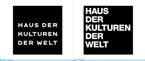
In modern-day Berlin architectural oddity and innovation is now an ordinary part of the booming landscape. Daniel Libeskind’s Jewish Museum, Norman Foster’s addition to the Reichstag and Frank Gehry’s DZ Bank are unarguable highlights, but there is one building that, at least on my visit, stood out as one of the most intriguing: The House of World Cultures (Haus der Kulturen der Welt). Designed in 1957 by architect Hugh Stubbin, the building’s iconic concrete roof is beautiful from afar, vertiginous up close, and surprising from any distance — delightfully offset by its massive copper-hued facade. The best way I could describe the building is as if a UFO would have landed in Stanley Kubrick’s A Clockwork Orange: Surreal, sensual, and slightly dangerous. The building has been closed to the public for more than a year and it reopens this month. To signal the new era for the institution Berlin-based Double Standards has designed a new identity: Helvetica uppercase in a box. A far cry from the idiosyncrasy of the building and an odd step backwards in the otherwise innovative visual landscape of Berlin. The previous logo, designed by Cornel Dwindlin in the late 80s, while he was working with Neville Brody, wasn’t extraordinarily innovative either — uppercase letters in a box — but the custom hand-drawn typography had enough peculiarities to make it feel unique to its mothering institution. Helvetica’s neutrality and ubiquity functions as the perfect vessel upon which to create meaning for any institution, but when it dismisses its unique context, Helvetica can really be a drag.
Story spotted on PAGE.

DATE: Aug.23.2007 POSTED BY: Armin
 CATEGORY: Culture
  COMMENTS:

TAGS:

Opinion BY Armin
A New Voice for the World Trade Center Memorial

Reflecting Absence, the planned memorial at the site of the World Trade Center, designed by Michael Arad and Peter Walker, has not come easily. It has endured more than five years of delays, scrutiny and political and sentimental maneuvering. Not surprisingly, of course, as it is a subject that requires tact and patience. The site on the southern tip of Manhattan remains, for lack of a better description, in ruins, and the expectation of what the site will be, only adds to the eagerness of seeing it completed. As a way to emphasize the importance of the memorial as a national endeavor the World Trade Center Memorial Foundation recently changed its name to the National September 11 Memorial & Museum at the World Trade Center. Long, certainly, but with pinpoint accuracy in giving it a larger sense of relevance, beyond New York. The identity, “a creative interpretation of the pools of the Memorial itself [that] represent the strength and the ephemeral quality of our memories” has been designed by New York-based Number Seventeen. [Bigger view here]. The design is understated, with its subtle depiction of the tower footprints, both as a reminder of what once stood there and as a representation of the water that now flows through them; elegant, in its soft colors and centered arrangement; and modern, in its typographic selection, reminding us that this happened in the 21st Century. As a reflection of what design can do to convey meaning and sentiment, this identity stands strong as a complementary voice to the powerful echo of the design of the memorial.

DATE: Aug.18.2007 POSTED BY: Armin
 CATEGORY: Culture
  COMMENTS:

TAGS:

BY Brand New
Paley’s Lens Turns Heads, Causes Neck Fractures
Guest Editorial by Joe Marianek
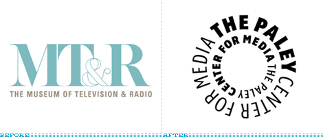
Earlier this month, Landor Associates announced a new name, strategy and identity for The Paley Center for Media; formerly the Museum of Television and Radio, with branches in Los Angeles and New York. The Paley Center for Media offers a curated collection of privately-donated media, holds panel discussions, and screenings in its theaters. The Paley Center doesn’t feature physical Smithsonian-type artifacts like vacum tubes, Alf’s carcass, or a comprehensive collection of everything ever broadcast on television and radio. What it does offer is a curated collection of 140,000 programs that one can access.
Continue reading this entry

DATE: Jun.23.2007 POSTED BY: Brand New
 CATEGORY: Culture
  COMMENTS:

TAGS:


