


Online
- FPO (For Print Only) / Celebrating the reality that print is not dead by showcasing the most compelling printed projects.
- Art of the Menu / Cataloguing the underrated creativity of menus from around the world.
- Quipsologies / Chronicling the most curious, creative, and notable projects, stories, and events of the graphic design industry on a daily basis.
- Speak Up (2002 – 2009) / Discussing, and looking for, what is relevant in, and the relevance of, graphic design. Archives Only.
- Word It (2003 – 2010) / Encouraging creative diversity in the community through monthly, one-word challenges. Archives Only.
- Brand New Classroom (2010 – 2011) / Providing a space for critique and opinions on student identity work. Archives Only.
Publishing
- The 2010 Brand New Awards / 2011, self-published.
- Flaunt: Designing effective, compelling and memorable portfolios of creative work / 2010, self-published.
Events & Judged Competitions
- Brand New Conference / A one-day event on the development of corporate and brand identity projects by some of today’s most active and influential practitioners from around the world.
- Brand New Awards / Celebrating the best identity work produced around the world.
- FPO Awards / Celebrating the best print work from around the world.
Writing
- Graphic Design, Referenced: A Visual Guide to the Language, Applications, and History of Graphic Design / 2009, Rockport.
- Women of Design: Influence and Inspiration from the Original Trailblazers to the New Groundbreakers / 2008, HOW Books.
- The Word It Book: Speak Up Presents a Gallery of Interpreted Words / 2007, HOW Books.
Graphic Design
- Department of Design / Designing corporate and brand identities and full development of printed and digital matter for clients.

Opinion BY Armin
Follow-up: ITV
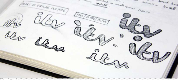
Last November we reported on the redesign of ITV, the biggest commercial television network in the UK. At the time, only the logo for the main channel had been introduced. Now, the full scope of the project — that includes revised logos, idents (over 80 produced), and on-screen graphics and navigation for all four channels — has launched. The project was carried out internally at “a dedicated ‘pop-up’ design studio” led by incoming Creative Director Phil Lind and Head of Operations Claire Finn. In this post we have insights from the team based on a very comprehensive case study they generously provided. My only comments on this one: This is an amazingly intense amount of work and it’s expertly carried out.
Continue reading this entry

DATE: Jan.29.2013 POSTED BY: ArminCATEGORY: Entertainment COMMENTS:


Opinion BY Armin
Billbold
![]()
First published in 1894, Billboard is a weekly magazine devoted to the music industry and issuing weekly charts of the top songs, including the popular and industry-leading Hot 100 of the top singles, which then spawned an endless inventory of CDs. This week, Billboard is introducing a redesigned magazine featuring a new logo, both by Pentagram partner Michael Bierut. The new identity will be introduced unto the website on January 26 when it relaunches.
Continue reading this entry
DATE: Jan.24.2013POSTED BY: ArminCATEGORY: Entertainment COMMENTS:
TAGS: bold, lowercase, magazine, pentagram, Sans Serif,
A B-Side BY Armin
Fandor
![]()
About: (Est. 2011) “Fandor is the leading on-demand independent film service, expanding the audience for independent films and offering an innovative new distribution platform that shares revenue with filmmakers. Fandor’s rich editorial environment and active community of film fans makes it easy and rewarding to discover movies from its handpicked library of independent and international films.
Design by: Surface Under Fire.
Ed.’s Notes: If the Playboy bunny and the Penguin penguin had a baby this would be it. Bigger view below (or after the jump).
Relevant links: N/A.
Continue reading this entry
DATE: Jan.14.2013POSTED BY: ArminCATEGORY: Entertainment The B-Side COMMENTS:
TAGS: mascot, Sans Serif, uppercase,
Opinion BY Armin
Univision Needs More, More, Más
![]()
Launched in 2002 as TeleFutura by parent network Univision and quickly rising as the second most watched U.S. Spanish-language television network, the recently renamed UniMás has been retooled specifically for Hispanic millennials with programming geared to a “younger, bicultural audience,” as well as complementing Univision’s programming plus being its “cultural connection más the coolest content for young, U.S.-based Latinos.” The new name was conceived internally as a combination of “Uni” from Univision and “Más” for “More” and “Plus” in Spanish while the identity and on-air graphics were designed by Troika.
Continue reading this entry
DATE: Jan.14.2013POSTED BY: ArminCATEGORY: Entertainment COMMENTS:
A B-Side BY Armin
The Biggest Loser
![]()
About: (Est. 2004) “The Biggest Loser is a reality television show which first started in the U.S. in 2004. The show centers on overweight contestants attempting to lose the most weight to fight for a cash prize. There are different variations of The Biggest Loser around the world. Each country has made its own adaptation to the show; however, the contestants always have the same goal: to lose the highest percentage of weight (or most weight) to become the Biggest Loser.” (Source: Wikipedia).
Design by: N/A.
Ed.’s Notes: Very important logo redesign we are talking about here. Bigger view of the logo below (or after the jump).
Relevant links: N/A.
Continue reading this entry
DATE: Jan.10.2013POSTED BY: ArminCATEGORY: Entertainment The B-Side COMMENTS:
A B-Side BY Armin
Food Network
![]()
About: (Est. 1993) “Food Network is a unique lifestyle network, website and magazine that connects viewers to the power and joy of food. The network strives to be viewers’ best friend in food and is committed to leading by teaching, inspiring and empowering through its talent and expertise. Food Network is distributed to more than 100 million U.S. households and averages more than 9.9 million unique web users monthly.”
Design by: N/A.
Ed.’s Notes: Pretty terrible evolution.
Relevant links: Food Network blog post.
DATE: Jan.09.2013POSTED BY: ArminCATEGORY: Entertainment The B-Side COMMENTS:
A B-Side BY Armin
Florida Lottery
![]()
About: (Est. 1988) “Over the past quarter century, the Florida Lottery has paid more than $37.7 billion in prizes to winners, enjoyed a mutually-beneficial relationship with more than 13,000 retailers and generated more than $24 billion for education.”
Design by: FutureBrand.
Ed.’s Notes: Bigger view of the new logo below (or after the jump).
Relevant links: 25th Anniversary mention.
Excerpt from provided description by Futurebrand:“Supported by insights gathered from extensive research, we put special focus on developing the mark’s keystone element—an engaging, expressive flamingo. Deemed fun, friendly and Floridian by players, retailers and community members alike, the new character is a manifestation of everything the Lottery can and does represent.”
Continue reading this entry
DATE: Jan.08.2013POSTED BY: ArminCATEGORY: Entertainment The B-Side COMMENTS:
TAGS: animal, illustration, mascot, script,
Opinion BY Armin
VH1’s own Plus One
![]()
Launched in 1985 (as VH-1 for “Video Hits One”), VH1 is a cable channel operated by MTV Networks and owned by Viacom with programming that includes music videos, exclusive events, live performances, music documentaries, and TV series. Like its sister channel, MTV, VH1 has mutated into a reality TV channel — i.e., Mob Wives, Basketball Wives, Hollywood Exes, Mama Drama, Rehab with Dr. Drew, etc. — where sometimes you might catch a music video or two. Over the weekend, and to start off the new year with a large rebrand, VH1 introduced a new logo and on-air look that signify what the channel has, reportedly, always been: “The Ultimate Mash Up”. No design credit given or press release issued but you can follow the launch with the #plussed hash tag. The logo and on-air package have been designed by New York, NY-based Gretel.
Continue reading this entry
DATE: Jan.07.2013POSTED BY: ArminCATEGORY: Entertainment COMMENTS:
TAGS: plus, Sans Serif, tv,
A B-Side BY Armin
Blackened
![]()
About: (Est. 2012) Blackened is the new record label established by Metallica, after purchasing the rights of all their existing work from Warner Music Group, to serve as “the home of all of [their] current albums and videos along with all future releases.”
Design by: N/A.
Ed.’s Notes: “Blackened” comes from the first song in Metallica’s fourth album …And Justice for All. I wish the stick of the flag and circle were less “perfect”.
Relevant links: Metallica blog post..
Thanks to Henric Sjösten for the tip.
DATE: Dec.07.2012POSTED BY: ArminCATEGORY: Entertainment The B-Side COMMENTS:
Opinion BY Armin
TVA Embraces Gradients
![]()
Established in 1971, TVA is a communications company with two main businesses: (1) television, where it operates the most viewed network in Quebec that includes the namesake channel as well as eight other specialty channels, and (2) publishing, where they produce over 75 magazines, making it the largest publisher of French-language magazines in Quebec. Last week TVA introduced a new logo for its parent company, TVA Groupe, its television channel, and it will continue into the rest of its properties in the coming months. The identity was designed by global agency Sid Lee.
Continue reading this entry
DATE: Dec.03.2012POSTED BY: ArminCATEGORY: Entertainment COMMENTS:
TAGS: canada, gradient, on-air, television,


Books about logo design, the designers that create them and the meaning of branding.
