
Opinion BY Armin
Raising the Bars
Established in 2007, NYSE Euronext is the holding company of some of the most important and influential securities exchanges in the world, including the doubly eponymous New York Stock Exchange (NYSE) and Euronext, trading equities, futures, options, fixed-income, and exchange-traded products. With 2,993 employees and 8,000 listed issues NYSE Euronext represents “one-third of the world’s equities trading and the most liquidity of any global exchange group.” Yesterday, NYSE Euronext introduced a new identity designed by Interbrand.
Continue reading this entry

DATE: May.15.2012 POSTED BY: Armin
 CATEGORY: Finance
  COMMENTS:

TAGS: blue, globe, green, interbrand, sans serif,

A B-Side BY Armin
Kiwibank

Established in 2002, Kiwibank is a New Zealand-based bank with more than 800,000 customers competing against the bigger (and Australia-based) banks like ANZ, ASB, BNZ, National Bank, and Westpac. A new logo (on a very nice new website) was introduced recently. To celebrate becoming a 10-year-old, Kiwibank also released a new TV spot by Ogilvy Auckland, shown below (or after the jump).
Continue reading this entry

DATE: Apr.23.2012 POSTED BY: Armin
 CATEGORY: Finance The B-Side
  COMMENTS:

TAGS: green, new zealand, sans serif,

A B-side BY Armin
Belfius
Dexia Group, a financial institution in Belgium that had a bad 2011, recently announced that its consumer banking operations purchased by the Belgian federal government would be relaunched as Belfius. Story, in French, here. The new logo was designed by Brussels-based Hoet&Hoet.

DATE: Mar.07.2012 POSTED BY: Armin
 CATEGORY: Finance The B-Side
  COMMENTS:

TAGS: belgium, sans serif,

A B-side BY Armin
BMO Harris Bank
Headquartered in Chicago, Illinois, BMO Harris Bank, is a result of a series of bank mergers after Bank of Montreal Financial group (Harris) acquired Marshall && Ilsley Corporation (M&&I) in July 2011. At that time, M&I Marshall && Ilsley Bank, M&&I Bank National Association (N.A.), and The Harris Bank N.A. merged into Harris N.A. Harris N.A. then changed it’s name to BMO Harris Bank N.A. Conversion of bank branches to the new look began in December 2011 and will continue until late 2012.
Thanks to Stefan Bean for the tip.

DATE: Feb.06.2012 POSTED BY: Armin
 CATEGORY: Finance The B-Side
  COMMENTS:


Opinion BY Armin
ITG Staggers
Established in 1987 in New York and now with 17 offices in 10 countries ITG (Investment Technology Group) is “an independent research broker partnering with global portfolio managers and traders throughout the investment process, from investment decision through to settlement.” If that’s a little unclear — it is to me — they help “clients understand market trends, improve performance, mitigate risk, and navigate increasingly complex markets.” To coincide with its 25th anniversary, ITG has dropped its full name and introduced a new identity and “brandline”, Decoding Signal from Noise, by Landor.
Continue reading this entry

DATE: Jan.25.2012 POSTED BY: Armin
 CATEGORY: Finance
  COMMENTS:

TAGS: acronym, black, landor, sans serif,

Opinion BY Armin
Pull Here
Founded in 1989 and 1986 respectively, Nara Bank and Center Bank have provided financial services to the Korean-American community across the United States. This past November they announced a merger to create BBCN Bank, creating the largest financial institution for this community in the country, with 44 full-service branches in California, New York, New Jersey, Washington and Illinois. I couldn’t find out who designed the logo, nor are there any explanations of what it means but, for some reason, I thought it was an interesting logo to point out.
Continue reading this entry

DATE: Jan.10.2012 POSTED BY: Armin
 CATEGORY: Finance
  COMMENTS:


Opinion BY Armin
Stretchy Line
With roots as far back as 1822, DNB, as it is now known, is Norway’s largest bank and financial services group. Last known as DnB NOR, from the 2003 merger of Den norske Bank (DnB) and Gjensidige NOR, DNB currently has more than 2.3 million retail customers and over 200,000 corporate customers with 200 locations across the country. A first peek at the new logo was released earlier this year in June with this unfortunately dopey picture but the official release of the new identity was earlier this month. The identity has been designed by Oslo-based Anti and Snøhetta Design.
Continue reading this entry

DATE: Nov.28.2011 POSTED BY: Armin
 CATEGORY: Finance
  COMMENTS:

TAGS: bank, norway, sans serif, teal,

Opinion BY Armin
Simple Banking, an Oxymoron Realized
Launched this Fall, Simple (formerly BankSimple) is a new alternative to banking with big ass banks that are pain in the ass. If you’ve ever called your bank’s customer support or tried to decode the online statements and wished that instead you were sitting naked in an igloo then you know what I’m talking about. Simple is not a bank, they are an intermediary between you and a bank. As they put it, “We take care of you, our bank partners take care of your money.” They provide a Visa card and you can then track your account and expenses through an amazingly designed and intuitive online and mobile interface. After being in Beta for a few months, Simple has launched to the public with a new name and new identity designed in-house by Ian Collins.
Continue reading this entry

DATE: Nov.16.2011 POSTED BY: Armin
 CATEGORY: Finance
  COMMENTS:


A B-Side BY Armin
Maybank
Established in 1960, Maybank is Malaysia’s largest financial services group with “over 1,750 branches and offices in 14 countries, employing 40,000 Maybankers and serving over 18 million customers.” Do not adjust your set, the “before” logo is that stretched. Press release here. Bigger view of the icon below (or after the jump).
Continue reading this entry

DATE: Sep.19.2011 POSTED BY: Armin
 CATEGORY: Finance The B-Side
  COMMENTS:

TAGS: bank, malaysia, sans serif, yellow,

A B-Side BY Armin
OneMain Financial
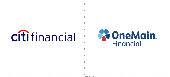
OneMain Financial is the new name for the former CitiFinancial, Citibank’s consumer-finance business as it prepares to sell that division. More story here.
Thanks to Robert Tommy Ward for the tip.

DATE: Aug.24.2011 POSTED BY: Armin
 CATEGORY: Finance The B-Side
  COMMENTS:

TAGS: blue, sans serif,


