


Online
- FPO (For Print Only) / Celebrating the reality that print is not dead by showcasing the most compelling printed projects.
- Art of the Menu / Cataloguing the underrated creativity of menus from around the world.
- Quipsologies / Chronicling the most curious, creative, and notable projects, stories, and events of the graphic design industry on a daily basis.
- Speak Up (2002 – 2009) / Discussing, and looking for, what is relevant in, and the relevance of, graphic design. Archives Only.
- Word It (2003 – 2010) / Encouraging creative diversity in the community through monthly, one-word challenges. Archives Only.
- Brand New Classroom (2010 – 2011) / Providing a space for critique and opinions on student identity work. Archives Only.
Publishing
- The 2010 Brand New Awards / 2011, self-published.
- Flaunt: Designing effective, compelling and memorable portfolios of creative work / 2010, self-published.
Events & Judged Competitions
- Brand New Conference / A one-day event on the development of corporate and brand identity projects by some of today’s most active and influential practitioners from around the world.
- Brand New Awards / Celebrating the best identity work produced around the world.
- FPO Awards / Celebrating the best print work from around the world.
Writing
- Graphic Design, Referenced: A Visual Guide to the Language, Applications, and History of Graphic Design / 2009, Rockport.
- Women of Design: Influence and Inspiration from the Original Trailblazers to the New Groundbreakers / 2008, HOW Books.
- The Word It Book: Speak Up Presents a Gallery of Interpreted Words / 2007, HOW Books.
Graphic Design
- Department of Design / Designing corporate and brand identities and full development of printed and digital matter for clients.

Opinion BY Sam Becker
Chicken Now now Chickenow
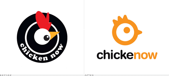
Chicken Now is a food court franchise that supplies chicken-based snacks for mid-mall snacking. Pentagram Austin, fresh off their recent Popeyes work, has helped them to rename and rebrand their popular (in the Southwest, at least) retail offering. And now for some Chickenow.
Continue reading this entry

DATE: Sep.21.2009 POSTED BY: Sam BeckerCATEGORY: Food COMMENTS:

TAGS:

BY Armin
A New Chipotle Pepper Harvest
![]()
Since moving to the U.S. in 1999 I have eaten a lot of burritos. A lot. As delicious as they are, they are highly responsible for my irresponsible weight gain as I went from college, home-cooked meals and almost daily basketball practice to join the workforce, eat take-out and lounge around watching TV. And burritos. So, I think I know burritos. And one of my favorite all-time burritos comes not from a hole-in-the-wall restaurant in a distant neighborhood but from a fast-food chain with more than 800 locations across the U.S.: Chipotle. They are invariably fresh, tasty, well-packed and properly packaged. Aside from the upstanding quality of the burrito they serve, Chipotle stood out as a comfortable and eccentric setting to enjoy a burrito, with its funky art, weird furniture and aluminum siding decor. And, even, its Papyrus-like logo stood out from the fast-food norm. Actually, I didn’t even notice when they switched away from it and into the circle logo shown in the image above, which has evolved into a new identity designed by San Francisco-based Sequence.
Continue reading this entry
DATE: Apr.29.2009POSTED BY: ArminCATEGORY: Food COMMENTS:
TAGS:
BY Armin
A Nod to Steaks from Omaha
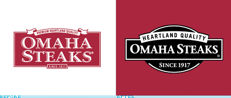
I must adamantly disclaim that I realize there is nothing particularly impressive, groundbreaking or interesting about this redesign. It is mostly, if not purely, a nostalgic nod. Back in the 1990s, when I was living in Mexico City, we had one of the first DirecTV dishes and since I have always had an insatiable TV appetite this was simply awesome. Like many people I religiously watched Friends — sure, laugh away, you probably did too — as part of the extinct species known as Must See TV, the primetime sitcom block of Thursdays that has yet to be repeated. So, to get to the point, at 7:59 pm, right before said primetime feast, the NBC channel that we received invariably had a 1-minute spot for Omaha Steaks, with a very jolly white fellow in a suit selling steaks. I was always surprised that such an offering (steaks by mail) could yield enough money to warrant such a prominent advertising slot. Yesterday, Omaha Steaks, a fifth-generation, family-owned business, announced its change of logo. It may not be a primetime redesign, but it’s a solid improvement.
Thanks to Tony Hall for the tip.
DATE: Mar.03.2009POSTED BY: ArminCATEGORY: Food COMMENTS:
TAGS:
BY Armin
Just Jack
![]()
I don’t travel much to the West Coast, so my only face-to-face experience with the fast food chain of Jack in the Box is limited to one tasty burger back in the late 1990s and I remember it was quite satisfying. Despite it being a limited staple on the far-left coast and Texas, Jack in the Box seems to have a very strong brand presence throughout the U.S. with their regularly entertaining TV ads and big-headed Jack. Without much fanfare — nor an update to their web site and much less a press release — Jack in the Box has been slowly updating their restaurants in San Diego, where they are headquartered.
Continue reading this entry
DATE: Feb.25.2009POSTED BY: ArminCATEGORY: Food COMMENTS:
TAGS:
BY Armin
Blimpie Loses Air, Crashes
![]()
Deep within the recesses of the year 1964 and the New Jersey city of Hoboken, Blimpie has been making barely acceptable sub sandwiches nationwide that are just barely less better than their main competitor, Subway. But my opinion of the taste of their subs doesn’t really matter, what matters is that in contrast to Subway, Blimpie has always had the “funner” look and feel, helped in no small part by its cute name. The previous logo and the iterations before it were fun and distinctive, even if not great or influential. The new logo… Yeah, it’s Futura Extra Bold, set in all caps, woo-hoo. Going from fun and distinctive to boring and generic, which matches the taste of their lettuce, I’ll grant that. Every now and then we mention how redesigns are lost opportunities and sometimes it’s just hot air, but in this case, I really think it was a blatant miss.
Thanks to Josh Berta for the tip.
DATE: Feb.05.2009POSTED BY: ArminCATEGORY: Food COMMENTS:
TAGS:
BY Armin
On the Menu: Good Typography
![]()
If you live in one of our nation’s larger metropolis and you have found yourself either late in the office or at home too lazy to cook, chances are that you have ordered through the menu heaven that is MenuPages, the 7-year-old web site that catalogs every conceivable menu in a city and puts it at your fingertips. When I first used it, I think it was here in New York, I don’t remember using it in Chicago, I had the impression that my only options would be flavorless diners or MSG-laden Chinese holes in the wall — no offense to either — because of the web site’s kitschy, beveled logo. Of course, nothing could be further from reality, MenuPages has always had menus for the best restaurants in town and it’s only now, with a new logo by the über typographers at Mucca Design, that the web site reflects a more varied and interested selection than your typical take-out joint. The new logo is more upscale, and may perhaps feel too New York-centric, like something you would see tiled on a subway platform, but the improvement is undeniable and attractive. The web site is a fantastic improvement as well.
Thanks to Courtney Dolloff for the tip.
DATE: Jan.22.2009POSTED BY: ArminCATEGORY: Food COMMENTS:
TAGS:
BY Armin
A Swirl of Orange
![]()
Sunkist, one of the many orange sodas looking to capitalize in parallel to the zesty orange success of Fanta, has recently updated its logo and line of packaging. Not much information to go on from the internet, but it doesn’t take a rocket scientist to figure out this one: More swirls equals more sales; it’s the kind of thing they teach you at Harvard Business School. Serious. Swirls. And swirls within swirls? It’s an implosion of success waiting to happen. In all fairness, the lettering isn’t half bad, it resolves the counterspaces rather successfully, but the orange party happening around it is just a little too much to handle. And in comparison to the recent Fanta rebrand, this is just way too undercooked.
Continue reading this entry
DATE: Nov.23.2008POSTED BY: ArminCATEGORY: Food COMMENTS:
TAGS:
BY Armin
Popeyes Gets Jazzy
![]()
I don’t know whether this is a positive or negative, but I have never eaten at Popeyes, the fast food chain serving fried chicken that seems to occupy a similar cult status to White Castle. Popeyes was served at Beyoncé and Jay Z’s wedding, it is the butt of the joke in films like Rush Hour and Little Nicky (okay, that may not be saying much but…), it finds its way to all sorts of lyrics, and people are always willing to admit it as a guilty pleasure. From what I gather, the spicy, Cajun-style, fried chicken there is delectable. I’ll find out one day, maybe. As kooky as the following to this fast food emporium is, its former logo was equally amusing (in that kitschy, fast food sort of way) and the colorful red-blue-and-yellow sign on the facade always stood out. With a new identity designed by Pentagram’s DJ Stout, Popeyes is positioning itself to be slightly more upscale (relatively speaking) while retaining its quirkiness.
Continue reading this entry
DATE: Jul.28.2008POSTED BY: ArminCATEGORY: Food COMMENTS:
TAGS:
BY Brand New
The Battle of Guaraná
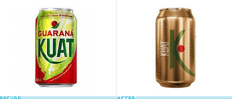
Guest Editorial by Guilherme Machiavelli
In Brazil, one of the biggest competitors of coke (be it Coca-Cola or Pepsi) in the soda market is a soft drink called Guaraná Antártica, made from the local fruit, guaraná. Ten years ago, Coca-Cola, in an attempt to tackle its rival, launched Guaraná Kuat. Kuat has been marketed in various forms, beginning with the (slightly odd) strategy of declaring itself as having the same taste as Guaraná Antártica. The brand later decided to target a teenage audience, with campaigns following the “Open up your mind‚” motto.
Continue reading this entry
DATE: Jul.15.2008POSTED BY: Brand NewCATEGORY: Food COMMENTS:
TAGS:
BY Ryan Hembree
Meet the Bread Man from Down Under
![]()
Atlanta Bread Co., hailing from, you guessed it, suburban Atlanta, is a casual bakery-café franchise offering fresh, quality food fast. Originally started as a small sandwich shop in 1993, the company has since franchised into approximately 100 locations in 24 states. As they have expanded, Atlanta Bread has not only enhanced the retail experience of their cafés, but updated their brand identity as well — a process they have been slowly rolling out over the past few months, here is an early look at the change.
Continue reading this entry
DATE: Jun.26.2008POSTED BY: (Display Name not set)CATEGORY: Food COMMENTS:
TAGS:


Books about logo design, the designers that create them and the meaning of branding.
