


Online
- FPO (For Print Only) / Celebrating the reality that print is not dead by showcasing the most compelling printed projects.
- Art of the Menu / Cataloguing the underrated creativity of menus from around the world.
- Quipsologies / Chronicling the most curious, creative, and notable projects, stories, and events of the graphic design industry on a daily basis.
- Speak Up (2002 – 2009) / Discussing, and looking for, what is relevant in, and the relevance of, graphic design. Archives Only.
- Word It (2003 – 2010) / Encouraging creative diversity in the community through monthly, one-word challenges. Archives Only.
- Brand New Classroom (2010 – 2011) / Providing a space for critique and opinions on student identity work. Archives Only.
Publishing
- The 2010 Brand New Awards / 2011, self-published.
- Flaunt: Designing effective, compelling and memorable portfolios of creative work / 2010, self-published.
Events & Judged Competitions
- Brand New Conference / A one-day event on the development of corporate and brand identity projects by some of today’s most active and influential practitioners from around the world.
- Brand New Awards / Celebrating the best identity work produced around the world.
- FPO Awards / Celebrating the best print work from around the world.
Writing
- Graphic Design, Referenced: A Visual Guide to the Language, Applications, and History of Graphic Design / 2009, Rockport.
- Women of Design: Influence and Inspiration from the Original Trailblazers to the New Groundbreakers / 2008, HOW Books.
- The Word It Book: Speak Up Presents a Gallery of Interpreted Words / 2007, HOW Books.
Graphic Design
- Department of Design / Designing corporate and brand identities and full development of printed and digital matter for clients.

BY Armin
A is for A Lot of Dots
![]()
The statement from Richard Maddocks, Chairman of the Australasian Writers and Art Directors Association, AWARD for short, states in part: Let’s be clear. AWARD is not a committee, a board or an institution. AWARD is a community. […] AWARD is as strong, dynamic and powerful as the people who participate in it. AWARD evolves as the community that forms it evolves. Based on the latter two principles, Interbrand Australia created a new, living identity that reflects the evolving and dynamic nature of the organization.
Continue reading this entry

DATE: Jul.09.2009 POSTED BY: ArminCATEGORY: Graphics Industry COMMENTS:

TAGS:

BY Armin
Cheap Printing, Cheap Logo to Match
![]()
For most identity designers, companies like LogoWorks, LogoBee or whatever other cute name they acquire, are not to be taken seriously and are only seen as damaging to the industry by lowering (rather ridiculously) prices and quality. For offset and other specialty quality printers, companies like Vistaprint hold a similar position: cheap, fast, mediocre quality. If you have ever printed anything with a quality printer and anything with Vistaprint you know the difference but, let’s face it, most civilians (non-designers) people don’t — which is worth more than $400 million in 2008 revenue for Vistaprint, according to their 10-k. And Graphic Arts Online, lists it as the 40th top printer in North America.
Continue reading this entry
DATE: Jul.01.2009POSTED BY: ArminCATEGORY: Graphics Industry COMMENTS:
TAGS:
BY Christian Palino
(Non-) Depth of Field
![]()
The Society for Environmental Graphic Design (SEGD) is “the global community for people who work at the intersection of communication design and the built environment.” Their new identity and website has been designed by Pentagram partner Michael Gericke and his team. Pentagram has a post about the project up on their blog where they describe the mark as consisting of “four brightly colored panels that can be interpreted as three-dimensional forms, printed graphics or interactive menus. On the site these panels act as visual springboards for the website content, providing sections for news, conferences, awards, publications and learning.”
Continue reading this entry
DATE: Apr.16.2009POSTED BY: Christian PalinoCATEGORY: Graphics Industry COMMENTS:
TAGS:
BY Armin
The Softer Side of Corbis
![]()
The stock photo agency Corbis has come a long way since its early 1990s incorporation into the workflow of designers looking for good photos of handshakes, among other broad selections. For the longest time, it was quickly identifiable by its “swirl” logo and super tracked out serif — here’s an old set of identity guidelines — and in the twenty-first century by its futuristic evolution (shown above) designed by Chicago-based Segura Inc. in 2004. At the time, or at least at the time leading up to that time, the stock photo industry was burgeoning and the Corbis and Getty big dogs were eating the competition. What a difference five years — and iStockphoto — make. To reflect the changing times, Corbis has evolved into a more friendly, appealing and design-oriented wordmark.
Continue reading this entry
DATE: Feb.16.2009POSTED BY: ArminCATEGORY: Graphics Industry COMMENTS:
TAGS:
BY Armin
MyFonts gets a MyRedesign
![]()
With an ever growing library of more than 62,000 typefaces from more than 400 foundries and designers, MyFonts has been one of the most comprehensive shopping spots on the web since its launch in 1999. It’s also been one of the easiest, friendliest and most accessible for designers and non-designers alike with its simple and ample tag references and categories. But for all its usability features, the design, well, sucked. With vast apologies to the original designer, but the look and feel of the web site (original here), the logo and all the related typography and visuals felt more appropriate to Chuck E. Cheese than a type reseller. First introduced in print materials at TypeCon this past July, MyFonts unveiled a new logo, and this past month launched a beta version of its web site.
Continue reading this entry
DATE: Jan.09.2009POSTED BY: ArminCATEGORY: Graphics Industry COMMENTS:
TAGS:
BY Armin
Merger Leads to Extended Results
![]()
Two of the larger independent branding firms — Laga (formerly known as Lipson Alport Glass & Associates) and Desgrippes Gobé (sometimes known as d/g) — have merged to form Brandimage – Desgrippes Laga. Yes, that’s the full name. The new firm now counts with 300 employees across New York, Chicago, Cincinnati, Paris, Brussels, Tokyo, Seoul, Hong Kong and Shanghai. Leading the firm are Joël Desgrippes and Laga’s Jim Barrett, and there is no mention of what happened to Marc Gobé who was the more public face of d/g. Read on if you are ready for some press-releasing.
Continue reading this entry
DATE: Jun.21.2008POSTED BY: ArminCATEGORY: Graphics Industry COMMENTS:
TAGS:
BY Ryan Hembree
Ribbons, How Brands Take Shape
![]()
MeadWestvaco, a global supplier of paper products, packaging and chemicals (and subsequently a resource used by many designers… for the paper, not the chemicals) on March 24th unveiled a new brand that shortens the company moniker to “MWV,” introduces a new ribbon element that is animated in a cheesy Flash presentation on the corporate website (more on this later), and incorporates the presumptuous tagline “How brands take shape.”
Continue reading this entry
DATE: May.06.2008POSTED BY: (Display Name not set)CATEGORY: Graphics Industry COMMENTS:
TAGS:
BY Armin
Self-Promotion: Opposites Attract 08
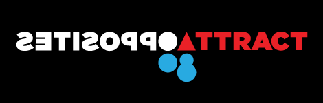
Alright, I know this is too close to the last self-promotion post, but I promise this is the last bit of it… at least for the foreseeable future. We are happy to introduce Opposites Attract ’08, a four-part series programmed by UnderConsideration and hosted at the Art Directors Club in New York.
DATE: Apr.14.2008POSTED BY: ArminCATEGORY: Graphics Industry COMMENTS:
TAGS:
BY JonSel
Enterprise gets Unionized

The toughest task a designer can undertake is creating an identity for oneself. Who hasn’t taken endless months to decide on just the right symbol, the perfect typography, the best paper stock, and, of course, that extra cool finishing touch: which letterpress printer to use? Most of us only have ourselves to please in this regard (and maybe our significant others). So imagine when a global identity consultant decides that not only do they need a new identity, they’re going to change the name as well. Fare thee well, Enterprise IG. The powers-that-be have elected to join The Brand Union.
Continue reading this entry
DATE: Nov.06.2007POSTED BY: Jonathan SelikoffCATEGORY: Graphics Industry COMMENTS:
TAGS:
BY Armin
More Time with the People you Love
A small interruption, with a special announcement, to our regularly scheduled critiques: As of today, UnderConsideration has started operating independently and officially. Yes, we have been doing that so far, but what I am trying to say is that as of last Thursday, September 27th I am no longer working at Pentagram (I know!) and, instead, have formed UnderConsideration as an LLC so that we can devote ourselves full-time to it. Bryony and I are co-owners and have also opened the doors to our Department of Design, an outlet for creative services for clients. For the full scoop I invite you to visit Speak Up, where all the beans are spilled. And, yes, in theory this means more logos more of the time.
DATE: Oct.02.2007POSTED BY: ArminCATEGORY: Graphics Industry COMMENTS:
TAGS:


Books about logo design, the designers that create them and the meaning of branding.
