


Online
- FPO (For Print Only) / Celebrating the reality that print is not dead by showcasing the most compelling printed projects.
- Art of the Menu / Cataloguing the underrated creativity of menus from around the world.
- Quipsologies / Chronicling the most curious, creative, and notable projects, stories, and events of the graphic design industry on a daily basis.
- Speak Up (2002 – 2009) / Discussing, and looking for, what is relevant in, and the relevance of, graphic design. Archives Only.
- Word It (2003 – 2010) / Encouraging creative diversity in the community through monthly, one-word challenges. Archives Only.
- Brand New Classroom (2010 – 2011) / Providing a space for critique and opinions on student identity work. Archives Only.
Publishing
- The 2010 Brand New Awards / 2011, self-published.
- Flaunt: Designing effective, compelling and memorable portfolios of creative work / 2010, self-published.
Events & Judged Competitions
- Brand New Conference / A one-day event on the development of corporate and brand identity projects by some of today’s most active and influential practitioners from around the world.
- Brand New Awards / Celebrating the best identity work produced around the world.
- FPO Awards / Celebrating the best print work from around the world.
Writing
- Graphic Design, Referenced: A Visual Guide to the Language, Applications, and History of Graphic Design / 2009, Rockport.
- Women of Design: Influence and Inspiration from the Original Trailblazers to the New Groundbreakers / 2008, HOW Books.
- The Word It Book: Speak Up Presents a Gallery of Interpreted Words / 2007, HOW Books.
Graphic Design
- Department of Design / Designing corporate and brand identities and full development of printed and digital matter for clients.

A B-Side BY lauren
ProMedica

Established in 1986, ProMedica Health System is a non-profit healthcare organization based out of Toledo, OH whose network offers diagnostic, medical and surgical specialties for much of the region. New logo started appearing this month.
Thanks to Matt Rower for the tip.

DATE: Mar.01.2011 POSTED BY: ArminCATEGORY: Health The B-Side COMMENTS:

TAGS:

Opinion BY Armin
New Miracle Balloon, now Hotter
![]()
Originally a televised fundraiser first aired in 1983, Children’s Miracle Network — now Children’s Miracle Network Hospitals — has since raised over $4.2 billion in funds that go directly to over 170 children’s hospitals. Most impressively, a lot of those billion dollars are raised $1 or $2 at a time through the sale of the paper “Miracle Balloons.” This month Children’s Miracle Network Hospitals announced its name change along with a new identity done pro-bono by the Cincinnati office of Landor.
Continue reading this entry
DATE: Jan.11.2011POSTED BY: ArminCATEGORY: Health COMMENTS:
TAGS: hospital, icon, landor, rounded sans serif,
Opinion BY Armin
Striking Out Cancer
Originally established by the Texas Legislature as the Texas State Cancer Hospital and the Division of Cancer Research in 1941, The University of Texas MD Anderson Cancer Center — named after Houston cotton merchant Monroe D. Anderson whose philanthropic foundation made great contributions to the center early on — is today one of the leading cancer research and treatment facilities in the world. Up to 2009, it has been as ranked No. 1 in cancer care in the “America’s Best Hospitals” survey published by U.S. News & World Report in six of the past eight years. Employing more than 17,000 people, MD Anderson treated over 96,000 patients in 2009. A new identity, introduced yesterday, aims to visualize the center’s mission, “to eliminate cancer in Texas, the nation and the world.”
Continue reading this entry
DATE: May.05.2010POSTED BY: ArminCATEGORY: Health COMMENTS:
TAGS: logo, md anderson, serif, texas, the richards group,
BY Armin
Nice Icon in Action
![]()
Established in 1957 as The Medical Foundation in Boston, Massachusetts the newly renamed Health Resources in Action has been providing grants for the advancement of public health and medical research. To be honest I had never heard of this organization before — my medical research grant ambitions are rather unambitious — but the new icon definitely caught my attention. There is enough of an abstract story told through it about making connections and the solid bonds created by the grants they make and it is also visually interesting with its unusual angle (it’s not 45°! It’s not 90°!). The muted colors are something you don’t see much of these days either. While I really like the icon, the typography leaves much (much) to be desired, mainly with the tight tracking it has. Certainly the long name does not help, and maybe a in a few years it can be narrowed to its HRIA acronym, which rolls off much better of the tongue than the sentence-like name they chose.
Continue reading this entry
DATE: Jun.18.2009POSTED BY: ArminCATEGORY: Health COMMENTS:
TAGS:
BY Armin
Crumpling as Identity
![]()
Originally founded in 1968 as a small alcohol counseling agency, the Swanswell Charitable Trust has since grown into an organization with more than 100 employees across the English Midlands, with headquarters in Birmingham, and a handful of £millions in operation, that helps people with their drug and alcohol dependencies. With growth had come brand confusion as well, with many initiatives taking on different names and Swanswell worked with Brand Guardians to establish a new brand positioning and most importantly adopt Swanswell as the main name for everything. After that phase of the project, the identity design went to johnson banks, who got their crumple on.
Continue reading this entry
DATE: May.19.2009POSTED BY: ArminCATEGORY: Health COMMENTS:
TAGS:
BY Armin
A Fighting Logo
![]()
Quickly one year after the first case of AIDS was registered in 1981, the San Francisco AIDS Foundation (SFAF) — then known as The Kaposi’s Sarcoma Research & Education Foundation — was established to help the local community understand the new disease, and since then it has played a significant role nationally in the ongoing battle in AIDS/HIV prevention and education. Earlier this year, SFAF adopted a new identity, designed by San Francisco based Mortar, to carry the organization forward as it continues its unfortunately endless quest to control AIDS/HIV.
Continue reading this entry
DATE: May.06.2009POSTED BY: ArminCATEGORY: Health COMMENTS:
TAGS:
BY Armin
A New Emblem in Health Insurance
![]()
When we were shopping for health insurance about a year ago I was dismayed about how bleak the design of that industry really is. Other than some obligatory happy-people photographs everything just feels rather antiseptic. One of the options we were presented as a front-runner was for HIP Health Plan of New York and its design did not instill enough confidence to plunk down more than a thousand dollars. Eventually we went with a provider that had a decent corporate identity and the best coverage. But enough of the set up. Recently the above mentioned provider, HIP, and Group Health Incorporated (GHI) became affiliated under a new parent company, EmblemHealth and have begun a very visible campaign in New York to promote the company.
Continue reading this entry
DATE: Oct.13.2008POSTED BY: ArminCATEGORY: Health COMMENTS:
TAGS:
BY Armin
Overwhalemingly Cute
![]()
Established more than 100 years ago as The Children’s Orthopedic Hospital, the institution has evolved to become one of the top ten hospitals for children, according to U.S.News & World Report. The hospital has already gone through five different names and four different logos, and this month it was introduced anew on both counts. It has gone from the broad Children’s Hospital and Regional Medical Center to a much more specific, memorable and relevant Seattle Children’s. And the new logo has vastly improved from an extremely dated ITC-esque sans serif to a wonderful new logo coupled with a simple sans.
Continue reading this entry
DATE: Sep.22.2008POSTED BY: ArminCATEGORY: Health COMMENTS:
TAGS:
BY Armin
Optimal Ribbon
![]()
Breastcancer.org, a 9-year-old, and 8 million visits a year online resource for breast cancer unveiled today a new identity. While this is technically a Before/After, the old logo was such a non-logo that I decided to just let the new logo shine. Unlike most brands I cover, I don’t have any direct relationship or experience with breastcancer.org — which is a good thing, I think — so this is purely a reaction to the design and hearing about this site for the first time. Designed by Siegel + Gale, the logo is an intertwined pink ribbon forming a circle, giving a new execution and a fresh idea to the ubiquitous single pink ribbons in a loop. I also see a wreath, which can be seen as a welcoming sign on the door, but also as a crown, celebrating those who fight this battle. The color is both gentle and authoritative and the choice of Optima — a typeface I have been championing for some time now — is elegant, personable and familiar. For these and other gut reactions, I have to say this is one of my favorite logos of the year so far — it even looks great on the blue background, a color combination that, in theory, would be preposterous. The shading on the bottom-left part of the circle could be less flat, but it’s a minor quibble. This really establishes the web site as a leader in its field and for its audience.
DATE: Jun.24.2008POSTED BY: ArminCATEGORY: Health COMMENTS:
TAGS:
BY Brand New
Shriners Face Forward
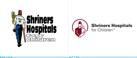
Guest Editorial by Christian Palino
While the U.S. Congress and the President go to the mats over child health care, the Shriners Hospitals for Children has steadily been treating children, free of charge, for almost 85 years. With over 850,000�patients cared for and nearly $10 billion spent, the Shriners Hospitals for Children also recently found some time and resources to initiate a much needed re-branding.
Continue reading this entry
DATE: Nov.03.2007POSTED BY: Brand NewCATEGORY: Health COMMENTS:
TAGS:


Books about logo design, the designers that create them and the meaning of branding.
