


Norwegian Cruise Line
The Torch Doha
The Dock at Montrose Beach
Hilton
Butlins
All B-Side Archives
Subscribe to B-Side RSS


Online
- FPO (For Print Only) / Celebrating the reality that print is not dead by showcasing the most compelling printed projects.
- Art of the Menu / Cataloguing the underrated creativity of menus from around the world.
- Quipsologies / Chronicling the most curious, creative, and notable projects, stories, and events of the graphic design industry on a daily basis.
- Speak Up (2002 – 2009) / Discussing, and looking for, what is relevant in, and the relevance of, graphic design. Archives Only.
- Word It (2003 – 2010) / Encouraging creative diversity in the community through monthly, one-word challenges. Archives Only.
- Brand New Classroom (2010 – 2011) / Providing a space for critique and opinions on student identity work. Archives Only.
Publishing
- The 2010 Brand New Awards / 2011, self-published.
- Flaunt: Designing effective, compelling and memorable portfolios of creative work / 2010, self-published.
Events & Judged Competitions
- Brand New Conference / A one-day event on the development of corporate and brand identity projects by some of today’s most active and influential practitioners from around the world.
- Brand New Awards / Celebrating the best identity work produced around the world.
- FPO Awards / Celebrating the best print work from around the world.
Writing
- Graphic Design, Referenced: A Visual Guide to the Language, Applications, and History of Graphic Design / 2009, Rockport.
- Women of Design: Influence and Inspiration from the Original Trailblazers to the New Groundbreakers / 2008, HOW Books.
- The Word It Book: Speak Up Presents a Gallery of Interpreted Words / 2007, HOW Books.
Graphic Design
- Department of Design / Designing corporate and brand identities and full development of printed and digital matter for clients.

Opinion BY Armin
Country Inns & Suites
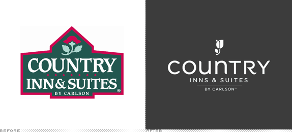
About: “Country Inns & Suites By Carlson is the upper mid-scale hotel brand within the Carlson Rezidor Hotel Group portfolio. Country Inns & Suites hotels are designed for both business and leisure travelers and provide complimentary amenities like hot breakfast and high-speed Internet. Country Inns & Suites hotels are mainly independently owned and operated and franchised under licensing agreements with the Carlson Rezidor Hotel Group. The brand currently operates 480 hotels throughout the world and has over 30 properties contracted and under development.” (Source Wikipedia)
Design by: N/A
Ed.’s Notes: The new logo is pretty decent but in contrast to the old one it’s almost a masterpiece.
Relevant links: USA Today Article. Press Release.
Select quote: “We are looking to the future and are making thoughtful changes that will allow us to grow our brand,” said Gordon McKinnon, executive vice president and chief branding officer for Carlson. “It’s a natural next step to evolve into a product that appeals to a younger generation. But we will be fiercely maintaining our service culture and amenities that have built our strong, loyal customer base.”
Thanks to Joe Mielzarek for the tip.

DATE: Apr.05.2013 POSTED BY: ArminCATEGORY: The B-Side Hospitality COMMENTS:

TAGS: hotel, icon, Sans Serif,

A B-Side BY Armin
Couchsurfing
![]()
About: (Est. 2004) Couchsurfing is “A global network of travelers, adventure seekers and lifelong learners who value trust among strangers and are dedicated to sharing their cultures, hospitality and authentic experiences — whether they’re on the road or in their hometowns. There are over 5 million Couchsurfers in more than 97,000 cities, with a new user signing up every 11 seconds.”
Design by: In-house.
Ed.’s Notes: Don’t worry, no handwriting was harmed in the making of this logo. It’s just a font. Two versions of the log exist: one without the loop as it appears on their site and one (below or after the jump) with the loop when the logo appears outside of the main website; part of the idea is that people can customize it.
Relevant links: Couchsurfing blog post.
Select quote: “Our objective with this new logo was to focus on the entire word ‘couchsurfing’ and turn it into a term that has meaning in and of itself. We’re not about ‘Couch’ and ‘Surfing’, we are about the act of ‘couchsurfing’, of connecting with people for inspiring experiences all over the world. We’d like to turn the word itself into the symbol that the couch has been. The designers brought this sense of human touch to life with the font they chose for the logo, which suggests handwriting. The more earthy shade of orange was chosen because it gives a sense of authenticity which reinforces the humanity of our brand.”
Continue reading this entry
DATE: Nov.27.2012POSTED BY: ArminCATEGORY: Hospitality The B-Side COMMENTS:
TAGS: faux, hand-drawn, orange,
A B-Side BY Armin
JA Resorts & Hotels
![]()
About: (Est. 1981) Formerly Jebel Ali International, JA Resorts & Hotels is a Dubai-based, locally-owned company with over 30 years of hospitality experience that runs six resorts and two residential properties.
Design by: Interbrand
Ed.’s Notes: Bigger view of the logo below (or after the jump).
Relevant links: Press release.
Continue reading this entry
DATE: Oct.02.2012POSTED BY: ArminCATEGORY: Hospitality The B-Side COMMENTS:
TAGS: bevel, dubai, gradient, Sans Serif,
A B-Side BY Armin
Hostels.com
![]()
Launched in 1999, Hostels.com is one of the leading online sources, with 38,126 listings, for finding hostels around the world. Earlier this month Hostels.com launched a Beta version of a new website that includes a new logo. Which isn’t great, but at least it doesn’t look like you are booking through Saw’s travel agent. No design credit given or press release issued about the look.
Thanks to Ranwa Hakim for the tip.
DATE: Jul.24.2012POSTED BY: ArminCATEGORY: Hospitality The B-Side COMMENTS:
TAGS: blue, Sans Serif,
Opinion BY Armin
A Swoosh is a Dish Best Not Served
![]()
Established in 1919, the National Restaurant Association (NRA), as its name implies, is the business association for the restaurant industry, representing more than 380,000 members in restaurant and foodservice outlets. The NRA’s mission is to “lead America’s restaurant industry into a new era of prosperity, prominence and participation, enhancing the quality of life for all we serve.” It does this by providing tools and advice, advocating on its members behalf in Washington, D.C., and hosting the industry’s largest trade show, the NRA Show. Earlier this month, NRA introduced a new logo. Although no design credit was given they do mention in their press release that they “sought input from industry professionals, state restaurant associations and policy makers to create a logo concept that resonates with a wide audience and that illustrates the restaurant and foodservice industry in multiple ways.”
Continue reading this entry
DATE: Jul.12.2012POSTED BY: ArminCATEGORY: Hospitality COMMENTS:
A B-Side BY Armin
Extended Stay America
![]()
Established in 1995, Extended Stay America is a chain of hotels with 650 properties around the United States. They recently introduced a new identity. A little bit more about it here.
Thanks to George Renfro for the tip.
DATE: May.07.2012POSTED BY: ArminCATEGORY: Hospitality The B-Side COMMENTS:
Opinion BY Armin
HotelsHotelsHotelsHotels.com
![]()
Launched in 2002, Hotels.com is an online service to reserve lodging around the world with more than 145,000 properties listed. The last time we talked about Hotels.com was in 2008 when two separate logos, one for the U.S. market and the other one for international sites, were introduced. Since then, Hotels.com has completely abandoned the bellhop mascot and adopted “SMART”, a soul-patched claymation spokesperson that is not as annoying as he may seem at first glance. This month, Hotels.com has introduced a new logo.
Continue reading this entry
DATE: Feb.15.2012POSTED BY: ArminCATEGORY: Hospitality COMMENTS:
TAGS: 3d, monogram, Sans Serif, script,
A B-Side BY Armin
Norwegian Cruise Line
![]()
Established in 1966, Norwegian Cruise Line is one of the leading cruise companies in the world, with 11 ships traveling everywhere from Alaska to Bermuda to the Mediterranean. A revised logo appeared recently.
Thanks to Adam Grobman for the tip.
DATE: Jan.03.2012POSTED BY: ArminCATEGORY: Hospitality The B-Side COMMENTS:
TAGS: Sans Serif,
A B-Side BY Armin
The Torch Doha
![]()
Measuring almost 1,000 feet high, the The Torch Doha is a luxury hotel in Qatar with 167 rooms. Its identity has been designed by London-based SomeOne. Some applications below (or after the jump).
Continue reading this entry
DATE: Nov.30.2011POSTED BY: ArminCATEGORY: Hospitality The B-Side COMMENTS:
Opinion BY bryony
Budget Pillow
![]()
Headquartered in France with 90 locations worldwide, Accor is a hotel operator, hotel franchisor and hotel asset manager and is considered the number one hotel operator worldwide simply in terms of units owned, leased or operated under management contract. It manages over 500,000 rooms across 4,200 hotels. Accor recently rebranded its line of economy hotels: Formerly ibis hotel, Etap Hotel, and All Seasons Hotels into ibis, ibis styles and ibis budget. The implementation of the new brand, designed by Boulogne-Billancourt, France-based W&Cie, and segmentation is expected to be completed worldwide by early 2013, with a strong communication campaign during 2012. The goal? to capitalize on the ibis “mega brand” through modernity, simplicity and well-being, while highlighting the unique qualities of each entity within the economy brands.
Continue reading this entry
DATE: Oct.14.2011POSTED BY: (Display Name not set)CATEGORY: Hospitality COMMENTS:
TAGS: 3D, colorful, gradient, hospitality, hotel, ibis, sans serif, shadow,


Books about logo design, the designers that create them and the meaning of branding.
