


Online
- FPO (For Print Only) / Celebrating the reality that print is not dead by showcasing the most compelling printed projects.
- Art of the Menu / Cataloguing the underrated creativity of menus from around the world.
- Quipsologies / Chronicling the most curious, creative, and notable projects, stories, and events of the graphic design industry on a daily basis.
- Speak Up (2002 – 2009) / Discussing, and looking for, what is relevant in, and the relevance of, graphic design. Archives Only.
- Word It (2003 – 2010) / Encouraging creative diversity in the community through monthly, one-word challenges. Archives Only.
- Brand New Classroom (2010 – 2011) / Providing a space for critique and opinions on student identity work. Archives Only.
Publishing
- The 2010 Brand New Awards / 2011, self-published.
- Flaunt: Designing effective, compelling and memorable portfolios of creative work / 2010, self-published.
Events & Judged Competitions
- Brand New Conference / A one-day event on the development of corporate and brand identity projects by some of today’s most active and influential practitioners from around the world.
- Brand New Awards / Celebrating the best identity work produced around the world.
- FPO Awards / Celebrating the best print work from around the world.
Writing
- Graphic Design, Referenced: A Visual Guide to the Language, Applications, and History of Graphic Design / 2009, Rockport.
- Women of Design: Influence and Inspiration from the Original Trailblazers to the New Groundbreakers / 2008, HOW Books.
- The Word It Book: Speak Up Presents a Gallery of Interpreted Words / 2007, HOW Books.
Graphic Design
- Department of Design / Designing corporate and brand identities and full development of printed and digital matter for clients.

In Brief BY Armin
In Brief: Emblemetric
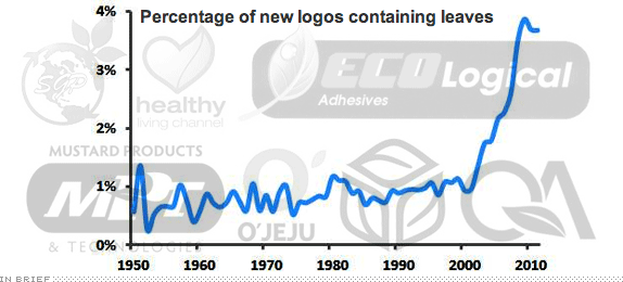
The above image is (an admittedly crude) juxtaposition (made by me) of what is otherwise an amazing question: What is the percentage of new logos containing leaves since the 1950s? More formidable is the fact that there can now be an answer to conundrums like these. James I. Bowie, PhD has just established Emblemetric, which will report “on trends in logo design, using quantitative analysis of data from the United States Patent and Trademark Office.” Some findings will be posted online, like what is the most used color in logos not just through time but by industry? Or insanely useless trivia bits like California being home to the most logos (14.4%) in a whole dissection of logos by geography. Apart from what is sure to be an addictive blog, Emblemetric offers custom research services so that you can demonstrate to your client in the insurance industry why choosing blue just makes it one more of 39% of the other logos out there.
Disclaimer: James has written for Brand New in the past, contributes to Quipsologies, and is otherwise a good acquaintance of UC.

DATE: Jul.25.2012 POSTED BY: ArminCATEGORY: In Brief COMMENTS:

TAGS: data-driven,

In Brief BY Armin
In Brief: Know Canada
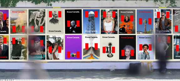
In the latest installment of the now popular Studio360 Redesigns series — past subjects include “Teachers” and Valentine’s Day — the radio show hosted by Kurt Andersen has looked North for inspiration: Redesign Canada. They tasked Bruce Mau Design with the brief to “fix the image problem Canada has here in the United States,” who instead of responding with a new identity decided the problem wasn’t with their country but with the United States: “Canada doesn’t need a redesign,” BMD explains in this thorough PDF, “America needs an education.” Their proposal, Know Canada, uses the very recognizable red bars of the Canadian flag as a frame for everything from twenty-first-century icons to inventions to actual places and people. The solution is simple, smart, and highly expandable — plus, there is not a maple leaf in sight. A few highlights of the work included in this post.
Continue reading this entry
DATE: Jul.11.2012POSTED BY: ArminCATEGORY: In Brief COMMENTS:
TAGS: bruce mau design, canada, studio360,
In Brief BY Armin
In Brief: A Proposed Microsoft Identity

In between classes and executed in just three days as a side project, Andrew Kim, a student at Art Center College of Design in Los Angeles, CA, has designed an alternate identity for Microsoft. The project has already gotten some generous airplay since it was posted this past Tuesday and with good reason: it’s not that the overall execution and concept are out of this world — they are both pretty good but start to come apart the deeper Andrew got into applications — it’s the attitude and approach that makes it stand out. In three days Andrew has made what Microsoft has yet to achieve: to feel and look cool, to act like the big, otherworldly-sized company it is. Included in this post are a few images to get you started but definitely pay a visit to the full project.
Continue reading this entry
DATE: Jul.05.2012POSTED BY: ArminCATEGORY: In Brief COMMENTS:
In Brief BY Armin
In Brief: Computer Arts Collection Volume 1 Part 4: Branding
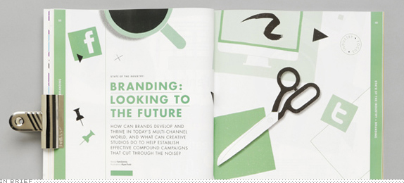
Computer Arts, the UK-based magazine for digital artists and designers, has published what they call the Computer Arts Collection, comprised of six, new, 200-plus-page annual issues, each devoted to their core topics: graphic design, typography, illustration, branding, photography, and advertising. Editor Nick Carson was kind enough to send me a sample of the branding annual and it’s pretty fantastic. While it covers some of the same things we do on Brand New — like the EDP, More4, and DC Comics identities — the in-depth coverage and the fact that you can take it with you into the John, makes for a welcome read. The issue is thick with great content, including a 48-page feature story that chronicles the development of an identity project by London-based Studio Output. See more about the branding issue here and the overall collection here. A few images of the magazine below (or after the jump).
Continue reading this entry
DATE: Jul.05.2012POSTED BY: ArminCATEGORY: In Brief COMMENTS:
TAGS: magazine,
In Brief BY Armin
In Brief: April Miscellany
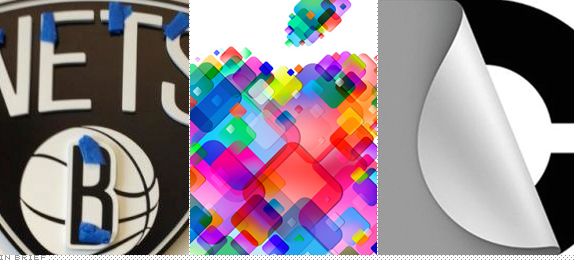
To almost end the month, here are some quick stories to tide you over the weekend.
Continue reading this entry
DATE: Apr.27.2012POSTED BY: ArminCATEGORY: In Brief COMMENTS:
In Brief BY Armin
In Brief: Drama. Period.

Like many other cable channels, TNT has become one of the better destinations on TV and for the last few years they have built their brand around the tagline of “We Know Drama” but that’s too many words, really. With the help of Los Angeles, CA-based Ferroconcrete has launched a new network graphics package that is just Drama, punctuated by a simplified TNT logo. Montage above. More visuals and story here.
DATE: Apr.20.2012POSTED BY: ArminCATEGORY: In Brief COMMENTS:
TAGS: ferroconcrete, on-air, Sans Serif,
In Brief BY Armin
Hebrew Literal Typographic Translations

One of the most visited posts in the now inactive Brand New Classroom was a collection of popular logos recreated in Hebrew typography, an assignment given by master Hebrew typographer Oded Ezer in his advanced typography class at H.I.T (Holon Institute of Technology), Visual Communication Department, in Israel. Oded and his students are back with nine more literal typographic translations of a Latin, Arabic, or Japanese logo in Hebrew.
Continue reading this entry
DATE: Apr.17.2012POSTED BY: ArminCATEGORY: In Brief COMMENTS:
In Brief BY Armin
In Brief: Dilbert on Logos
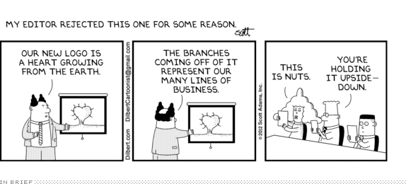
Dilbert creator Scott Adams shares a comic that was rejected by his editor. I wonder if it was rejected because it makes fun in an unacceptable way of the venerable, heritage-rich tradition of logo design in corporate America or because of the allusion to men’s balls?
Thanks to Matt Hunter Ross for the tip.
DATE: Mar.29.2012POSTED BY: ArminCATEGORY: In Brief COMMENTS:
TAGS:
In Brief BY Armin
In Brief: Logo Mapping
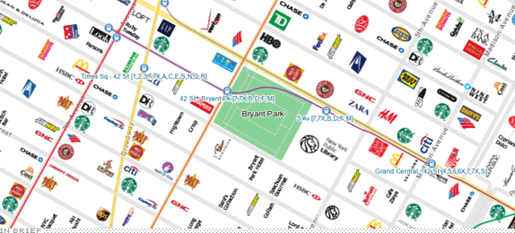
Launched in 2010, CityMaps has all kinds of social-this and social-that features that help you socialize. Or something. But the interesting part, an unlike other maps, is that it lists each business with their logo, giving you an amazingly helpful visual overview of what’s where. Currently, only maps for New York (shown), San Francisco, and (surprisingly) Austin are available. The logo tapestry in the New York map is quite amazing. Plus, if the restroom at a Starbucks has a long line you can quickly see where the next Starbucks is and make a run for it.
DATE: Mar.13.2012POSTED BY: ArminCATEGORY: In Brief COMMENTS:
TAGS:
In Brief BY Armin
In Brief: British 5-year-old Analyzes Logos
Not as adorable or authentic as the original, but this 5-year-old Brit gives the 5-year-old Yank a run for her money. “Decoration” is the new “Cheetah”. For more street cred, the video could have done without the forced self-promo at the end.
DATE: Mar.09.2012POSTED BY: ArminCATEGORY: In Brief COMMENTS:
TAGS:


Books about logo design, the designers that create them and the meaning of branding.
