


Online
- FPO (For Print Only) / Celebrating the reality that print is not dead by showcasing the most compelling printed projects.
- Art of the Menu / Cataloguing the underrated creativity of menus from around the world.
- Quipsologies / Chronicling the most curious, creative, and notable projects, stories, and events of the graphic design industry on a daily basis.
- Speak Up (2002 – 2009) / Discussing, and looking for, what is relevant in, and the relevance of, graphic design. Archives Only.
- Word It (2003 – 2010) / Encouraging creative diversity in the community through monthly, one-word challenges. Archives Only.
- Brand New Classroom (2010 – 2011) / Providing a space for critique and opinions on student identity work. Archives Only.
Publishing
- The 2010 Brand New Awards / 2011, self-published.
- Flaunt: Designing effective, compelling and memorable portfolios of creative work / 2010, self-published.
Events & Judged Competitions
- Brand New Conference / A one-day event on the development of corporate and brand identity projects by some of today’s most active and influential practitioners from around the world.
- Brand New Awards / Celebrating the best identity work produced around the world.
- FPO Awards / Celebrating the best print work from around the world.
Writing
- Graphic Design, Referenced: A Visual Guide to the Language, Applications, and History of Graphic Design / 2009, Rockport.
- Women of Design: Influence and Inspiration from the Original Trailblazers to the New Groundbreakers / 2008, HOW Books.
- The Word It Book: Speak Up Presents a Gallery of Interpreted Words / 2007, HOW Books.
Graphic Design
- Department of Design / Designing corporate and brand identities and full development of printed and digital matter for clients.

Opinion BY Sam Becker
Mergers & Executions
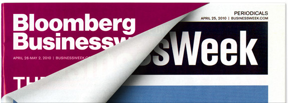
BusinessWeek, a weekly periodical catering to the business community (go figure), was recently acquired by Bloomberg Media from their previous owner, McGraw-Hill. Financial pundits saw this as a quick route for Bloomberg, the successful, finance-oriented media outlet started by the mayor of New York, to a strong presence in print. More to the point, it was viewed as an opportunity to make Bloomberg, the unseen hand behind so many news feeds and stock tickers, more of a household name. And so it came to be. Their name now graces the living rooms and reception areas of millions of homes and businesses across the world, announcing its debut by turning a new page in BusinessWeek’s 80-year history.
Continue reading this entry

DATE: Jun.10.2010 POSTED BY: Sam BeckerCATEGORY: Publishing COMMENTS:

TAGS: bloomberg, christian schwartz, helvetica, magazine, richard turley,

Opinion BY Armin
Around the World in 51 Characters
How I feel about the visual language of Wikipedia is similar to how I feel about unkempt public restrooms: I hold my breath as long as possible, do my business, get out and try not to get too nauseated. Perhaps a harsh comparison to the accumulated smell of pee and poo but, from logo, to layout, Wikipedia isn’t the most pleasing sight for the eyes so, in the same way, when I visit it, which is often, I kind of hold my aesthetic senses, do my business, get out and try not to get too nauseated. Sure, it could all be worse but it could also all be better and that’s what Wikipedia is trying to do, as it started implementing a new design, and a new logo, last week.
Continue reading this entry
DATE: May.17.2010POSTED BY: ArminCATEGORY: Publishing COMMENTS:
TAGS:
Opinion BY Armin
Scribd gets Designd
Perhaps one of the most underrated platforms in the realm of web innovation, connection and the freeing of information is the three-year-old Scribd. While Facebook and Twitter get all the social media recognition and Google Books all the information hoarding props, Scribd is a vibrant repository — 10 million documents published so far — of user-generated content that makes books, magazine articles, white papers, presentations, and more, available in a painless format that is easy for users to share and for readers to access. I became enamored with Scribd when we were working on Graphic Design, Referenced as we were able to find plenty of articles and essays that otherwise would have been a pain in the behind to acquire. The service isn’t perfect, of course, as it’s prone to illegal uploads but in its short three years, it has grown tremendously — the time for a redesign seems appropriate.
Continue reading this entry
DATE: Mar.18.2010POSTED BY: ArminCATEGORY: Publishing COMMENTS:
TAGS:
Opinion BY Armin
Pixelated Blogging
At a time when various blogs are evolving into printed products — Exhibits A, B, and C — it’s oddly reassuring to see what started as a zine back in the late 1980s maintain its web dominance a good ten years after it launched as one of the first juggernaut blogs in 2000. Chronicling all things technology, creative and sometimes just plain bizarre, Boing Boing has been an assured time waster for its thousands of readers for what seems like a blogging eternity. I realize that a blog is kind of off topic amidst the corporations, universities and consumer products we regularly feature on Brand New but in terms of impact, for a broadly niche audience, few entities can outpace Boing Boing. So as a fellow blogger I thought it would be nice to acknowledge identity design within our shared medium of communication.
Continue reading this entry
DATE: Nov.03.2009POSTED BY: ArminCATEGORY: Publishing COMMENTS:
TAGS:
Opinion BY Armin
Rand Rolls Off the Press
First established in 1908 and operating from a small office in Manhattan, it wasn’t until 1961 that Yale University Press (YUP) officially became a part of Yale University while remaining, all this time, financially and operationally independent. YUP has published over 8,000 books and now does so at a rate of approximately 300 titles a year. And since 1985, much of these titles have carried the idiosyncratic logo designed by Paul Rand. After this point, 24 years later, Rand’s logo will no longer grace spines, instead, it will now be the primary Yale logo — typeset in Matthew Carter’s The Yale Typeface designed in 2004 — as reported by the Yale Daily News.
Continue reading this entry
DATE: Oct.01.2009POSTED BY: ArminCATEGORY: Publishing COMMENTS:
TAGS:
BY Armin
How Things End Up on Brand New
No one has really asked, but given that my brandnew@ e-mail account is swelling with unanswered e-mails about tips and suggestions, I feel a self-imposed burden to explain a little bit of how I choose which identities we review here on Brand New.
Continue reading this entry
DATE: Apr.08.2009POSTED BY: ArminCATEGORY: Publishing COMMENTS:
TAGS:
BY Armin
Alien Fingers
![]()
Welcome to, as I found out this morning, the complicated world of Yellow Pages, Yellow Books and Walking Fingers. Like “Xerox” or “Kleenex”, “Yellow Pages” has come to signify the market for those bulky telephone directories that magically appear at your doorstep when you least expect it. Yellow pages have existed since the late 19th century and now comprise a global network of directories published by different phone companies or local entities, and even specialty yellow pages developed for specific neighborhoods and target audiences. The Walking Fingers logo, the “Let Your Fingers Do The Walking” slogan, and Yellow Pages name were first introduced in 1961 by AT&T, and the subsidiary regional operating companies that made up the Bell System, but the logo was never trademarked by AT&T and, actually, AT&T happily allowed others to use the logo — this, of course, was rosy when AT&T was a monopoly and you didn’t have Verizon, or SBC bombarding you with yellow bricks.
Continue reading this entry
DATE: May.02.2008POSTED BY: ArminCATEGORY: Publishing COMMENTS:
TAGS:
BY Armin
Reading that’s Hard to Digest

I don’t recall ever opening a copy of Reader’s Digest. I may have been tempted to do so in some crowded doctor waiting room but I probably chose to read something like Rhinoplasty Monthly which, even as a made up magazine, sounds more interesting than what the cover of a Reader’s Digest ever promised by looks alone — it felt cheap, lowbrow and filled with ads of “As Seen on TV”. [Full disclosure: I religiously read gossip mags like Us and OK! when I travel, so make of my literary tastes what you will]. Clearly, I’m one of the few in the world that does not read this magazine that enjoys distribution in 60 countries, in 50 editions and 21 languages, reaching 40 million people worldwide. Every month. 10 million copies alone make up the circulation in the U.S.. Well, as of December 10, with the launch of a new design and supporting a new positioning, only 8 million copies. Reader’s Digest is trying to gain ground on a younger market so it will put more effort and resources into its web site, accounting for the 2-million drop in circulation… and serifs.
Continue reading this entry
DATE: Dec.12.2007POSTED BY: ArminCATEGORY: Publishing COMMENTS:
TAGS:
BY Armin
Fluxuantingly Fluxing Flux
![]()
Not all rebrandings and logo redesigns have to happen on a larger than life scale, some happen in small offices under the guidance of a small group of people… sometimes only — gasp — just one person and, the change, only mattering to a diminutive audience. Nonetheless, the results are equally interesting. Such is the case with the work that John Walsh, of holdenandfriends in Knutsford, Cheshire, did for flux magazine — an independent publication covering fashion, music, art and culture — recently, redesigning the logo and the magazine from the outside in.
Continue reading this entry
DATE: Dec.29.2006POSTED BY: ArminCATEGORY: Publishing COMMENTS:
TAGS:


Books about logo design, the designers that create them and the meaning of branding.
