


Online
- FPO (For Print Only) / Celebrating the reality that print is not dead by showcasing the most compelling printed projects.
- Art of the Menu / Cataloguing the underrated creativity of menus from around the world.
- Quipsologies / Chronicling the most curious, creative, and notable projects, stories, and events of the graphic design industry on a daily basis.
- Speak Up (2002 – 2009) / Discussing, and looking for, what is relevant in, and the relevance of, graphic design. Archives Only.
- Word It (2003 – 2010) / Encouraging creative diversity in the community through monthly, one-word challenges. Archives Only.
- Brand New Classroom (2010 – 2011) / Providing a space for critique and opinions on student identity work. Archives Only.
Publishing
- The 2010 Brand New Awards / 2011, self-published.
- Flaunt: Designing effective, compelling and memorable portfolios of creative work / 2010, self-published.
Events & Judged Competitions
- Brand New Conference / A one-day event on the development of corporate and brand identity projects by some of today’s most active and influential practitioners from around the world.
- Brand New Awards / Celebrating the best identity work produced around the world.
- FPO Awards / Celebrating the best print work from around the world.
Writing
- Graphic Design, Referenced: A Visual Guide to the Language, Applications, and History of Graphic Design / 2009, Rockport.
- Women of Design: Influence and Inspiration from the Original Trailblazers to the New Groundbreakers / 2008, HOW Books.
- The Word It Book: Speak Up Presents a Gallery of Interpreted Words / 2007, HOW Books.
Graphic Design
- Department of Design / Designing corporate and brand identities and full development of printed and digital matter for clients.

BY Christian Palino
Back to Brushstroke Basics
![]()
The once-textile-manufacturer turned-ski-manufacturer Rossignol — which was purchased by Quicksilver in 2005 and looks like it’s now being sold — has now evolved from a snowsport brand to become a “Mountain Lifestyle Brand.” This shift is reinforced by their current rebranding, replacing a forgettable, gradient-enabled and beveled “R” with a return to their original and energetic script “R.” The new one-color solution is graphically much stronger and contrasts well with the revised DIN-inspired typography. From their release:
Continue reading this entry

DATE: Mar.05.2008 POSTED BY: Christian PalinoCATEGORY: Retailers COMMENTS:

TAGS:

BY Ryan Hembree
Prescription: Clarity and Focus
![]()
Sunglass Hut International, a purveyor of fashionable sunglasses and eyewear, is in the midst of rolling out a new brand identity to its 1,500 retail stores located in malls and other high-density retail areas around the globe. The new identity, developed by everyone’s favorite, Wolff Olins and retail specialist FRCH Cincinnati, has already been unveiled in Europe, and is only now just starting to make its public debut here in the United States, replacing an interim identity plaguing some applications, like the web site. The result has been a confusing image for an iconic sunglass retailer — one that is not nearly as distinctive as the one that it replaces.
Continue reading this entry
DATE: Dec.11.2007POSTED BY: (Display Name not set)CATEGORY: Retailers COMMENTS:
TAGS:
BY Armin
Fresh & Easy & Not Much Else
![]()
To continue with our supermarket streak (three in a row, booyah!) at Brand New I would like to offer a, well, brand new entrant into the category. Fresh & Easy Neighborhood Market (yes, that’s the official full name) is a new chain of supermarkets opening in the West Coast of the United States, with 30 stores planned to open in the states of Arizona, California and Nevada by the end of 2007. The new venture is headed by UK-based Tesco, one of the world’s largest retailers (“the world’s third-largest retailer, behind Wal-Mart of the United States and Carrefour of France” according to Wikipedia). Launching the store and its associated 1,500-plus SKUs, Tesco worked with three agencies to complete the project, U.S.-based marketing / communications / anythingelse firm Deutsch Inc., U.K.-based and independently-owned branding agency Pemberton & Whitefoord (P&W), and U.K.-based and retail-specialized design and fabrication company Schorleaf. (The invoices from all three combined could probably buy you three or four of those islands near Dubai).
Continue reading this entry
DATE: Dec.04.2007POSTED BY: ArminCATEGORY: Retailers COMMENTS:
TAGS:
BY Armin
Ye Olde Pathmark
![]()
If you can’t tell the difference between the two logos above, that’s because there isn’t. Pathmark is a 40-year-old supermarket chain with 140+ stores in the states of New Jersey, New York, Pennsylvania and Delaware and is currently the 31st out of the top 75 supermarkets in the nation according to Supermarket News and, earlier this year, it launched a 55,400-square-foot protoype store in Kinnelon, New Jersey to capitalize on its new branding and merchandising initiative, “Go Fresh, Go Local”. So while the logo has stayed the same, the real changes have happened inside.
Continue reading this entry
DATE: Dec.01.2007POSTED BY: ArminCATEGORY: Retailers COMMENTS:
TAGS:
BY Christian Palino
Inspired by ick n ay
![]()
As part of a R110 million (US$16 million+) rebranding effort by Pick n Pay — a 40-year-old supermarket chain in South Africa, and one of its largest retail groups — that includes converting 450 stores and 1,200 product lines within a 24 month period, the store is taking the opportunity to update with a new logo that does away with its dated-looking use of slab serifs to embrace the ever-so-modern san serif.
Continue reading this entry
DATE: Nov.26.2007POSTED BY: Christian PalinoCATEGORY: Retailers COMMENTS:
TAGS:
BY Joe Marianek
Toys R Us Grows

Toys R Us, Inc. finally trimmed a thread of frivolous grammatical imposition from their logo. The company’s new legal name is Toys R Us…(no quotation marks around the backwards R). The star has been stuffed into the engorged R in order to make a tight and simple(r) wordmark which is less patriotic, more bulbous and more fun.
Continue reading this entry
DATE: Oct.29.2007POSTED BY: J. MarianekCATEGORY: Retailers COMMENTS:
TAGS:
BY Ryan Hembree
The Softer Side of… Shopko?
![]()
Shopko, a department store chain with approximately 135 stores throughout the Midwest, Mountain and Pacific Northwest regions of the United States, recently shed its very masculine image in favor of one that softens perceptions about the retailer and appeals to its primary customer base — women (much like the Sears campaign of yesteryear). Shopko provides “quality name-brand merchandise, great values, pharmacy and optical services” — which at quick glance is not what the old identity communicated.
Continue reading this entry
DATE: Sep.19.2007POSTED BY: (Display Name not set)CATEGORY: Retailers COMMENTS:
TAGS:
BY Armin
Payless, Suckmore
![]()
A year ago, almost to the date, I wrote a heartfelt and disparaging review of the redesign of the Payless Shoesource identity on Speak Up — Brand New’s “mom” as I like to call it. Since the launch of this blog, the most requested logo review and/or tip has been for Payless. More than a dozen times. I always point our readers to the link above and explain that we try to keep our reviews as current as possible and prefer not to discuss older work. Until now I had refrained on bringing up Payless again, but the recurring requests are perhaps an indication (or is it vindication?) of my original feelings… That the old Payless identity, in all of its Cooper Black glory, had too much equity that could have been evolved instead of being replaced by an unnervingly meaningless icon and subjectively boring typography.
Continue reading this entry
DATE: Jul.11.2007POSTED BY: ArminCATEGORY: Retailers COMMENTS:
TAGS:
BY Armin
Skns iAfeth vaeFu’s Puzzling Identity
![]()
Many companies dream of an organic, adaptable and changing identity to avoid looking static, stoic and stale. Most companies, too, flail at the thought of managing a constantly fluctuating identity, commonly opting for one logo lockup… two, if they are feeling saucy. MTV has made a living out of changing logo looks faster than Madonna, and VH1 has adopted a similar mentality; Fossil may have one official logo, but its look is as diverse as the retro look can be milked; and companies like GE, Motorola and BASF find comfort in extensive color palettes to render their logo in. These are few and far in between and the exception rather than the rule. Saks Fifth Avenue’s embrace of a changing identity — changeable in 100 googol ways no less — designed by Pentagram (Michael Bierut, to be specific) is a feat all the more impressive considering the stagnant state of retail identity, specially in this category (Nordstrom, Bloomingdale’s, etc.).
Continue reading this entry
DATE: Jan.05.2007POSTED BY: ArminCATEGORY: Retailers COMMENTS:
TAGS:
BY David Weinberger
6 lbs of Cream Cheese and an Airplane, Please
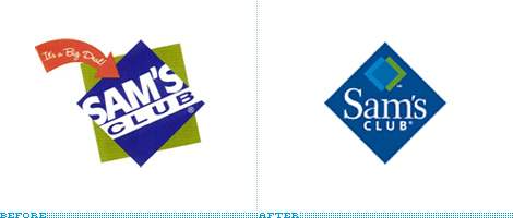
Following in the recent footsteps of sister-store Walmart, Sam’s Club is attempting to go after a higher income customer.
Continue reading this entry
DATE: Nov.29.2006POSTED BY: David WeinbergerCATEGORY: Retailers COMMENTS:
TAGS:


Books about logo design, the designers that create them and the meaning of branding.
