


Online
- FPO (For Print Only) / Celebrating the reality that print is not dead by showcasing the most compelling printed projects.
- Art of the Menu / Cataloguing the underrated creativity of menus from around the world.
- Quipsologies / Chronicling the most curious, creative, and notable projects, stories, and events of the graphic design industry on a daily basis.
- Speak Up (2002 – 2009) / Discussing, and looking for, what is relevant in, and the relevance of, graphic design. Archives Only.
- Word It (2003 – 2010) / Encouraging creative diversity in the community through monthly, one-word challenges. Archives Only.
- Brand New Classroom (2010 – 2011) / Providing a space for critique and opinions on student identity work. Archives Only.
Publishing
- The 2010 Brand New Awards / 2011, self-published.
- Flaunt: Designing effective, compelling and memorable portfolios of creative work / 2010, self-published.
Events & Judged Competitions
- Brand New Conference / A one-day event on the development of corporate and brand identity projects by some of today’s most active and influential practitioners from around the world.
- Brand New Awards / Celebrating the best identity work produced around the world.
- FPO Awards / Celebrating the best print work from around the world.
Writing
- Graphic Design, Referenced: A Visual Guide to the Language, Applications, and History of Graphic Design / 2009, Rockport.
- Women of Design: Influence and Inspiration from the Original Trailblazers to the New Groundbreakers / 2008, HOW Books.
- The Word It Book: Speak Up Presents a Gallery of Interpreted Words / 2007, HOW Books.
Graphic Design
- Department of Design / Designing corporate and brand identities and full development of printed and digital matter for clients.

Opinion BY Armin
National Rugby League Goes Corporate’er
![]()
Established in 1997, the National Rugby League (NRL) is the premier league of professional rugby football clubs in Australasia with sixteen teams competing across Australia and New Zealand through a 26-week season culminating in the Grand Final. This week, the NRL introduced a new logo for itself and a broad system that seeps down into all the different leagues, competitions, and initiatives. No design credit given.
Continue reading this entry

DATE: Oct.30.2012 POSTED BY: ArminCATEGORY: Sports COMMENTS:

TAGS: australia, green, ligature, logo system, rugby, sans serif, yellow,

A B-Side BY Armin
FIT Athletics and Recreation
![]()
About: FIT Athletics and Recreation, as described by Pentagram: “FIT, the Fashion Institute of Technology, is an internationally recognized college known for its exceptional curriculum in art, design, communications, business, and fashion, of course, but not for its sports teams. Over the years, however, FIT has developed a first-rate athletic program. The school fields 13 intercollegiate teams in such sports as volleyball, soccer, tennis, track and field, half-marathon, cross country, swimming and table tennis, plus a dance company.”
Design by: Pentagram partner DJ Stout
Ed.’s Notes: Sample uniform and logo extensions below (or after the jump). The team is known as FIT Tigers, hence the tiger.
Relevant links: Pentagram case study (plenty more images).
Continue reading this entry
DATE: Sep.28.2012POSTED BY: ArminCATEGORY: Sports The B-Side COMMENTS:
Opinion BY Armin
It’s a Sports Nation, we are only Living in it
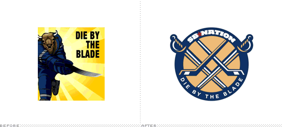
Launched in 2004, SB Nation (short for Sports Blog Nation) is a massive network of more than 300 blogs run by paid sports writers-slash-fans. Combined, SB Nation pulls in 100 million pageviews a month through 20 million unique visitors, 80% of them dudes. While there is a mothership blog that covers sports in general, SB Nation’s real appeal are its local and team blogs, dedicated to the micro concerns of fans in different cities and for specific sports and teams, i.e., there is SB Nation Chicago for all of its citizens but there is also Bleed Cubbie Blue for the MLB’s Cubs, Windy City Gridiron for the NFL’s Bears, and Blog a Bull for the NBA’s Bulls. Over the years, each blog has been given free reign to design its own logo based on its own puny, insider-ey name — the result has been humorous yet mostly crummy, rectangular pieces of artwork. Earlier this month, in preparation for a relaunch of the look and functionality of its blogs, SB Nation introduced new logos for ALL blogs through a unified approach, designed by London-based Fraser Davidson. ALL of them, designed by Fraser Davidson. 300-plus.
Continue reading this entry
DATE: Sep.24.2012POSTED BY: ArminCATEGORY: Sports COMMENTS:
A B-Side BY Armin
Kentucky Derby 139
![]()
About: “Churchill Downs, the world’s most legendary racetrack, has conducted Thoroughbred racing and presented America’s greatest race, the Kentucky Derby, continuously since 1875.” 2013 marks the 139th edition of the Kentucky Derby.
Design by: SME.
Ed.’s Notes: This is the fifth year in a row SME designs the logo.
Relevant links: Press Release (with thorough design explanation).
Thanks to Stu Taylor for the tip.
DATE: Sep.21.2012POSTED BY: ArminCATEGORY: Sports The B-Side COMMENTS:
TAGS: bold, extended, sme Branding,
A B-Side BY Armin
Hershey Bears
![]()
Founded in 1932, the Hershey Bears is a hockey team in the American Hockey League with 11 championships to their name and based in the chocolate-friendly city of Hershey, Pennsylvania. This week the Bears introduced a new identity, designed by Pottsville, PA-based The Joe Bosack Graphic Design Company. Press release here. Many more images and info at Chris Creamer’s Sports Logos.
Thanks to Steve Semanchik for the tip.
DATE: Aug.31.2012POSTED BY: ArminCATEGORY: Sports The B-Side COMMENTS:
A B-Side BY Armin
2013 MLB All-Star Game
![]()
Scheduled for July 16, 2013, the New York Mets will host the 2013 MLB All-Star Game. The logo for the game was released this past Tuesday. Press release here. Breakdown of the story by Chris Creamer here. Detail view of the logo below (or after the jump).
Continue reading this entry
DATE: Aug.10.2012POSTED BY: ArminCATEGORY: Sports The B-Side COMMENTS:
A B-Side BY Armin
Southland Conference
![]()
Established in 1963, the Southland Conference participates in all sports in NCAA’s Division I and includes ten teams from Texas, Oklahoma, Arkansas, and Louisian. A revision to its logo, designed by Norman, OK-based Old Hat Creative, was announced in June From the press release: “[The] mark now has a beveled, three-dimensional look, and a brighter gold trim is now two-toned and also beveled. The familiar Southland starburst on the full logo has also been modified to feature 10 points.” Bigger view of the logo below (or after the jump).
Continue reading this entry
DATE: Aug.06.2012POSTED BY: ArminCATEGORY: Sports The B-Side COMMENTS:
TAGS: bevel, ncaa, slab serif,
Opinion BY Christian Palino
The Sky’s the Limit
![]()
As the Division I Big Sky Conference — that spans from the left-ish middle of the country to the West Coast of the U.S. — expands to eleven full-time members (and two affiliate members) this year, they’ve launched their new logo and branding campaign. In 2011 SME (who also handled the Pac-10 rebranding) was awarded the 2012 rebranding, advertising, and marketing contract by the Big Sky Conference, work that will continue into 2014 for the league’s 50th anniversary.
Continue reading this entry
DATE: Aug.02.2012POSTED BY: Christian PalinoCATEGORY: Sports COMMENTS:
TAGS: blue, ncaa, perspective, sme Branding,
A B-Side BY Armin
Melbourne Tigers
![]()
Founded in 1931, the Melbourne Tigers are Australia’s oldest and one of the most respected teams in the National Basketball League. They have won four championships, most recently in 2008. No design credit given and no press release issued, which isn’t needed really: we don’t need anyone to let us know how much this sucks.
Thanks to Matt Gibbs for the tip.
DATE: Jul.12.2012POSTED BY: ArminCATEGORY: Sports The B-Side COMMENTS:
TAGS: animal, australia, basketball, mascot, slab serif,
A B-Side BY Armin
PGA Championship
![]()
Currently in its 94th edition, the PGA Championship, organized by the Professional Golfers Association of America, is one of the four major golf tournaments each year. Up until now, the logo for each year’s tournament has been different but starting in 2013, the logo will remain the same for future tournaments. Story here. Designed by New York, NY-based PS212.
Thanks to Marc Nijborg for the tip.
DATE: Jul.03.2012POSTED BY: ArminCATEGORY: Sports The B-Side COMMENTS:


Books about logo design, the designers that create them and the meaning of branding.
