
A B-Side BY Armin
Star TV (Turkey)
Launched in 1989, Star TV was the first private television channel in Turkey, showing original programming as well as international shows. Recently a new logo was introduced.
Thanks to Günes Ülker for the tip.

DATE: Jan.11.2012 POSTED BY: Armin
 CATEGORY: Entertainment The B-Side
  COMMENTS:

TAGS: star, television, turkey,

A B-Side BY Armin
Meebo
Launched in 2005, Meebo is a “consumer internet company that organizes the web around people, and helps build out their interest graph for easy, faster access to relevant info on the web.” They recently relaunched their service and are sporting a new logo.
Thanks to Andrew Watterson for the tip.

DATE: Jan.10.2012 POSTED BY: Armin
 CATEGORY: Technology The B-Side
  COMMENTS:

TAGS: icon, rounded sans serif,

A B-Side BY Armin
Gildan
Established in 1984, Gildan is a “marketer and globally low-cost vertically-integrated manufacturer of quality branded basic apparel.” From socks to t-shirts to fleece, over 30,000 employees worldwide push this good-enough brand. A revised logo appeared last Fall.
Thanks to Michael Smith for the tip.

DATE: Jan.09.2012 POSTED BY: Armin
 CATEGORY: Consumer products The B-Side
  COMMENTS:

TAGS: sans serif, swoosh,

A B-Side BY Armin
Young Epilepsy
Established in 1897, Young Epilepsy is “a national charity that supports the 112,000 children and young people under 25 with epilepsy in the UK.” Until November of 2011 it was known as The National Centre for Young People with Epilepsy. The new identity was designed by Leeds-based Thompson Brand Partners. The star icon’s content changes to accommodate artworks created by students at schools operated by the charity. Story here.
Thanks to Marc Nijborg for first tip.

DATE: Jan.06.2012 POSTED BY: Armin
 CATEGORY: Non-Profit The B-Side
  COMMENTS:

TAGS:

A B-Side BY Armin
Texas Farm Bureau
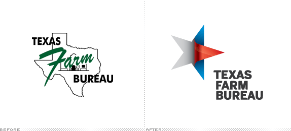
Established in 1933, the Texas Farm Bureau is a member-controlled and financed organization that provides “a voice for farmers, ranchers, rural citizens and everyone interested in preserving and protecting this way of life” and one of its main functions is grassroots policy development. The new logo has been designed by Interbrand. More images here. Press release here. As far as updates go, this is one of the most remarkable, simply because of how un-designed the old one was.
Thanks to James I. Bowie for the tip.

DATE: Jan.05.2012 POSTED BY: Armin
 CATEGORY: Food The B-Side
  COMMENTS:

TAGS: gradient, interbrand, texas,

A B-Side BY Armin
Long Island University
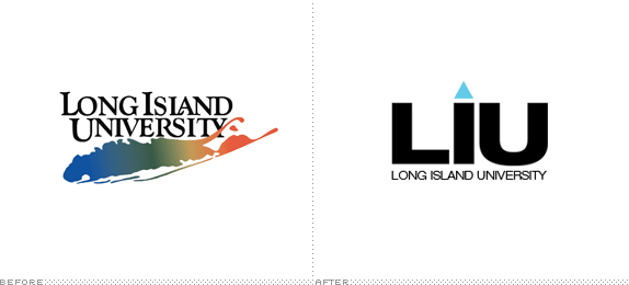
Established in 1926, Long Island University is reportedly “one of the largest and most comprehensive private universities in the country” with over 575 degree programs and certificates and over 23,000 students. This month they have introduced a new identity to go with their shortened name of LIU. Why the triangle? Simple: “Instead of dotting the ‘i’ in a conventional way, we chose to use a symbol to add meaning to the logo and make it more ownable. The upward-pointing triangle represents upward mobility and aspiration. The triangle also is commonly viewed as a delta symbol, which means change. These associations are a natural fit for a campaign that urges students to achieve their potential through the transformative power of education.” Yuck all around. Press release here.
Thanks to Stephen Dettling for the tip.

DATE: Jan.04.2012 POSTED BY: Armin
 CATEGORY: Education The B-Side
  COMMENTS:

TAGS: sans serif, university,

A B-Side BY Armin
Norwegian Cruise Line
Established in 1966, Norwegian Cruise Line is one of the leading cruise companies in the world, with 11 ships traveling everywhere from Alaska to Bermuda to the Mediterranean. A revised logo appeared recently.
Thanks to Adam Grobman for the tip.

DATE: Jan.03.2012 POSTED BY: Armin
 CATEGORY: Hospitality The B-Side
  COMMENTS:

TAGS: sans serif,

A B-Side BY Armin
Urecel Quickdry
Established in 1997, Urecel is an Indonesian company that manufactures a specialty high-performance foam called Quickdry that is used for high-end outdoor cushions. Among other things and uses. The new identity has been designed by Melbourne-based Lucas Melbourne. A cool infographic video below (or after the jump).
Continue reading this entry

DATE: Jan.02.2012 POSTED BY: Armin
 CATEGORY: Consumer products The B-Side
  COMMENTS:


A B-Side BY Armin
News Life Media

Formerly News Magazines, News Life Media is one of Australia’s largest print and online publishers with renown magazine brands like Vogue and GQ. The new logo to reflect the new name was designed by gen.a.

DATE: Dec.14.2011 POSTED BY: Armin
 CATEGORY: Publishing The B-Side
  COMMENTS:


A B-Side BY Armin
TuneIn

Founded in 2002, TuneIn Radio is a free service that allows you to, well, tune in to more than 50,000 radio stations through your browser or smartphone. “Our new logo combines the ‘t’ and ‘i’ from our name into a shape that conveys a simple form of humanity.” Blog post announcing the new logo here.
Thanks to Erik Botsford for the tip.

DATE: Dec.13.2011 POSTED BY: Armin
 CATEGORY: Culture The B-Side
  COMMENTS:

TAGS: colorful, icon, sans serif,


