NOTE: This is an archived version of the first incarnation of Brand New. All posts have been closed to comments. Please visit underconsideration.com/brandnew for the latest version. If you would like to see this specific post, simply delete _v1 from the URL.
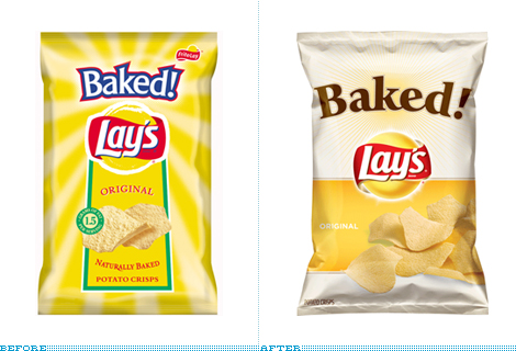
Unlike your run of the mill, delicious chips that are fried in fatty goodness, Frito Lay’s Baked! chips — exclamation point theirs — are, as the name exclamingly implies, baked for the health-conscious consumer. Where most chips contain 10 grams of fat, Baked! touts only 1.5 grams. I don’t buy chips often, only when I’m road-tripping and that has happened, like, three times in the past five years so I somewhat embarrassingly admit that I had no idea of the existence of Baked! Lay’s, which have been on the market since 1996. I must be a sucker for pretty things but I have to say that seeing this new packaging does tempt me to look for them on my next road trip or, more likely, on my next trip to the grocery store.
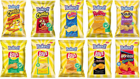
Old Baked! Lay’s packaging. [Image source]
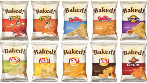
New Baked! Lay’s packaging. [Image source]
The redesign was done by Seattle-based Hornall Anderson, who have been doing some heavy-hitting packaging for the best part of the last twenty or so years. For the new Baked! Lay’s they have taken the female consumer as their main target audience:
We translated key consumer insights into emotionally impactful designs that reconsidered everything from mouth-watering photography, packaging size, portion control, tone of voice and visual personality to create a fresh and inspiring look and feel. With a focus on both product and differentiation in the grocery aisle, the new packaging encourages female consumers to stop and re-consider the chip aisle as a place “for me.”
— Hornall Anderson project page
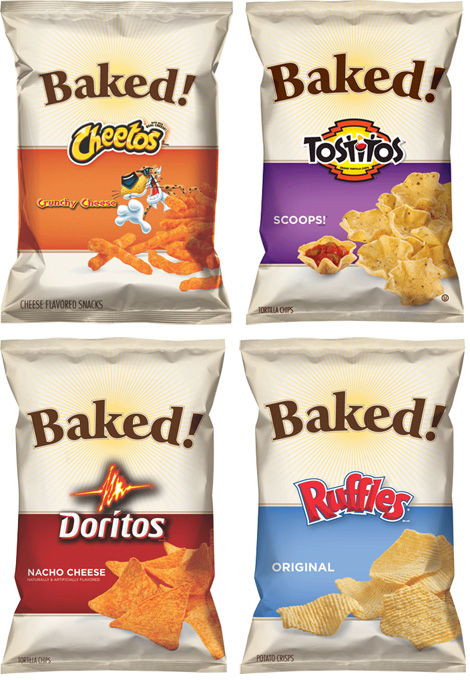
Nonsense press releasing aside, the design speaks for itself. It’s clean, simple and manages to look healthy without having to scream about it. It also manages to evolve the basic visual design structure of the old packaging with the revised sunburst and similar positioning of the elements. One of the nicest things of the redesign is how well the Baked! branding integrates with strong, established brands like Cheetos and Doritos as seen below.
As part of the scope, Hornall Anderson also designed the Flat Earth (shown below) packaging, the 100 Calorie packs, and a new brand called Smartfood.
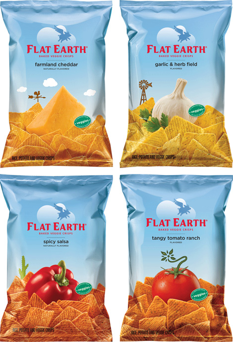
Thanks to Clint Williams for first tip, and for sending this image from the field, and to Joe Hribar for sending us extended links.

Jump to Most Recent Comment
James’s comment is:
I like the old Baked Better.
But overall, I like the new design. A lot.
On Mar.30.2009 at 11:50 AM
dave’s comment is:
isnt "baked" a slang term for being high? and isnt potato chips something someone with the munchies might crave?
On Mar.30.2009 at 11:50 AM
Kim’s comment is:
Well, speaking as the apparently coveted female consumer, what that packaging says to me is "Try us, we taste like cardboard!"
The original packaging isn't great, IMO, but this new style communicates total blandness. Won't be trying these any time soon.
On Mar.30.2009 at 11:51 AM
Armin’s comment is:
@Dave. Yes, and I debated whether to go for that angle on the story : )
On Mar.30.2009 at 11:55 AM
emily’s comment is:
leave it to big corporations to attempt to look "individual," "green," and "natural."
On Mar.30.2009 at 12:01 PM
Jay’s comment is:
My main problem with it is that the photos (illustrations?) of the chips never looked appetizing, old or new.
On Mar.30.2009 at 12:03 PM
Adam’s comment is:
The new design is much better. The 'simplicity' angle works here I think because it will stand out from most snack chip packaging. Also, the color choices make it seem much 'healthier' and more 'organic' even if the chips aren't officially organic.
p.s. Lays was including a sticker featuring this new look on all their bags of baked products, helping prep the consumer for the change. A thoughtful idea that can help reduce the shock of such a change and the cost at which it can produce if the consumer revolts. (i.e. Pepsi or Tropicana)
On Mar.30.2009 at 12:03 PM
Quality Vintage’s comment is:
Looks good, makes a really nice cohesive set of packages. The old ones are cringe-worthy with that blinding yellow sun and poor integration of the various brands. Nice work, but the eating of baked chips is the real problem - bleah!
I don't know if this will covert any greasy chip lovers like myself, but these do have a more crafted, healthy feel about them. Enjoy with your favorite bean sprout sandwich I guess...
On Mar.30.2009 at 12:04 PM
Jeromy’s comment is:
Love the new packaging! The transition from the typical centered-on-line to the asymmetrical layout is very well done. And I particularly love how the use of bolder colors now draws attention to key elements as opposed to background noise. I now see logo>"Baked">product instead of searching for a focal point.
On Mar.30.2009 at 12:07 PM
Amanda’s comment is:
The NEW packaging is light years better than the old!
While the old chips looked fake or like a drawing the new ones make me want to grab a bag right now.
Sure, big companies have to try hard to look like they are not trying but these really are much nicer and the actual chips look like something I would enjoy eating... not so before. In fact these might be the nicest chip bags I have seen yet.
On Mar.30.2009 at 12:21 PM
Matthew’s comment is:
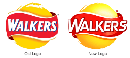
Its just occurred to me after seeing this that Lays must be the same company as Walkers Crisps in the UK, heres their go at the exact same product:

I think I prefer the type of the Walkers 'Baked' but the packaging design of the Lays crisps/chips does suggest the appearance of being healthier a lot better. The Walkers Baked packs are actually designed nearly identically to the regular fatty crisps. They also retain the irritating colour mismatch of cheese and onion vs salt and vinegar - in the UK salt and vinegar flavour is, by the majority of companies, packaged in blue, cheese and onion in green. For some reason Walkers decide to do the complete opposite, leaving many (including myself) irritated when they pick up the wrong flavour :(
On Mar.30.2009 at 12:24 PM
Paul’s comment is:
It’s clean, simple and manages to look healthy without having to scream about it.
You mean besides the gigantic "Baked!" emblazoned across the front?
I never minded the old packages (I guess I figured they were par for the course for chip packages). The new one's are OK, but I fear they'll simply blend in with all the other "Natural" and "Healthy" packages in the snack aisle.
On Mar.30.2009 at 12:33 PM
James’s comment is:
Maybe I'm not familiar enough with the product line, but isn't the overemphasis on "Baked!" as the first thing a consumer sees akin to the misstep Tropicana made with "100% Juice!"?
Personally I would at least give the brand logos equal scale emphasis, not subjugate them significantly by the word, making it arguably harder for consumers to find what they are looking for.
On Mar.30.2009 at 12:33 PM
Amanda B’s comment is:
@Dave. That was my first thought when I saw the packaging too. Chips for stoners!
Aside from that, I think the new packages are a huge improvement. The line is much more cohesive and it's easy to figure out the flavour with the different colours and big product photography.
On Mar.30.2009 at 12:44 PM
Rachel’s comment is:
The new packaging is lovely, clean, screams "healthy" - and looks way too "adult," IMO. Aren't kids a major consumers of chips? (Maybe I'm wrong.) I think the sunny appearance of the old packaging helps it stand out on the shelves, especially for children who are drawn to colorful, bright objects. I can't really imagine a kid going "Mommy, I want the beige chips!"
Maybe Frito-Lay isn't going for the kid demographic with their Baked line, but that's kind of sad, considering the high rate of child obesity in the U.S.
On Mar.30.2009 at 12:59 PM
Ryan Paul’s comment is:
Minor correction: Smartfood is not a new brand – we had it in our kitchen when I was a teenager.
It's been around since the mid-80s, and has been part of Frito-Lay since 1989:
http://en.wikipedia.org/wiki/Smartfood
On Mar.30.2009 at 01:08 PM
LB’s comment is:
I really appreciate the redesign of the Flat Earth packaging. Those chips look tasty. And while I think the Baked! Lays packaging is a nice design, I find it a little boring. I know Lays is trying to convince people that their chips are made with potatoes, love and sunshine, but how does that work with the energetic youthful brands of Doritos or Cheetos?
On Mar.30.2009 at 01:15 PM
Erik at Logo Critiques’s comment is:
The new packaging comes across looking like a lot of other organic, natural & baked packaging. It's nice, but nothing special in my mind.
On Mar.30.2009 at 01:21 PM
Melissa’s comment is:
Overall I like the new packaging...Some details do look a little weird to me the longer I look at them. The Doritos logo placement on the chip package hits the line underneath in a visually uncomfortable place. I do think the bags with the orange color band start to lose some of distinction between chip and color.
On Mar.30.2009 at 01:28 PM
Jacob’s comment is:
I like the design, but it's not appropriate. It's too "country kitchen-ish".
On Mar.30.2009 at 01:30 PM
michelle’s comment is:
I like the new, natural-style design but the bag seems unbalanced to me: love the bottom 2/3, the top 1/3 feels way too airy and bare.
On Mar.30.2009 at 01:45 PM
Alec’s comment is:
The different between the old and new packages really depend on consumer's perception. I personally feels that the old packages were following the traditional concept of eye catching at store aisles, attracting those who have temptation of snacks in everyday or purchase for parties and sport games.
The new package design trying to put these products stay away from junk food category but a real good supplement for our life, which are "Baked" with less fat.
I like Flat Earth's packaging even more if talking about snack products, images of real vegetables or ingredients could help reduce my guilty in eating junk food.
On Mar.30.2009 at 01:49 PM
Kaz’s comment is:
It's nice, but reminds me a lot of the italian SanCarlo snacks:


And so on...
Still, the Lay's design is a lot more refined.
On Mar.30.2009 at 01:58 PM
Chad Kaufman’s comment is:
I like the Flat Earth designs. While the primarily white packaging of the Baked chips may standout among the color-saturated packages of the other competitors (similar to the Lifesavers redesign), it overall seems rather bland to me, perhaps not being the best support to overcome healthy foods' bland stereotype. It almost screams, "It's healthy and boring". (by the way, I love the taste of Baked Lays)
On Mar.30.2009 at 02:08 PM
Spencer Cross’s comment is:
I agree with what seems to be the majority that the Flat Earth packaging seems much more successful. I want to like the Baked! packaging, but something about the proportions and relationships, especially in the top half of the bag, just seems really off to me. It's also inconsistent. Why, for example, is the "Baked!" element smaller on the Cheetos bag that it is on the others? And whoever decided to add that horrible, horrible black outer glow to the Doritos logo needs a long, stern talking to.
Also, I never realized that this line was supposed to be called "Baked!" rather than "Baked! Lays" or "Baked! Doritos." They seem to be addressing that here by giving those each of those elements more of their own space, but if you ask me it's creating all kinds of confusion.
On Mar.30.2009 at 02:29 PM
Ben’s comment is:
It would appear as though the Lays logo has been updated as well.
On Mar.30.2009 at 02:36 PM
Neil’s comment is:
This is neither an improvement nor a step backwards. I think if you swapped the before and after photos, there'd be nothing gained or lost in either of them.
On Mar.30.2009 at 02:41 PM
Jay Williams’s comment is:
I think the new design is a good improvement. The layout is simple and clean, and feels like it fits in with other "health food" packaging. Also of note, the new design uses a more matte plastic, rather than the general ultra-glossy plastic, which makes them feel less greasy, and more "healthy" in my opinion.
On Mar.30.2009 at 02:57 PM
Dale Campbell’s comment is:
Cool.
I actually noticed this yesterday while I was shopping with my wife.
I think that it's an overall improvement although I got to thinking that they ARE potato chips, so I can imagine that they can only be SO healthy.
That being said, I thought the appearance on the shelf was very earthy and that alone made it stand out.
I like the new design very much.
Keep well,
Dale

Mark’s comment is:
At least it will be easier to find the Baked! Lays chips.
Before with the old design I had to look carefully for the Baked! logo, it was a little hard since it was kind of small. Also it hardly even looked different compared to the regular Lays chips design,all was different was the red white and blue Baked! logo that can be glanced by easily, I even pass by them accidentally without even noticing it. This new one stands out more and is a lot less cluttered. NOW it jumps out at you. Big improvement.
These chips are delicious! healthy or not, I can't just eat one. They taste BETTER than regular Lays chips!
On Mar.30.2009 at 03:56 PM
Mark’s comment is:
Huh, I don't know if anyone has noticed, but it looks like the Lay's logo slightly changed too, it looks a lot less like the Pepsi wave, is this due to Pepsi changing it's logo?
I'm asking because PepsiCo owns Frito Lay, I wouldn't be surprised if something like this did happen.
On Mar.30.2009 at 04:13 PM
Kevin’s comment is:
Chips - I can't speak to any of the others, but Baked! Lays are tremendously better than regular Lays.
Design - I like the simplicity of the new design. Of course, I also liked the re-brand of Tropicana that most other consumers apparently hated.
On Mar.30.2009 at 05:06 PM
Mike’s comment is:
I welcome and enjoy the new packaging, though when I look at chips what I focus on is the brand name and the picture of the chips themselves. I don't pay attention to the packaging as a whole, though looking at them now I'm more attracted to the newer version. Just something about it makes you feel good about getting it. Maybe it's the healthy and clean look that everyone has mentioned.
On Mar.30.2009 at 05:30 PM
Joseph Maguire’s comment is:
I like the new baked packaging altogether but I am disapointed to see such heavy handed brand unision. They look like they were made to fit a brand style guide. Why did the neuter their individual brands. This is similar to what went wrong over at tropicana. Treat your products like their children with names and they'll have individual responses, treat your children like they all should celebrate their birthdays on one day and your product is ultimately not unique at all. Despite this I been a fan of the new cheetos advertising and I hope they dont let this packaging go to the super market ( the design might look better than their prior work but it looks quite neutered and they should work on it.
On Mar.30.2009 at 05:59 PM
Mike’s comment is:
I've been reflecting on how brands are using color to say "natural!" a lot lately (maybe especially to imply "natural!"ness when it's not really there). These chips have it, with the less saturated pale yellow compared to the old version. Skippy "natural" peanut butter uses that muted brown to suggest "natural!" somehow. there are now "natural" cheetos that also use more muted colors. I have no idea what might be "natural" about these cheetos (aren't cheetos constructed entirely of plastics?), but when I see that bag I *feel* swaddled in a warm flannel cloud of naturalitude.
On Mar.30.2009 at 06:56 PM
jRod’s comment is:
i would have to say that these are really good and a big step up from the previous version. heck i would say snack packaging as a whole has been on the uprise over the last 5 years as manufacturers are starting to realize the importance of good design. it also is a tribute to the fact the printing technology has taken a giant leap forward as of late, such as matte-finished packaging and cleaner colors. i have always thought it would be fun to design something like what we have here. i envy you guys that do retail design.
but i wouldn't trade web design for anything :)
On Mar.30.2009 at 07:02 PM
craig shully’s comment is:
In this case - does it really matter if the Baked packages are perhaps not that impactful? After all Flat Earth is also a Frito Lay product, as are Sun Chips, Tostitos, Doritos, Staceys, True North and on and on.
Frito Lay so completely dominates the salted snacks category on every level that it is actually difficult to NOT buy a Frito Lay product.
On Mar.30.2009 at 08:03 PM
Glenn Sakamoto’s comment is:
Hornall Anderson can do much better. This refresh looks like it was designed by committee. The upper/lowercase font solution looks weak, the exclamation point unnecessary, and the typesetting on the arc is just plain silly.
It straddles the line between an all-natural line extension and a mainstream consumer product. It looks as if it might actually be good for you.
On Mar.30.2009 at 09:01 PM
Matt Klaman’s comment is:
i hate potato chips (not tortilla chips). but i am in love with this new packaging.
less is more, for the win!
On Mar.30.2009 at 10:29 PM
Brian’s comment is:
It's a step up from the old packaging. Not much more to say than that though.
On Mar.30.2009 at 10:41 PM
D. Moe’s comment is:
Adding another wrinkle, there's also a line of "Natural" Cheetos and "Natural" Lays (etc.) which is independent from "Baked." These also have a bag design divided in thirds with the original logo and a product shot in the middle.
On Mar.30.2009 at 10:56 PM
Don’s comment is:
The new packaging is a clear win across the board.
While the Baked! bags are not perfect I really appreciate the clean, minimal design. These looks like DESIGNERS created them, not chimps. It is refreshing in this market segment to see honest to God design. I can imagine that getting this kind of thing through the many layers of mangers and executives at Frito Lay could not have been easy. Along the way the designers probably lost some battles... and yet the end result is fantastic. I want to eat these... somehow they made then packages less busy yet with more design and much better photography all at once. BRAVO!
As for Flat Earth.... well that is a near home run.... Again, the photography takes center stage and yet it is still a DESIGNED bag... not some overworked mess nor some cheesy (no pun) "homey" photography. The designs and photos just work.
I have yet to see the Smart Food but I truly am encouraged to see such legacy companies like Frito Lay and Pepsi taking some chances and I will support them (assuming the things actually taste as good as they look).
P.S. Just showed these to my wife... they are now on the list of "to buys"
On Mar.30.2009 at 11:27 PM
josh’s comment is:
flat earth wins, too bad we will never get them in australia.
On Mar.30.2009 at 11:32 PM
Nik Daum’s comment is:
I think the new designs are a step in a better direction. Simpler/healthier/and clearer differentiation between products in the Baked! line. But there is a visual disconnect between the BAKED! and the product logo. They seem like a healthy bag of chips with a garish junk food logo slapped on them.
On Mar.31.2009 at 05:17 AM
Jonathan’s comment is:
Does the B that's just hanging out next to the "aked!" not bother anyone? Seems really disconnected to me.
I'm liking the bottom 2/3rds of the bag though.. Nice and clean! I personally liked baked lays, I feel healthier eating them, and I feel that the design of these bags also conveys that feeling.
On Mar.31.2009 at 09:44 AM
Matt’s comment is:
OK I guess.
Not very engaging... bit beige, not bad just leaves me feeling a bit underwhelmed. Surely not a desirable consumer response in foodstuffs? Makes me feel the snacks are going to be ever so slightly less interesting to eat than the shipping carton they're packed in...

Adam’s comment is:
When the Baked! chips are juxtaposed next to the Flat Earth brand, they look silly. If I saw both of those on a shelf, no contest that the Flat Earth bag would capture my attention first.
On Mar.31.2009 at 10:09 AM
Rachel’s comment is:
I Guess I could pick apart the design and I actually do agree with some of the previous comments about very specific issues. However as an overall design these are really a huge improvement and IMO lead the category easily.
They are just nice looking, clean and unified packages that make the chips inside look great and have a natural and healthy feeling. Seems like a win to me.
Flat Earth seems to be going for a slightly different market and I agree that they look wonderful. Another marked improvement over the old designs and very unique... I have never had these before but will try now.
On Mar.31.2009 at 11:26 AM
Christie’s comment is:
I don't think you can judge the new packaging without considering who their target audience is, which is most likely adult women. They're calorie conscious and health conscious. Not only do neutral colors and a more subtle design really make the package stand out in the chip aisle, but it also quickly communicates what it is to women looking for an alternative to the regular greasy and full-of-calories chips.
On Mar.31.2009 at 11:42 AM
Mongoose’s comment is:
Mmm. Now I want some potato chips. Hurrah, there's Pringles in the house!
So, let's review. The pale background and the big "BAKED!" do ramp up the "Hey, these are the healthy version" impression rather well. And I love that tilted 'e', it adds a little character. less garish than the old white bounded by blue bounded by red 'Baked!' by far.
Setting the subsidary brand and flavor information in the wide stripe works nicely; People will quickly register on the baked, but not linger, and be able to focus on if these are Ranch or Cheeze. Effectively, the top third of the bag is meant to be quickly ignored, and that's a good thing; the packaging also feels less busy overall.
Flat earth's redesign is rather nice; they've kept the blueness of the old packaging but made it look a lot more ingredient-centric and airy.
Old packaging:

As mentioned by someone else upthread: Smartfood is not a new brand. http://en.wikipedia.org/wiki/Smartfood . They're a redesigner's dream: The bag stays black and you can pretty much do whatever else you want to it, people will know it's that nummy popcorn.
I give the repackaging/rebrand an A-; The color choices and design choices are very good, and it's minimalism done right. Information, familiar brand choices, lets me toss it in my shopping cart and feel I'm eating something that might not clog my arteries so badly.
--Mongoose
On Mar.31.2009 at 12:29 PM
Alice Baldwin’s comment is:
Baked Lays are delicious! Way better than the usual greasy stuff.
I think the new packaging is generally very handsome, except I don't think "Baked!" needs to be so large. Overall, the packaging is aligned with the product, making them look as delicious as they are.
On Mar.31.2009 at 04:14 PM
kirk’s comment is:
why are they so excited about being baked?
Baked!
ok, you still taste like flavored rice cakes.
On Mar.31.2009 at 04:20 PM
Nate’s comment is:
All this talk of chips is making me hungry as hell. Speaking of which, I have to say the new design makes me want to eat the chips inside. More so than the old design.
I wouldn't give a thumbs up or thumbs down on the new packaging--it's sort of a lateral move in my mind--but my reaction is visceral. It seriously makes me hungry.
Maybe it's because there's more focus on the product. Maybe it's the colors. I don't know, there's some subliminal messages being sent.
One thing I wish would happen in the next century is for chips to be packaged in boxes like cereal. Seriously, let's end the disappointment of finding the last 20% of your chips being smashed to bits. Pringles kind of has it right.
On Apr.01.2009 at 01:29 AM
Josh’s comment is:
Any idea what the typography is for "Baked!"?
On Apr.01.2009 at 02:11 AM
Jonathon’s comment is:
This new design works so much better for me, but for one simple reason: I don't often eat potato chips because my stomach mildly reacts to the oils, and those oils are what the yellow colour of the old packaging brought to my mind. When I see the natural brown-silver colour scheme, I don't as much think of the oil, and it makes them seem lower-fat and therefore more tempting.
I like the Flat Earth designs, too, although their Fertigo-like logo typeface and pig logo don't work for me, I have to say.
On Apr.02.2009 at 01:31 AM
Scoobie’s comment is:
Er, so, does anyone know the connection between Lays and Walkers?

Anonymous’s comment is:
The packaging is so-so, but the actual product is great imo, and it does squeeze in those necessary veggies for the day!
On Apr.02.2009 at 09:57 PM
vladsinger’s comment is:
Walker's is now owned by Frito-Lay (which is owned by PepsiCo...), that's why the logo is similar.
On Apr.04.2009 at 09:23 PM
Jordan Foutz’s comment is:
I really like the clean look. Everything is going sterile these days. Identity design, web design, and even interior design. The whole thing is less busy and more focused on the product, which should be the main focus of packaging design.
All they need to do is clean up this rubbish, unimaginitive type on their "regular" packaging:


Chuck Spidell’s comment is:
Today, I saw the Baked! Lay's Original chips in Safeway and the new packaging is a welcome change. The previous packaging was convoluted with too many primary colors - not to mention that nasty center alignment. The new products feature a monochromatic color scheme, allowing punches of color that don't overpower the design. Now, the brand is fresh, enticing, and constrained. Cheddar & Sour Cream Ruffles are the bomb.
On Apr.06.2009 at 01:36 AM
Marshal’s comment is:
Love the new baked branding. LOVE the Flat Earth packaging more. If I saw Flat Earth chips on a grocery run, they'd be in my cart.
On Apr.06.2009 at 09:31 AM
Adam thinks he knows’s comment is:
those flat earth chips look DELICIOUS!!
On Apr.30.2009 at 03:12 AM
JC’s comment is:
this is a welcome change!
Occam's Razor was clearly in effect here!

JC’s comment is:
this clearly is a medley of the hip "Kettle cooked" handmade feel and pop snack icon. Concept is tight and with a few adjustments and some time we won't know the difference. FTW!
On May.02.2009 at 01:21 AM
Comments in Brand New, V1.0 have been closed.


