


Airwalk by Richard Dongses
The entire semester was devoted to researching a dying brand, and coming up with a new logo redesign and style/brand guide. We were to expand on what the original brand sold, and try to think on how this new branding could encompass products/ideas/lifestyles not addressed in the original branding. Here is the course description: The goal of this course is to visually and verbally understand identity and branding as it relates to a variety of businesses and their organizational structures. Students will investigate what defines the personality, identity and substance of these businesses through the creation and execution of brand and identity programs.

Academy of Art University
San Francisco, CA
Nature of Identity
Hunter Wimmer
Approach
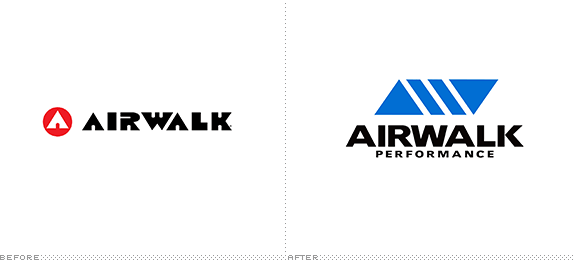
I knew early on that I wanted to do an athletics brand. I ended up focusing on shoes. Because I grew up in a culture that seemed obsessed with buying the right shoes for the right sports and occasions. I was reading the Tipping Point, suggested by my instructor, and it talked about the brand Airwalk, and how it used to be a hot brand amongst the skateboarding community, until it “sold out” and became commercialized. It lost its appeal to the skateboarding enthusiast, and seemed to have lost its original identity. I chose to redesign Airwalk, with the tag line, back to the basics, or back to the fundamentals.
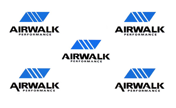
Alluding to the heights from when the brand had fallen, as well as emphasizing performance. Fundamentals of any sport is crucial. I wanted to brand to be synonymous with hardcore sports enthusiast who desired shoes and equipment that would take them to the peak of their game, as well as look good in them. So I started off with skateboarding (the original focus of the brand) and expanded it to all board sports, such as surfing and snowboarding. I also branched off and created performance parks: like skateboard parks, snowboard parks, and surf parks. There were also performance stores which sold Airwalk performance gear. The new brand is called Airwalk Performance. The logo is a combination of simple but crucial elements that make up the iconic “A” and “W” of the name Airwalk. Since I envisioned it to be all about performance and imagining hardcore enthusiast doing crazy aerials and 360s, I wanted to try to create a basic logo that could be seen right side up, and upside down.
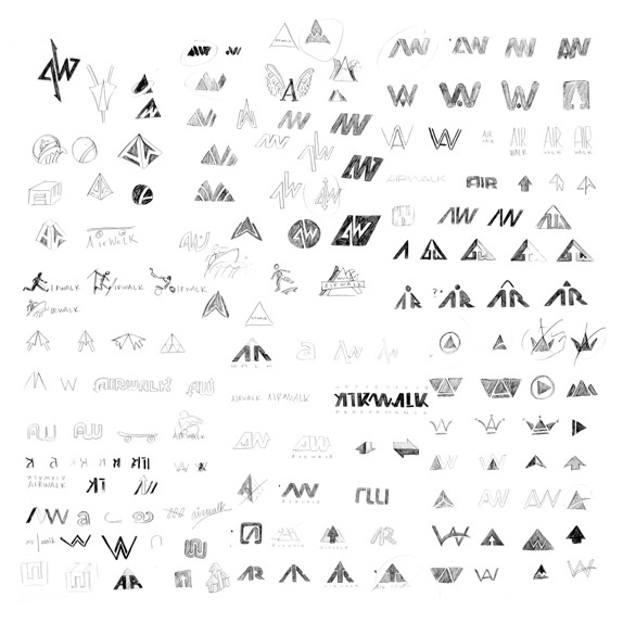
Sketches and Process
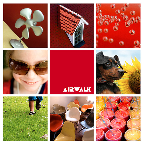
Brand Grid Before: What Airwalk is like at this moment, to me.
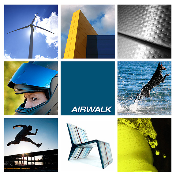
Brand Grid After: How I would rebrand Airwalk.
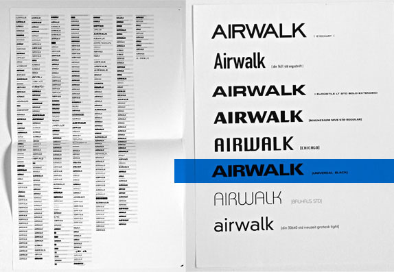
Initial type treatment options for the logo.

Logo revision process.
Solution
Final logo decision.
Airwalk Style Guide (13 in × 19 in book).
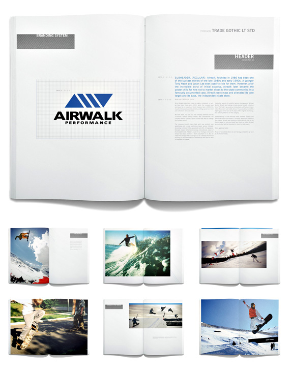
Select pages from style guide.
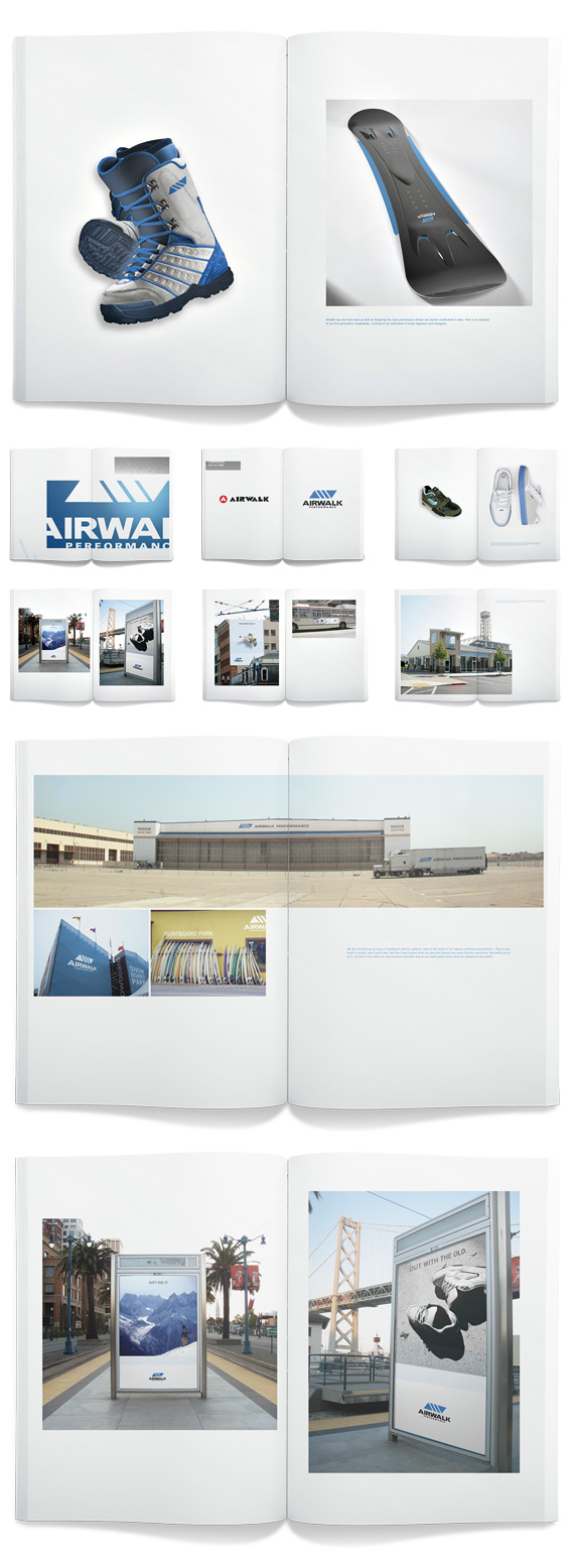
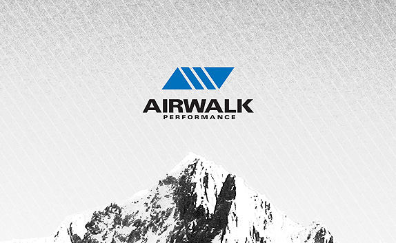
Select pages: products, performance parks, advertisements.
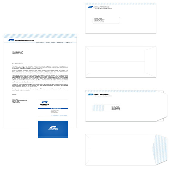
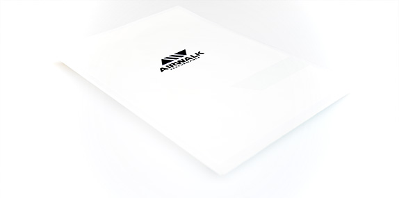
Business system.


DATE: May.04.2010 POSTED BY: ArminCATEGORY: Consumer Product COMMENTS:

TAGS: airwalk, guidelines, logo, stationery,


Celebrating the reality that print is not dead by showcasing the most compelling printed projects.

Corraling the most relevant and creative on- and off-line bits that pertain to the design community — and said community is openly invited and encouraged to add their hard-earned links.

Describing, tracking and explaining culture, commerce, politics, media, sports, brands — everything possible, really — through design.

Discussing, and looking for, what is relevant in, and the relevance of, graphic design. [Archives Only]

Encouraging creative diversity in the community through monthly, one-word challenges. [Archives Only]

Designing corporate and brand identities and full development of printed and digital matter for clients and us.