


Crayola Washable Fingerpaints by Christine Clayton
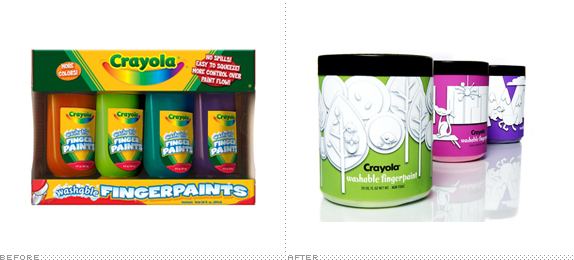
We were asked to redesign an existing product/package or to create a new line for an existing brand. I decided to redesign Crayola's Washable Fingerpaints packaging. Crayola's current Fingerpaints packaging is basic and doesn't really add to the brand experience or capitalize on any of the brand equity that Crayola has built over the last 125 years.

Portfolio Center
Atlanta, GA
Advanced Packaging
Brett Player
Approach
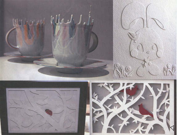
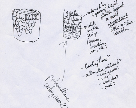
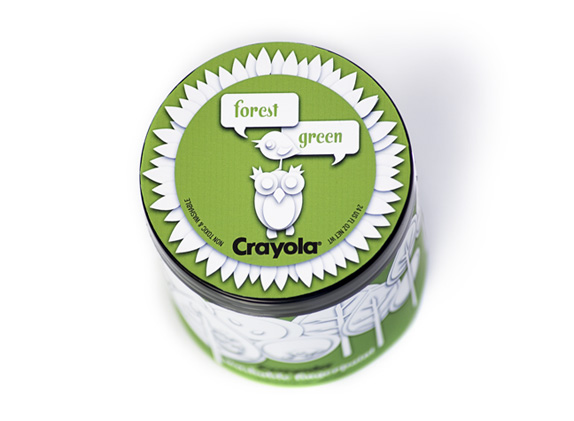
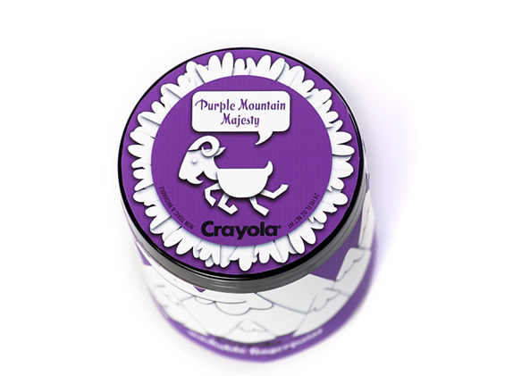
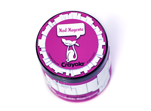
This particular project had a few false starts and challenges that I had to work through along the way before getting to a completed stage. In the concepting phase I started out with mood boards and design inspirations and decided on 3 different initial design directions (there are process sketches for concepts A & B). I was initially very taken with a teacup I had seen produced by an industrial design student, Elisa Werbler I wanted the containers of fingerpaint to have a similar effect on the top lip whereby it would look like the paint was dripping out of the white on white cut paper scenes on the containers’ labels. The white on white cut paper label illustrations depicting the crayola color names are meant to signify a blank canvas and the drippy colors on the lids are the paint colors running out of the scenes.
It was truly a situation where I was more in love with the idea than the practicality of the design. I hadn’t initially considered the problems until I tried creating several mockups using different materials to create the drips (I tried dripped wax, wood glue, and acrylic paint on different trials). It was after I had a few physical pieces in my hands that I started to fully realize the limitations of the process: high cost of production, choking hazards, shipping/packing/shelf display impracticalities and a piece that was starting to look very forced and gimmicky.
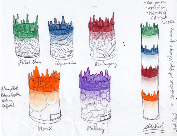
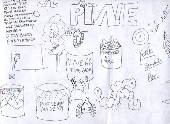
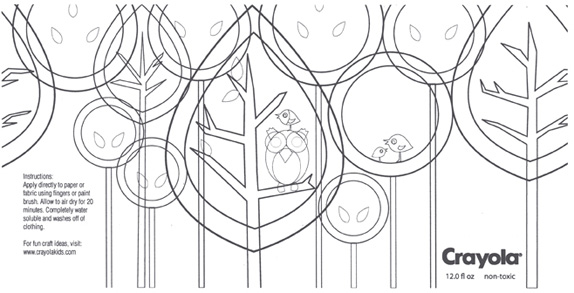
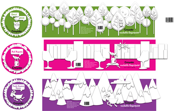
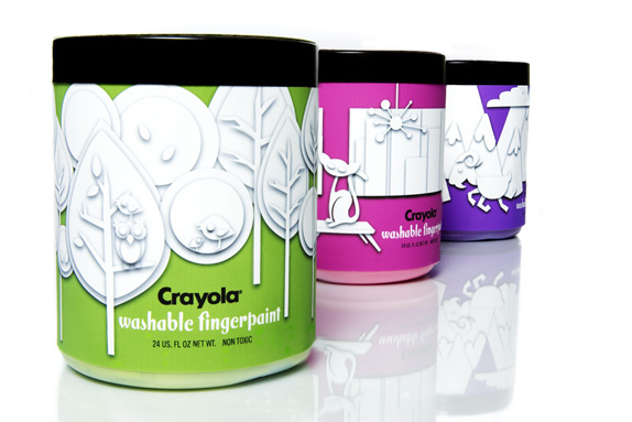
So, I began re-thinking the project and honed in on what was really at the heart of the message. I got out a large sheet of paper and began with the color names in the top left corner of the page. These were my anchors — the goldmine of brand equity in the names of the Crayola colors themselves. I knew I wanted to retain the white on white cut paper concept. So, I set out sketching scenes depicting the color names and settled on three that I really loved: Forrest Green, Purple Mountain Magesty and Mod Magenta.
So, for false start number two. I thought it would be amazing to design and physically construct the white on white cut paper scenes and then have them photographed. I created the illustrations, scanned them into illustrator, and then arranged them as I would want the label to look. Then, I layed all the individual pieces out on a 11x17 size file and printed them so that I could cut them out with my x-acto. Then I scheduled an appointment with the photographer. With the three 19 × 4 inch cut paper scenes in hand, I went in to have them photographed. We tried a lot of different angles, lighting and adjusting of shadows but ultimately, couldn’t salvage a picture that worked. We just couldn’t get enough control of the drop shadows to create an image that looked clean and well defined. I had to start again and figure out another solution.
I decided that to get the clean, modern, fresh feel that I really wanted to create, I would create the scenes in illustrator and diligently adjust and tweak the drop shadow settings to get something that looked like it could have been photographed. I played with it until I got it where I wanted it and ultimately I am very happy with the finished product. So, the labels were printed, wrapped onto the canisters and the canisters were filled with their respective colored paints — and there you have it.
Sketches and Process
Design inspiration.
Concept A.
Concept B.
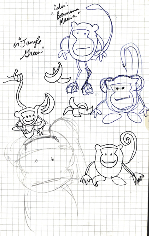
Considered scene for Banana Mania.
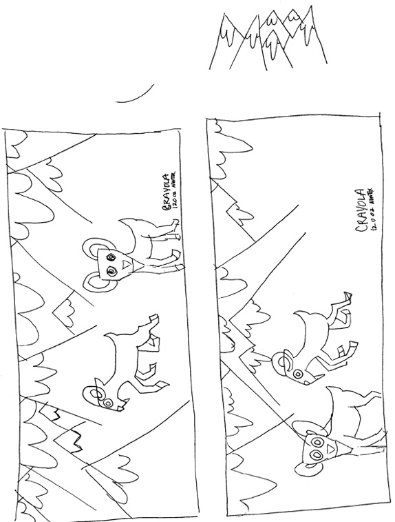
Sketch for Purple Mountain Majesty.
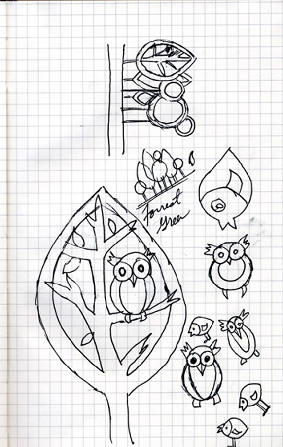
Sketch for Forest Green.
Pieces laid out in Illustrator before cutting.
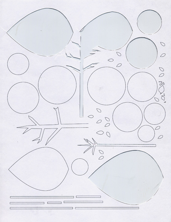
Cut paper pieces.
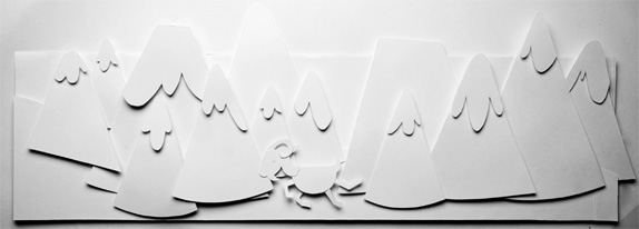
Cut paper for Purple Mountain Majesty.
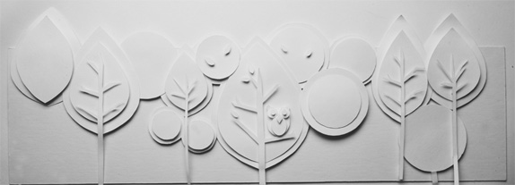
Cut paper for Forest Green.
Solution
Christine Clayton’s Website


DATE: Apr.26.2010 POSTED BY: ArminCATEGORY: Consumer Product COMMENTS:


Celebrating the reality that print is not dead by showcasing the most compelling printed projects.

Corraling the most relevant and creative on- and off-line bits that pertain to the design community — and said community is openly invited and encouraged to add their hard-earned links.

Describing, tracking and explaining culture, commerce, politics, media, sports, brands — everything possible, really — through design.

Discussing, and looking for, what is relevant in, and the relevance of, graphic design. [Archives Only]

Encouraging creative diversity in the community through monthly, one-word challenges. [Archives Only]

Designing corporate and brand identities and full development of printed and digital matter for clients and us.