


Mainco by Eric Krichevsky
We were assigned three random companies from the yellow pages and had to pick one of them for a complete identity overhaul. We were given 100% creative control, the most important condition was that we had to provide at least 100 thumbnail sketches for the new logo idea.

Fashion Institute of Technology
New York, NY
Corporate Identity
Carol Massa
Approach
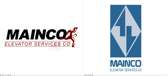
I approached this logo as if my professor was the actual client. I wanted to take an outdated and irrelevant logo and modernize it. Elevators are one of the biggest technological breakthroughs of all time. With that in mind, I wanted one of the leading elevator service companies in America to have a logo that represents them accordingly. I wanted to explore every possible direction I can think of with the sketches, everything from typical generic ideas to far out the box unexpected concepts.
I wanted the final solution to show that Mainco is keeping up with the modern days and that you can trust in them and their abilities.
Sketches and Process
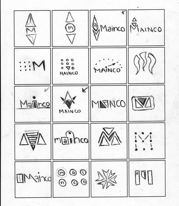
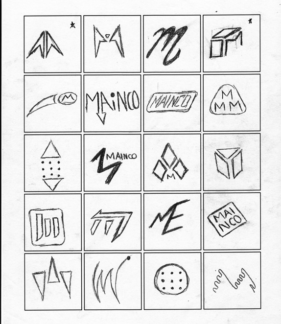
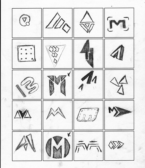
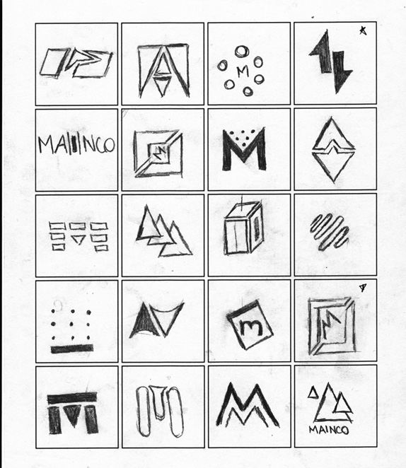
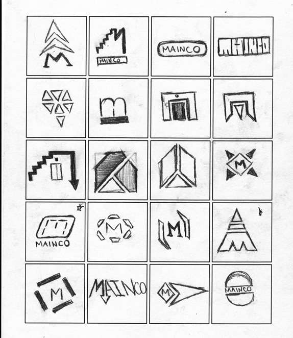
I’ve never done so many thumbnails for one single client before so with the new opportunity, I wanted to explore so many different possiblities and tried to keep all 100 sketches as unique as possible. As hard as I tried to keep stepping “outside the box”, I found myself experimenting a lot with arrows and dots/buttons. Between a lot of brainstorming (on scrap paper) and modifying sketches over and over again, this 5-page process took about 2 weeks to finalize.
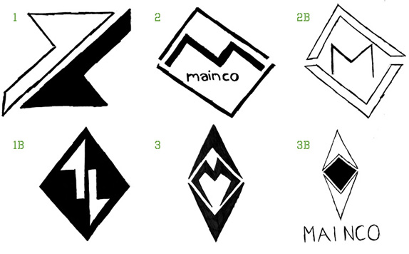
After a lot of deliberation, class discussions, and compromising, I had to let go off several of my favorite ideas because I just knew they wouldn’t be as effective in the long run. Out of 100+ ideas, it came down to the 3 drawings above, which I then made an alternative version of for each concept making it 6 total.
After doubting my final choices for a little bit and scanning through the 100 thumbnails non-stop, I became more confident in my “top 6” and finally made my choice on which concept I like the most. I finally narrowed it down to one idea, and now it’s a matter of perfecting it.
Solution
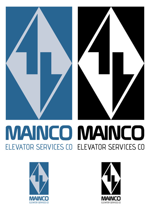
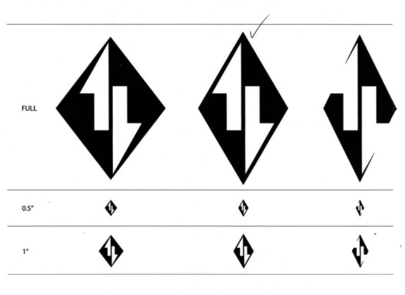
To conclude, I did a lot of research on colors and the typography, but unfortunately I don’t have that material anymore (pardon the lame excuse). To sum it all up, inverting the logo into a rectangular shape was a last minute idea that I ended up liking a lot. Not only did it give a better feeling of an elevator, but I also interpreted it as this safe box that secures the ” precious diamond” (the people riding the elevator) in the middle. The blue represents security, safety and stability, which I think is extremely important when you step into an elevator at 90 stories high. Lastly, the typography! This logo overall was about a 2 month process; by the time I reached the typography aspect, I was honestly running on empty so I feel like I didn’t give it my absolute best, but I did put in a hell of an effort with picking out the most appropriate fonts.
Eric Krichevsky’s Website


DATE: May.21.2010 POSTED BY: BryonyCATEGORY: Service COMMENTS:

TAGS: 100 sketches, icon, logo, mainco,


Celebrating the reality that print is not dead by showcasing the most compelling printed projects.

Corraling the most relevant and creative on- and off-line bits that pertain to the design community — and said community is openly invited and encouraged to add their hard-earned links.

Describing, tracking and explaining culture, commerce, politics, media, sports, brands — everything possible, really — through design.

Discussing, and looking for, what is relevant in, and the relevance of, graphic design. [Archives Only]

Encouraging creative diversity in the community through monthly, one-word challenges. [Archives Only]

Designing corporate and brand identities and full development of printed and digital matter for clients and us.