


MEA by Bruno Zalum
We were asked to choose a poorly designed logo that is ineffective, and redesign it.

School of Visual Arts
New York, NY
Design & Intentions
Milton Glaser
Approach
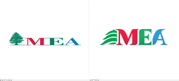
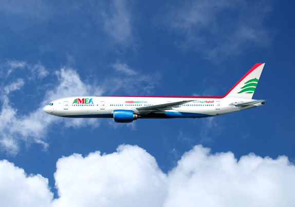
I chose to work on the logo of the airline company I travel with quite often: Middle East Airlines. It is the official airline of Lebanon, and their fleet and service are impeccable. However, their logo is old-fashioned and doesn’t convey anything relevant to the company. It almost looks like an environmental or botanical corporation from the 1980s.
Their icon is the Cedar tree, which is the symbol of Lebanon. It is exactly the same icon that is used on the Lebanese flag. The type is very rigid and the negative spaces drove me crazy.
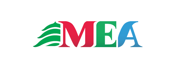
I started to experiment by simplifying the color palette and adding Arabic type inside the cedar. I then finally decided to boost the 3 colors of MEA for recognition purposes, and conveyed a subtle oriental touch without having to add calligraphy. It’s such a pity that it became kinda freaky to see huge Arabic type on an airplane nowadays!
I created the logotype with the idea of movement in mind. The 3 letters had to be dynamic and specific to MEA. The cedar was turned into a recognizable icon conveying the idea of flying, and merging into the type.
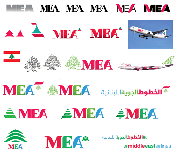
Sketches and Process
Solution
Bruno Zalum’s Website and SVA Page


DATE: Dec.07.2010 POSTED BY: BryonyCATEGORY: Transportation COMMENTS:

TAGS: airplane, logo, MEA, typography,


Celebrating the reality that print is not dead by showcasing the most compelling printed projects.

Corraling the most relevant and creative on- and off-line bits that pertain to the design community — and said community is openly invited and encouraged to add their hard-earned links.

Describing, tracking and explaining culture, commerce, politics, media, sports, brands — everything possible, really — through design.

Discussing, and looking for, what is relevant in, and the relevance of, graphic design. [Archives Only]

Encouraging creative diversity in the community through monthly, one-word challenges. [Archives Only]

Designing corporate and brand identities and full development of printed and digital matter for clients and us.