


Spy Museum by Aubrey Birkholtz, Dave Mason and Sarah DeGarmo

We were asked to do a re-branding campaign for an existing museum. It was to be comprised of a logo, letterhead system, advertisements, museum signage, website, web advertisement, packaging/bags, collateral, and a final display. We were allowed to choose the museum we wanted out of a list of around 15. We had to have all components of a campaign and it had to be relatable to the actual museum.

Kansas State University
Manhattan, KS
Senior Studio
Mervi Pakaste
Approach
Conceptually we wanted something strong, an idea that would stand out among other campaigns. So as a team we collaborated, and came up with our idea of a sleek retro feel. This approach led us to lots of brainstorming, raking our brains of silver screen spy’s and real life spies. It lead to a lot of late nights and many great ideas. In the process of coming up with concepts for ads, signs and posters we realized that what we had, might actually be something presentable to the museum itself.
It was a challenge at first to work alongside our classmates, but we then utilized our individual strengths, and collaborated to make them flow together into visually interesting and conceptually strong pieces.
I can say that we each had our hand in the project, and while some group projects may be a nightmare, this one was very team oriented and we all had the same end goal in mind, and we worked together very well.
Sketches and Process
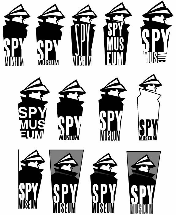
Together we decided that we felt the museum/ logo should have a geometric feel, something that would be easily readable, yet could be carried through generations. We had trouble with finding a typeface that worked well inside of the shape, which led us to design our own typeface.
Solution
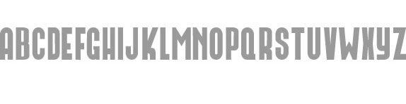
Custom typeface.
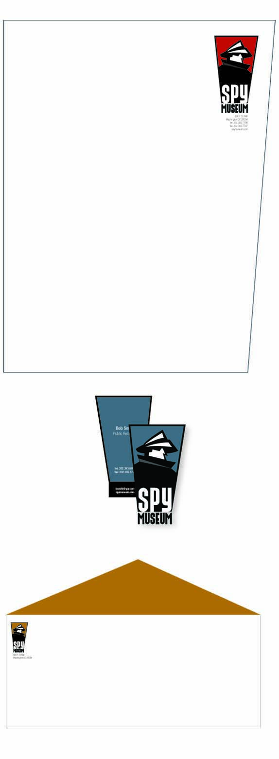
Stationery.
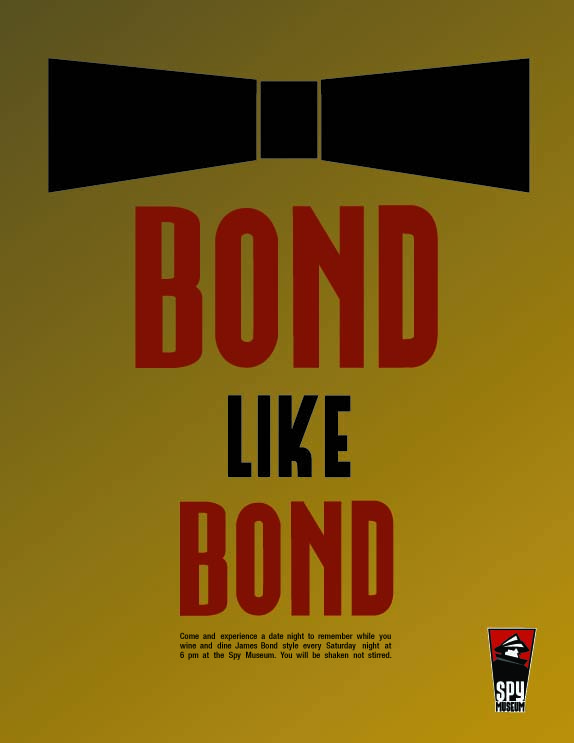
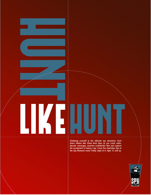
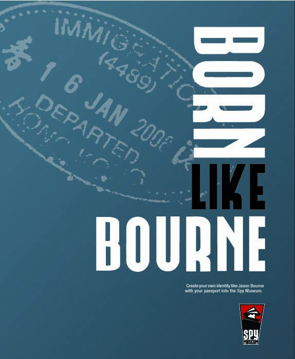
We wanted to keep our ads simple, after brainstorming we decided to use silver screen spies to be easily recognizable to the patrons of the museum. The themes of the ads that related back to events happening in the museum.
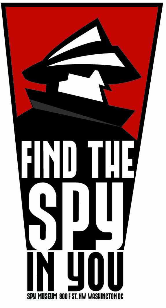
Poster.
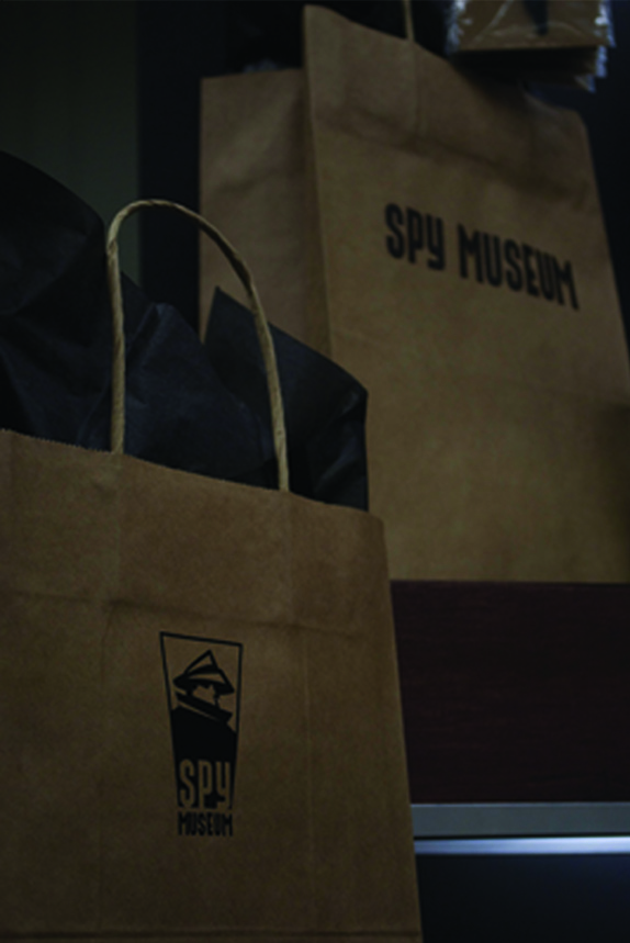
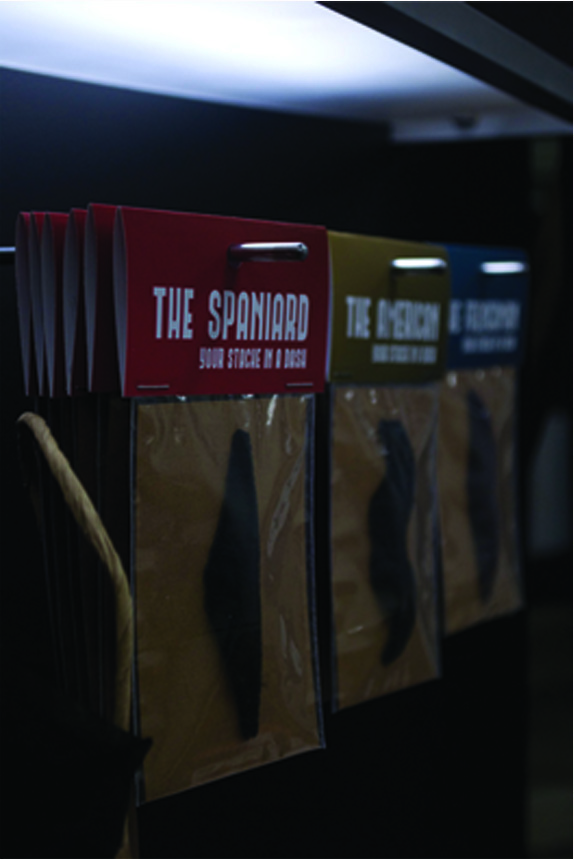
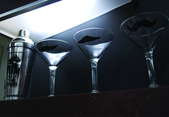
Packaging.
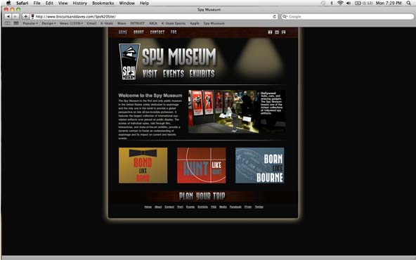
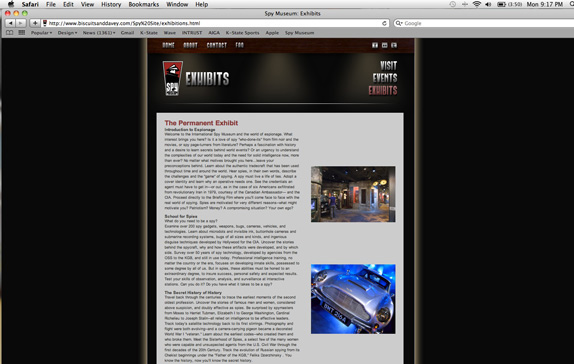
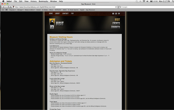
The website was a jump from the original. We wanted one that was very user friendly, yet kept the sleek look and feel of the rest of our campaign. Each page is designed for the patrons to be able to navigate through and gain knowledge about the museum.
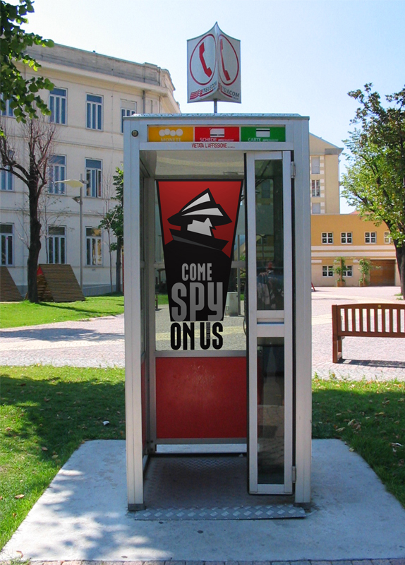
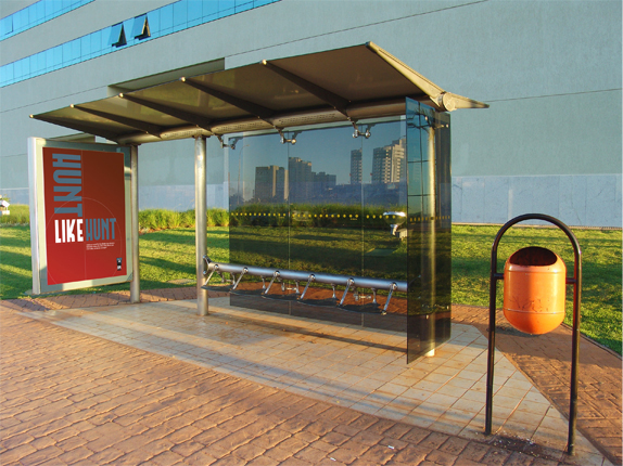
Bus stops.
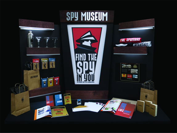
All together.


DATE: Jun.15.2010 POSTED BY: BryonyCATEGORY: Culture COMMENTS:

TAGS: advertising, bus stop, custom typeface, logo, packaging, poster, spy musuem, stationery, website,


Celebrating the reality that print is not dead by showcasing the most compelling printed projects.

Corraling the most relevant and creative on- and off-line bits that pertain to the design community — and said community is openly invited and encouraged to add their hard-earned links.

Describing, tracking and explaining culture, commerce, politics, media, sports, brands — everything possible, really — through design.

Discussing, and looking for, what is relevant in, and the relevance of, graphic design. [Archives Only]

Encouraging creative diversity in the community through monthly, one-word challenges. [Archives Only]

Designing corporate and brand identities and full development of printed and digital matter for clients and us.