


Tampax by Aaron Heth
The brief was completely self initiated, and my goal was to create or rebrand a system of packaging for a tampon line.

Savannah College of Art and Design
Savannah, GA
Studio II
Scott Boylston
Approach
The approach began with quite a bit of market research, including a series of 10 questions. The research set limits and direction on both graphic applications and physical packaging. After my initial research, I directed myself to create a new brand for Tampax, but after further research, I discovered that it would be more appropriate to rebrand an existing line and evolve the current arena of tampon packaging as opposed to creating an entirely new niche.
RESEARCH STATISTICS (Based on answers from 60 women from survey made online)
Q: “What are your thoughts on current graphic treatments to tampon packaging?”
41.4%: Somewhat ugly to Insulting
58.6%: Somewhat Attractive to Very Attractive
Q: “What are your thoughts on current packaging functionality?”
44.8%: Could be better to Needs Improvement
55.2%: Does the job to Useful
21% of respondents had trouble finding what they were looking for quickly.
31% are sometimes embarrassed buying tampons.
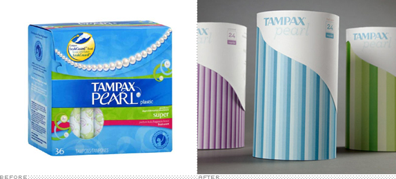
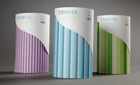
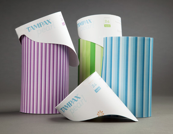
The most popular tampon brand is Tampax Pearl. The surveys showed that there were many issues with the physical packaging concerning its size, sturdiness, and ability to easily travel. A cylindrical shape for the packaging was chosen from the very beginning to act as a more appropriate shape in use (stackable with many other toiletries). Additionally, the shape of the package would help add sturdiness during travel, and the overall size of the packaging was reduced.
Graphically, the surveys showed that there was a general feeling of obnoxiousness to current tampon packaging, especially Tampax Pearl. Bright, almost neon colors and flowers were the main cause, and these same colors also added to confusion in the hierarchy of information such as absorbencies and scents.
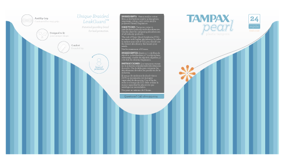
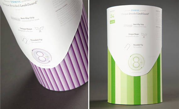
The packaging evolved from a subdued color scheme with black, and a variety of patterns to represent absorbencies. The black was done away with because it was deemed too masculine (ironically, Kotex has recently rebranded and used black). The final design created a much more pearlescent and clean experience. The challenge was to find a balance between clean, while avoiding generic. The Tampax Pearl logotype is the original Tampax logo with “pearl” set in a slightly modified Archer.The slight, curving shape of the lid alludes to a smooth pearl, while also enticing the viewer to pick up the packaging and turn it. The lines act as a secondary indicator for absorbency.
Sketches and Process
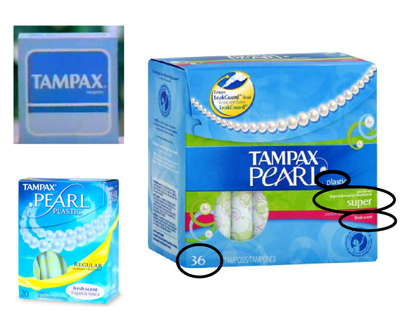
History (top left), current packaging. My absorbency and quantity information is placed in a similar holding shape to the older original Tampax packaging from the top left.
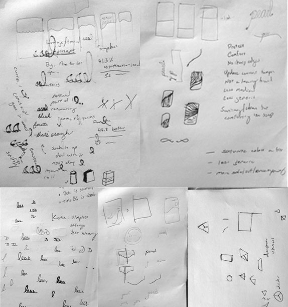
Sketches
On-screen sketches (progress is from top left to bottom right)
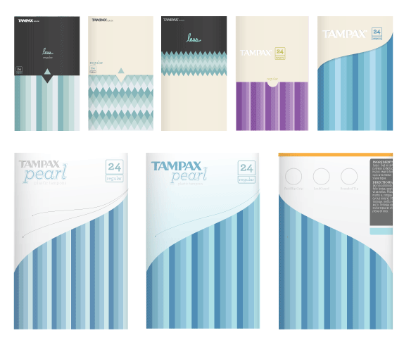
On screen rough (flat view of cylinder).
Solution
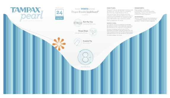
Final layout (flat view of cylinder).


DATE: May.03.2010 POSTED BY: ArminCATEGORY: Consumer Product COMMENTS:


Celebrating the reality that print is not dead by showcasing the most compelling printed projects.

Corraling the most relevant and creative on- and off-line bits that pertain to the design community — and said community is openly invited and encouraged to add their hard-earned links.

Describing, tracking and explaining culture, commerce, politics, media, sports, brands — everything possible, really — through design.

Discussing, and looking for, what is relevant in, and the relevance of, graphic design. [Archives Only]

Encouraging creative diversity in the community through monthly, one-word challenges. [Archives Only]

Designing corporate and brand identities and full development of printed and digital matter for clients and us.