About this Year’s Identity
Very shortly after the 2017 Brand New Conference — in fact, it was on the drive back to Bloomington from Chicago — we decided on the approach for this year's conference. It's based on a cliché but we liked where that cliché took us so we went with it: New York is a “Concrete Jungle”, ergo we are going to use concrete. And this isn't meant as a metaphor, we are literally going to use concrete in the materials. We usually come up with a concept, establish an identity, and then build the materials around it but this time we did it, and are doing it, backwards, where we mostly figured out how we wanted to do the materials and then established an identity around it.
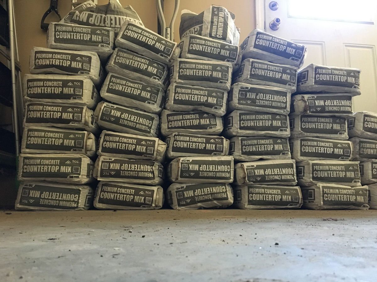
Our current stash of concrete mix.
It's hard to design a logo around the concept of "concrete" but, in keeping things somewhat literal, we then thought about what makes New York a "Concrete Jungle" and, no big reveal here, it's the buildings. Aside from being tall, one cool thing about New York buildings are the inscriptions carved unto them, regardless of whether they are a church, a bank, or a school. One of the great things about these inscriptions is the variety of typefaces and lettering they use.
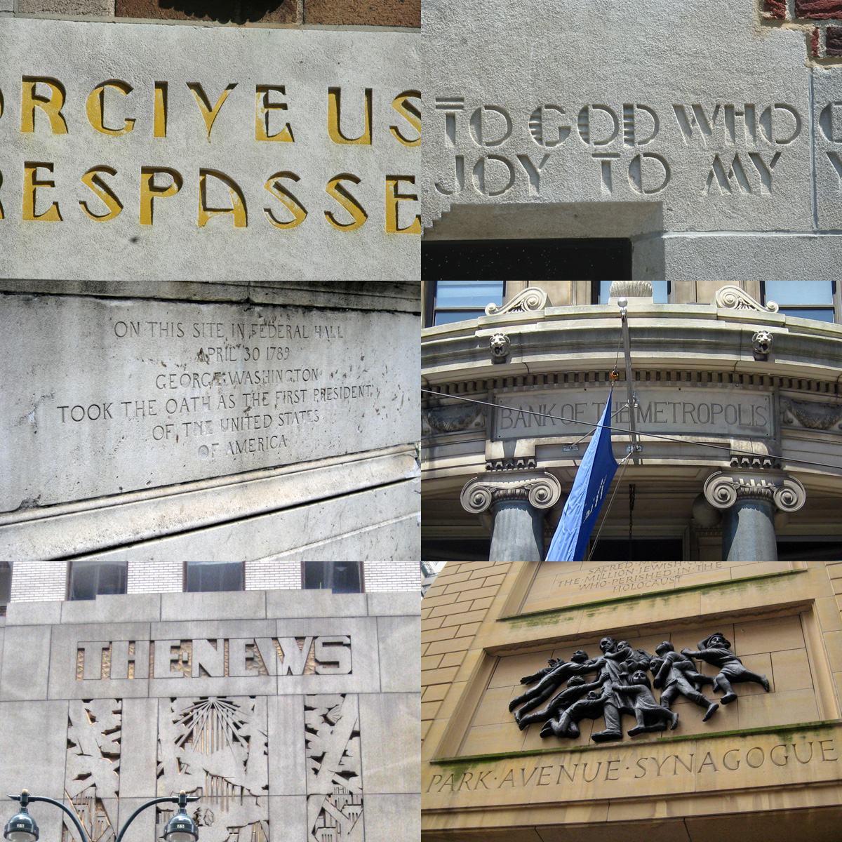
A small sampling of etched inscriptions and signage on New York buildings. Top two photos by Paul Shaw, all others by Wally Gobetz.
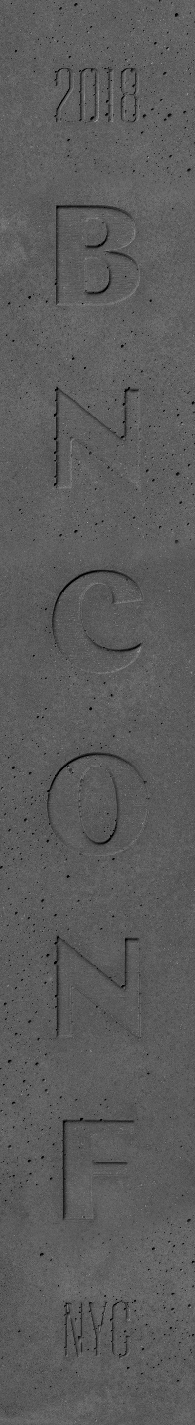
One style that we thought we could expand on is the high-contrast sans serif with its calligraphic/chiseled structure — in part because it’s an interesting style and in part because it’s something we haven’t done before for the conference. As a way to further channel the cacophony that New York can be we decided that instead of choosing just one font or type family we could use a bunch of high-contrast sans serifs. We chose Chap (Black to be specific) from Schick Toikka as the primary font. We added Hoefler & Co.’s Peristyle and Typotheque’s Valter as contrasting complements to Chap. As a major bonus, it turned out that Frere-Jones Type had been working on a contrasting sans serif that only had uppercase glyphs when we first started talking and we really liked its idiosyncratic aesthetic. Given its limited character set we couldn’t quite use it but a few weeks later Tobias Frere-Jones worked out the numerals and lowercase and only a few days ago he sent us a Compressed version (seen on the “REGISTER” buttons) which is superb. We are excited to be doing a Beta run for Bosca (and Bosca Compressed) and we’ll integrate it more into the program. Lastly, we added the least contrast-y high-contrast typeface with the choice of Beausite by Fatype so that we could use it for body copy.
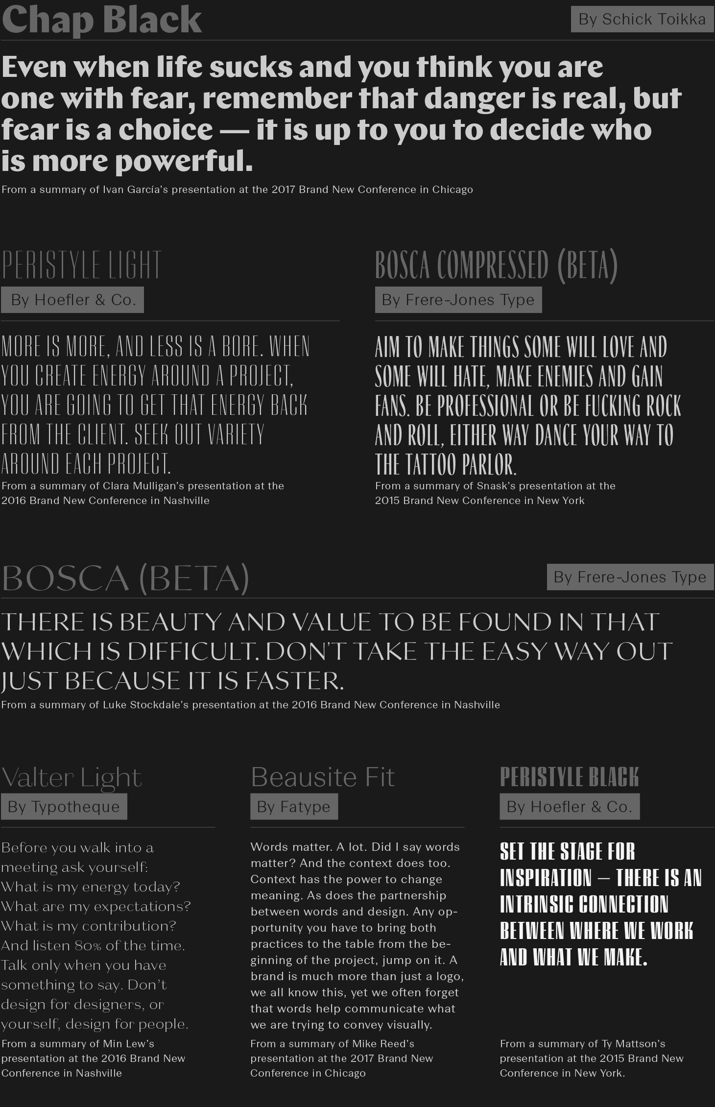
The five high-contrast sans serifs at play.
So far we haven’t established a clear this-is-the-logo other than the two lock-ups below used for some of the materials. More than having a repeatable logo this year, we might rely on the typographic palette to set the tone.
A couple logo lock-ups.
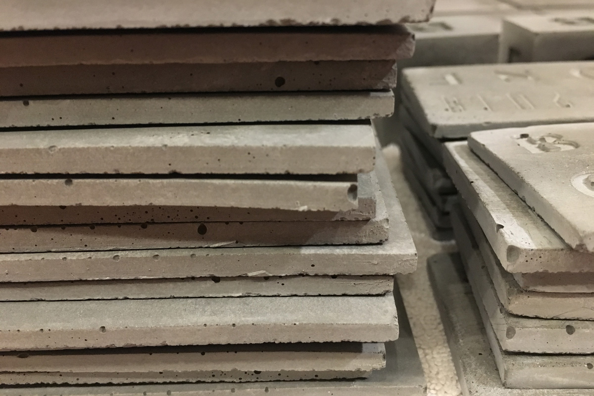
Speaking of tones, as you can see throughout the website everything is in shades of gray because, yes, concrete is gray. It’s the first time we don’t have an accent color so we have to use the typography in different ways to establish hierarchy, which is not the easiest or most efficient and we wouldn’t suggest doing it for a long-term, larger-scale project but for a one-time event for graphic designers, it’s feasible. Speaking of the website, you might have noticed a lot of drop shadows… we are not trying to make the early 2000s happen, no… we were looking to capture the effect below (without being overly literal about it) of blocks of concrete coming together.
Concrete slabs. Photo by Wally Gobetz.
As usual, this is work in progress and more often than not it all comes together at the last minute, although, this year we’ve already been busy day in and day out mixing, pouring, and casting concrete. To what end? That, you will have to attend to find out!