About the Identity
Few city slogans are as memorable and as appropriate or as co-opted and parodied as “Keep Austin Weird”. Attributed to Red Wassenich, an Austin Community College librarian, who uttered the phrase in 2000 when he phoned into KOOP Radio’s The Lounge Show to donate money and when asked by the host why he was donating, his response, “I don't know. It helps keep Austin weird.”, became an instant hit. The slogan was adopted by the Austin Independent Business Alliance to promote local businesses and since then has become Austin’s unofficial motto — to much debate. Many argue that Austin stopped being weird in the 1970s, others that it was in the 1990s, and others, like us who lived there between 2009 and 2017, in the 2010s.
Point being that, even in light of the incomparable economic and cultural growth of Austin in the past three decades, the city has indeed managed to keep that weird, counter-culture spirit alive despite its mainstream appeal, its rising corporate interests, and its high cost of living that has driven out many of the businesses, people, and organizations that made and kept Austin weird. With such a legacy and with it being so ingrained in the essence of what Austin is we could not help ourselves but to get weird with this year’s identity.
Even though we’ve done some crazy stuff over the years — spray painting 1,500 program covers; casting more than a thousand pounds of concrete; or printing on vinyl records — our design style is far, very far, from being weird so we knew we needed help in capturing a genuinely weird aesthetic that took us out of our own comfort zone.
Drawing blanks for many months and not exactly sure how to proceed, our doom-scrolling on Instagram eventually paid off: In one of her Instagram stories, Jacquelyn De Jesu — serendepitously a 2017 Brand New Conference speaker — reposted the work of “GEO”. It was an instant follow but it wasn’t an instant “This is it” moment… sometimes we are slow like that. After seeing more of his work, for clients and for his own amusement, it one day hit us: This is it!
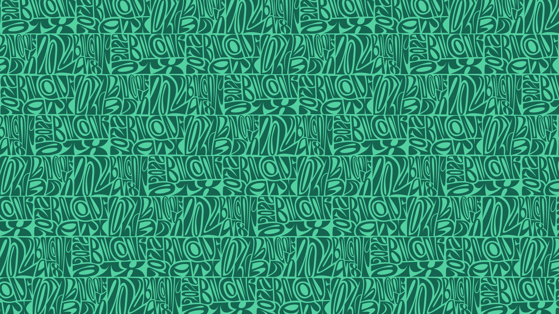
Full name Sultan Jum, GEO is a nomadic designer with a home base in Toronto, ON, traveling the world for the past few months — at least since we have been following him — and specializing in stunning lettering explorations that challenge readability and conventions through exotic modifications of existing typefaces leaving no bezier point unmodified as letters organically animate in his work. Fluid and elegant but undeniably weird, we found the perfect conduit for Austin’s slogan in GEO’s aesthetic and sensibility.
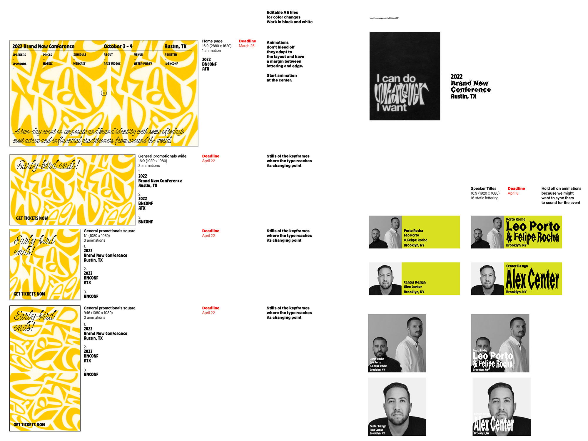
Using some of his existing work as placeholder, we put together some crude art direction to get him started (that, almost by magic, blossomed into what you see on the site today). On the quick mock-ups above we had already defined the typeface choices but it wasn’t because we were perfectly prepared as we didn’t have a selection 48 hours before putting the above together. GEO needed a starting-off typeface from which to get weird from, which was the necessary kick in the pants we needed to make a selection. As the primary typeface we selected Ozik from the newly founded Nuform type foundry by artist and designer Erik Marinovich. Inspired by the cover of Black Sabbath’s 1972 album, Vol. 4, Ozik is a 4-weight display face with rounded counters and clean cut terminals that OH no’s James Edmonson described as “messy and bewildered, but stands as one of the foundries most captivating and influential typefaces in all of its bizarre, damaged brilliance.” We couldn’t have said it better and we chose it for all of its weirdness.
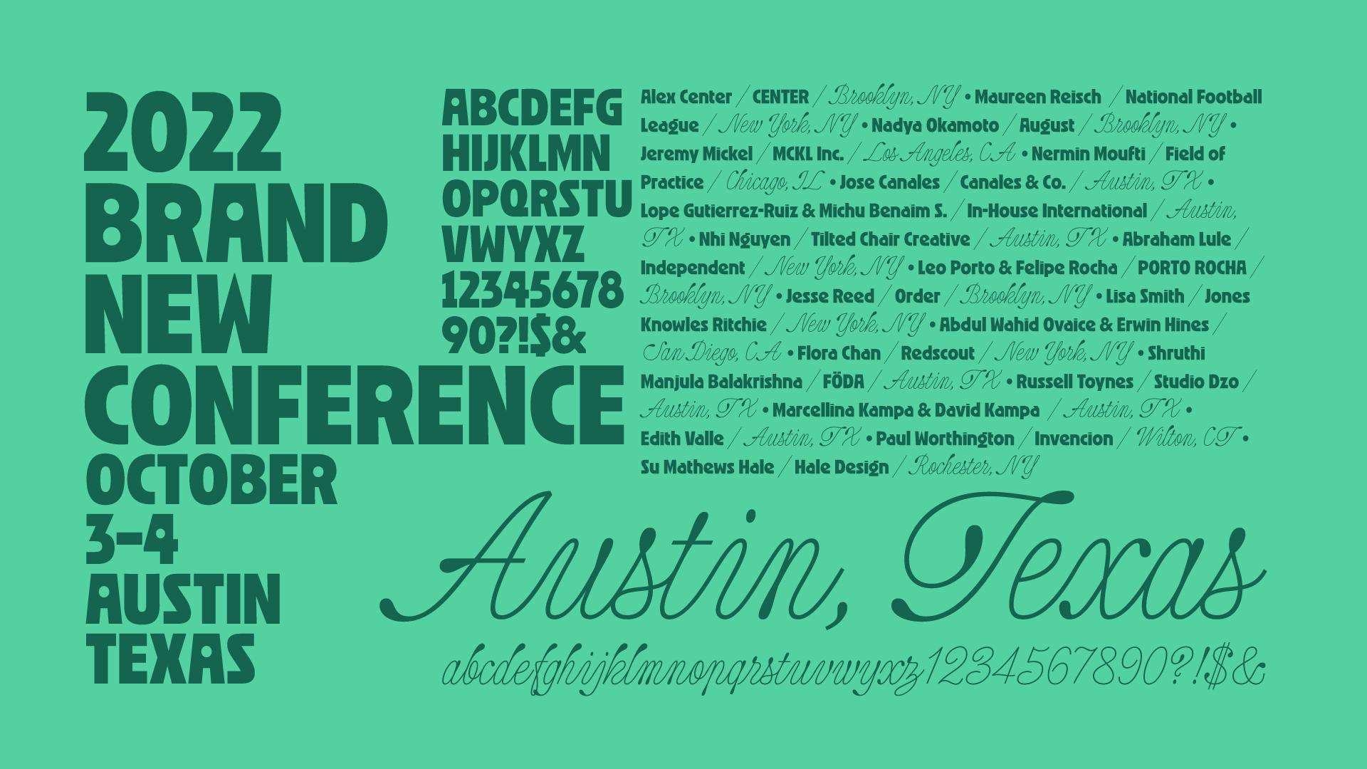
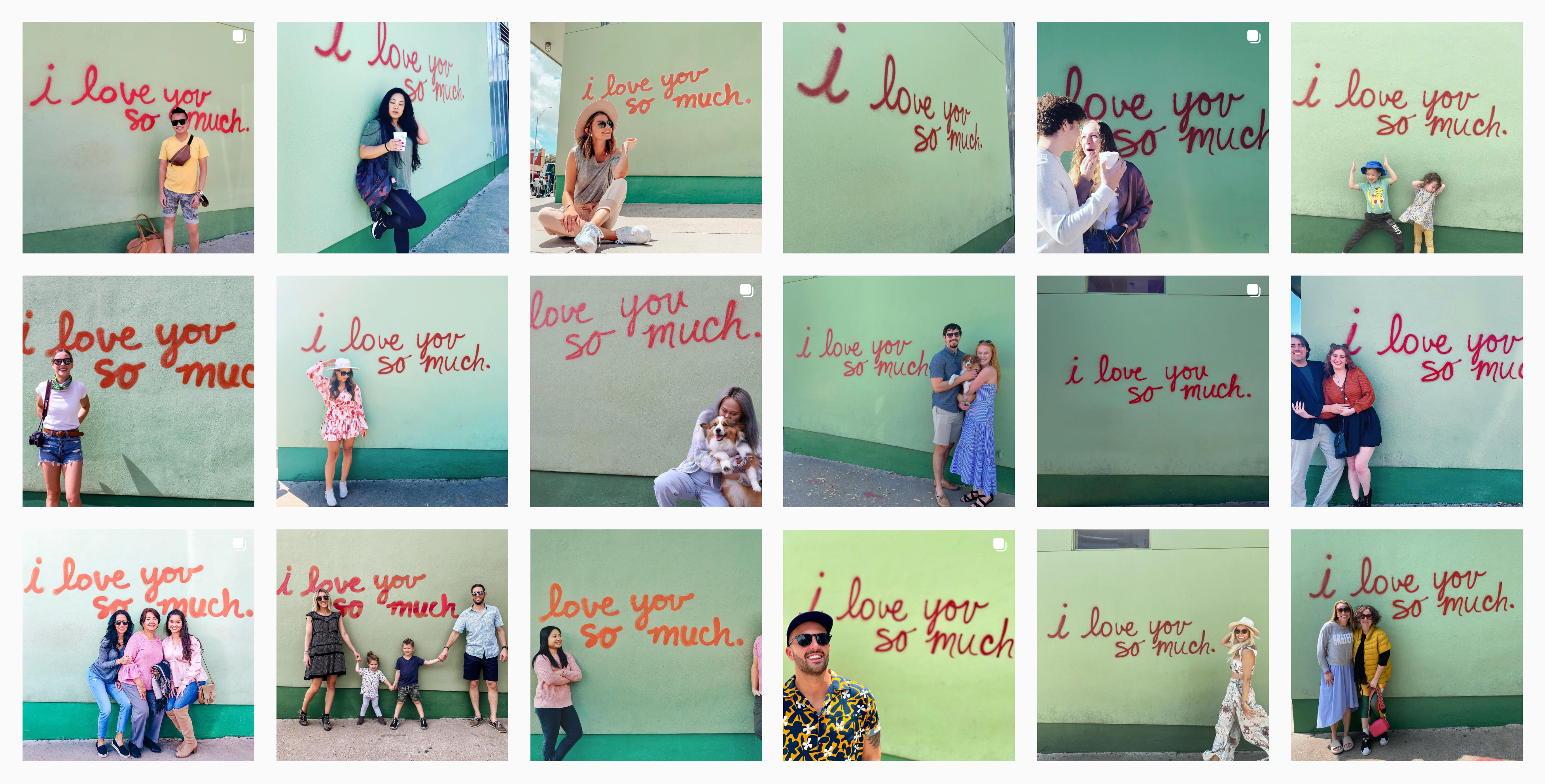
The other primary typeface may seem very unexpected and completely unrelated to Ozik. Both assessments are not wrong but hear us out: One of the things that has kept Austin weird is its vibrant street art, from the original HOPE Outdoor Gallery to the graffiti railroad bridge but there is probably no street art more famous, more visited, and more Instagram’d than the “I love you so much” graffiti on the side of Jo’s Coffee in the South Congress area of Austin, one of the city’s most popular. The graffiti was done in 2010 by musician Amy Cook, the life/romantic partner at the time of Jo’s Coffee owner, Liz Lambert, and is the reason why it has stayed on for so many years, getting redrawn anytime the establishment needs a new coat of paint (or anytime someone vandalizes it). That piece of graffiti lead us down a dark and deep rabbit hole of finding a unique script typeface, which we found in Commercial Type’s Vault, a repository for 17 years of unreleased typefaces from the foundry. Candy Darling is far from a replica of the graffiti but the terminals of its design look like the effect you get when you hold the spray paint can just a little longer at the end to get a little blob of paint.
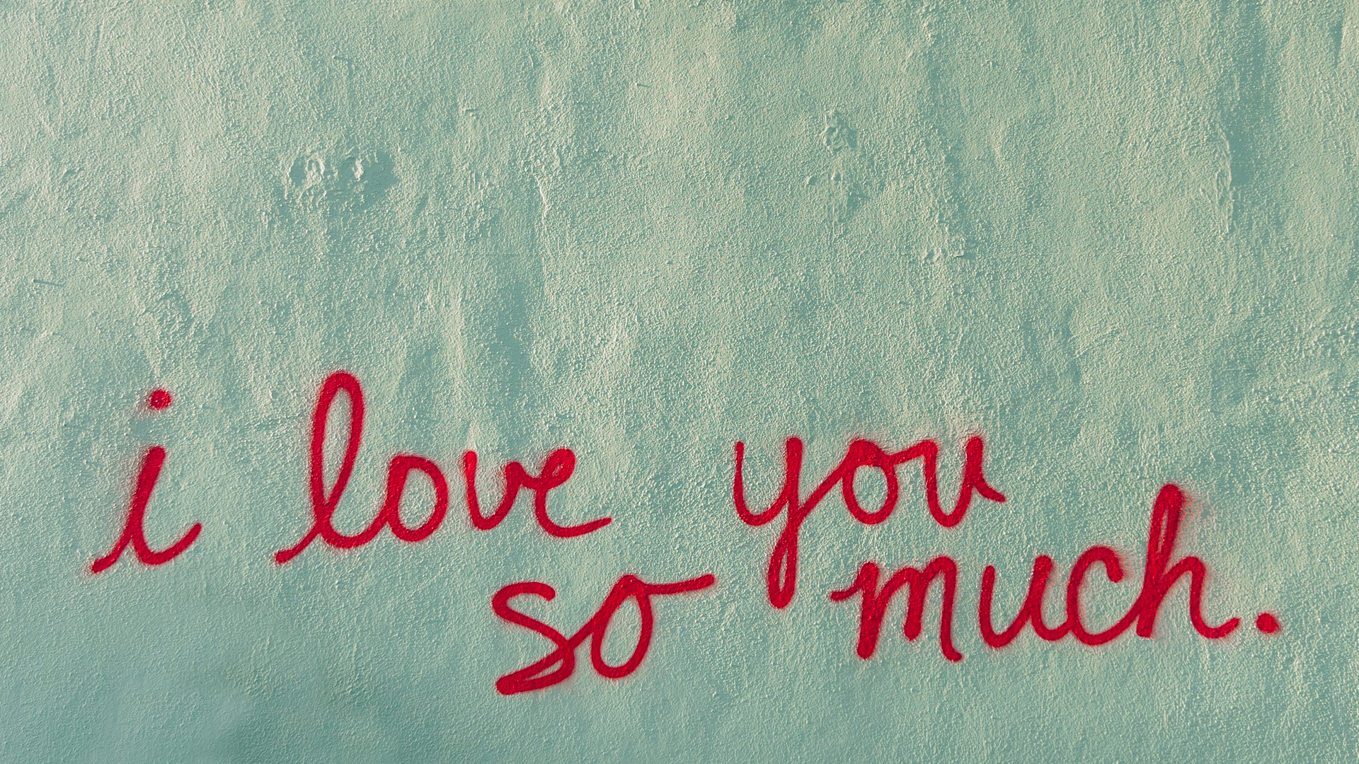
The mural also defined the color palette which we know is a little jarring but, remember, we are keeping things weird this year. It was hard to get an exact PMS read on the green and red and it’s a pair of colors whose hues have changed over the years and that look completely different based on the time of day and the photographer’s camera so we took our best guess and selected a combination that was vibrant but that doesn’t completely destroy your retinas and that doesn’t look like Christmas. The dark green in our color palette comes from the darker green stripe at the bottom of the wall of Jo’s Coffee.
Rounding out the identity are two “normal” typefaces, Shift and Specter, both by Jeremy Mickel, who is one of this year’s speakers. Lastly, we started playing with a pattern made from the different “states” of the animation and as more animations are developed these patterns might get more complex and weird.
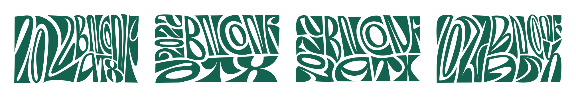
A single graffiti wall is a weird thing to base a whole identity around but we were surprised at how many interesting elements we were able to extract from it and help support the wonderful lettering and animations created by GEO, which you will see more of in social media and during the event. Below are a few of the early assets at play, including the custom first-name animations for each of the speakers. As usual, at this point, we have very little idea of what the conference materials — program, badge, tote bag, etc. — will be like (and as usual we are freaking out a little about it) but you can count on us this year to keep it weird.