ADV @ UNDERCONSIDERATION Peek here for details
BROWSE
Dimensions (Width × Height × Depth)
6.125 in × 9.125 in × .825 in
Page Count
320
Paper Stock
100 Lb. C1S VACUMET Metallized paper
Number of Colors
CMYK
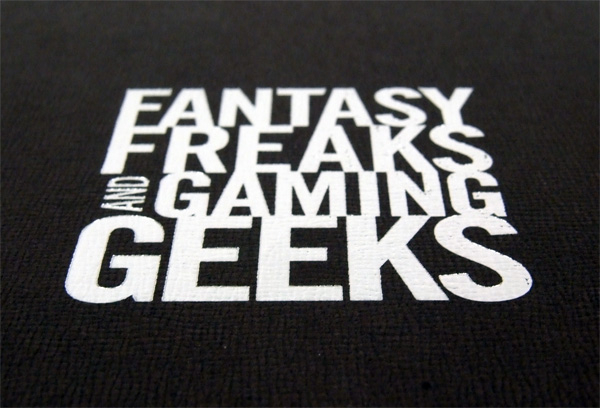
With influences that span the work of John Gall, Paul Sahre and Paula Scher, Bret Kerr set out to evoke the sprit of fantasy and gaming while avoiding clich�s, and providing geeky references for its core audience. The following reveals just a little of the mystery of production for mass market books.
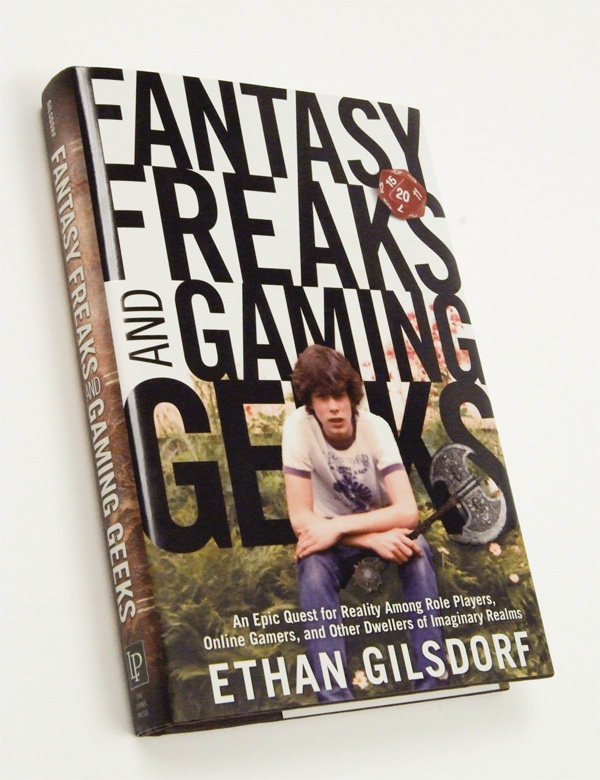
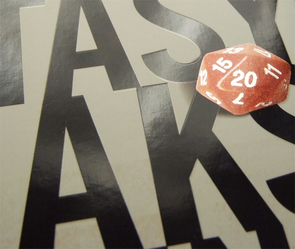
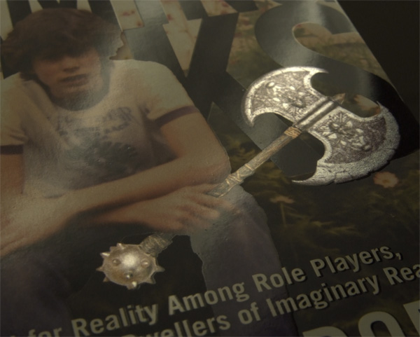
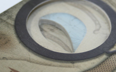
I originally wanted to do an all type cover with one possible small photo inset. So I started the project in Illustrator and focused on the typography. The title is very catchy so I wanted to explore ways of highlighting the words. The cover was originally designed without knowing for sure if the budget would allow printing on metallic paper, so the design had to work either way—the cover shows a vintage photo of the author when he was a teen. The author was a big part in working out details of the cover so that we would not hit any false notes within the gaming community. For example, a week before press time we had to have some 20-sided dies over-nighted so that we could shoot them for the cover. I had an 8-sided die in place, but later found out that any serious gamer would respond more to rolling a “natural 20”.
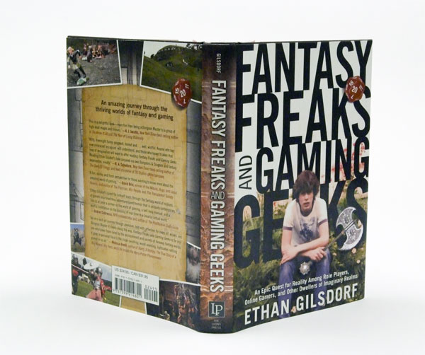
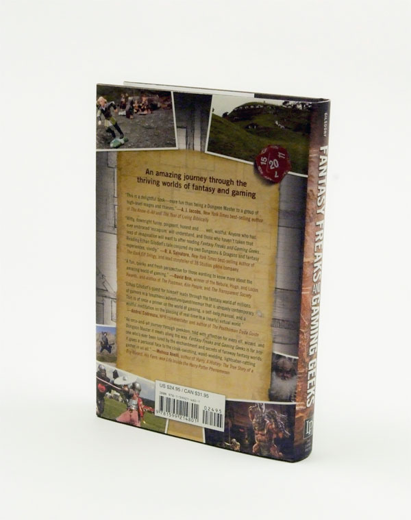
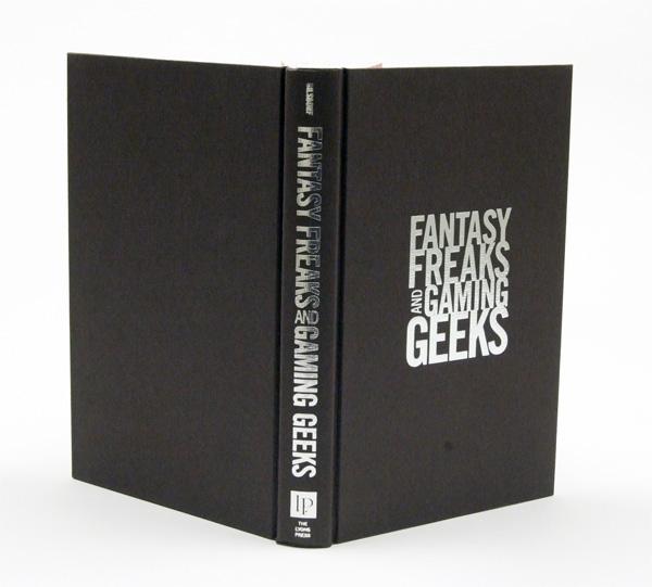
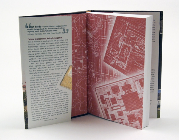
Once printing on metallic paper stock was approved, the printer (who has lots of experience printing on metallic) advised me to create a white plate that would mask out the metallic paper in the right places and at the right percent. I also changed the spine from having metallic text to having white text so that it would pop more on the iridescent leather background. We also were able to foil stamp the title on the cover of the book (under the jacket), something we usually reserve for the spine. Some of the other details had nothing to do with production, but with pure geekery such as picking headband colors of maroon and gold as a nod to Harry Potter fans.

Fantasy Freaks and Gaming Geeks Book
Production Method
Design
Cover: Bret Kerr
Interior: Sheryl Kober
Printing
Lyons Press Manufacturing
Director: Kevin Lynch
Printer: Brady Palmer
This post was published in the original layout of FPO so all images are smaller. Project descriptions as well as production lessons are quoted in the main content area.
Post Author
Bryony

Bryony Gomez-Palacio
Editor of FPO and co-founder of UnderConsideration LLC.
More: Online / On Twitter
Date Published
November 11, 2009
Filed Under
Books
Tagged with
book
CMYK
foil stamp
metallic paper
offset
perfect bound
spot gloss varnish


About
FPO (For Print Only), is a division of UnderConsideration, celebrating the reality that print is not dead by showcasing the most compelling printed projects.
FPO uses Fonts.com to render Siseriff and Avenir Next.
FPO is run with Six Apart’s MovableType
All comments, ideas and thoughts on FPO are property of their authors; reproduction without the author’s or FPO’s permission is strictly prohibited
Twitter @ucllc
Sign-up for Mailing List
Mailing list managed by MailChimp
Thanks to our advertisers
About UnderConsideration
UnderConsideration is a graphic design firm generating its own projects, initiatives, and content while taking on limited client work. Run by Bryony Gomez-Palacio and Armin Vit in Bloomington, IN. More…
blogs we publish
Brand New / Displaying opinions and focusing solely on corporate and brand identity work.
Art of the Menu / Cataloguing the underrated creativity of menus from around the world.
Quipsologies / Chronicling the most curious, creative, and notable projects, stories, and events of the graphic design industry on a daily basis.
products we sell
Flaunt: Designing effective, compelling and memorable portfolios of creative work.
Brand New Conference videos / Individual, downloadable videos of every presentation since 2010.
Prints / A variety of posters, the majority from our AIforGA series.
Other / Various one-off products.
events we organize
Brand New Conference / A two-day event on corporate and brand identity with some of today's most active and influential practitioners from around the world.
Brand Nieuwe Conference / Ditto but in Amsterdam.
Austin Initiative for Graphic Awesomeness / A speaker series in Austin, TX, featuring some of the graphic design industry's most awesome people.
also
Favorite Things we've Made / In our capacity as graphic designers.
Projects we've Concluded / Long- and short-lived efforts.
UCllc News / Updates on what's going at the corporate level of UnderConsideration.

Related entries
Severe(d): A Creepy Poetry Collection by Holly Riordan
BOYCO Classpack® Book
Antes de Perder la Esperanza Book
Gunnel Wåhlstrand Exhibit Book
Szép versek & Körkép Book Covers