ADV @ UNDERCONSIDERATION Peek here for details
BROWSE
Client
Ryan and Jeshurun
Quantity Produced
100
Production Cost
$500
Production Time
1 month
Dimensions (Width × Height × Depth)
Invitations: 6 in × 9 in
Page Count
–
Paper Stock
Letra
Number of Colors
2 Spot
Varnishes
–
Binding
–
Typography
Sabon (Jan Tschichold)
Trade Gothic (Jackson Burke)
Arnhem (Fred Smeijers)
Ryan and Jeshurun developed their wedding materials with a series of elements that spoke to their history together, as well as what life had in store for each one of them at that moment. They met in a coffee shop, he manages a coffee shop, she was about to graduate from school and had access to a press…
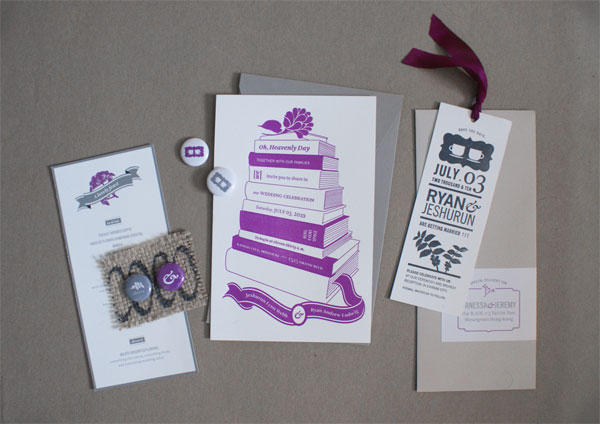
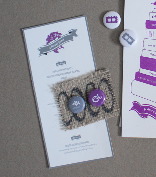
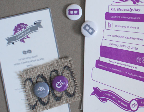
Of course, as a graphic designer, there is some pressure to make your wedding invites a slice of design perfection. And on top of that, I was finishing my Master’s thesis in graphic design at RISD at the same time I was planning the wedding. Whew! Surprisingly, the invitations came together organically and without much stress. My husband Ryan manages a coffee shop, and we met in a coffee shop, so it seemed natural to incorporate that element as a design detail. Coffee plants are actually quite beautiful. I also recycled burlap coffee bags from his work by cutting them into small rectangles and attaching some home-made buttons of my own design to be used at the place settings.
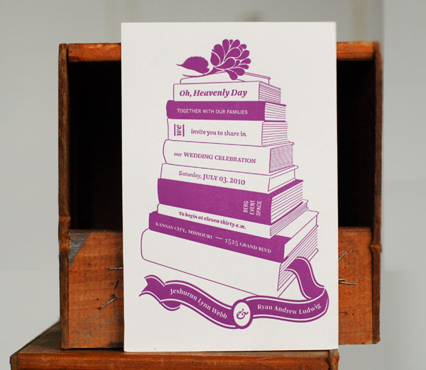
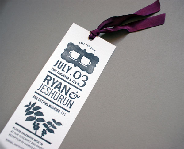
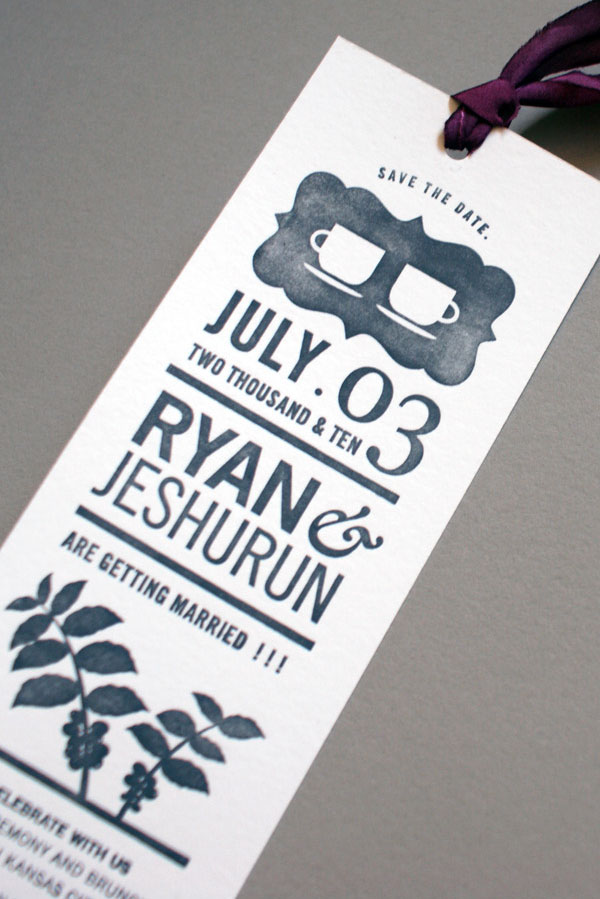
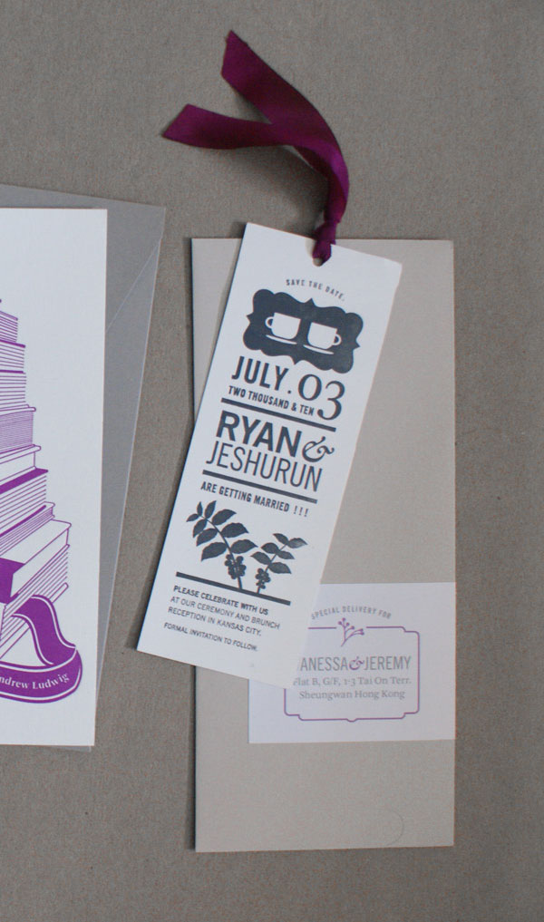
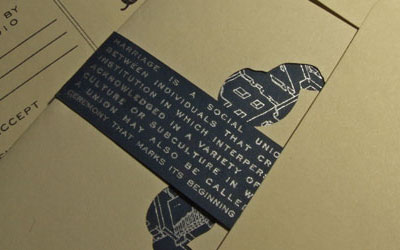
I letterpressed my Save the Date’s at RISD and attached gorgeous hand-dyed silk ribbon (from Hanah Silk Ribbon) to create the bookmarks. To continue the book theme, I stacked books I had at home into the shape of a wedding cake and then photographed them and traced them loosely in Illustrator to create the invitations. My friend Elana at Spoon&Sailor Letterpress handled the printing of the invites since I wanted a perfect color-match and some additional letterpress expertise.
A rubber stamp and scalloped note cards from Paper Source made the RSVP’s a breeze. The menu was simply ink-jet printed on my Canon at home.
Shades of gray were the main color scheme, while shots of fuschia tied it all together.
As in most projects, there is a lesson to be kept (sometimes small and cheap, sometimes big and expensive):
I learned it is best to go to the letterpress experts, but I’m glad I fumbled my way through printing the save the dates myself. I like the salty look of how they came out. And cheap ribbon will not do, having the hand-dyed silk ribbon made all the difference.

Ryan and Jeshurun Wedding Invitation
Production Method
Design
Jeshurun Webb
Printing
Invitation: Spoon&Sailor Letterpress
Other materials: Jeshurun Webb
This post was published in the original layout of FPO so all images are smaller. Project descriptions as well as production lessons are quoted in the main content area.
Post Author
Bryony

Bryony Gomez-Palacio
Editor of FPO and co-founder of UnderConsideration LLC.
More: Online / On Twitter
Date Published
October 15, 2010
Filed Under
Wedding materials
Tagged with
buttons
DIY
letra
letterpress
PMS
ribbon
wedding invitation
wedding materials


About
FPO (For Print Only), is a division of UnderConsideration, celebrating the reality that print is not dead by showcasing the most compelling printed projects.
FPO uses Fonts.com to render Siseriff and Avenir Next.
FPO is run with Six Apart’s MovableType
All comments, ideas and thoughts on FPO are property of their authors; reproduction without the author’s or FPO’s permission is strictly prohibited
Twitter @ucllc
Sign-up for Mailing List
Mailing list managed by MailChimp
Thanks to our advertisers
About UnderConsideration
UnderConsideration is a graphic design firm generating its own projects, initiatives, and content while taking on limited client work. Run by Bryony Gomez-Palacio and Armin Vit in Bloomington, IN. More…
blogs we publish
Brand New / Displaying opinions and focusing solely on corporate and brand identity work.
Art of the Menu / Cataloguing the underrated creativity of menus from around the world.
Quipsologies / Chronicling the most curious, creative, and notable projects, stories, and events of the graphic design industry on a daily basis.
products we sell
Flaunt: Designing effective, compelling and memorable portfolios of creative work.
Brand New Conference videos / Individual, downloadable videos of every presentation since 2010.
Prints / A variety of posters, the majority from our AIforGA series.
Other / Various one-off products.
events we organize
Brand New Conference / A two-day event on corporate and brand identity with some of today's most active and influential practitioners from around the world.
Brand Nieuwe Conference / Ditto but in Amsterdam.
Austin Initiative for Graphic Awesomeness / A speaker series in Austin, TX, featuring some of the graphic design industry's most awesome people.
also
Favorite Things we've Made / In our capacity as graphic designers.
Projects we've Concluded / Long- and short-lived efforts.
UCllc News / Updates on what's going at the corporate level of UnderConsideration.

Related entries
Herbst & Spungen Wedding Invitation Suite
Erin and Brian Wedding Invitation
Daniela & Rui Wedding Invitation
Benjamin & Catalina Wedding Announcement
Devon & Mike Wedding Invitation