ADV @ UNDERCONSIDERATION Peek here for details
BROWSE
Client
Self-Promotion
Quantity Produced
5
Production Cost
$152
Production Time
3 days
Dimensions (Width × Height × Depth)
841 mm × 594 mm (33.1 in × 23.4 in)
Page Count
–
Paper Stock
180gsm, uncoated
Number of Colors
–
Varnishes
–
Binding
–
Typography
DIN 1451 Std (Engschrift)
Geneva
The things we place value on; the things we hold most beautiful, are of our own accord. This project reminds people to step back and consider every object or mark as an opportunity to create something new or improve upon the existing.
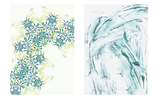
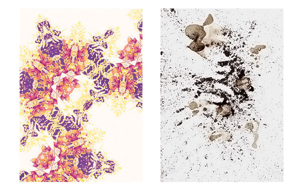
This poster series was part of a wider research project exploring the value of decoration. The designs were created using everyday objects, residues and ephemera. Each A1 print is double-sided, with the original objects printed on the reverse of the decorative design that was created from them.
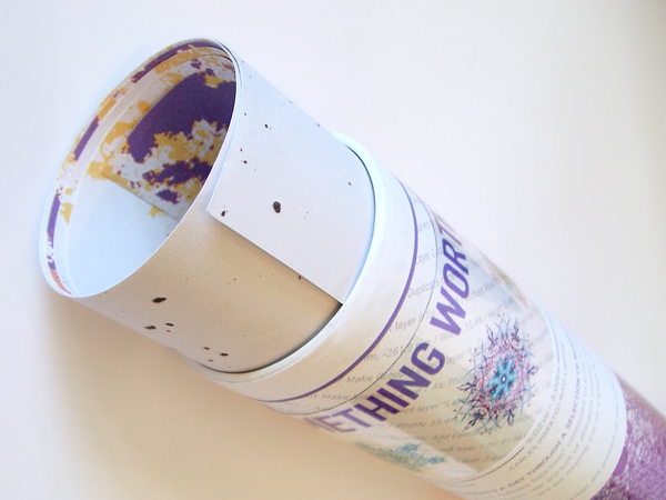
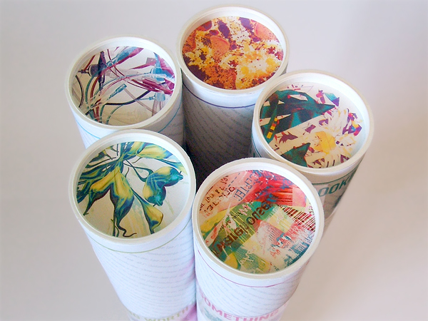
Each poster comes packaged in a cardboard tube, with a close-up “snapshot” of each side of the poster printed on the lids of the two ends of each tube.
No front, back, top or bottom has been labelled - providing people with the choice of which side of the poster they choose to display; a subtle invitation for them to proclaim their allegiance toward superfluous decoration, or pure unadulterated reality.
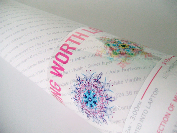
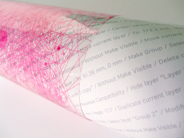
Instructions for creating the decorative piece inside are also printed as a continuous string of text around each tube. Complex and seemingly endless, they highlight the detail and unpredictability of this style of design.
A flyer printed on transparency film is wrapped around each tube, showing the other designs in the series, and also a documentation of the mouse movements used in the creation of the design inside.
Printing such a small quantity of large, double-sided posters proved to be a challenge. Few printers were able to do double-sided prints of this size unless they were offset or in bulk runs.
The posters were digitally printed on an inkjet, with one side left to dry then manually fed back through to print the other side. There needed to be a larger than usual bleed in order to account for human error.
Printing onto the poster tubes was another challenge. The text was printed in long strips which were then glued to the tubes in a spiral format. The spiral format ensured the join lines ran along parallel to the diagonal text, rather than straight down the tube, interrupting the text.
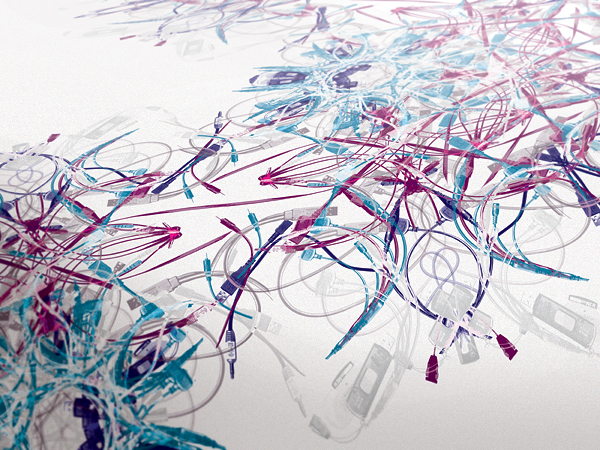

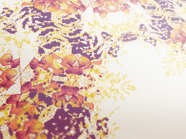
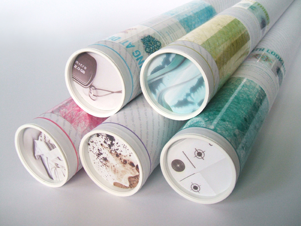
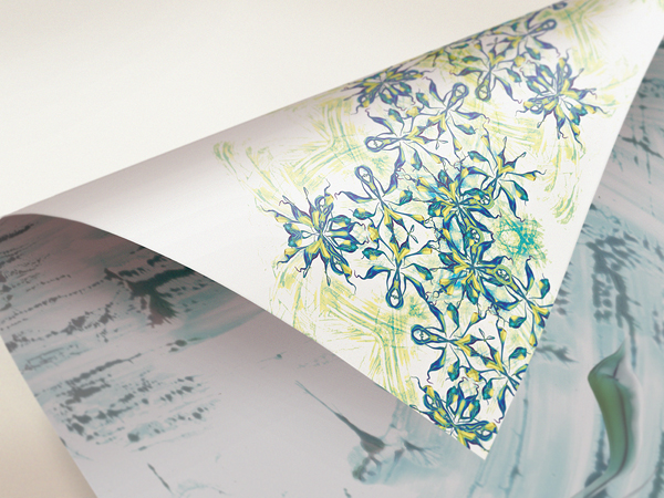
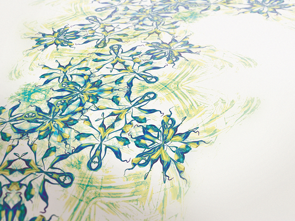
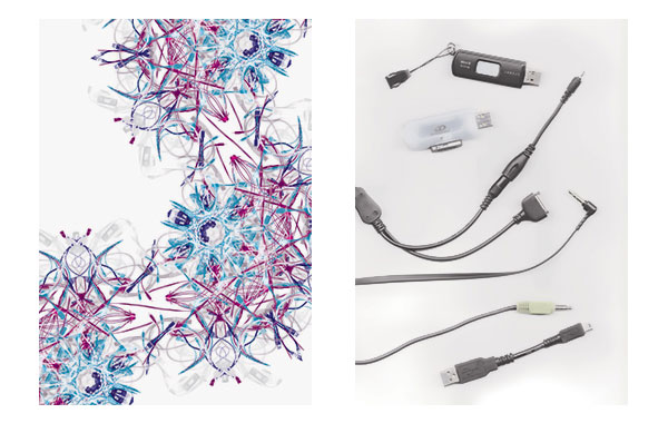
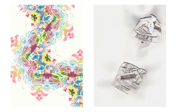
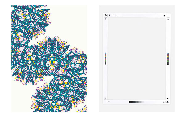
Below is the flat artwork for each poster, the left image showing the original object: Cables, shopping receipts, print offcuts, toothpaste, and coffee residue.
This post was published in the original layout of FPO so all images are smaller. Project descriptions as well as production lessons are quoted in the main content area.


About
FPO (For Print Only), is a division of UnderConsideration, celebrating the reality that print is not dead by showcasing the most compelling printed projects.
FPO uses Fonts.com to render Siseriff and Avenir Next.
FPO is run with Six Apart’s MovableType
All comments, ideas and thoughts on FPO are property of their authors; reproduction without the author’s or FPO’s permission is strictly prohibited
Twitter @ucllc
Sign-up for Mailing List
Mailing list managed by MailChimp
Thanks to our advertisers
About UnderConsideration
UnderConsideration is a graphic design firm generating its own projects, initiatives, and content while taking on limited client work. Run by Bryony Gomez-Palacio and Armin Vit in Bloomington, IN. More…
blogs we publish
Brand New / Displaying opinions and focusing solely on corporate and brand identity work.
Art of the Menu / Cataloguing the underrated creativity of menus from around the world.
Quipsologies / Chronicling the most curious, creative, and notable projects, stories, and events of the graphic design industry on a daily basis.
products we sell
Flaunt: Designing effective, compelling and memorable portfolios of creative work.
Brand New Conference videos / Individual, downloadable videos of every presentation since 2010.
Prints / A variety of posters, the majority from our AIforGA series.
Other / Various one-off products.
events we organize
Brand New Conference / A two-day event on corporate and brand identity with some of today's most active and influential practitioners from around the world.
Brand Nieuwe Conference / Ditto but in Amsterdam.
Austin Initiative for Graphic Awesomeness / A speaker series in Austin, TX, featuring some of the graphic design industry's most awesome people.
also
Favorite Things we've Made / In our capacity as graphic designers.
Projects we've Concluded / Long- and short-lived efforts.
UCllc News / Updates on what's going at the corporate level of UnderConsideration.

Related entries
36 Days of Type Poster
Ministry of Environment in Colombia Poster
National Parks Map
eBoy Poster
“Love Your Mother” Print