ADV @ UNDERCONSIDERATION Peek here for details
BROWSE
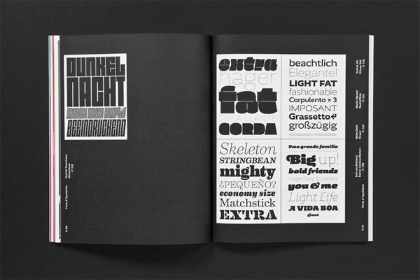
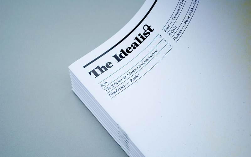
Exploring the differences between the concepts of bold and light, Slanted shows us that light is bold and it’s bold to be light. Containing type essays set in beautiful type, no designer can resist stepping into this magazine’s light.
Client
Slanted
Quantity Produced
10,000
Production Cost
–
Production Time
4 weeks
Dimensions (Width × Height × Depth)
210 mm × 270 mm (8.3 in × 10.6 in)
Page Count
148
Paper Stock
Mixed coated and uncoated, 250 g/qm, 130 g/qm, 70 g/qm
Number of Colors
Interior: CMYK, 1 HKS color
Varnishes
–
Binding
Adhesive
Typography
Akko, Ambroise Std Francois, Klimax Std, Monopol, Tanger, Theinhardt

Project Description
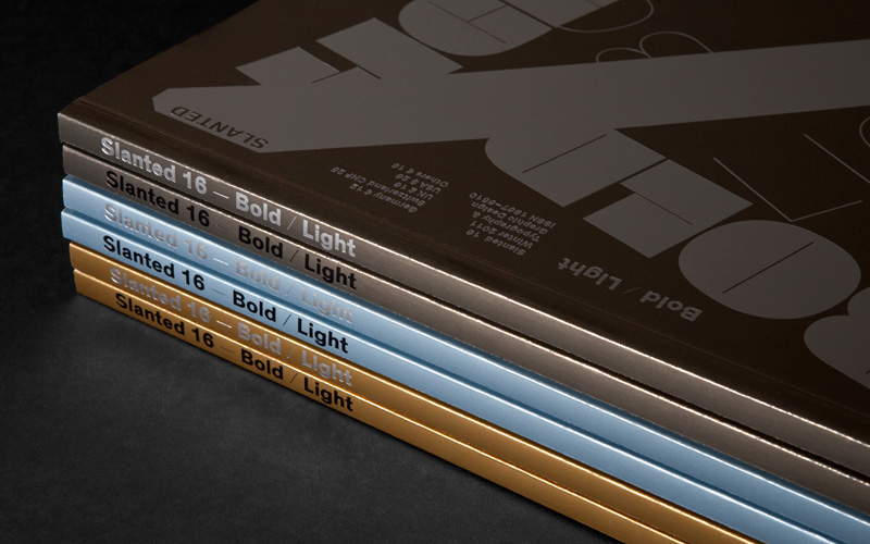
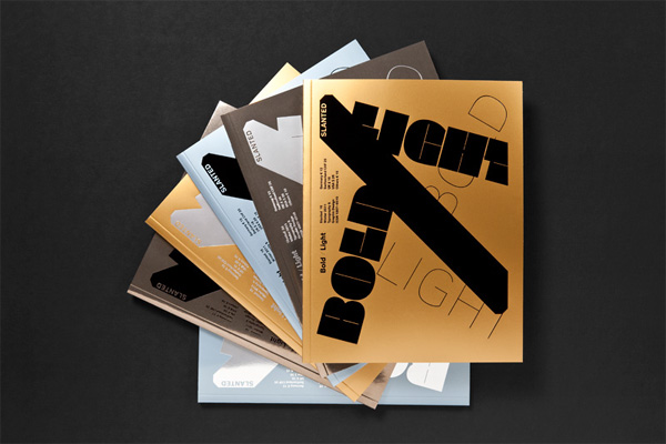
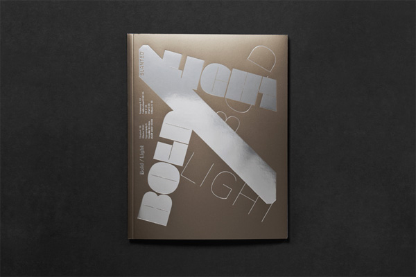
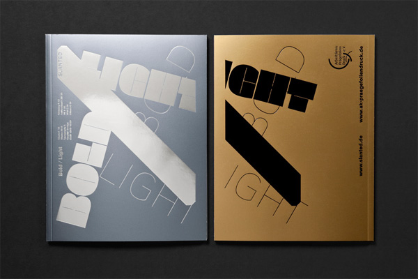
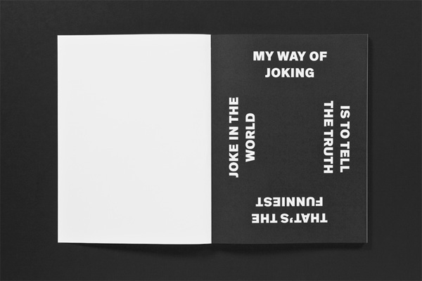
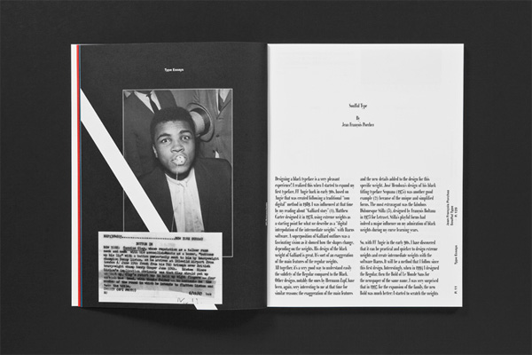
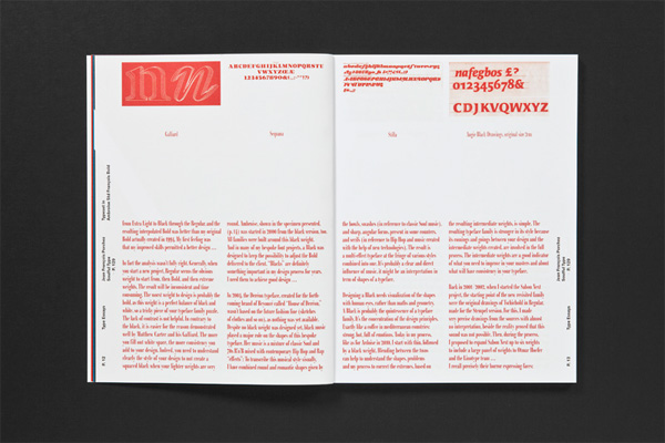
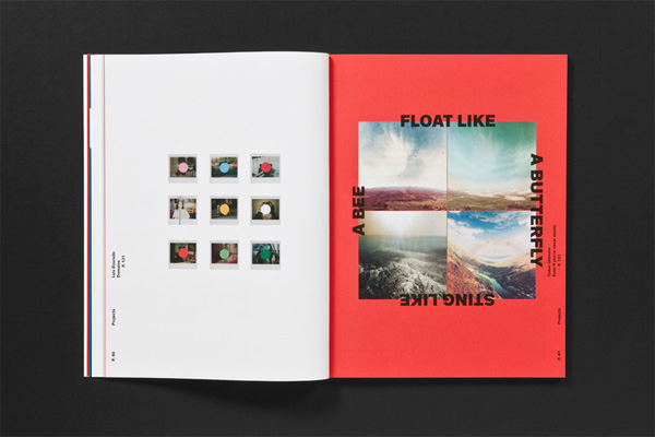
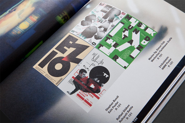
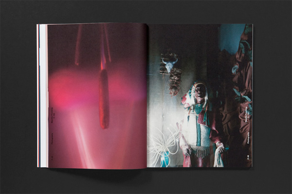
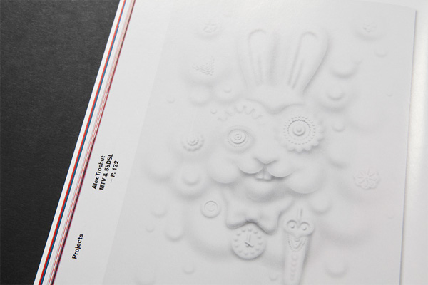
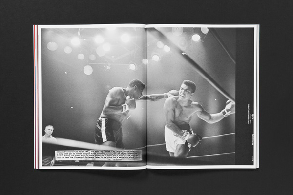
The new issue deals with the loud and the silent, the eye-catching and the inconspicuous. BOLD is the opposite of despondent. In typography it is a popular method of accentuation. LIGHT is the opposite of noisy and bigmouthed. For this theme of contrasts we initially had more loud and bold fonts, works and pictures in mind than quiet, restrained ones. We are impressed of a time – striking and epic in its occurrences – which rushes past and carries us off. The soft overtones only get little attention at this rapid speed.So, how can we pause, set the LIGHT against the BOLD? The fluid, cinematic moment of presentation has an exceptional meaning for us also in this issue. We are bothered about a linear concept of narration. The rhythmic comparison encourages to stay and immerse. Creative decisions and the use of typography for this compilation were stretched far to specific borders, to underline the topic and to work out the character of the two extremes. This precipitates also in the production: By the use of different, metallic Chromolux papers and a two-colored finishing, issue #16 appears with six different covers. Furthermore a haptic surprise awaits the reader in the inner part.
Post Author

Jessica Mullen
Writer for UnderConsideration LLC.
More: Online / On Twitter
Date Published
March 27, 2012
Filed Under
Magazines
Offset
V1 to V2
Tagged with
CMYK
magazine
offset
typography


About
FPO (For Print Only), is a division of UnderConsideration, celebrating the reality that print is not dead by showcasing the most compelling printed projects.
FPO uses Fonts.com to render Siseriff and Avenir Next.
FPO is run with Six Apart’s MovableType
All comments, ideas and thoughts on FPO are property of their authors; reproduction without the author’s or FPO’s permission is strictly prohibited
Twitter @ucllc
Sign-up for Mailing List
Mailing list managed by MailChimp
Thanks to our advertisers
About UnderConsideration
UnderConsideration is a graphic design firm generating its own projects, initiatives, and content while taking on limited client work. Run by Bryony Gomez-Palacio and Armin Vit in Bloomington, IN. More…
blogs we publish
Brand New / Displaying opinions and focusing solely on corporate and brand identity work.
Art of the Menu / Cataloguing the underrated creativity of menus from around the world.
Quipsologies / Chronicling the most curious, creative, and notable projects, stories, and events of the graphic design industry on a daily basis.
products we sell
Flaunt: Designing effective, compelling and memorable portfolios of creative work.
Brand New Conference videos / Individual, downloadable videos of every presentation since 2010.
Prints / A variety of posters, the majority from our AIforGA series.
Other / Various one-off products.
events we organize
Brand New Conference / A two-day event on corporate and brand identity with some of today's most active and influential practitioners from around the world.
Brand Nieuwe Conference / Ditto but in Amsterdam.
Austin Initiative for Graphic Awesomeness / A speaker series in Austin, TX, featuring some of the graphic design industry's most awesome people.
also
Favorite Things we've Made / In our capacity as graphic designers.
Projects we've Concluded / Long- and short-lived efforts.
UCllc News / Updates on what's going at the corporate level of UnderConsideration.

Related entries
“Poetics of Harmony” Experimental Publication
Big Scary Monsters CD/DVD Package
Portland General Store Brochure
Papergirl Wrapping Products
The University of Houston Graphics Alumni Partnership Poster Series