ADV @ UNDERCONSIDERATION Peek here for details
BROWSE
Work Smarter Poster Series
Production Method
Letterpress
Silkscreen
Design
Orange Element
Printing
Baltimore Print Studios
Client
Self-Promotion
Quantity Produced
300 (50 of each poster)
Production Cost
$1,200
Production Time
2 Weeks
Dimensions (Width × Height × Depth)
12 in × 18 in
Page Count
–
Paper Stock
French Paper, Muscletone Whip Cream, 140 lb Cover
Number of Colors
2 spot per poster (7 spot total in series)
Varnishes
–
Binding
–
Typography
Helvetica Neue
Ziggurat
assorted wood type from Baltimore Print Studios
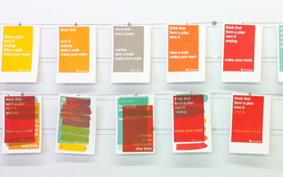
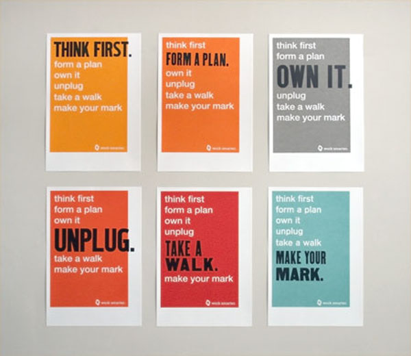
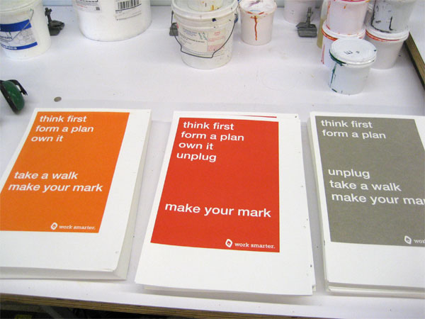
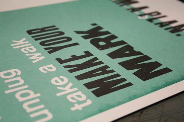
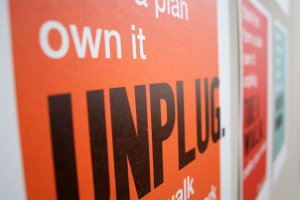
First imagined as a direct mail piece, then a custom sketchbook, and finally the set of six solution-oriented posters seen below, Orange Element’s dynamic illustration of their 2011 mantra, “Work Smarter,” takes its own advice.
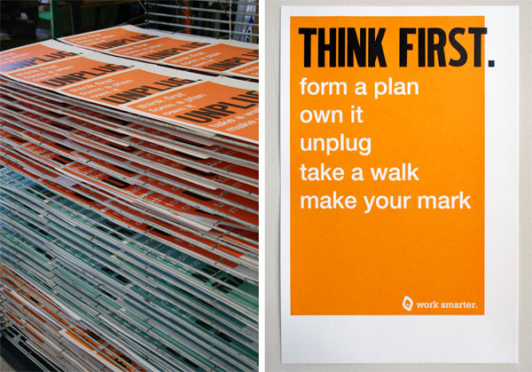
We set out to create a series that would illustrate our 2011 mantra, “Work Smarter,” in a dynamic yet simple way. The goal was to inspire ourselves and our clients and friends to think and work differently. The process began this past summer, when we would gather in our kitchen during lunch and discuss methods of working smarter. Food always helps, right? Initially, we created a direct mail piece incorporating the same set of statements you see today on the posters; only first they appeared on a set of custom screen printed notebooks. We liked the outcome of the notebooks so much we decided to take it a few steps further. We designed and produced a series of six letterpress and screen printed posters containing the same set of statements and actions that have helped us with our creative process and how we function as designers and a team.
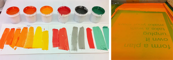
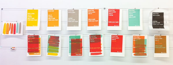
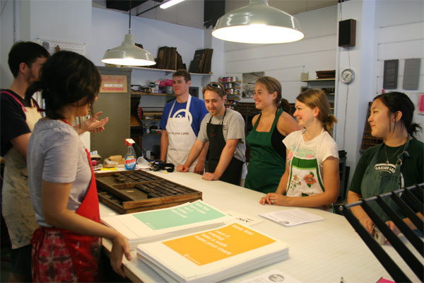
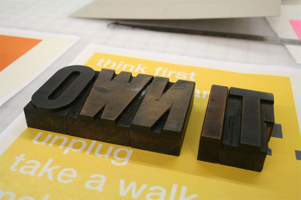
Initially, we were going to use polymer plates for the background shell and overprint with wooden type for the callouts on each poster. This proved to be costly and our clever friends at Baltimore Print Studios suggested screen printing each background and then letterpressing only the callout text per poster. We designed the backgrounds for the screen print portion digitally and then went in and physically measured BPS’s wooden print collection to see what letters would fit best. After finessing on the computer, we sent over files for the backgrounds to be printed, selected the colors and then came in to see what a wonderful job BPS did. With all the backgrounds of the posters printed and ready to go, we were able to handset the wooden type and print each callout text per poster. The alignment of text proved to be tricky at times but with patience and the helpful hands of BPS, we were able to complete the multi-media piece and we could not be happier with the outcome!

Post Author

Kelly Cree
Writer for UnderConsideration LLC.
More: Online / On Twitter
Date Published
March 8, 2012
Filed Under
Letterpress
Posters
Silkscreen
Tagged with
letterpress
screenprint
series
wood type


About
FPO (For Print Only), is a division of UnderConsideration, celebrating the reality that print is not dead by showcasing the most compelling printed projects.
FPO uses Fonts.com to render Siseriff and Avenir Next.
FPO is run with Six Apart’s MovableType
All comments, ideas and thoughts on FPO are property of their authors; reproduction without the author’s or FPO’s permission is strictly prohibited
Twitter @ucllc
Sign-up for Mailing List
Mailing list managed by MailChimp
Thanks to our advertisers
About UnderConsideration
UnderConsideration is a graphic design firm generating its own projects, initiatives, and content while taking on limited client work. Run by Bryony Gomez-Palacio and Armin Vit in Bloomington, IN. More…
blogs we publish
Brand New / Displaying opinions and focusing solely on corporate and brand identity work.
Art of the Menu / Cataloguing the underrated creativity of menus from around the world.
Quipsologies / Chronicling the most curious, creative, and notable projects, stories, and events of the graphic design industry on a daily basis.
products we sell
Flaunt: Designing effective, compelling and memorable portfolios of creative work.
Brand New Conference videos / Individual, downloadable videos of every presentation since 2010.
Prints / A variety of posters, the majority from our AIforGA series.
Other / Various one-off products.
events we organize
Brand New Conference / A two-day event on corporate and brand identity with some of today's most active and influential practitioners from around the world.
Brand Nieuwe Conference / Ditto but in Amsterdam.
Austin Initiative for Graphic Awesomeness / A speaker series in Austin, TX, featuring some of the graphic design industry's most awesome people.
also
Favorite Things we've Made / In our capacity as graphic designers.
Projects we've Concluded / Long- and short-lived efforts.
UCllc News / Updates on what's going at the corporate level of UnderConsideration.

Related entries
36 Days of Type Poster
Ministry of Environment in Colombia Poster
National Parks Map
eBoy Poster
“Love Your Mother” Print