ADV @ UNDERCONSIDERATION Peek here for details
BROWSE
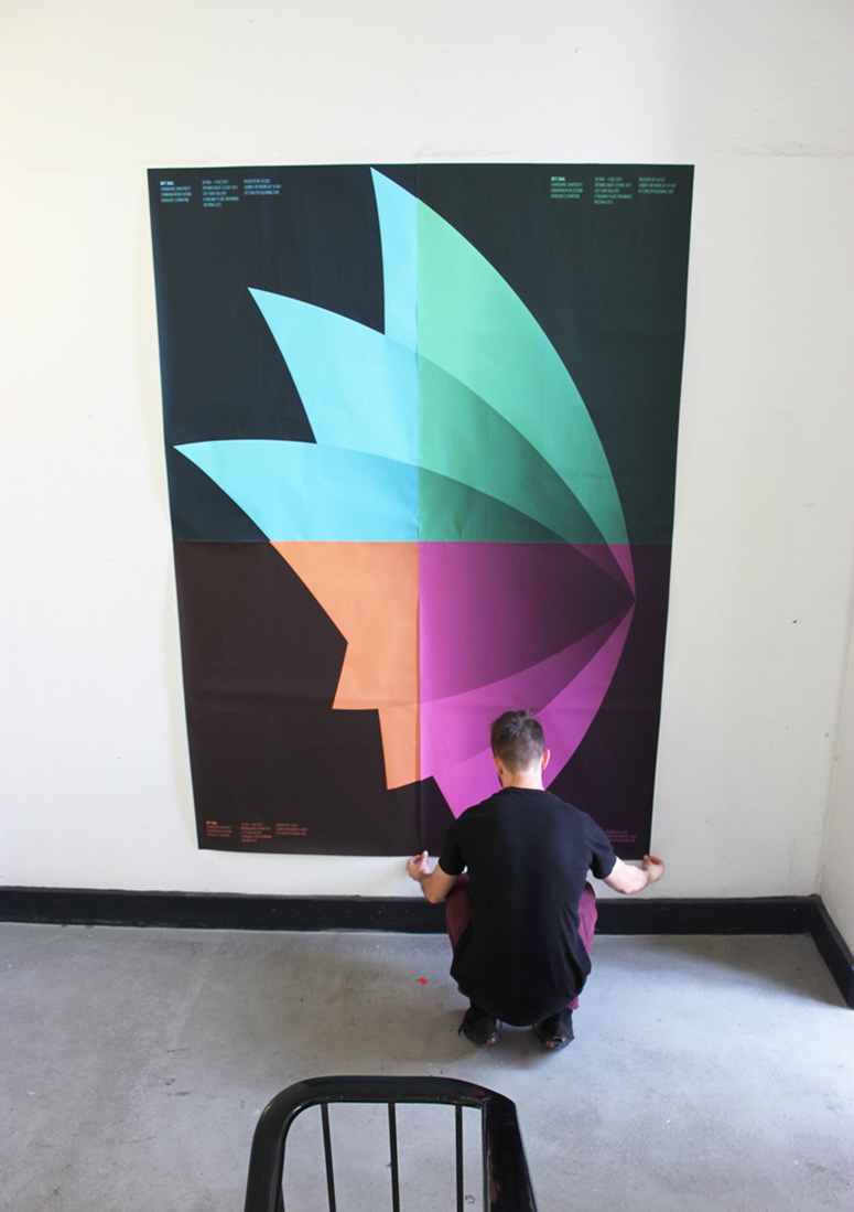
Swinburne University Graduate Exhibition Invitation + Posters
Production Method
Digital
Design
Jordan Rowe
Christopher See
Printing
Print Express
CMYK on donated, colored paper results in vibrant and deliciously dynamic solutions for design students on a budget. If only eating ramen noodles looked this good.
Client
Swinburne University Faculty Of Design Comm. Design Graduate Exhibition 2011
Quantity Produced
Invitations: 500
Posters: 250
Production Cost
–
Production Time
2 Days
Dimensions (Width × Height × Depth)
Invitation: 130 mm × 210 mm (5.1 in × 8.3 in)
Poster: 297 mm × 420 mm (11.7 in × 16.5 in)
Page Count
–
Paper Stock
K.W. Doggets / Kaskade / Uncoated / 225 GSM
Number of Colors
CMYK
Varnishes
–
Binding
–
Typography
Akzidenz-Grotesk by H. Berthold
Project Description
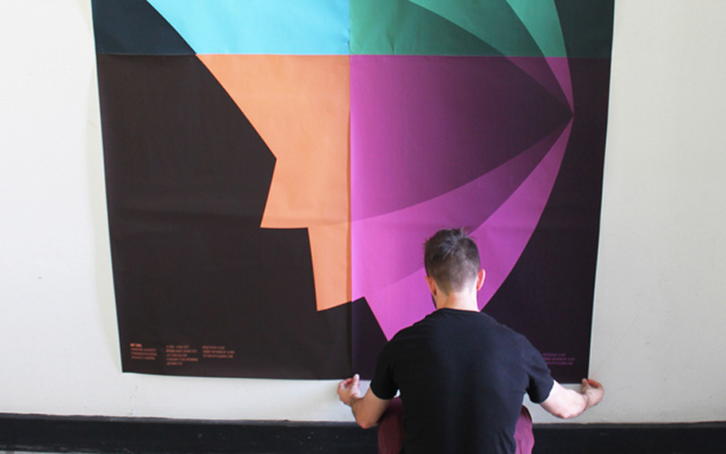
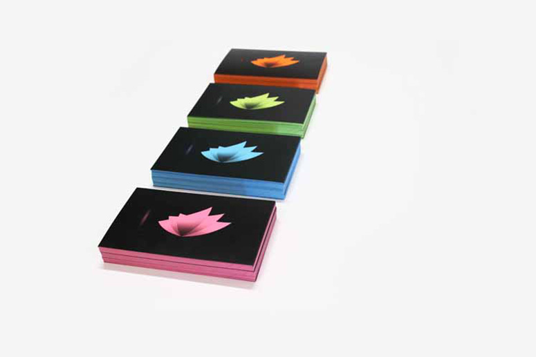
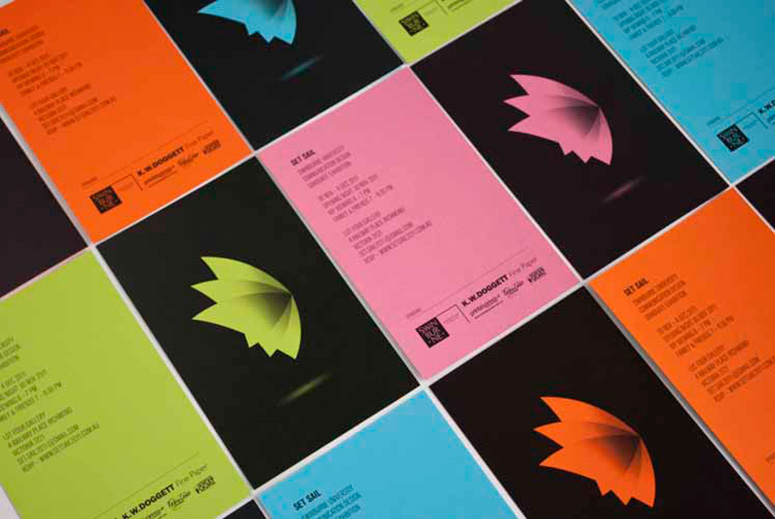
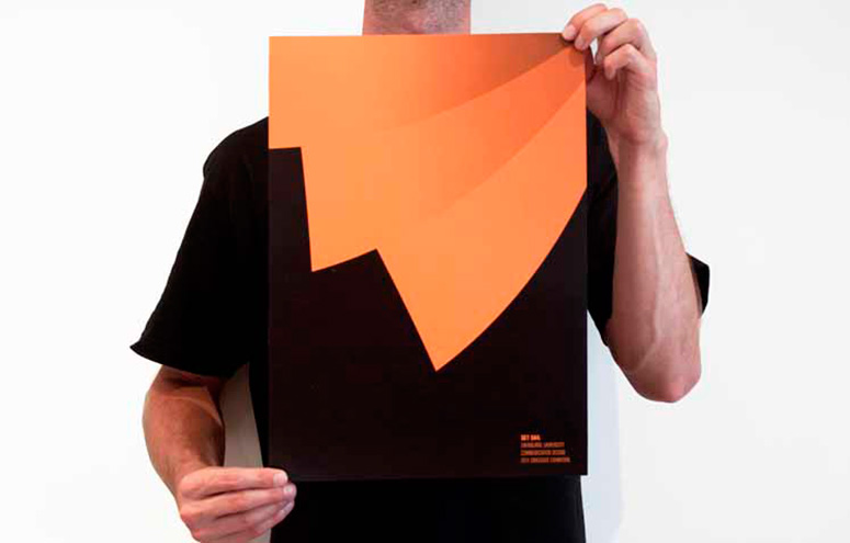
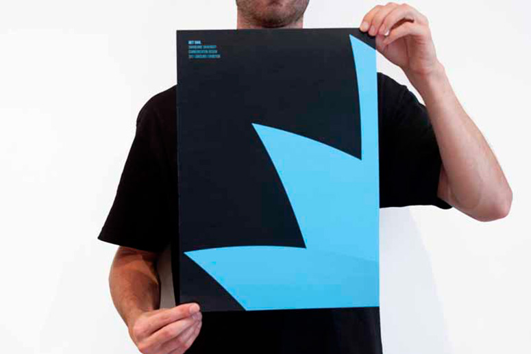
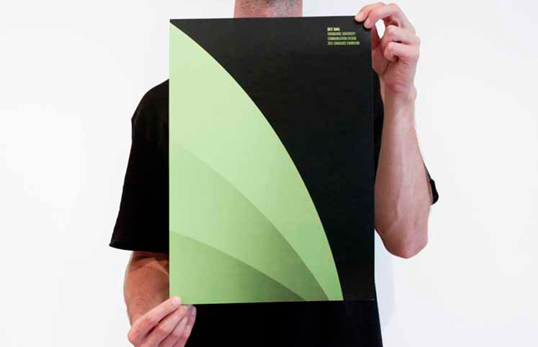
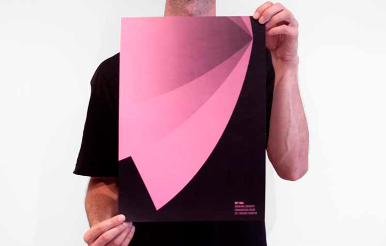
The creative was inspired by the branding which consisted of four colours with three of them representing the different bodies of students that were exhibiting (orange, green and pink) with the fourth colour (blue) making up the master brand colour.The concept behind the invitation and the poster was to create a piece of communication that was striking and bold enough to grab attention, but at the same time emulate the style of the mark being very elegant and minimal. Additionally the posters were created to be experience as a set; as once brought together creating the completed logo.
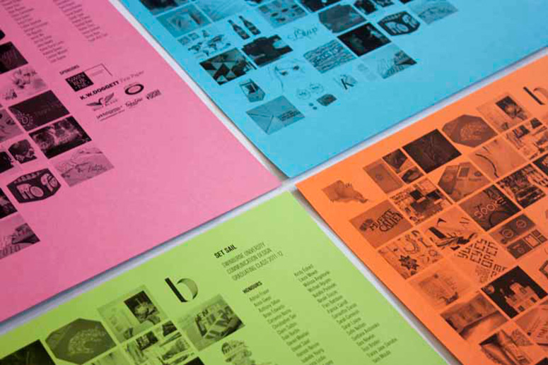
We used this in a way to slowly unveil the identity of Set Sail to the Swinburne design community to create some mystique and interest around not only the exhibition but the additive nature of the poster installation. Which actually turned out to be one of the biggest talking points around the uni in the weeks leading up to the exhibition. The poster designs were also used as a give away at the exhibition with the reverse side containing all of the work and names of the graduating students.
Production Lesson(s)
Kaskade paper presented us with the opportunity to utilise the beautifully vibrant coloured paper as a replacement for expensive spot colours. We achieved this by reversing the logo out of a solid rich black which would then only reveal the coloured paper through the form of the Set Sail logo.The printing process also gave the appearance of coloured edge printing due to the the full coverage of the black which was a great little addition.

Post Author

Kelly Cree
Writer for UnderConsideration LLC.
More: Online / On Twitter
Date Published
April 13, 2012
Filed Under
Digital
Invitations
Posters
Tagged with
CMYK
color paper
digital
student


About
FPO (For Print Only), is a division of UnderConsideration, celebrating the reality that print is not dead by showcasing the most compelling printed projects.
FPO uses Fonts.com to render Siseriff and Avenir Next.
FPO is run with Six Apart’s MovableType
All comments, ideas and thoughts on FPO are property of their authors; reproduction without the author’s or FPO’s permission is strictly prohibited
Twitter @ucllc
Sign-up for Mailing List
Mailing list managed by MailChimp
Thanks to our advertisers
About UnderConsideration
UnderConsideration is a graphic design firm generating its own projects, initiatives, and content while taking on limited client work. Run by Bryony Gomez-Palacio and Armin Vit in Bloomington, IN. More…
blogs we publish
Brand New / Displaying opinions and focusing solely on corporate and brand identity work.
Art of the Menu / Cataloguing the underrated creativity of menus from around the world.
Quipsologies / Chronicling the most curious, creative, and notable projects, stories, and events of the graphic design industry on a daily basis.
products we sell
Flaunt: Designing effective, compelling and memorable portfolios of creative work.
Brand New Conference videos / Individual, downloadable videos of every presentation since 2010.
Prints / A variety of posters, the majority from our AIforGA series.
Other / Various one-off products.
events we organize
Brand New Conference / A two-day event on corporate and brand identity with some of today's most active and influential practitioners from around the world.
Brand Nieuwe Conference / Ditto but in Amsterdam.
Austin Initiative for Graphic Awesomeness / A speaker series in Austin, TX, featuring some of the graphic design industry's most awesome people.
also
Favorite Things we've Made / In our capacity as graphic designers.
Projects we've Concluded / Long- and short-lived efforts.
UCllc News / Updates on what's going at the corporate level of UnderConsideration.

Related entries
36 Days of Type Poster
Ministry of Environment in Colombia Poster
National Parks Map
eBoy Poster
“Love Your Mother” Print