ADV @ UNDERCONSIDERATION Peek here for details
BROWSE
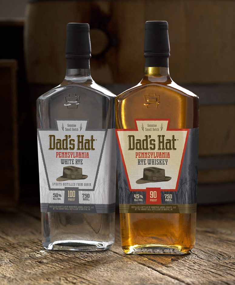
Dad’s Hat Pennsylvania Rye Bottle Design
Production Method
Die-cut
Emboss
Offset
Design
Signature Communications
Art Director/Designer: Matthew Sulcoski
Creative Director: Tony DeMarco
Printing
Valley Forge Tape and Label
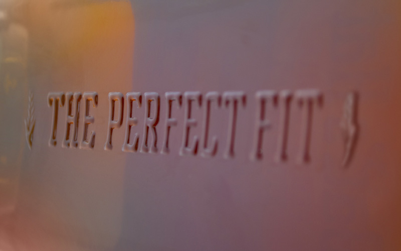
Named for the heirloom fedora founder Herman Mihalich regularly — and proudly — sports, Dad’s Hat is a product connected to its creator. The proof is in the packaging.
Client
Dad's Hat/Mountain Laurel Spirits, LLC
Quantity Produced
10,000
Production Cost
–
Production Time
2 Weeks
Dimensions (Width × Height × Depth)
4.64 in × 6.88 in.
Page Count
–
Paper Stock
–
Number of Colors
5
Varnishes
UV Coating
Binding
–
Typography
LHF Logomotive
Gotham HTF Condensed
Project Description
Our mission was to brand a new small-batch Rye Whiskey along with its un-aged White Rye companion to emphasize its local, craft-distilling origins while appealing to discerning whiskey enthusiasts and the surging new breed of cocktail lovers. The key was highlighting the personal connection between the product and its creator. Founder Herman Mihalich wears his father's fedora and fondly recalls the bar his family owned in Pittsburgh. Following much exploration, we decided on the name Dad's Hat Pennsylvania Rye for the traditional values it embodies - recalling a simpler time while lending it a fillip of style and sophistication.Production Lesson(s)
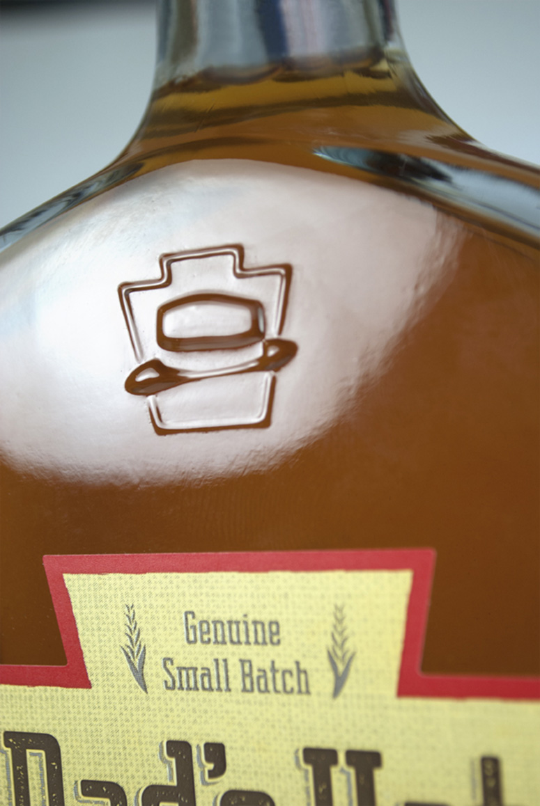
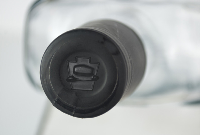
When it comes to small batch product lines, stay adaptable. Limited budgets often yield the most creative methods of getting things done. Initially our client requested that our label designs were to be hand-applied as a way for the new start-up distillery to control costs. Custom die-cutting and limited print runs meant little room for error in production. So we devised a simple technique of incorporating a series notches in the glass on the lower part of the bottle that endured the label would be aligned perfectly without any guesswork, by hand or even with the use of a label applicator. Seems like a small thing but when the budget is tight and competition for shelf space is feirce, there's no time to be 'off center'.


About
FPO (For Print Only), is a division of UnderConsideration, celebrating the reality that print is not dead by showcasing the most compelling printed projects.
FPO uses Fonts.com to render Siseriff and Avenir Next.
FPO is run with Six Apart’s MovableType
All comments, ideas and thoughts on FPO are property of their authors; reproduction without the author’s or FPO’s permission is strictly prohibited
Twitter @ucllc
Sign-up for Mailing List
Mailing list managed by MailChimp
Thanks to our advertisers
About UnderConsideration
UnderConsideration is a graphic design firm generating its own projects, initiatives, and content while taking on limited client work. Run by Bryony Gomez-Palacio and Armin Vit in Bloomington, IN. More…
blogs we publish
Brand New / Displaying opinions and focusing solely on corporate and brand identity work.
Art of the Menu / Cataloguing the underrated creativity of menus from around the world.
Quipsologies / Chronicling the most curious, creative, and notable projects, stories, and events of the graphic design industry on a daily basis.
products we sell
Flaunt: Designing effective, compelling and memorable portfolios of creative work.
Brand New Conference videos / Individual, downloadable videos of every presentation since 2010.
Prints / A variety of posters, the majority from our AIforGA series.
Other / Various one-off products.
events we organize
Brand New Conference / A two-day event on corporate and brand identity with some of today's most active and influential practitioners from around the world.
Brand Nieuwe Conference / Ditto but in Amsterdam.
Austin Initiative for Graphic Awesomeness / A speaker series in Austin, TX, featuring some of the graphic design industry's most awesome people.
also
Favorite Things we've Made / In our capacity as graphic designers.
Projects we've Concluded / Long- and short-lived efforts.
UCllc News / Updates on what's going at the corporate level of UnderConsideration.

Related entries
Alivu EVOO Packaging
Dutch Harvest Hemp Tea Packaging
GoSimple Packaging
The Farmer’s Daughter Hot Pepper Jelly
Calyx Wellness Centre Package Design