ADV @ UNDERCONSIDERATION Peek here for details
BROWSE

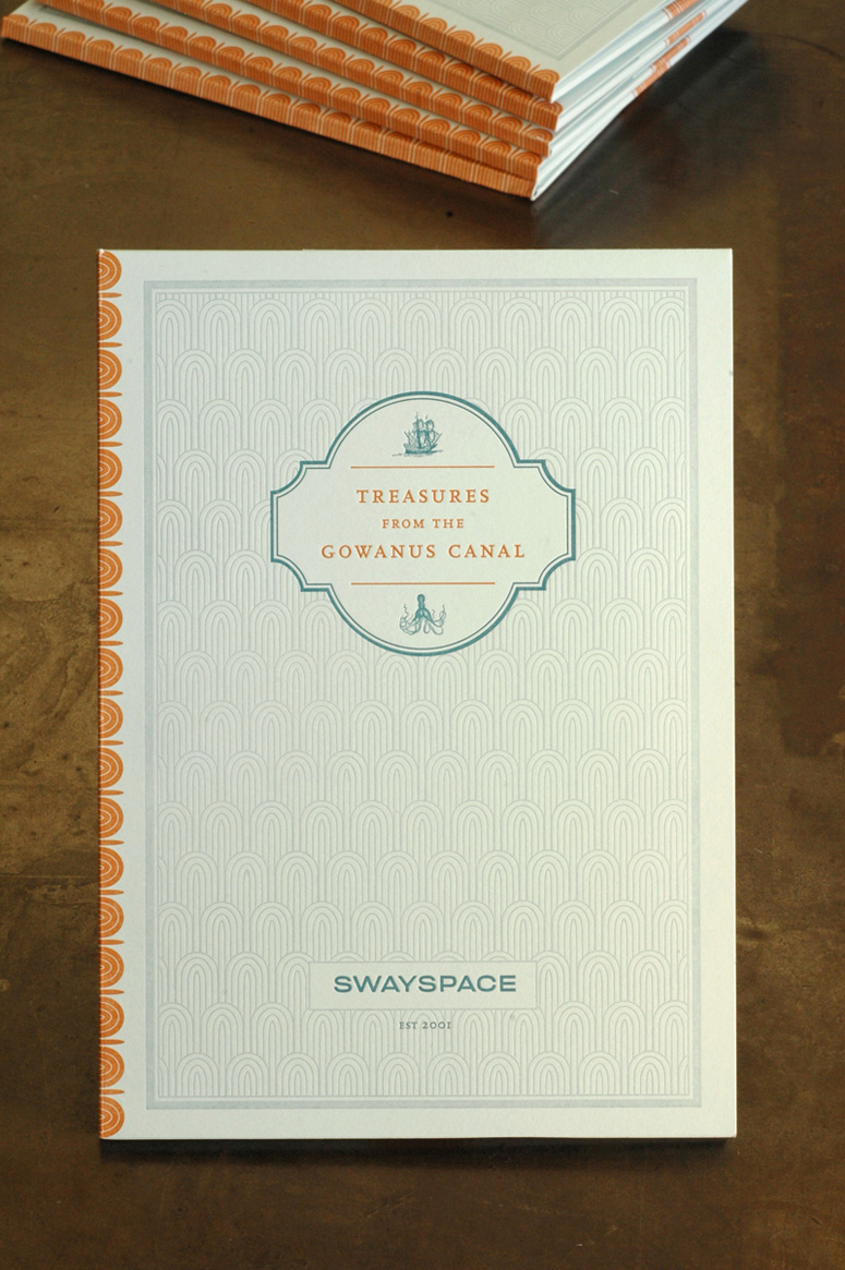
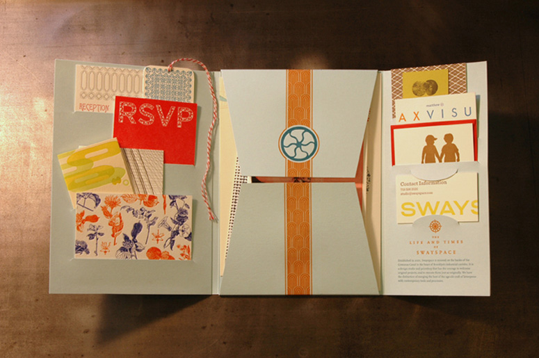
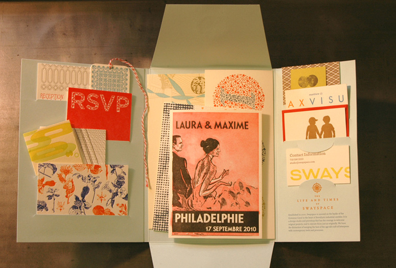
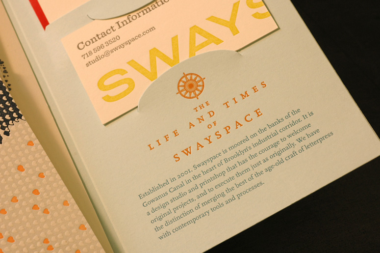
Charming and eclectic, this cozy collection of letterpress samples turned press kit lets potential clients know there’s no Swayspace like home.
Dimensions (Width × Height × Depth)
6.75 × 9.5 × .375 in.
Page Count
–
Paper Stock
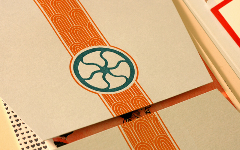
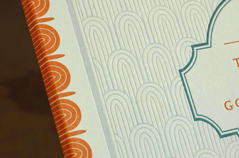
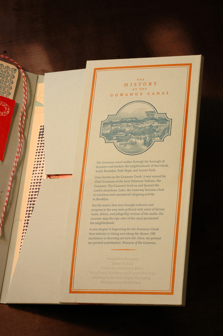
French Paper Co. / Muscletone / Sno Cone / 140C
Number of Colors
3
Varnishes
–
Binding
–
Typography
Scala
Rhode
Sentinel
Project Description
We are periodically asked by press and clients for samples of our letterpress projects, and we wanted to introduce ourselves along with our work and capabilities. This was really a collaborative and iterative effort within the studio as we all wanted to be able to stand behind the piece as something that represented us. When we were done, it also became something that we wanted to reach out with, so we have been sending it to institutions and people that we admire, letting them know who we are, and that we like to work on special projects.Production Lesson(s)
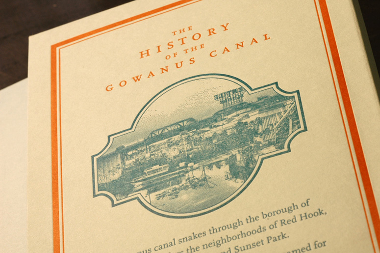
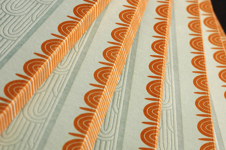
This project brought together many of the things we do in our letterpress studio, but rarely all together. We utilized the entirety of our Vandercook's printable area, and our artwork varied from large fills to fine type to a bitmapped photo. We had to find happy mediums for ink levels and pressure.We needed to modify our color scheme on press. The original light blue we specified looked better as it tended towards gray, and the bright orange that we originally specified did not integrate well until we added some of the bluish gray to it, making it veer towards rust.
It was difficult to maintain tight registration as the paper stretched and warped each time it passed through the press. The finishing house had to make a decision around where to register the die cut as the artwork drifted a bit. They wisely chose to focus on the front cover and spine.
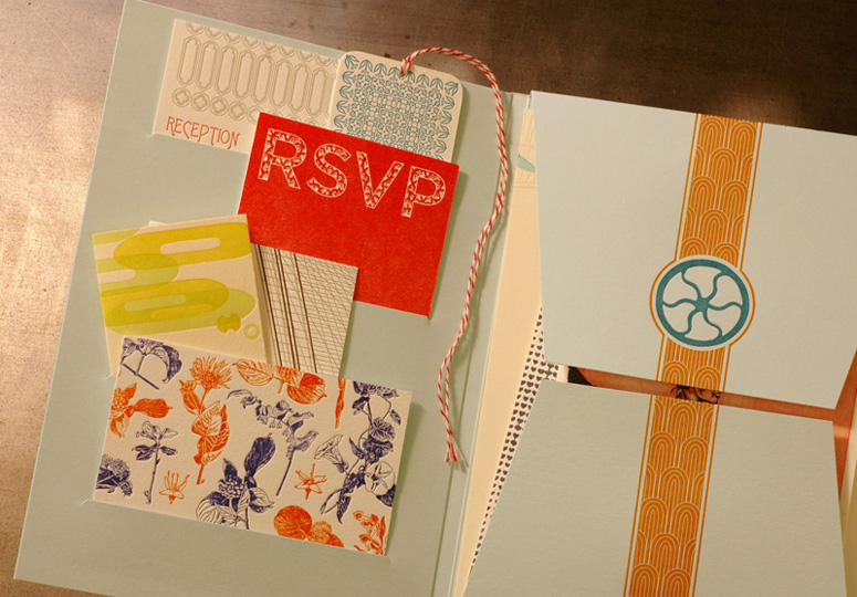
Finally, our first gluing scheme didn't work out too well (luckily we only glued 50 of them initially). We had placed too many strips of adhesive around the pockets, and they were too snug. Once we took away most of the strips that ran horizontally under each pocket, and let the slit and paper do some of the gripping work, the pockets started to behave better.

Post Author

Kelly Cree
Writer for UnderConsideration LLC.
More: Online / On Twitter
Date Published
July 23, 2012
Filed Under
Letterpress
Self promotion
Tagged with
multiple parts
press kit


About
FPO (For Print Only), is a division of UnderConsideration, celebrating the reality that print is not dead by showcasing the most compelling printed projects.
FPO uses Fonts.com to render Siseriff and Avenir Next.
FPO is run with Six Apart’s MovableType
All comments, ideas and thoughts on FPO are property of their authors; reproduction without the author’s or FPO’s permission is strictly prohibited
Twitter @ucllc
Sign-up for Mailing List
Mailing list managed by MailChimp
Thanks to our advertisers
About UnderConsideration
UnderConsideration is a graphic design firm generating its own projects, initiatives, and content while taking on limited client work. Run by Bryony Gomez-Palacio and Armin Vit in Bloomington, IN. More…
blogs we publish
Brand New / Displaying opinions and focusing solely on corporate and brand identity work.
Art of the Menu / Cataloguing the underrated creativity of menus from around the world.
Quipsologies / Chronicling the most curious, creative, and notable projects, stories, and events of the graphic design industry on a daily basis.
products we sell
Flaunt: Designing effective, compelling and memorable portfolios of creative work.
Brand New Conference videos / Individual, downloadable videos of every presentation since 2010.
Prints / A variety of posters, the majority from our AIforGA series.
Other / Various one-off products.
events we organize
Brand New Conference / A two-day event on corporate and brand identity with some of today's most active and influential practitioners from around the world.
Brand Nieuwe Conference / Ditto but in Amsterdam.
Austin Initiative for Graphic Awesomeness / A speaker series in Austin, TX, featuring some of the graphic design industry's most awesome people.
also
Favorite Things we've Made / In our capacity as graphic designers.
Projects we've Concluded / Long- and short-lived efforts.
UCllc News / Updates on what's going at the corporate level of UnderConsideration.

Related entries
E.A.S.E. Stationery Set
End of Work iPad and Notebook Cases
Cranky Bucks Promotion
Pizza Box Promo Mailer
Bryan Patrick Todd Mailer