ADV @ UNDERCONSIDERATION Peek here for details
BROWSE
Camping de Dalt
Production Method
Digital
Design
La Buhardi - architecture & graphic design
Marina Senabre Roca for La Buhardi
Printing
–
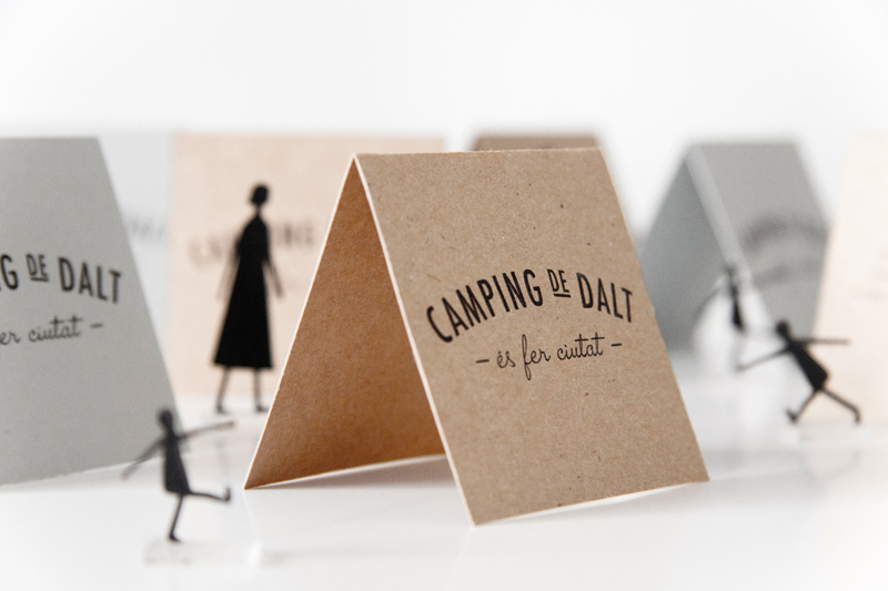
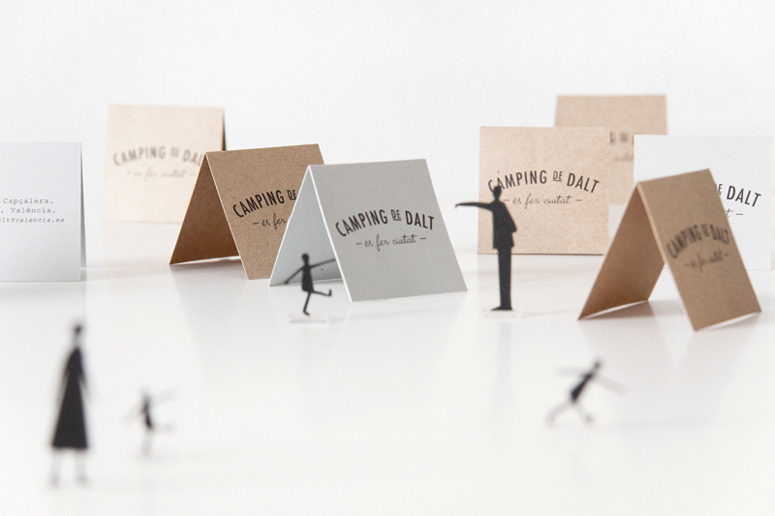
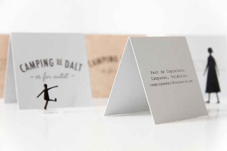
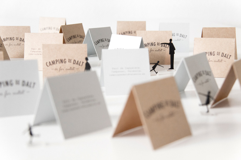
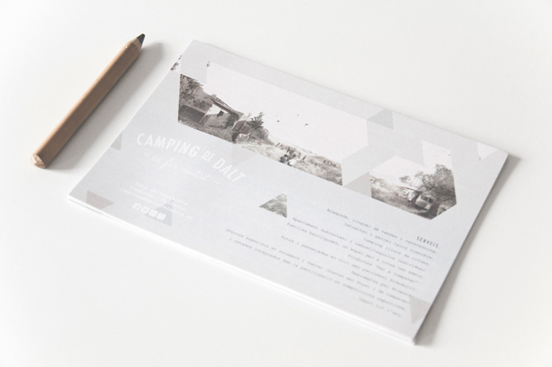
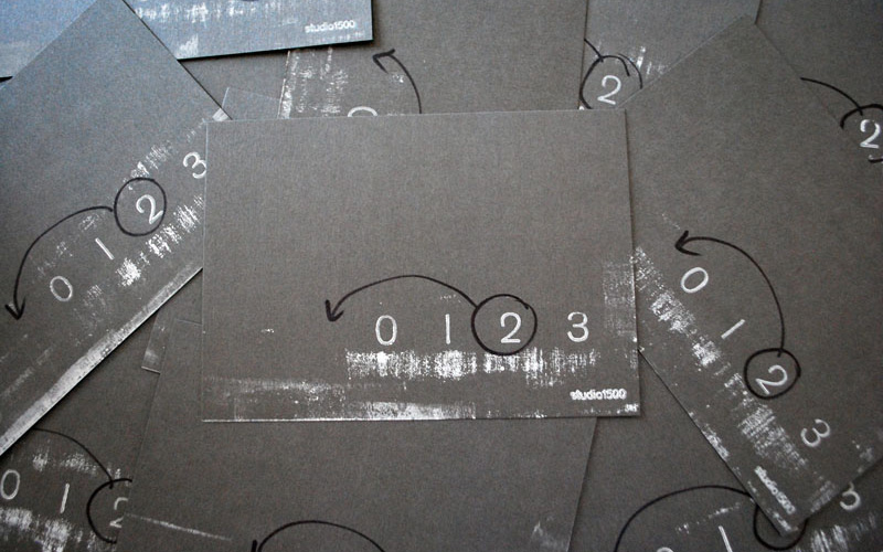
Duality and potential are running themes in this project, in which the business cards double as tents for tiny campers and the triangle pattern has the potential to expand infinitely. Like the urban campsites they are designed to represent, these collateral pieces seek to provoke questions about relationships between seemingly contradictory entities—like nature and cities, mechanical serif type and organic script letters, or escape in the middle of the melee.
Dimensions (Width × Height × Depth)
–
Page Count
–
Paper Stock
craft paper
Number of Colors
1
Varnishes
–
Binding
–
Typography
futura condensed medium
mr blaketon

Project Description
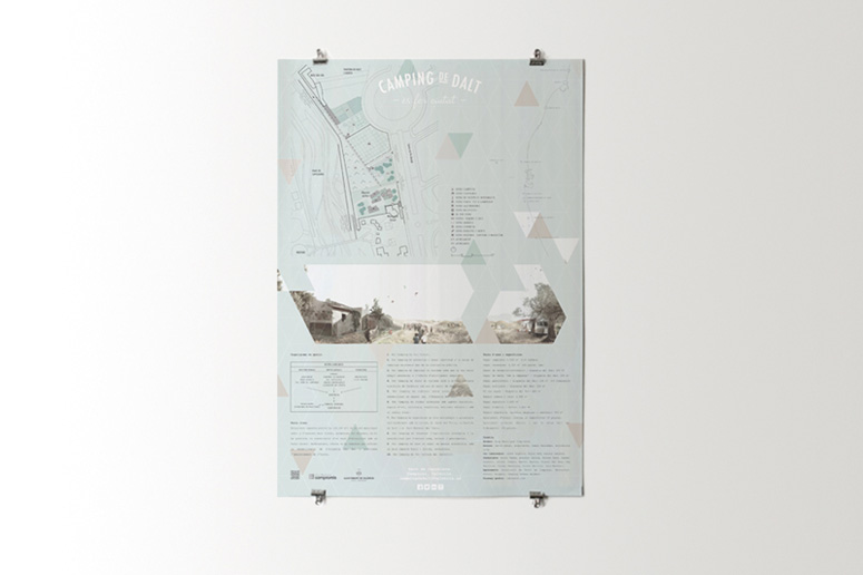
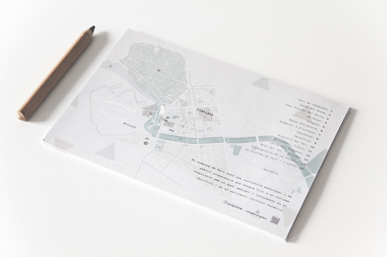
THE URBAN CAMPSITE.“Camping de Dalt” is a proposal for a local urban campsite, located in the metropolitan area of Valencia.
The campsite is a place of relationships. Relationships among its users, and also relationships between those users and the environment. It has a beautiful feature: the absence of limits. The limit is only a fictitious line established for technical purposes. But if left to expand, the campsite could do so infinitely. Located in the city, this could translate into increasingly suggestive new relationships. The campsite could generate an interesting urban pattern and, therefore, create a new town identity.
THE GRAPHIC CAMPSITE.
The urban campsite is notable for its interesting duality: nature and city; introvert, but connected; a place to relax, but next to the city's offerings. It is important that the brand identity of the campsite is able to convey this duality. At the smallest scale, the typography is the one in charge to evidence that duality through the contrast between a sans serif font and a more organic one.
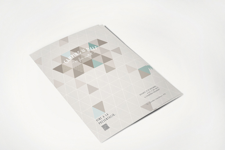
The smallest unit of a campsite is the tent. On a graphic level, the tent quickly associates to its symbol: the tent is a triangle. The urban pattern generated by the campsite can be visually translated into a graph formed by “tents”. This pattern is capable of spreading infinitely.
The brand identity is the result of combining the typography and the pattern of “tents”, leading to many different compositional possibilities. The visual compositions represent the heterogeneous character of the campsite, the generational contrast, the evocative urban fabric …
Post Author

Duncan Robertson
Former intern at UnderConsideration LLC.
More: Online / On Twitter
Date Published
April 25, 2013
Filed Under
Collateral
Digital
Tagged with
maps
natural
organic
tents
triangle grid


About
FPO (For Print Only), is a division of UnderConsideration, celebrating the reality that print is not dead by showcasing the most compelling printed projects.
FPO uses Fonts.com to render Siseriff and Avenir Next.
FPO is run with Six Apart’s MovableType
All comments, ideas and thoughts on FPO are property of their authors; reproduction without the author’s or FPO’s permission is strictly prohibited
Twitter @ucllc
Sign-up for Mailing List
Mailing list managed by MailChimp
Thanks to our advertisers
About UnderConsideration
UnderConsideration is a graphic design firm generating its own projects, initiatives, and content while taking on limited client work. Run by Bryony Gomez-Palacio and Armin Vit in Bloomington, IN. More…
blogs we publish
Brand New / Displaying opinions and focusing solely on corporate and brand identity work.
Art of the Menu / Cataloguing the underrated creativity of menus from around the world.
Quipsologies / Chronicling the most curious, creative, and notable projects, stories, and events of the graphic design industry on a daily basis.
products we sell
Flaunt: Designing effective, compelling and memorable portfolios of creative work.
Brand New Conference videos / Individual, downloadable videos of every presentation since 2010.
Prints / A variety of posters, the majority from our AIforGA series.
Other / Various one-off products.
events we organize
Brand New Conference / A two-day event on corporate and brand identity with some of today's most active and influential practitioners from around the world.
Brand Nieuwe Conference / Ditto but in Amsterdam.
Austin Initiative for Graphic Awesomeness / A speaker series in Austin, TX, featuring some of the graphic design industry's most awesome people.
also
Favorite Things we've Made / In our capacity as graphic designers.
Projects we've Concluded / Long- and short-lived efforts.
UCllc News / Updates on what's going at the corporate level of UnderConsideration.

Related entries
Black Sheep Studio Business Cards and Promotional Items
E.A.S.E. Stationery Set
“A to Z Letters for Sale” Promo
End of Work iPad and Notebook Cases
CNN Digital New Hire Kit