ADV @ UNDERCONSIDERATION Peek here for details
BROWSE
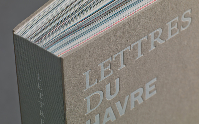
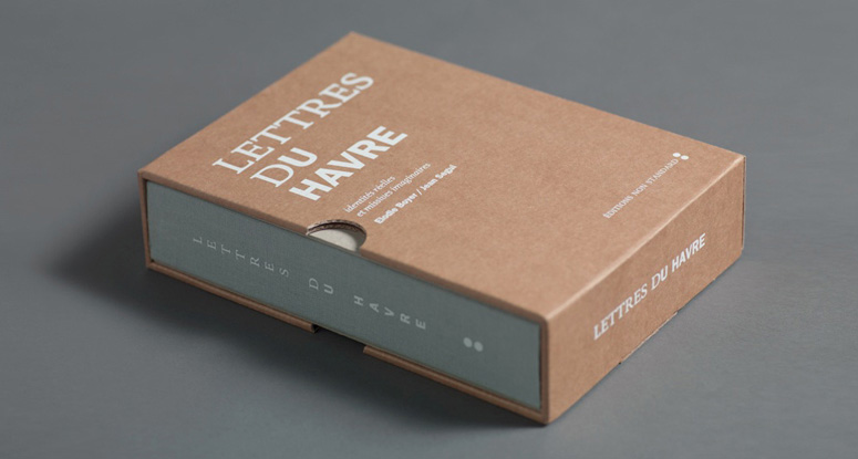
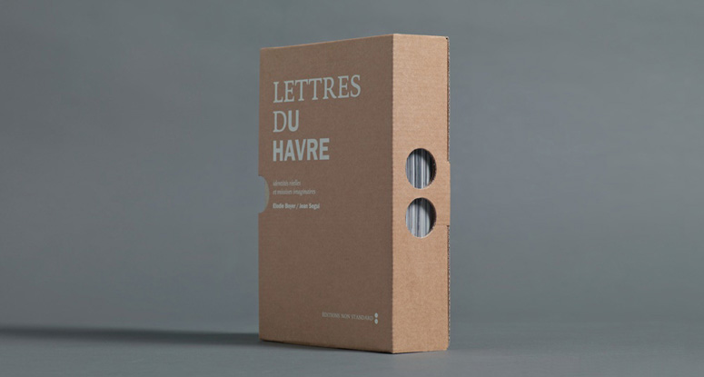
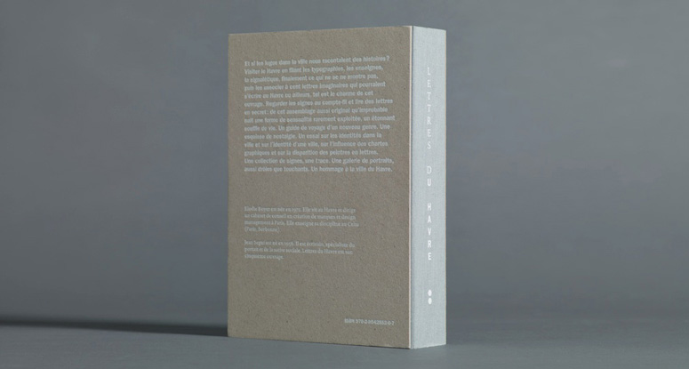
Lettres du Havre
Production Method
Offset
Risograph
Silkscreen
Design
Editions Non Standard
Designer: Patrick Doan assisted by Morgann Lechat and Jeremy Glatre
Risographie: Knust / Extrapool
Printer: LenoirSchuring
Binder: Patist
Printing
LenoirSchuring
This extraordinary book is many things at the same time: a monograph of a city; a typographic signage reference; a collection of written letters paired with images; an specimen of exceptional graphic design, book design, and book production; an alternative city guide; an architectural reference; a study on signs; a collection of printing techniques; and I’ve probably missed a few. Perhaps, an example of what can happen when people start making and sharing is the pièce de résistance of this chef-d’œuvre from Editions Non Standard.
Client
Editions Non Standard
Quantity Produced
2,000 (of which 500 are numbered)
Production Cost
–
Production Time
3 months (18 months back and forth to conceive the project together with manufacturing)
Dimensions (Width × Height × Depth)
6.69 × 9.45 × 2.4 in
Page Count
804
Paper Stock
Dacosta 100 g
Sirio Perla 140 g
Munken Polar 150 g
Munken Lynx 80 g
LuxoMagic 135 g
Number of Colors
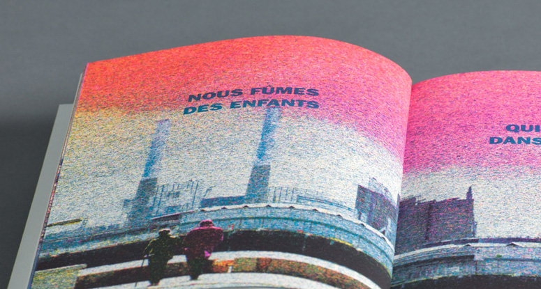
CMYK + 1 fluor + risgraphie + foil (cover) + sikscreen (slipcase)
Varnishes
–
Binding
glue
Typography
ITC Franklin Gothic (for the author Elodie Boyer)
DTL Documenta (for the author Jean Segui)

Project Description
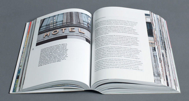
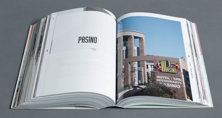
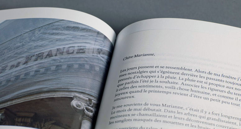
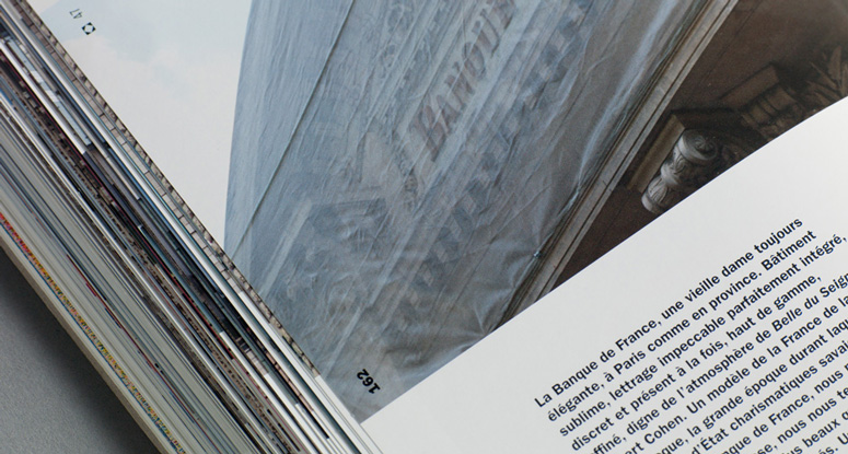
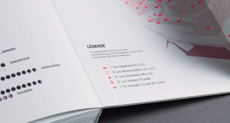
The book plays on the dual meaning of the word "letters": typefaces, signs, logotypes on the one hand, and fictional letters (love letters, letters to relatives, professional letters, administrative letters … ) on the other hand, in order to investigate the role of identities in a city, the evolution of brand design and signage, the interactions between social state and graphic signs.As a result, one hundred imaginary letters are inspired by a selection of one hundred photographs of signs located in Le Havre. The signs are organised in five chapters and analysed accordingly: industry, public service, independent shops, franchise, seaside and temporary signs. The outcome looks like a big picture of Le Havre in 2011-2012 composed by a collection of zooms, both visual and social since the human contemporary issues are all raised in the letters (crisis, election, Europe, eternal family rivalries, love, hate, jealousy, administrative nonsense … ). Lettres du Havre can also be seen as two books woven into one.
A VISUAL AND SOCIAL ARCHIVE
Lettres du Havre is aimed at all kinds of readers: experts interested in evolution of branding and signage, decision makers willing to understand the impact of signs and the relationship between signage and architecture, graphic designers searching for an alternative collection of signs or interested in book design, people fond of Le Havre city, readers of letters looking for a good laugh and curious about human nature.
Lettres du Havre can be seen as an alternative city guide, an archive on Le Havre and the French society today, an essay on brands in the city and city branding, a collection of endangered signs, a tribute to Le Havre.
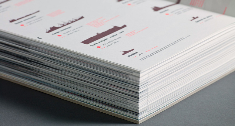
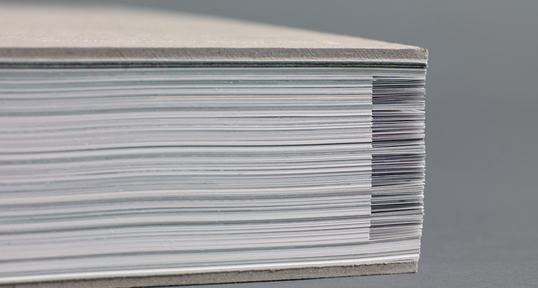
Lettres du Havre is made by state of the art book manufacturers using unique techniques (804 pages, no signature, 402 sheets glued, 2 pages formats, 5 different papers, 10 pages in risographie). Lettres du Havre is available in French only.
Production Lesson(s)
The pleasure or doing and sharing was our best motto, with mutual respect between all the actors of the project, integrating desire and constraints. The result was so much better thanks to this.It was smarter for us to do a very ambitious book rather than a 'reasonable' book. Although the outcome makes it more expensive, its uniqueness is appealing and raises almost instant interest.

Post Author

Duncan Robertson
Former intern at UnderConsideration LLC.
More: Online / On Twitter
Date Published
April 15, 2013
Filed Under
Books
Offset
Risograph
Silkscreen
Tagged with
architecture
city guide
french
lettering
signage


About
FPO (For Print Only), is a division of UnderConsideration, celebrating the reality that print is not dead by showcasing the most compelling printed projects.
FPO uses Fonts.com to render Siseriff and Avenir Next.
FPO is run with Six Apart’s MovableType
All comments, ideas and thoughts on FPO are property of their authors; reproduction without the author’s or FPO’s permission is strictly prohibited
Twitter @ucllc
Sign-up for Mailing List
Mailing list managed by MailChimp
Thanks to our advertisers
About UnderConsideration
UnderConsideration is a graphic design firm generating its own projects, initiatives, and content while taking on limited client work. Run by Bryony Gomez-Palacio and Armin Vit in Bloomington, IN. More…
blogs we publish
Brand New / Displaying opinions and focusing solely on corporate and brand identity work.
Art of the Menu / Cataloguing the underrated creativity of menus from around the world.
Quipsologies / Chronicling the most curious, creative, and notable projects, stories, and events of the graphic design industry on a daily basis.
products we sell
Flaunt: Designing effective, compelling and memorable portfolios of creative work.
Brand New Conference videos / Individual, downloadable videos of every presentation since 2010.
Prints / A variety of posters, the majority from our AIforGA series.
Other / Various one-off products.
events we organize
Brand New Conference / A two-day event on corporate and brand identity with some of today's most active and influential practitioners from around the world.
Brand Nieuwe Conference / Ditto but in Amsterdam.
Austin Initiative for Graphic Awesomeness / A speaker series in Austin, TX, featuring some of the graphic design industry's most awesome people.
also
Favorite Things we've Made / In our capacity as graphic designers.
Projects we've Concluded / Long- and short-lived efforts.
UCllc News / Updates on what's going at the corporate level of UnderConsideration.

Related entries
2017 Brand New Conference Program
Severe(d): A Creepy Poetry Collection by Holly Riordan
Um Caminho para Santiago CD Package and Diary
BOYCO Classpack® Book
Antes de Perder la Esperanza Book