ADV @ UNDERCONSIDERATION Peek here for details
BROWSE
Adolphson-Wiemer Wedding Invitation
Production Method
Letterpress
Offset
Design
Cristina Pandol
Photography: Garrett Shannon
Letterpress: Vandercook rental at Lala Press
Save the Date Printing: Typecraft Wood & Jones
Calligraphy: Katrina S. L. Centeno of Calligraphy Katrina
Printing
Cristina Pandol via Vandercook rental at Lala Press
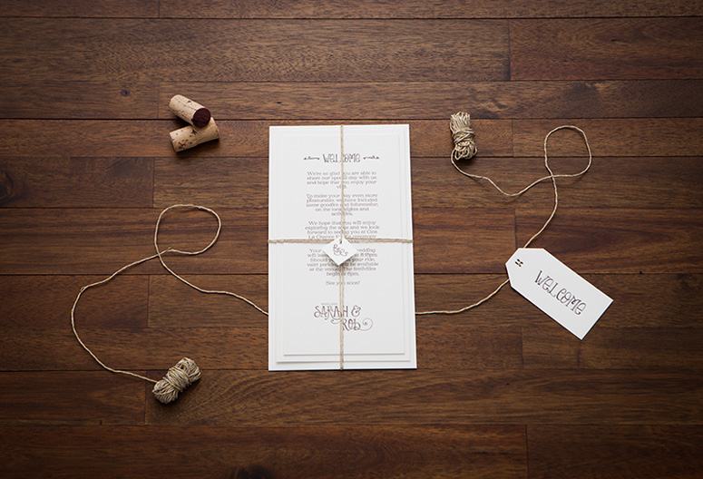
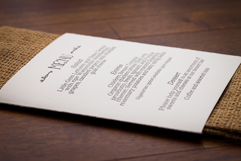
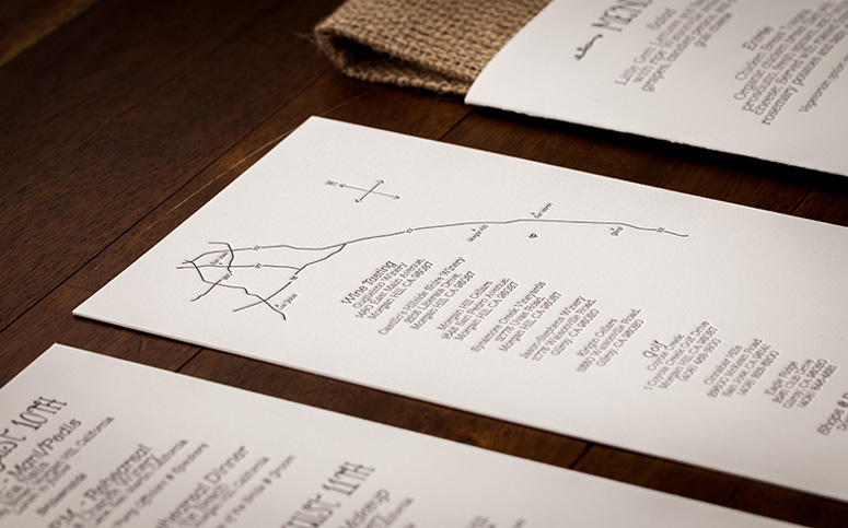
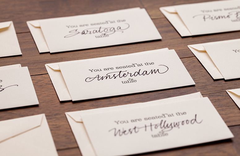
Wedding invitations designed and printed with care by someone with a personal connection are all the more special. This set of wedding materials are a nice example of what can happen when the couple trusts the designer. With attention-grabbing quality and tasteful references to wine—because the couple would be married in a vineyard—each piece finds the balance between something safe to send a conservative relative, and a representation of the couple’s energy and creativity.
Client
Sarah Adolphson
Quantity Produced
125 of each piece
Production Cost
$4,800
Production Time
3 months
Dimensions (Width × Height × Depth)
–
Page Count
13
Paper Stock
Reich Paper / Savoy / Natural White / 236C and 118C
Number of Colors
1
Varnishes
–
Binding
–
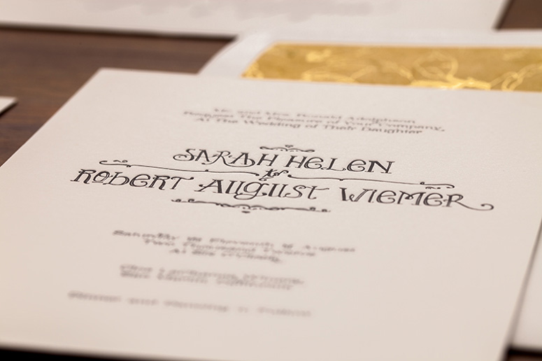
Typography
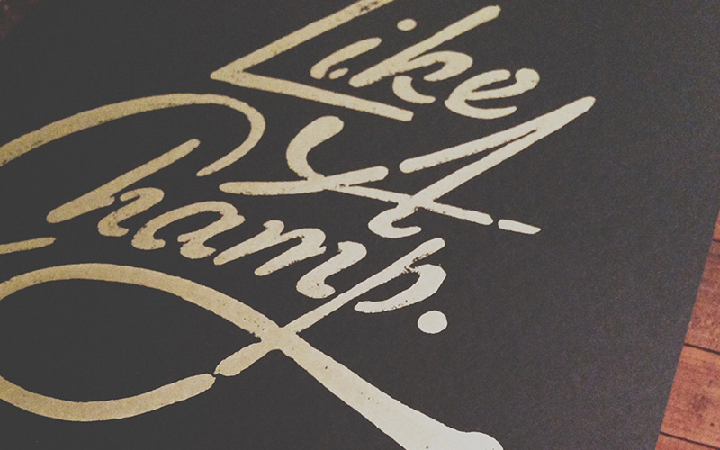
Lady Rene
Brioche
Project Description
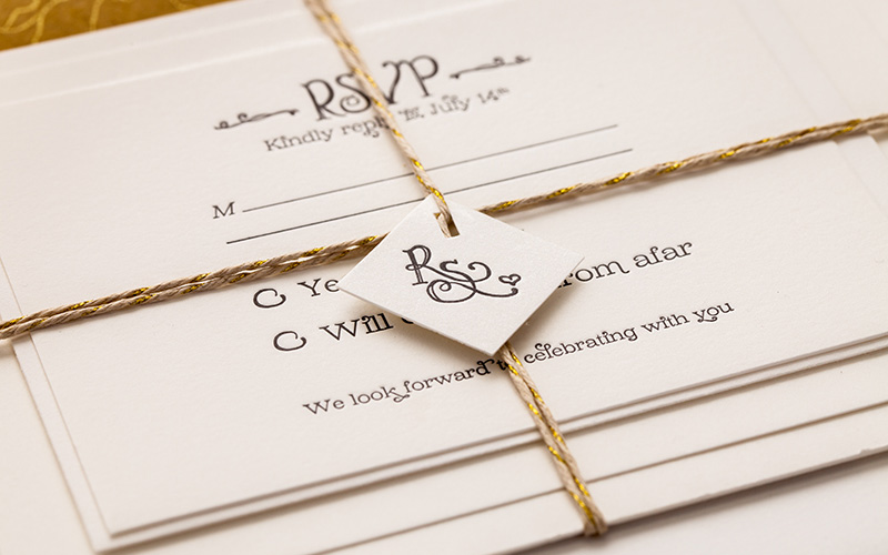
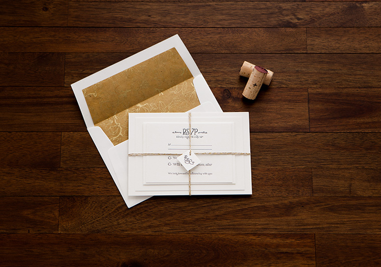
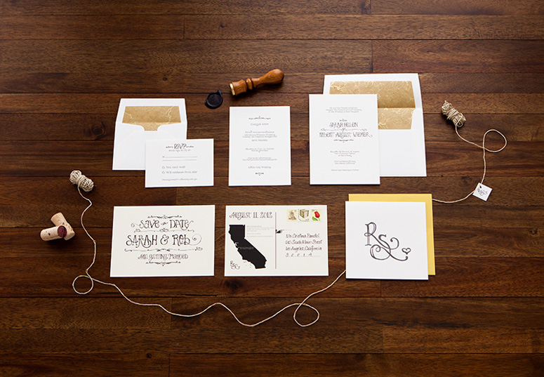
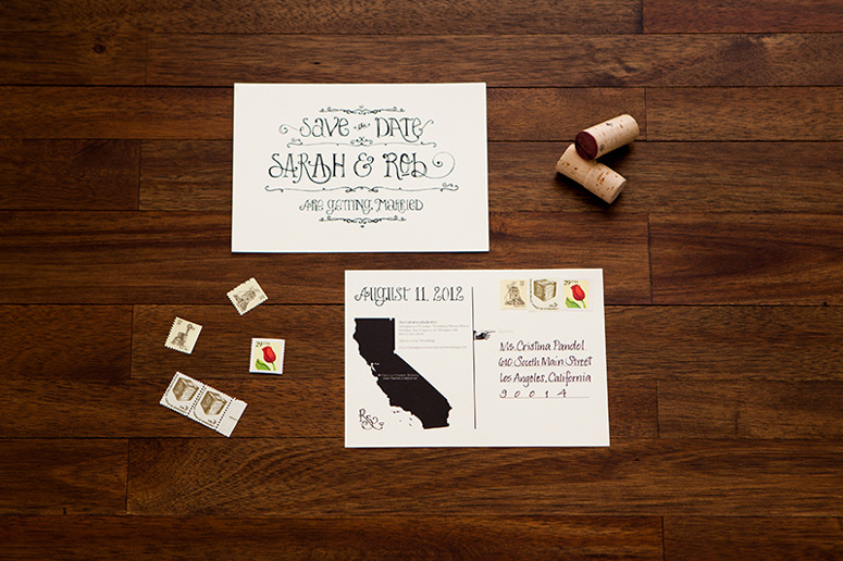
Sarah Adolphson is a colleague of mine, so this project was a very personal one for me. Though I've designed and printed many things, this was my first wedding invitation. Normally this would be a huge concern to a Bride who wants everything to be special and perfect, but Sarah had nothing but trust in my abilities and the end result is really lovely.Robby and Sarah are a fun couple who are energetic, creative, very hands on, and most importantly crazy about each other. They asked me to design something that represented them as a couple and was young and interesting, without being too unconventional or offensive since they would be mailing this to some more conservative relatives. The only design inspiration I was given by the couple was to think wine since they were going to be married on a vineyard and that they wanted people to really take notice when they saw it in their mailbox.
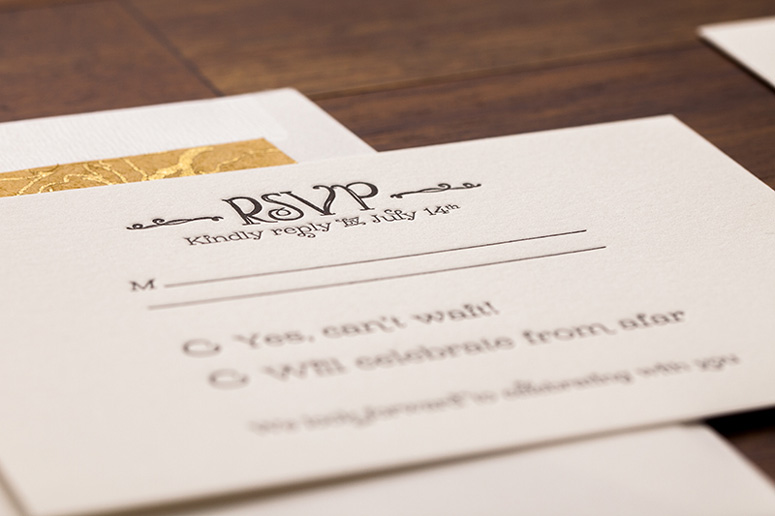
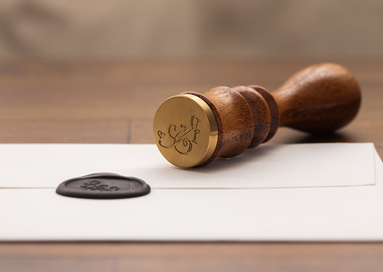
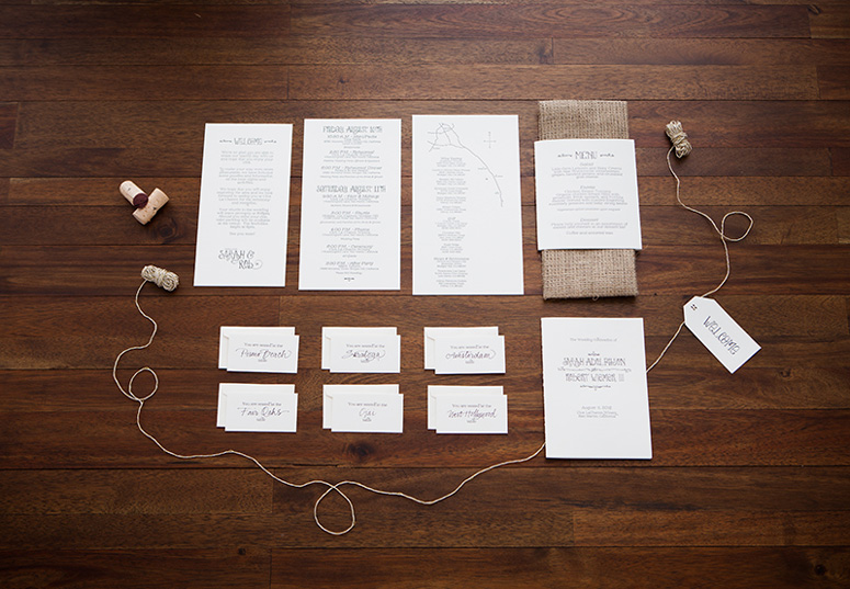
The branding for the wedding started with designing their monogram and once Sarah fell in love with that, everything fell into place. All of the print work used Lady Rene as the focal typeface and Brioche as the secondary typeface. Brioche is so elegant and sweet, while Lady Rene is charming and many of its ornaments are somewhat reminiscent of a vine branch. Every piece was letterpressed with a fairly deep impression on a warm cream colored French cotton paper. Because Sarah is so dear to me, I wanted to make sure the pressing was done properly, so I rented out a Vandercook machine and pressed every piece myself. Sarah wanted to do some of the work herself and be part of the experience, so in addition to texting her photos of the entire process, I created a stencil for her to use to cut all of the envelope liners and secure them to the envelope, in addition to a few other parts that weren't too difficult. Showing Sarah how to score paper was funny, but she got the hang of it and hand scored every single program, menu and thank you card.
Overall, this was a phenomenal project that only brought us closer and I'm sad to see that it's over. If i had to do it all again, I wouldn't change a thing.
Production Lesson(s)
I learned that when it comes to a wedding it is extremely importantly to know who your client is because everyone has an opinion.
Post Author

Duncan Robertson
Former intern at UnderConsideration LLC.
More: Online / On Twitter
Date Published
May 23, 2013
Filed Under
Letterpress
Offset
Wedding materials
Tagged with
hand folded
personal
vandercook
wax seal


About
FPO (For Print Only), is a division of UnderConsideration, celebrating the reality that print is not dead by showcasing the most compelling printed projects.
FPO uses Fonts.com to render Siseriff and Avenir Next.
FPO is run with Six Apart’s MovableType
All comments, ideas and thoughts on FPO are property of their authors; reproduction without the author’s or FPO’s permission is strictly prohibited
Twitter @ucllc
Sign-up for Mailing List
Mailing list managed by MailChimp
Thanks to our advertisers
About UnderConsideration
UnderConsideration is a graphic design firm generating its own projects, initiatives, and content while taking on limited client work. Run by Bryony Gomez-Palacio and Armin Vit in Bloomington, IN. More…
blogs we publish
Brand New / Displaying opinions and focusing solely on corporate and brand identity work.
Art of the Menu / Cataloguing the underrated creativity of menus from around the world.
Quipsologies / Chronicling the most curious, creative, and notable projects, stories, and events of the graphic design industry on a daily basis.
products we sell
Flaunt: Designing effective, compelling and memorable portfolios of creative work.
Brand New Conference videos / Individual, downloadable videos of every presentation since 2010.
Prints / A variety of posters, the majority from our AIforGA series.
Other / Various one-off products.
events we organize
Brand New Conference / A two-day event on corporate and brand identity with some of today's most active and influential practitioners from around the world.
Brand Nieuwe Conference / Ditto but in Amsterdam.
Austin Initiative for Graphic Awesomeness / A speaker series in Austin, TX, featuring some of the graphic design industry's most awesome people.
also
Favorite Things we've Made / In our capacity as graphic designers.
Projects we've Concluded / Long- and short-lived efforts.
UCllc News / Updates on what's going at the corporate level of UnderConsideration.

Related entries
Black Sheep Studio Business Cards and Promotional Items
Herbst & Spungen Wedding Invitation Suite
Cranky Bucks Promotion
Seegno Business Cards
“Miniature Views” Promotion