ADV @ UNDERCONSIDERATION Peek here for details
BROWSE
All aboard the Grahamtrak!
Production Method
Digital
Design
Chris Halverson
Printing
Kinkos (Hey, they hit the color perfect and they were done in 15 min)
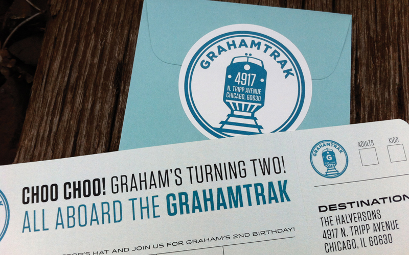
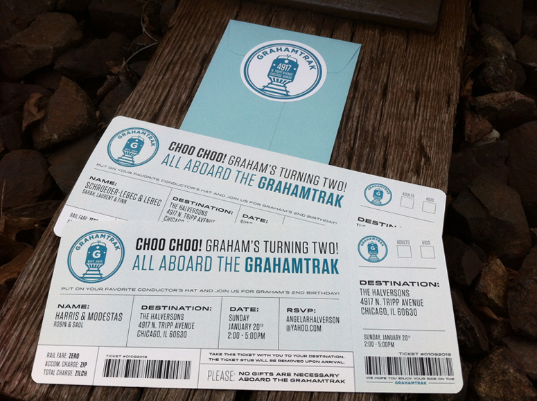
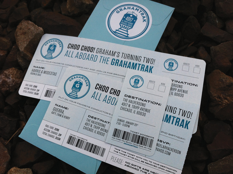
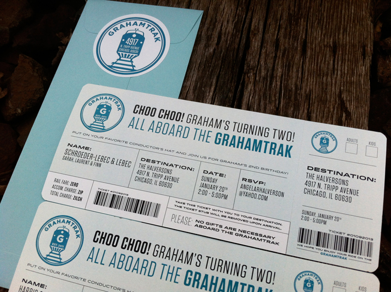
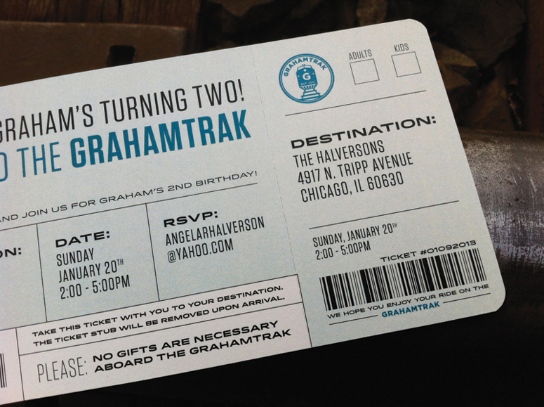
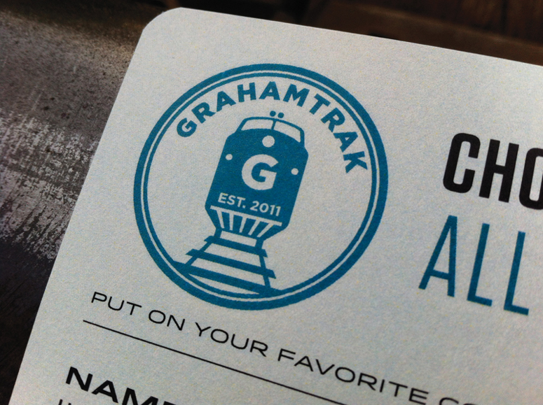
It is difficult—and some would even say wrong—for designers to resist designing anything we can get our hands on, and this includes two-year-olds’ birthday party invitations. Chris Halverson took his son’s obsession with trains to the next level with these “Grahamtrack” train ticket invites, even going so far as to design a logo for the little tyke.
Client
Graham (my son)
Quantity Produced
40 (2 per invite, to account for mistakes)
Production Cost
$95
Production Time
2 days (including trimming, perforating, and corner rounding)
Dimensions (Width × Height × Depth)
9.25 × 3.875 in
Page Count
–
Paper Stock
Mohawk / Superfine White
Number of Colors
CMYK
Varnishes
–
Binding
–
Typography
Tungsten by Hoefler & Frere-Jones
Idlewild by Hoefler & Frere-Jones
Gotham by Hoefler & Frere-Jones
Project Description
My son is OBSESSED with trains. And while he is only turning two and can't appreciate the train ticket style invitation yet, he will look back and realize how cool his dad is.We were originally going to do something much easier and less time consuming for me&mdash:maybe an emailed PDF or even (gasp!) an Evite. But being a designer I felt it was my responsibility to do something awesome for his birthday. The ticket idea came immediately, but the "Grahamtrak" name came later, and it was one of those "ah HA!" epiphany type moments that designers long for. I started to work on the logo (yes, I know branding my 2 year old is sick) and within a couple of days I had knocked out a rough draft. I kept tweaking it here and there until I ended up with what you see here. (I'm also doing a "Now Boarding" style sign that isn't ready in time for this submission)
My wife wanted to steer me away from personalizing each one (every ticket is addressed to the particular recipient) but we both knew that perforating the right-third of the ticket and rounding each corner would send it into another dimension. My hope is that people will get this in the mail and at first glance have to ask their spouse, "Honey, when did we buy Amtrak tickets?"
Production Lesson(s)
Perforating each was the toughest part. Keeping the tool straight without it pushing the ruler to the side was actually pretty difficult.I wanted the space for each name to be the exact same on every invitation (even though a recipient wouldn't see any but their own) but of course some names were super long, some had more kids than the next and some people were single with short names. I ended up having to tweak each one individually, which threw off the information next to it, so getting the space equal on every invite wasn't so much difficult but very time consuming.

Post Author

Duncan Robertson
Former intern at UnderConsideration LLC.
More: Online / On Twitter
Date Published
May 13, 2013
Filed Under
Digital
Invitations
Tagged with
birthday
low budget
perforation
rounded corners
ticket


About
FPO (For Print Only), is a division of UnderConsideration, celebrating the reality that print is not dead by showcasing the most compelling printed projects.
FPO uses Fonts.com to render Siseriff and Avenir Next.
FPO is run with Six Apart’s MovableType
All comments, ideas and thoughts on FPO are property of their authors; reproduction without the author’s or FPO’s permission is strictly prohibited
Twitter @ucllc
Sign-up for Mailing List
Mailing list managed by MailChimp
Thanks to our advertisers
About UnderConsideration
UnderConsideration is a graphic design firm generating its own projects, initiatives, and content while taking on limited client work. Run by Bryony Gomez-Palacio and Armin Vit in Bloomington, IN. More…
blogs we publish
Brand New / Displaying opinions and focusing solely on corporate and brand identity work.
Art of the Menu / Cataloguing the underrated creativity of menus from around the world.
Quipsologies / Chronicling the most curious, creative, and notable projects, stories, and events of the graphic design industry on a daily basis.
products we sell
Flaunt: Designing effective, compelling and memorable portfolios of creative work.
Brand New Conference videos / Individual, downloadable videos of every presentation since 2010.
Prints / A variety of posters, the majority from our AIforGA series.
Other / Various one-off products.
events we organize
Brand New Conference / A two-day event on corporate and brand identity with some of today's most active and influential practitioners from around the world.
Brand Nieuwe Conference / Ditto but in Amsterdam.
Austin Initiative for Graphic Awesomeness / A speaker series in Austin, TX, featuring some of the graphic design industry's most awesome people.
also
Favorite Things we've Made / In our capacity as graphic designers.
Projects we've Concluded / Long- and short-lived efforts.
UCllc News / Updates on what's going at the corporate level of UnderConsideration.

Related entries
Black Sheep Studio Business Cards and Promotional Items
E.A.S.E. Stationery Set
“A to Z Letters for Sale” Promo
End of Work iPad and Notebook Cases
CNN Digital New Hire Kit