ADV @ UNDERCONSIDERATION Peek here for details
BROWSE
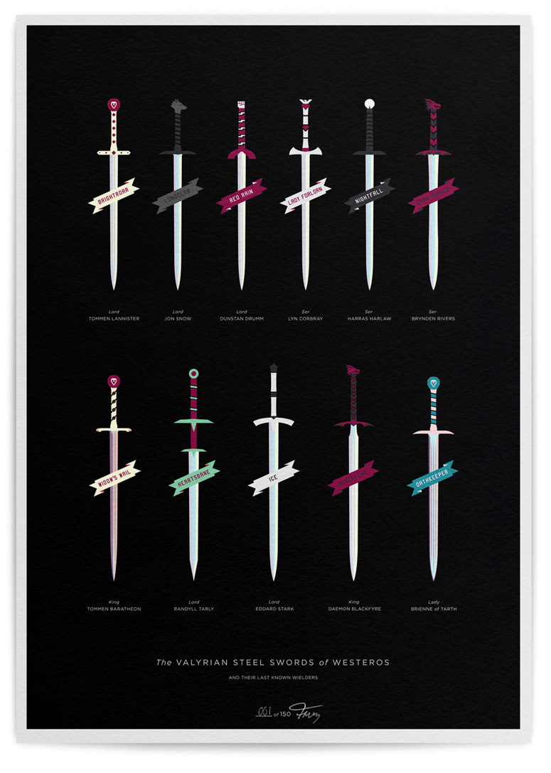
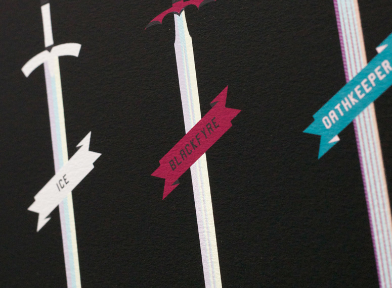
The Valyrian Steel Swords of Westeros
Production Method
Digital
Silkscreen
Design
Lorenzo Fruzza
Printing
Atom Pinting
This poster serves as a catalogue of the most prominent Valyrian steel swords from the “A Song of Ice and Fire” (aka Game of Thrones) book series. Influenced by Darrin Crescenzi’s Best of 2012 “The Houses of Westeros” poster, Lorenzo Fruzza focused on giving the magical swords a clean modern feel, which is contrary to the books’ raw timbre.
Dimensions (Width × Height × Depth)
16.5 × 23.4 × .01 in
Page Count
1
Paper Stock
Hahnemühle / German Etching / 310gsm
Number of Colors
Giclée
Varnishes
Silkscreen Varnish layer over blades
Binding
–
Typography
Gotham
Project Description
The Valyrian Steel Swords of Westeros—giclée / screen print16.5" x 23.4" giclée archival pigment inks print with silkscreen varnish, on Hahnemühle German Etching 310gsm paper Hand-numbered edition of 150
Inspired by the "A Song of Ice and Fire" books by G. R. R. Martin and the subsequent homage poster by Darrin Crescenzi, I was keen to create a visual catalogue of the Valyrian steel swords of Westeros.
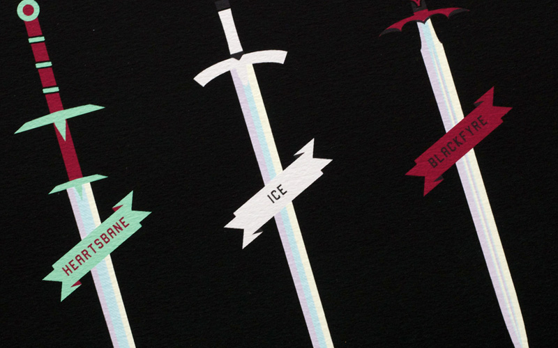
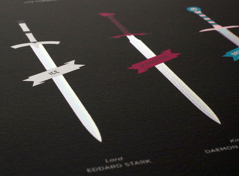
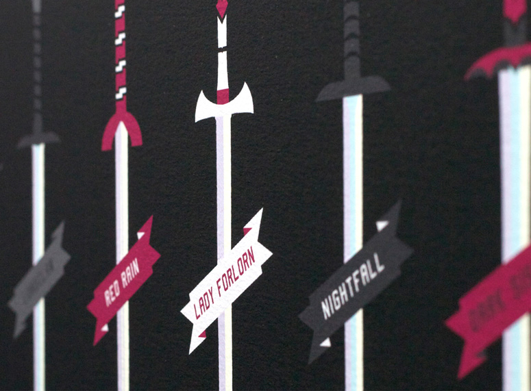
Forged from a magical metal in the days of old Valyria, Valyrian steel swords are of the highest quality and extremely rare, which makes them some of the most sought after prizes in "A Song of Ice and Fire." I wanted to illustrate the main* swords, referencing their last known wielders and each wielder's house. Similar to Crescenzi's poster, I intended the illustrations to feel modern and clean, juxtaposing the book's grittiness.
Contrary to the description given in the books, I chose to make the blades almost luminous and glowing but retained the subtle waves in the steel and the red tinge within Oathkeeper and Widow's Wail. The screen layer adds a varnish to the blades to give them a gloss shine.
I used a varsity-esque font for the sword names because I like the idea of them feeling like a sports team you might support. Everyone has a favorite character or house from the series, so that was something I wanted to bring through using a visual language that people would be familiar with but not necessarily expect. This is echoed in the use of only 2 'house colours' to create each sword handle and name scroll.
*whilst other swords are mentioned, I have attempted to visualise the ones named and given importance by the book.
Production Lesson(s)
Working with tight digital imagery, then introducing a hand pulled screen element proved quite tricky at first and the initial screen design had to be more simplified. Understanding the strengths of one print process versus another, is fundamental right from the start.
Post Author

Duncan Robertson
Former intern at UnderConsideration LLC.
More: Online / On Twitter
Date Published
August 15, 2013
Filed Under
Digital
Posters
Silkscreen
Tagged with
catalog
etching
Game of Thrones
hand-numbered
varnish


About
FPO (For Print Only), is a division of UnderConsideration, celebrating the reality that print is not dead by showcasing the most compelling printed projects.
FPO uses Fonts.com to render Siseriff and Avenir Next.
FPO is run with Six Apart’s MovableType
All comments, ideas and thoughts on FPO are property of their authors; reproduction without the author’s or FPO’s permission is strictly prohibited
Twitter @ucllc
Sign-up for Mailing List
Mailing list managed by MailChimp
Thanks to our advertisers
About UnderConsideration
UnderConsideration is a graphic design firm generating its own projects, initiatives, and content while taking on limited client work. Run by Bryony Gomez-Palacio and Armin Vit in Bloomington, IN. More…
blogs we publish
Brand New / Displaying opinions and focusing solely on corporate and brand identity work.
Art of the Menu / Cataloguing the underrated creativity of menus from around the world.
Quipsologies / Chronicling the most curious, creative, and notable projects, stories, and events of the graphic design industry on a daily basis.
products we sell
Flaunt: Designing effective, compelling and memorable portfolios of creative work.
Brand New Conference videos / Individual, downloadable videos of every presentation since 2010.
Prints / A variety of posters, the majority from our AIforGA series.
Other / Various one-off products.
events we organize
Brand New Conference / A two-day event on corporate and brand identity with some of today's most active and influential practitioners from around the world.
Brand Nieuwe Conference / Ditto but in Amsterdam.
Austin Initiative for Graphic Awesomeness / A speaker series in Austin, TX, featuring some of the graphic design industry's most awesome people.
also
Favorite Things we've Made / In our capacity as graphic designers.
Projects we've Concluded / Long- and short-lived efforts.
UCllc News / Updates on what's going at the corporate level of UnderConsideration.

Related entries
Um Caminho para Santiago CD Package and Diary
36 Days of Type Poster
CNN Digital New Hire Kit
Alivu EVOO Packaging
Ministry of Environment in Colombia Poster