ADV @ UNDERCONSIDERATION Peek here for details
BROWSE
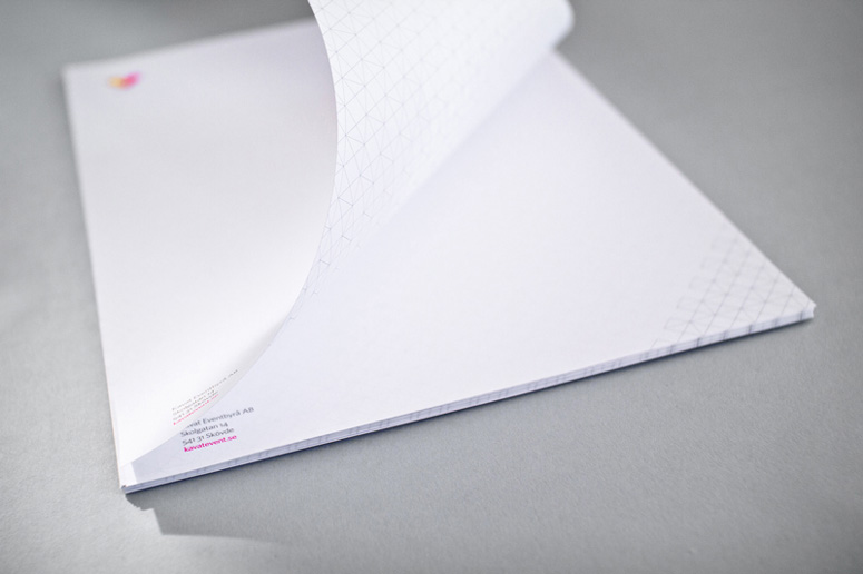
Kavat Stationery
Production Method
Emboss
Foil stamp
Offset
Design
GREBBAN
Printing
Göteborgstryckeriet
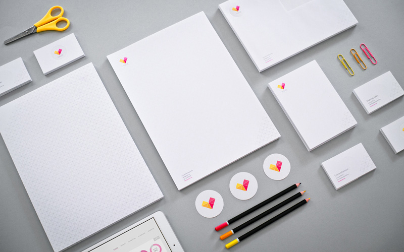
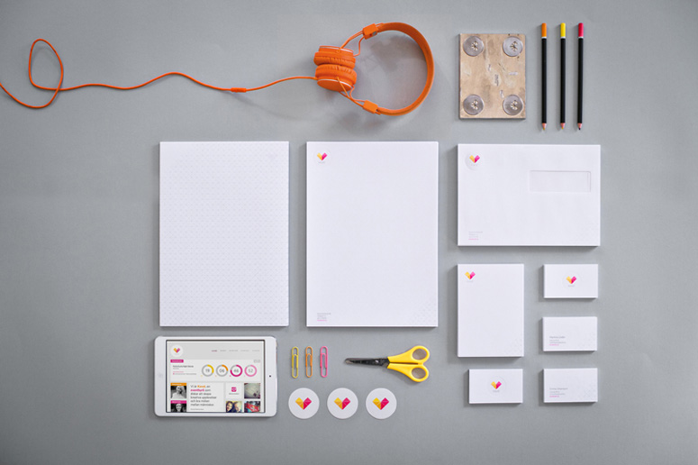
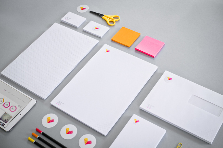
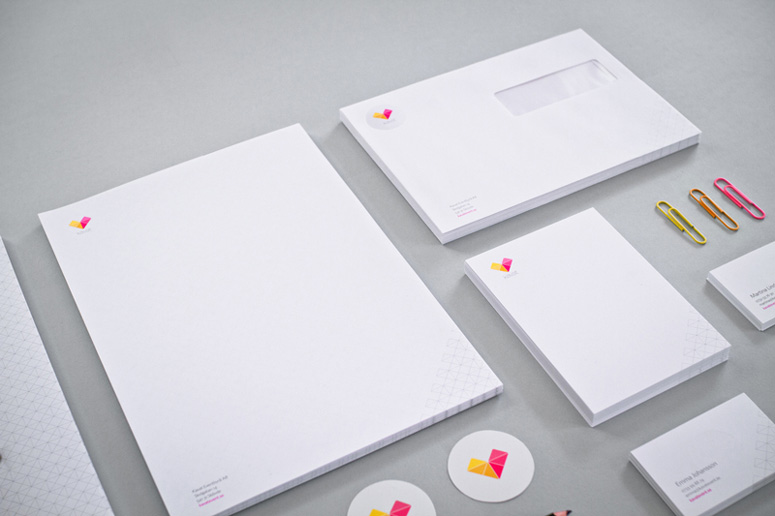
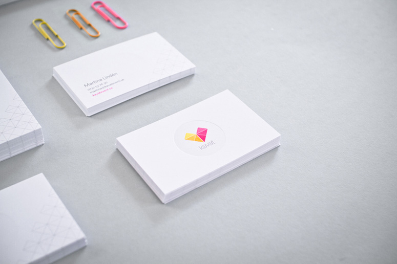
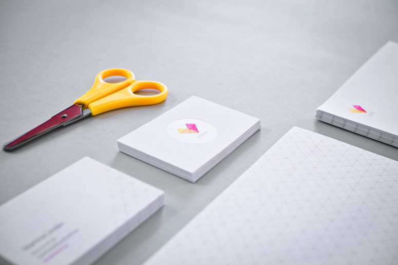
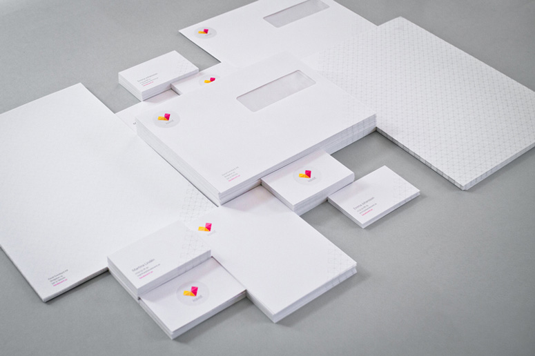
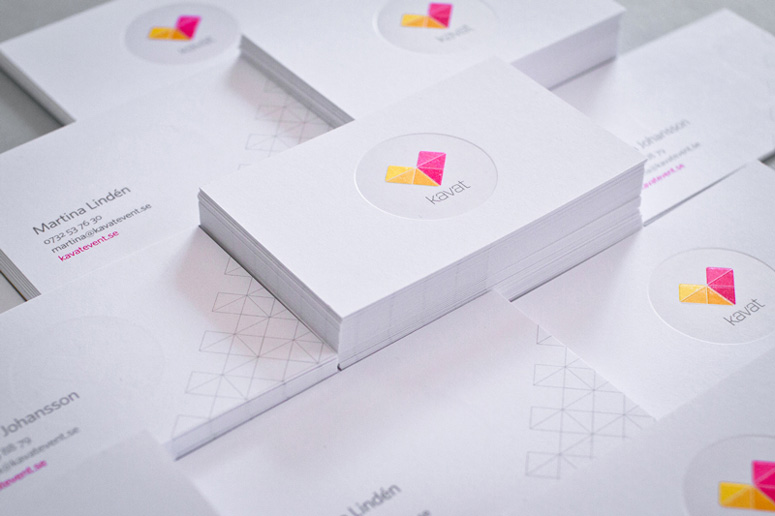
Kavat—a small event planning firm with big heart—came to Grebban for an visual identity that felt more professionally credible than their previous one. The resulting logo and application maintains a feeling of playful honesty, while bringing in an edge of modern elegance. The new color palette exudes creativity, energy, and reflects Kavat’s versatility. A double foil and embossing were used on the stationery and business cards so the white circle is still visible on white paper.
Dimensions (Width × Height × Depth)
–
Page Count
–
Paper Stock
Scandia / 2000 / White / 440g
Scandia / 2000 / White / 100g
Scandia / 2000 / White / 115g
Scandia / 2000 / White / 300g
Number of Colors
4
Varnishes
–
Binding
–
Typography
Whitney

Project Description
We got the mission to create the identity, logotype, and website for the company Kavat. Our client—Kavat—came to us with a goal of "feeling like they have a more professional image." The result is an identity with a feeling of honesty and elegance, in a modern package. The color palette breaths creativity, energy and reflects Kavat's different work areas.Production Lesson(s)
We wanted the white circle around the logo to be visible even on white paper. So, we came up with the idea to emboss and foil stamp the circle area to create extra contrast against the matt paper.
Post Author

Duncan Robertson
Former intern at UnderConsideration LLC.
More: Online / On Twitter
Date Published
October 24, 2013
Filed Under
Business Cards
Emboss
Foil stamp
Offset
Stationery
Tagged with
double foil
HTF
triangle grid
Whitney


About
FPO (For Print Only), is a division of UnderConsideration, celebrating the reality that print is not dead by showcasing the most compelling printed projects.
FPO uses Fonts.com to render Siseriff and Avenir Next.
FPO is run with Six Apart’s MovableType
All comments, ideas and thoughts on FPO are property of their authors; reproduction without the author’s or FPO’s permission is strictly prohibited
Twitter @ucllc
Sign-up for Mailing List
Mailing list managed by MailChimp
Thanks to our advertisers
About UnderConsideration
UnderConsideration is a graphic design firm generating its own projects, initiatives, and content while taking on limited client work. Run by Bryony Gomez-Palacio and Armin Vit in Bloomington, IN. More…
blogs we publish
Brand New / Displaying opinions and focusing solely on corporate and brand identity work.
Art of the Menu / Cataloguing the underrated creativity of menus from around the world.
Quipsologies / Chronicling the most curious, creative, and notable projects, stories, and events of the graphic design industry on a daily basis.
products we sell
Flaunt: Designing effective, compelling and memorable portfolios of creative work.
Brand New Conference videos / Individual, downloadable videos of every presentation since 2010.
Prints / A variety of posters, the majority from our AIforGA series.
Other / Various one-off products.
events we organize
Brand New Conference / A two-day event on corporate and brand identity with some of today's most active and influential practitioners from around the world.
Brand Nieuwe Conference / Ditto but in Amsterdam.
Austin Initiative for Graphic Awesomeness / A speaker series in Austin, TX, featuring some of the graphic design industry's most awesome people.
also
Favorite Things we've Made / In our capacity as graphic designers.
Projects we've Concluded / Long- and short-lived efforts.
UCllc News / Updates on what's going at the corporate level of UnderConsideration.

Related entries
KitchenAid Limited Edition Cards
BOYCO Classpack® Book
Herbst & Spungen Wedding Invitation Suite
Fracas Productions Business Cards
Gunnel Wåhlstrand Exhibit Book