ADV @ UNDERCONSIDERATION Peek here for details
BROWSE
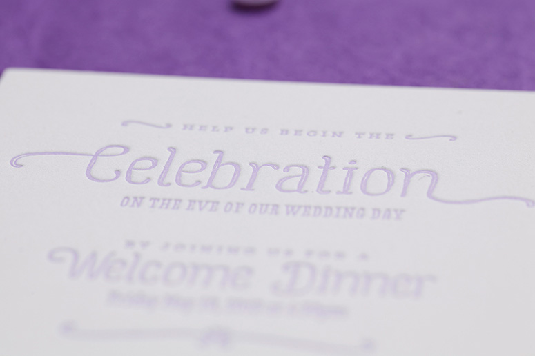
Jessica and Scott Wedding Materials
Production Method
Letterpress
Design
Cristina Pandol
Photography: Garrett Shannon
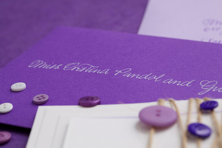
Calligraphy: Katrina S. L. Centeno of Calligraphy Katrina
Printing
Self Printed via Vandercook Rental at Lala Press
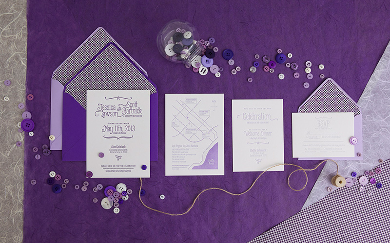
I learned a new word on this one! Ombré is a word borrowed from French, which means “having colors or tones that shade into each other.” In this case ombré happens where the purple print starts darker and gets lighter across the different pieces in the wedding suite.
Client
Jessica Lawson
Quantity Produced
100
Production Cost
$1,500
Production Time
4 weeks
Dimensions (Width × Height × Depth)
–
Page Count
4
Paper Stock
118C
Number of Colors
1
Varnishes
–
Binding
–
Typography
Gulyesa
Love Potion
Museo Slab
Project Description
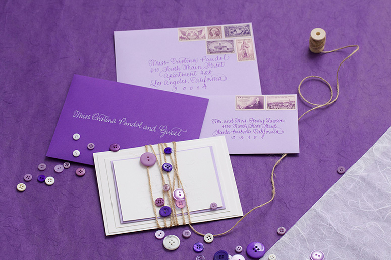
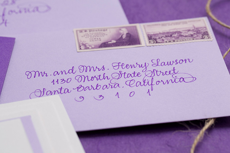
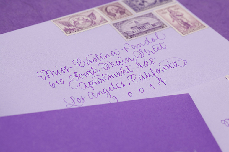
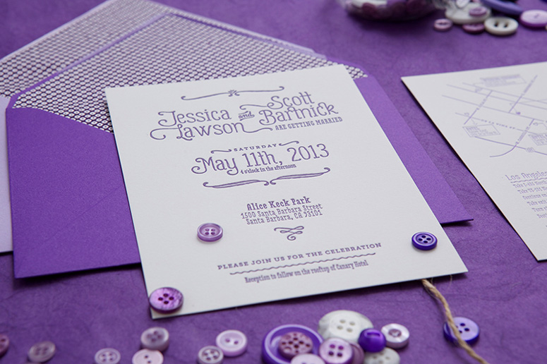
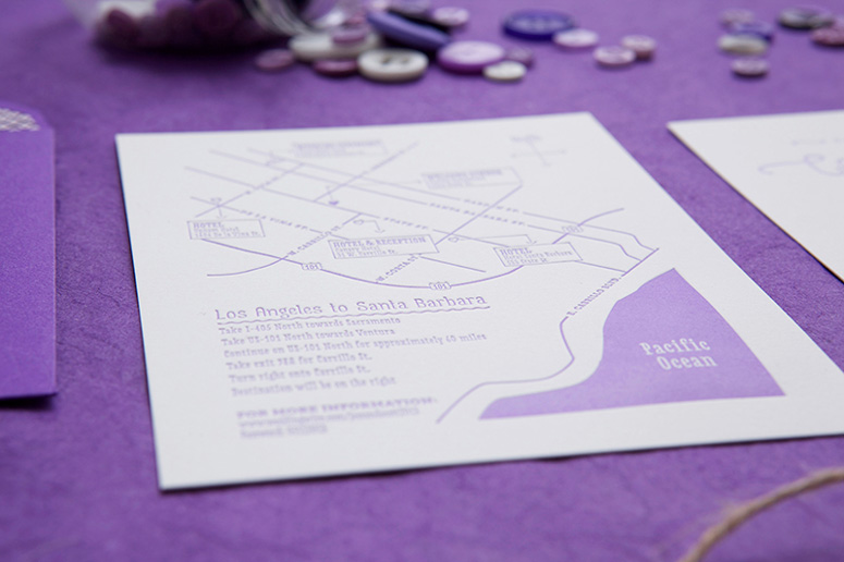
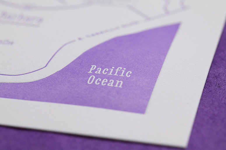
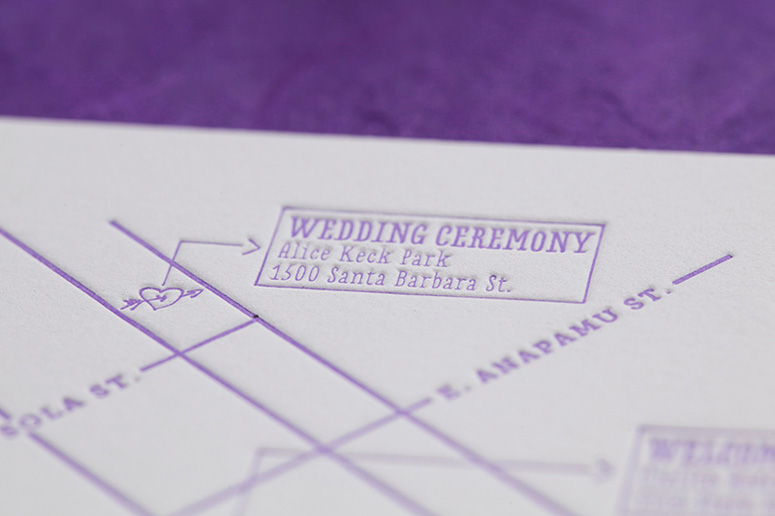
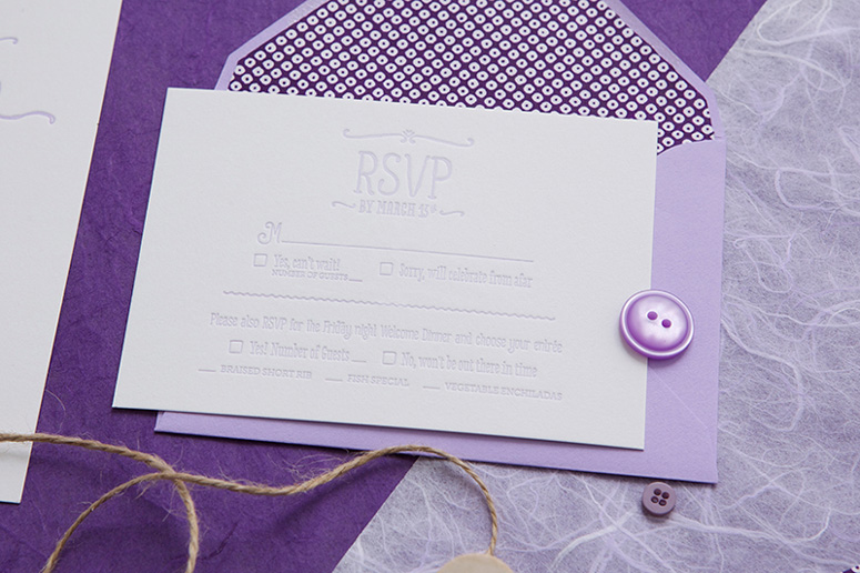
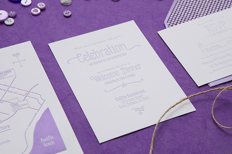
Ombré had been such a hot trend in fashion, hair, design, etc., that I was dying to apply the concept to stationery but was waiting for the right project to come along. When Jessica reached out to me for her wedding and stressed how much she loves all shades of purple, I knew that she would die over the concept. Jessica & Scott are a young, fun couple that met in college and were having a destination wedding in Santa Barbara, CA. The wedding suite progresses from dark purple to light purple, and everything from the calligraphy to the postage is purple.Ombré had been such a hot trend in fashion, hair, design, etc., that I was dying to apply the concept to stationery but was waiting for the right project to come along. When Jessica reached out to me for her wedding and stressed how much she loves all shades of purple, I knew that she would die over the concept. Jessica & Scott are a young, fun couple that met in college and were having a destination wedding in Santa Barbara, CA. The wedding suite progresses from dark purple to light purple, and everything from the calligraphy to the postage is purple.
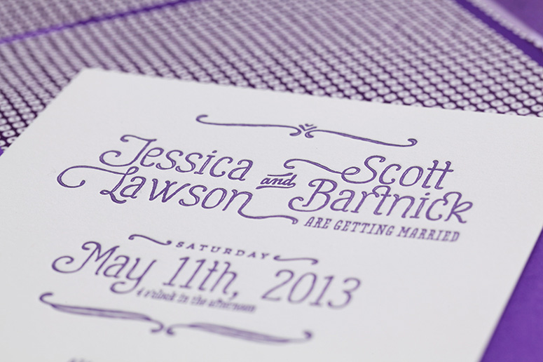
The design revolves around the pairing of three very different typefaces to show the couple's playful and eclectic style. The primary type is Gulyesa and Love Potion & Museo Slab were used to compliment the primary type. Every piece was letter pressed with a fairly deep impression on a bright white French cotton paper. I wanted to make sure the pressing and ombré was done properly, so I rented a Vandercook machine and pressed every piece myself. Jessica wanted to do some of the work herself and be part of the experience. I created a stencil for her to use to cut all of the envelope liners and Jessica secured all of the pieces together with string and buttons.
Production Lesson(s)
The ombré was challenging and a lot of test prints where needed, but the best way to achieve this look is to mix the lightest ink color and darkest ink color, start with the lightest ink color and very slowly add the darker ink color to the letterpress drum so the machine naturally mixes the color. It would be impossible to do this with a large quantity project because you wouldn't be able to re-ink the machine and achieve the same color.
Post Author

Duncan Robertson
Former intern at UnderConsideration LLC.
More: Online / On Twitter
Date Published
October 17, 2013
Filed Under
Letterpress
Wedding materials
Tagged with
buttons
ombre
purple


About
FPO (For Print Only), is a division of UnderConsideration, celebrating the reality that print is not dead by showcasing the most compelling printed projects.
FPO uses Fonts.com to render Siseriff and Avenir Next.
FPO is run with Six Apart’s MovableType
All comments, ideas and thoughts on FPO are property of their authors; reproduction without the author’s or FPO’s permission is strictly prohibited
Twitter @ucllc
Sign-up for Mailing List
Mailing list managed by MailChimp
Thanks to our advertisers
About UnderConsideration
UnderConsideration is a graphic design firm generating its own projects, initiatives, and content while taking on limited client work. Run by Bryony Gomez-Palacio and Armin Vit in Bloomington, IN. More…
blogs we publish
Brand New / Displaying opinions and focusing solely on corporate and brand identity work.
Art of the Menu / Cataloguing the underrated creativity of menus from around the world.
Quipsologies / Chronicling the most curious, creative, and notable projects, stories, and events of the graphic design industry on a daily basis.
products we sell
Flaunt: Designing effective, compelling and memorable portfolios of creative work.
Brand New Conference videos / Individual, downloadable videos of every presentation since 2010.
Prints / A variety of posters, the majority from our AIforGA series.
Other / Various one-off products.
events we organize
Brand New Conference / A two-day event on corporate and brand identity with some of today's most active and influential practitioners from around the world.
Brand Nieuwe Conference / Ditto but in Amsterdam.
Austin Initiative for Graphic Awesomeness / A speaker series in Austin, TX, featuring some of the graphic design industry's most awesome people.
also
Favorite Things we've Made / In our capacity as graphic designers.
Projects we've Concluded / Long- and short-lived efforts.
UCllc News / Updates on what's going at the corporate level of UnderConsideration.

Related entries
Black Sheep Studio Business Cards and Promotional Items
Herbst & Spungen Wedding Invitation Suite
Cranky Bucks Promotion
Seegno Business Cards
“Miniature Views” Promotion