ADV @ UNDERCONSIDERATION Peek here for details
BROWSE
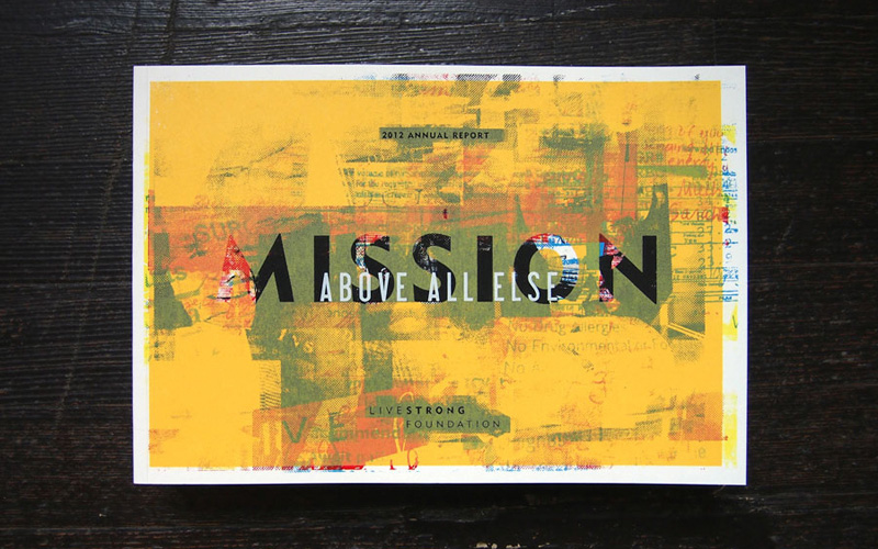
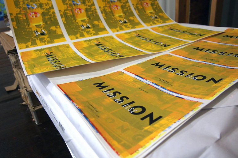
Mission Above All Else: LIVESTRONG Foundation 2012 Annual Report
Production Method
Offset
Silkscreen
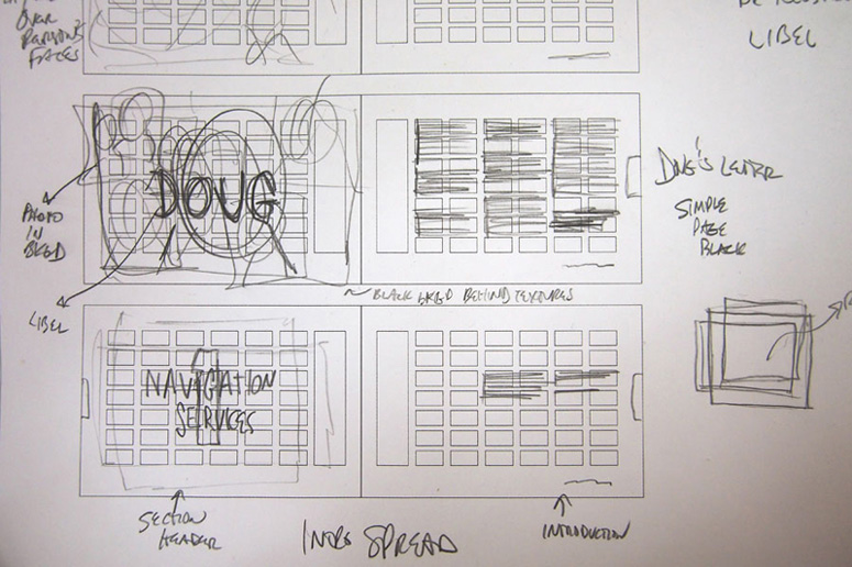
Design
BLDG
Printing
Hennegan
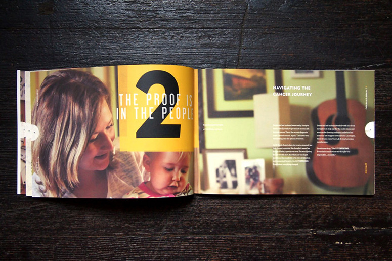
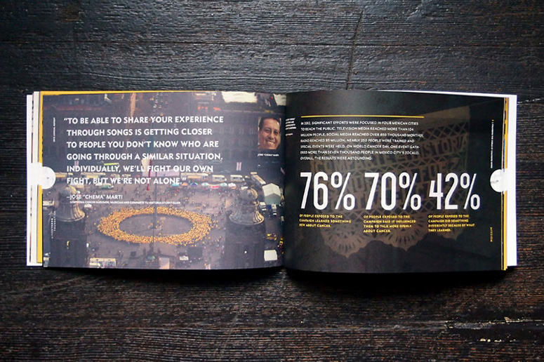
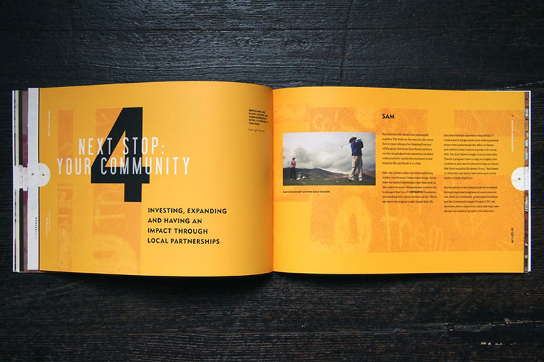
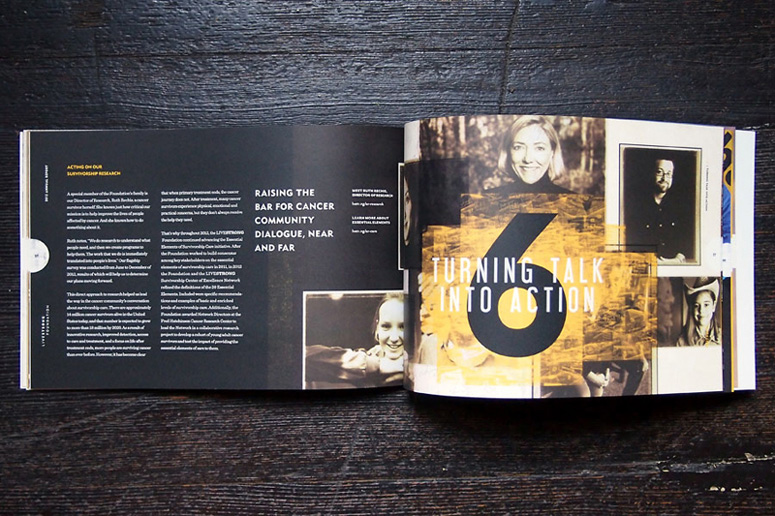
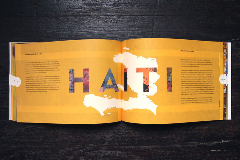
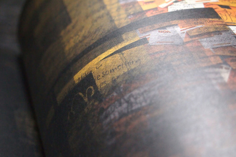
The concept for the fifteenth LIVESTRONG annual report carries from the content through the design to the chosen printing process. The idea involves visually conveying the layered experience of having cancer through overlaying textures and patterns with bold colors and complex articulation. Screen printing works as a metaphor for and literal expression of these layers of a cancer patient’s journey.
Dimensions (Width × Height × Depth)
11 × 7.5 × .375 in
Page Count
54
Paper Stock
Cover: Legion Paper / Coventry Rag
Text: Monadnock / Dulcet
Number of Colors
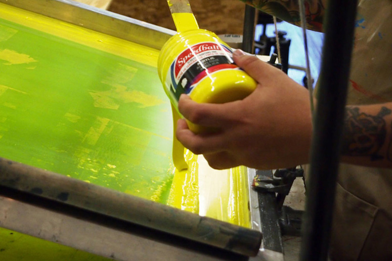
Cover: 6-color screen print
Interior: 4-color
Varnishes
Interior: aqueous coat
Binding
perfect binding with custom cover
Typography
Metro
Mr. Eaves
Sentinel
Libel Suit
Project Description
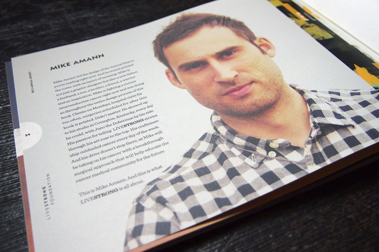
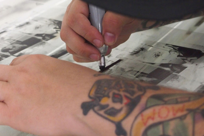
After 15 years of tremendous strides toward improving the lives of people affected by cancer, The LIVESTRONG Foundation sought a renewed platform to showcase their efforts. We partnered with local advertising agency Proclamation to design the organization's 2012 annual report which visually communicates the layered experience of having cancer. By layering different textures and patterns with bold colors and complex language, our design captures the emotional journey from diagnosis to treatment to friends and family support and LIVESTRONG's assistance. We screen printed the covers for 900 copies and also developed a responsive website to extend the visual story into the digital space.Production Lesson(s)
Hand-pulling 770 screen printed covers is real physical labor, especially when you figure in 6 colors.Being that the concept is all about the parallels between the layers of being a cancer patient and the layers of screen printing, the design utilizes dot patterns that would typically be a nightmare for offset printing. Hennegan's stochastic screening technique eliminated all moire patterning and produced a super-sharp print. Without this technique, the final print would not be nearly as successful.

Post Author

Duncan Robertson
Former intern at UnderConsideration LLC.
More: Online / On Twitter
Date Published
November 18, 2013
Filed Under
Annual Reports
Offset
Silkscreen
Tagged with
layers
stochastic
yellow


About
FPO (For Print Only), is a division of UnderConsideration, celebrating the reality that print is not dead by showcasing the most compelling printed projects.
FPO uses Fonts.com to render Siseriff and Avenir Next.
FPO is run with Six Apart’s MovableType
All comments, ideas and thoughts on FPO are property of their authors; reproduction without the author’s or FPO’s permission is strictly prohibited
Twitter @ucllc
Sign-up for Mailing List
Mailing list managed by MailChimp
Thanks to our advertisers
About UnderConsideration
UnderConsideration is a graphic design firm generating its own projects, initiatives, and content while taking on limited client work. Run by Bryony Gomez-Palacio and Armin Vit in Bloomington, IN. More…
blogs we publish
Brand New / Displaying opinions and focusing solely on corporate and brand identity work.
Art of the Menu / Cataloguing the underrated creativity of menus from around the world.
Quipsologies / Chronicling the most curious, creative, and notable projects, stories, and events of the graphic design industry on a daily basis.
products we sell
Flaunt: Designing effective, compelling and memorable portfolios of creative work.
Brand New Conference videos / Individual, downloadable videos of every presentation since 2010.
Prints / A variety of posters, the majority from our AIforGA series.
Other / Various one-off products.
events we organize
Brand New Conference / A two-day event on corporate and brand identity with some of today's most active and influential practitioners from around the world.
Brand Nieuwe Conference / Ditto but in Amsterdam.
Austin Initiative for Graphic Awesomeness / A speaker series in Austin, TX, featuring some of the graphic design industry's most awesome people.
also
Favorite Things we've Made / In our capacity as graphic designers.
Projects we've Concluded / Long- and short-lived efforts.
UCllc News / Updates on what's going at the corporate level of UnderConsideration.

Related entries
2017 Brand New Conference Program
Severe(d): A Creepy Poetry Collection by Holly Riordan
Um Caminho para Santiago CD Package and Diary
BOYCO Classpack® Book
Antes de Perder la Esperanza Book