ADV @ UNDERCONSIDERATION Peek here for details
BROWSE
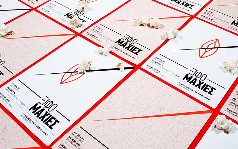
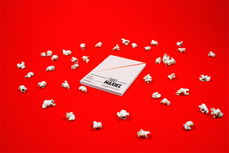
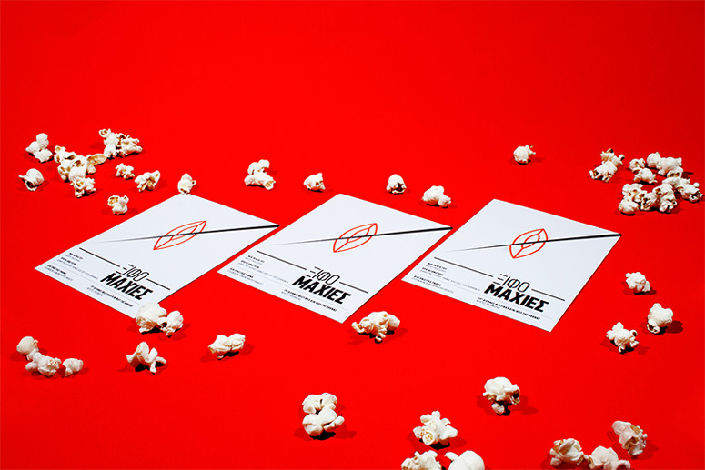
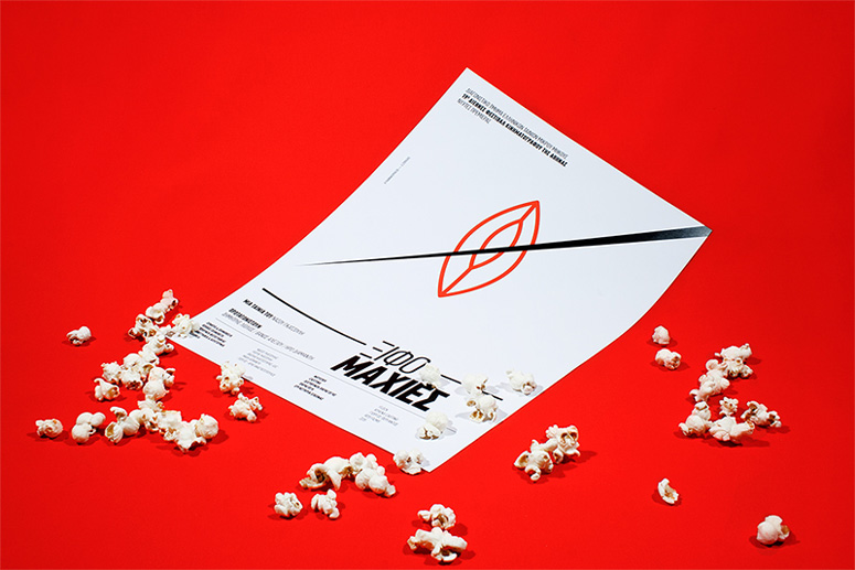
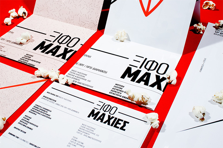
“Swordfights” Movie Promotional Materials
Production Method
Digital
Design
The Birthdays™
Konstantina Yiannakopoulou
George Strouzas
Printing
Alphabet S.A
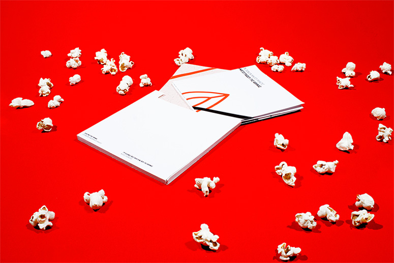
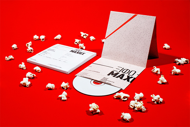
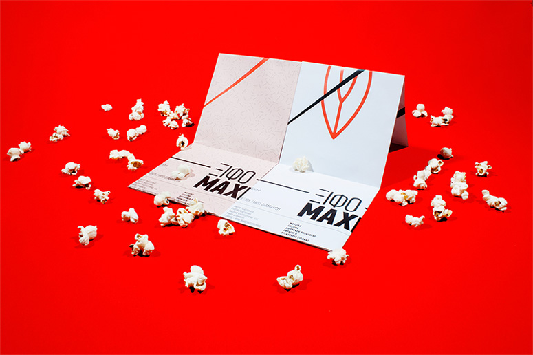
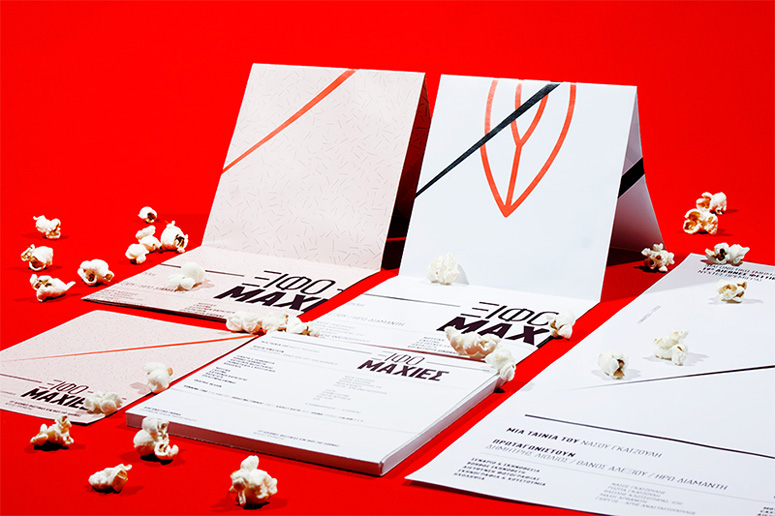
The posters designed for this short film serve as the visual identity, promotional pieces, and key aspects of the DVD packaging. The Birthdays™ extended the film makers’ choices and analogies into the visual representation through simple illustration and typography choices.
Client
Nasos Gatzoulis
Quantity Produced
Posters: 50
Flyers: 100
DVD Packaging: 50
Production Cost
$138.04
Production Time
2 Days
Dimensions (Width × Height × Depth)
Posters: 11.69 × 16.54 in
Flyers: 4.41 in × 6.1 in
DVD Packaging: 5.91 × 5.91 × 0.39 in
Page Count
–
Paper Stock
Velvet Matte / 120 gr
Velvet Matte / 250 gr
Number of Colors
2
Varnishes
–
Binding
–
Typography
PF Din Text Compressed Pro
Project Description
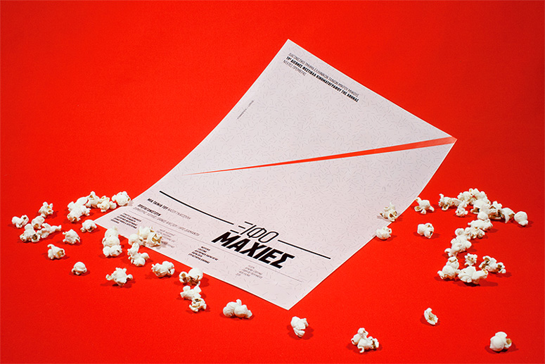
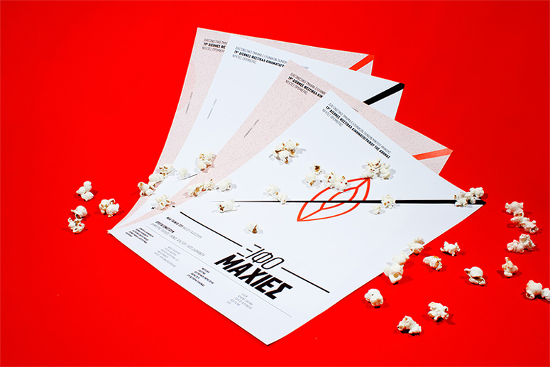
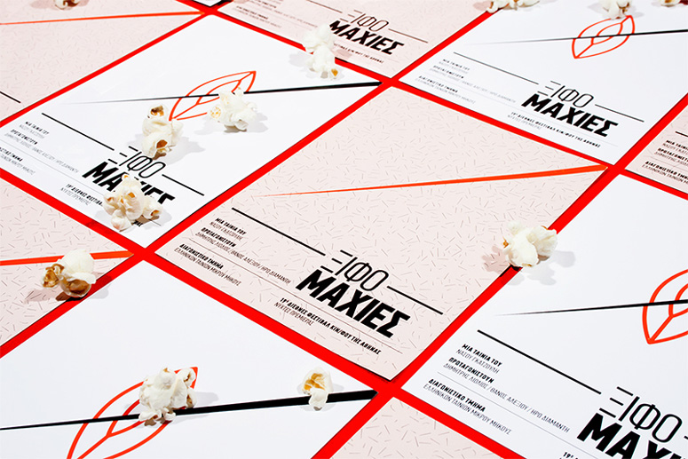
The design of this movie identity was approached in a more semantically and less chatty way, which is based on the overall feel of the film rather than a snapshot (highlight). The absolute and solid typographic style reflects the intense dialogues between the actors. This basic fact of the movie is communicated with two very different weights of the same font in both the title (to look like the compound word), and the ancillary information. All elements—the typography and illustration—are the same on both versions of the poster, except for the basic graphic. The variant-version (the pink one) presents far fewer elements from the idea of the film, but with a funnier approach, something that characterizes the atmosphere of the film.Production Lesson(s)
The title of the movie, Swordfights, has been figuratively used by the filmmaker and in a funny way—no one in the film actually fights with swords. So the most difficult part was to visualize the title in relation to the film's content, and effectively communicate the intensity of the film's atmosphere. The typography and the graphic played important role.
Post Author

Duncan Robertson
Former intern at UnderConsideration LLC.
More: Online / On Twitter
Date Published
December 17, 2013
Filed Under
Digital
Posters
Tagged with
black and red
DIN
Greek
minimalist


About
FPO (For Print Only), is a division of UnderConsideration, celebrating the reality that print is not dead by showcasing the most compelling printed projects.
FPO uses Fonts.com to render Siseriff and Avenir Next.
FPO is run with Six Apart’s MovableType
All comments, ideas and thoughts on FPO are property of their authors; reproduction without the author’s or FPO’s permission is strictly prohibited
Twitter @ucllc
Sign-up for Mailing List
Mailing list managed by MailChimp
Thanks to our advertisers
About UnderConsideration
UnderConsideration is a graphic design firm generating its own projects, initiatives, and content while taking on limited client work. Run by Bryony Gomez-Palacio and Armin Vit in Bloomington, IN. More…
blogs we publish
Brand New / Displaying opinions and focusing solely on corporate and brand identity work.
Art of the Menu / Cataloguing the underrated creativity of menus from around the world.
Quipsologies / Chronicling the most curious, creative, and notable projects, stories, and events of the graphic design industry on a daily basis.
products we sell
Flaunt: Designing effective, compelling and memorable portfolios of creative work.
Brand New Conference videos / Individual, downloadable videos of every presentation since 2010.
Prints / A variety of posters, the majority from our AIforGA series.
Other / Various one-off products.
events we organize
Brand New Conference / A two-day event on corporate and brand identity with some of today's most active and influential practitioners from around the world.
Brand Nieuwe Conference / Ditto but in Amsterdam.
Austin Initiative for Graphic Awesomeness / A speaker series in Austin, TX, featuring some of the graphic design industry's most awesome people.
also
Favorite Things we've Made / In our capacity as graphic designers.
Projects we've Concluded / Long- and short-lived efforts.
UCllc News / Updates on what's going at the corporate level of UnderConsideration.

Related entries
Black Sheep Studio Business Cards and Promotional Items
E.A.S.E. Stationery Set
“A to Z Letters for Sale” Promo
End of Work iPad and Notebook Cases
CNN Digital New Hire Kit