ADV @ UNDERCONSIDERATION Peek here for details
BROWSE
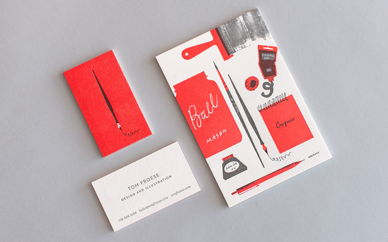
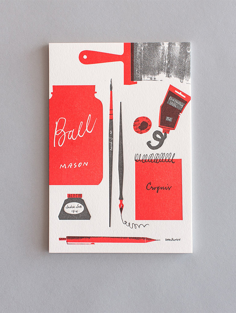
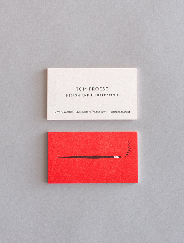
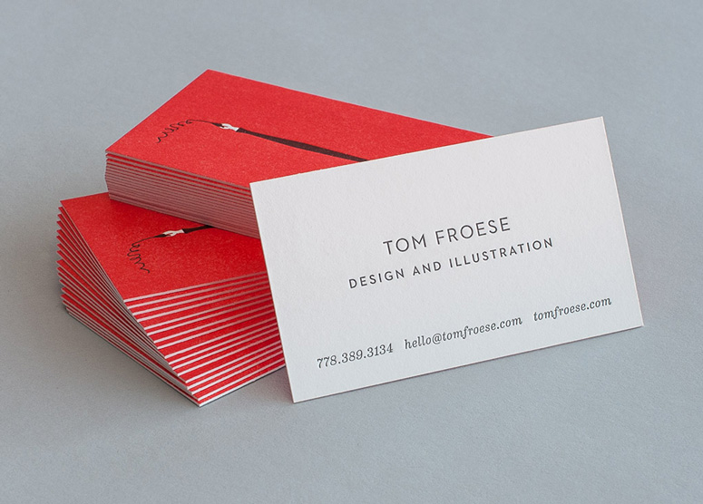
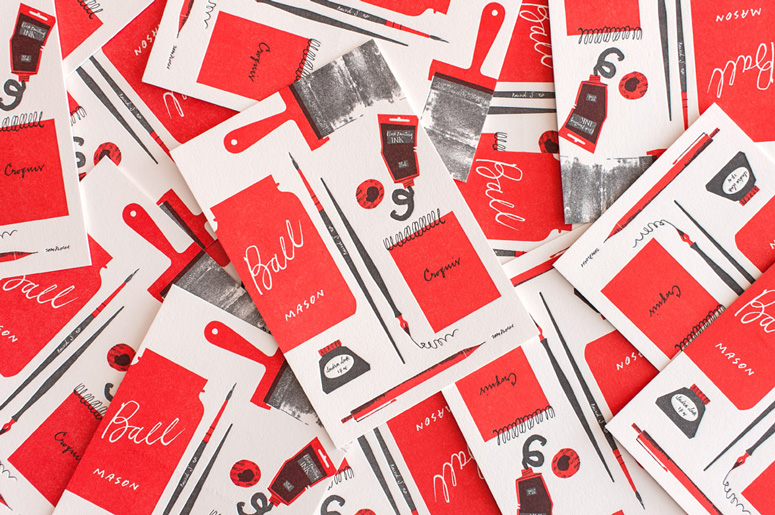
Tom Froese Stationery
Production Method
Letterpress
Design
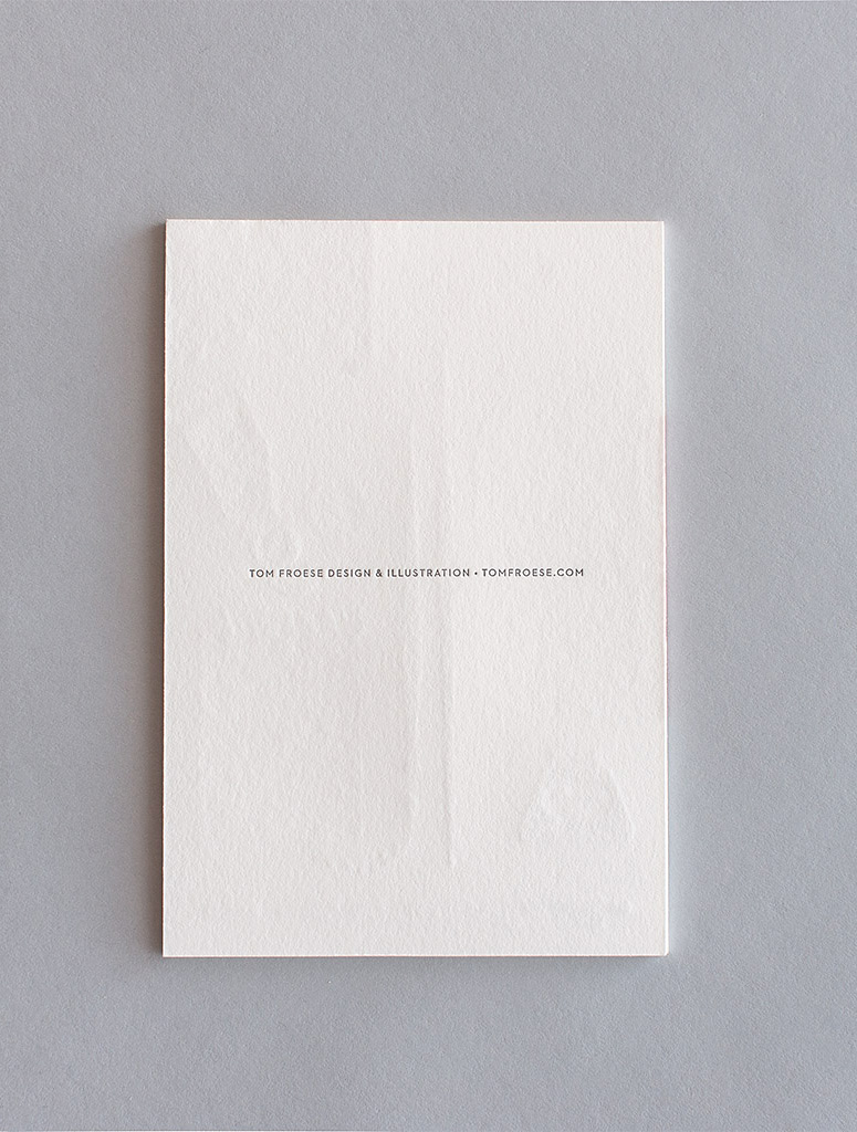
Tom Froese Design & Illustration
Letterpress: Everlovin' Press
Photos of the work: Nychuk Design
Printing
Everlovin' Press
Tom Froese designed these cards as tangible keepsakes, instead of simple calling cards. Letterpress allowed him to create tactile interaction with his illustration. The printing method also aligns nicely with Froese’s illustration style, which he admits takes inspired from letterpress and silkscreen techniques. The results are reminiscent of Eames-era design artifacts that one might hold on to if just to admire from time to time.
Dimensions (Width × Height × Depth)
Post Cards: 4.5 × 6.5 in
Business Cards: 3.5 × 2 in
Page Count
–
Paper Stock
Rising museum board / 180 lb
Number of Colors
2
Varnishes
–
Binding
–
Typography
Eames Century
Neutraface
Project Description
These letterpressed business cards and post cards were designed as tangible mementos I could leave with people with whom I meet and people I would like to connect with, respectively. They provide a tactile way for people to interact with my illustration, to not just see the forms but to feel them, to run their finger along them. What I like about letterpress printing is that it is its own evidence of the process. You can see and feel the impression where the ink was laid down. There is something very honest about letterpress printing, where you work in limited colours, and those colours will only ever be themselves, not part of some matrix of many colours pretending to be one. Letterpress is a very natural production method for my illustration style, which uses larger coloured forms accented by simple, often linear details. I usually volunteer the constraints of letterpress/silkscreen methods as a basis for my work, so in this sense, this is the truest way for people to encounter my work.Production Lesson(s)
One thing I wasn't sure would work was the use of textures in letterpress (particularly in the brayer marking on the post card). Vince at Everlovin' was able to convince me it would, and by gosh he did it. One thing he cautioned me about was doing a flood of colour—originally the post cards were to be full bleed red with white knocked out. While it could work, it might have reduced the overall depth of impression, which, when you're doing letterpress, you want to take advantage of.
Post Author

Duncan Robertson
Former intern at UnderConsideration LLC.
More: Online / On Twitter
Date Published
March 20, 2014
Filed Under
Business Cards
Letterpress
Postcard
Tagged with
black and red
eames
retro
two colors


About
FPO (For Print Only), is a division of UnderConsideration, celebrating the reality that print is not dead by showcasing the most compelling printed projects.
FPO uses Fonts.com to render Siseriff and Avenir Next.
FPO is run with Six Apart’s MovableType
All comments, ideas and thoughts on FPO are property of their authors; reproduction without the author’s or FPO’s permission is strictly prohibited
Twitter @ucllc
Sign-up for Mailing List
Mailing list managed by MailChimp
Thanks to our advertisers
About UnderConsideration
UnderConsideration is a graphic design firm generating its own projects, initiatives, and content while taking on limited client work. Run by Bryony Gomez-Palacio and Armin Vit in Bloomington, IN. More…
blogs we publish
Brand New / Displaying opinions and focusing solely on corporate and brand identity work.
Art of the Menu / Cataloguing the underrated creativity of menus from around the world.
Quipsologies / Chronicling the most curious, creative, and notable projects, stories, and events of the graphic design industry on a daily basis.
products we sell
Flaunt: Designing effective, compelling and memorable portfolios of creative work.
Brand New Conference videos / Individual, downloadable videos of every presentation since 2010.
Prints / A variety of posters, the majority from our AIforGA series.
Other / Various one-off products.
events we organize
Brand New Conference / A two-day event on corporate and brand identity with some of today's most active and influential practitioners from around the world.
Brand Nieuwe Conference / Ditto but in Amsterdam.
Austin Initiative for Graphic Awesomeness / A speaker series in Austin, TX, featuring some of the graphic design industry's most awesome people.
also
Favorite Things we've Made / In our capacity as graphic designers.
Projects we've Concluded / Long- and short-lived efforts.
UCllc News / Updates on what's going at the corporate level of UnderConsideration.

Related entries
Black Sheep Studio Business Cards and Promotional Items
Herbst & Spungen Wedding Invitation Suite
Cranky Bucks Promotion
Seegno Business Cards
“Miniature Views” Promotion