ADV @ UNDERCONSIDERATION Peek here for details
BROWSE
STRIETMAN Collateral
Production Method
Offset
Design
Vincent Meertens
Design: Vincent Meertens
Product photography: Wouter Strietman
Photography of the visual identity: Vincent Meertens
Printing
Zwaan Printmedia
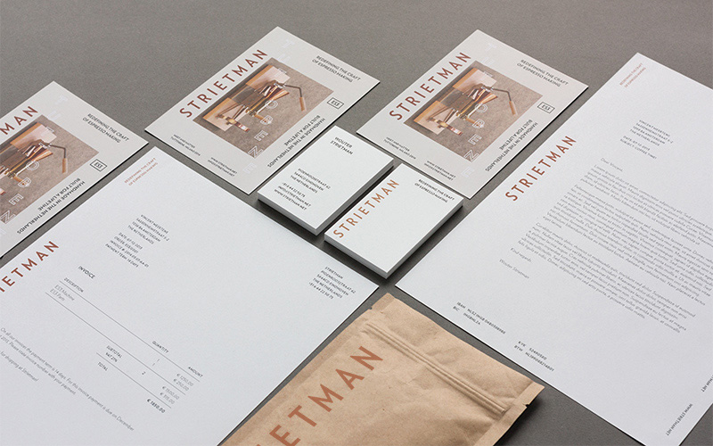
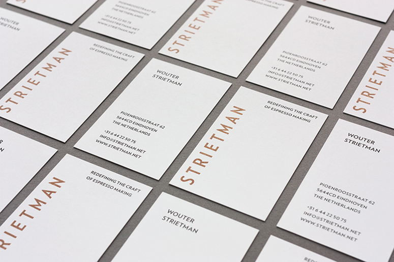
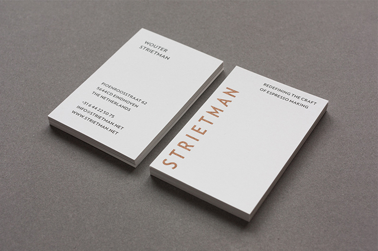
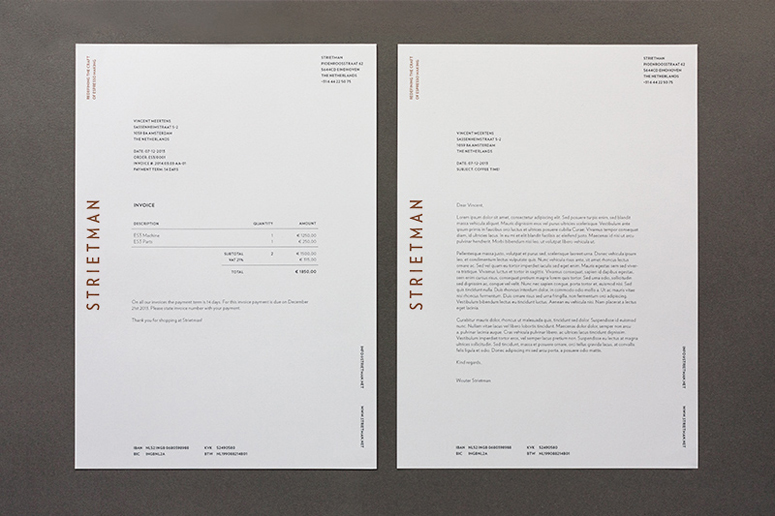
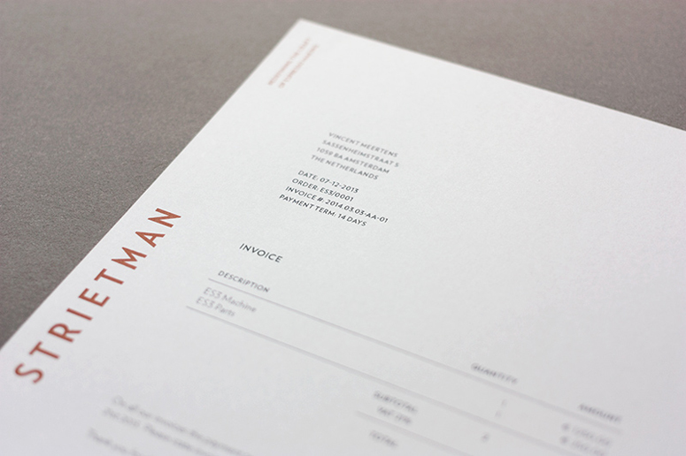
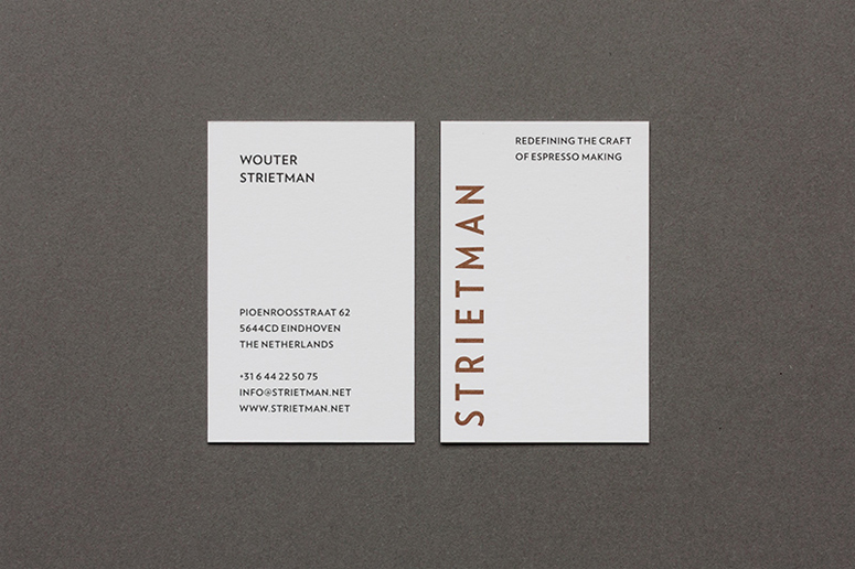
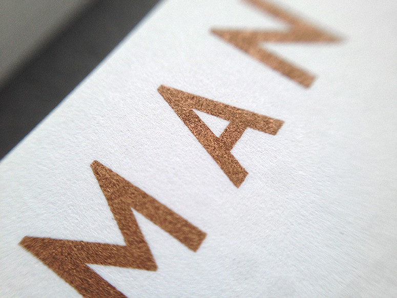
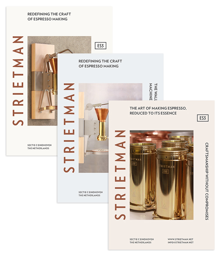
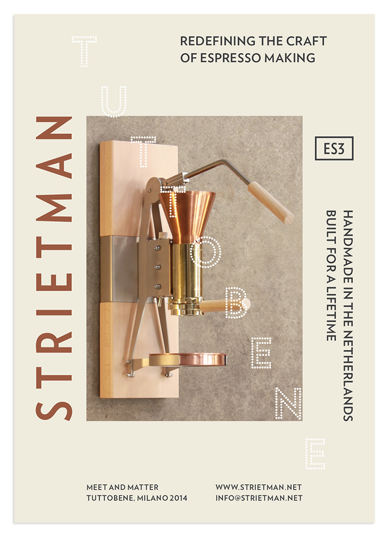
Copper ink (PMS 876U) on tactile paper replicates the natural materials used in STRIETMAN’s exceptionally crafted espresso makers in this stationery suite by designer Vincent Meertens.
Dimensions (Width × Height × Depth)
business cards: 2.165 × 3.346 in.
flyers: 5.8 × 8.3 in.
Page Count
–
Paper Stock
Munken / Lynx / 400 grams
Munken / Lynx Rough / 300 grams
Munken / Lynx Rough / 90 grams
Number of Colors
5 (PMS COPPER + CMYK)
Varnishes
–
Binding
–
Typography
Verlag
Verlag Condensed
Project Description
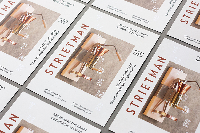
STRIETMAN, founded by Wouter Strietman, is dedicated to the perfection of espresso making. The design firm develops coffee related products for the consumer market that excel in craftsmanship: simple and reliable engineering built to last forever. The ES3 espresso machine goes back to the essence of espresso making. The technology involved has been simplified and made visible in every detail. The ES3 is operated manually for full quality control, letting the user trust their own judgement by relying on the senses.When approached by STRIETMAN to design the company's visual identity, my strategy was to communicate the exceptional attention to craftsmanship found in STRIETMAN products, evident in each and every identifiable element. Using highly tactile paper with the logo printed in a PMS copper finish, the communication material is a first introduction to the high end quality of STRIETMAN products. Promotional flyers are printed in sets of 3, each with their own lay-out and photography. For a specific application or event, an extra layer of information is added by silkscreening on top using white ink. A clean typographic system supports the product photography while the color palette reflects the three main materials STRIETMAN employs: copper, brass and metal.
Production Lesson(s)
The Strietman product range uses very pure materials that are natural and uncoated (no paint or finishing layers are used). The challenge was that this same tactility and luxurious feeling needed to be present in all communication material. I used a PMS copper ink (876U) on extra rough paper to achieve this. The PMS copper ink exactly has that same material qualities that can be found in Strietman products.
Post Author

Kelly Cree
Writer for UnderConsideration LLC.
More: Online / On Twitter
Date Published
July 10, 2014
Filed Under
Collateral
Offset
Tagged with
copper


About
FPO (For Print Only), is a division of UnderConsideration, celebrating the reality that print is not dead by showcasing the most compelling printed projects.
FPO uses Fonts.com to render Siseriff and Avenir Next.
FPO is run with Six Apart’s MovableType
All comments, ideas and thoughts on FPO are property of their authors; reproduction without the author’s or FPO’s permission is strictly prohibited
Twitter @ucllc
Sign-up for Mailing List
Mailing list managed by MailChimp
Thanks to our advertisers
About UnderConsideration
UnderConsideration is a graphic design firm generating its own projects, initiatives, and content while taking on limited client work. Run by Bryony Gomez-Palacio and Armin Vit in Bloomington, IN. More…
blogs we publish
Brand New / Displaying opinions and focusing solely on corporate and brand identity work.
Art of the Menu / Cataloguing the underrated creativity of menus from around the world.
Quipsologies / Chronicling the most curious, creative, and notable projects, stories, and events of the graphic design industry on a daily basis.
products we sell
Flaunt: Designing effective, compelling and memorable portfolios of creative work.
Brand New Conference videos / Individual, downloadable videos of every presentation since 2010.
Prints / A variety of posters, the majority from our AIforGA series.
Other / Various one-off products.
events we organize
Brand New Conference / A two-day event on corporate and brand identity with some of today's most active and influential practitioners from around the world.
Brand Nieuwe Conference / Ditto but in Amsterdam.
Austin Initiative for Graphic Awesomeness / A speaker series in Austin, TX, featuring some of the graphic design industry's most awesome people.
also
Favorite Things we've Made / In our capacity as graphic designers.
Projects we've Concluded / Long- and short-lived efforts.
UCllc News / Updates on what's going at the corporate level of UnderConsideration.

Related entries
2017 Brand New Conference Program
Severe(d): A Creepy Poetry Collection by Holly Riordan
Um Caminho para Santiago CD Package and Diary
BOYCO Classpack® Book
Antes de Perder la Esperanza Book