ADV @ UNDERCONSIDERATION Peek here for details
BROWSE
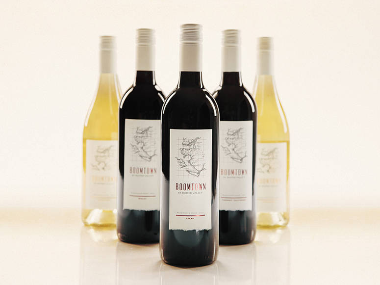
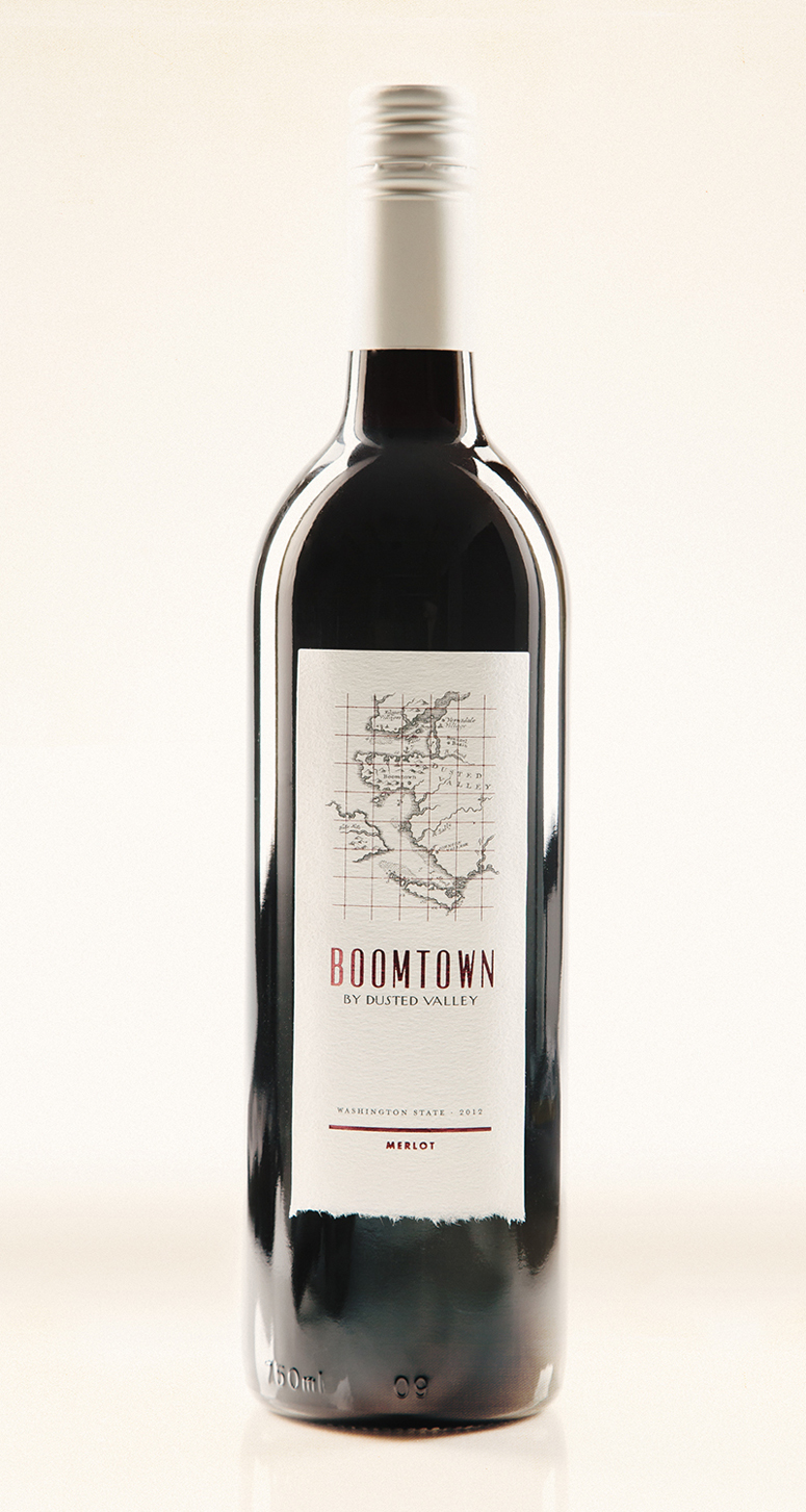
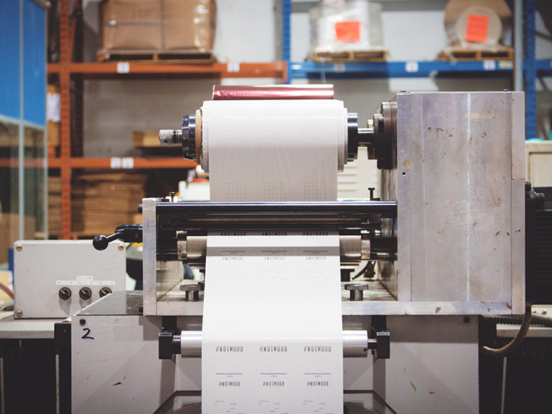
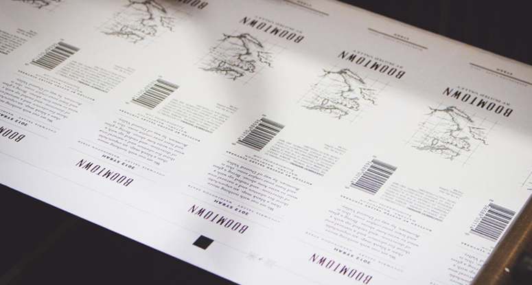
Boomtown Wine Label
Production Method
Foil stamp
Offset
Design
GreenRubino
Creative Direction: Joe Quatrone
Design, Art Direction: Quinn Ianniciello
Production: Bob Bost
Printing
Metro Label
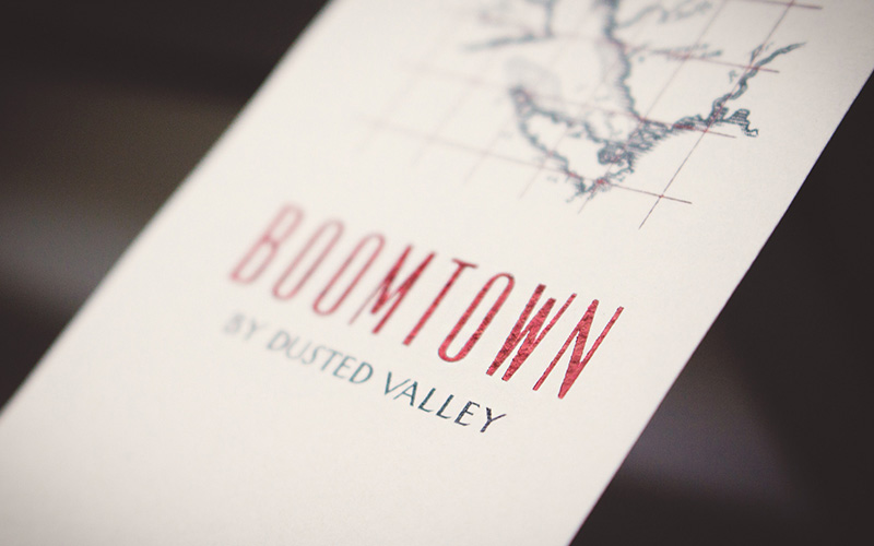
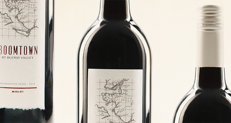
True torn edges and bright metallics elevate Boomtown’s recently re-imagined label while remaining true to the authenticity of Dusted Valley’s vision: Adventure.
Dimensions (Width × Height × Depth)
–
Page Count
–
Paper Stock
Specialty 80# Deckled Edge White
Felt
One Deckled Edge w/Permanent Adhesive (UPM Raflatac)
Number of Colors
1 Spot Color + 2 Foils (Metallic Red/Gold) Stamped
Flood Custom Tint
Varnishes
Flood Matte
Binding
–
Typography
Vevey
Mrs. Eaves
Futura
Project Description
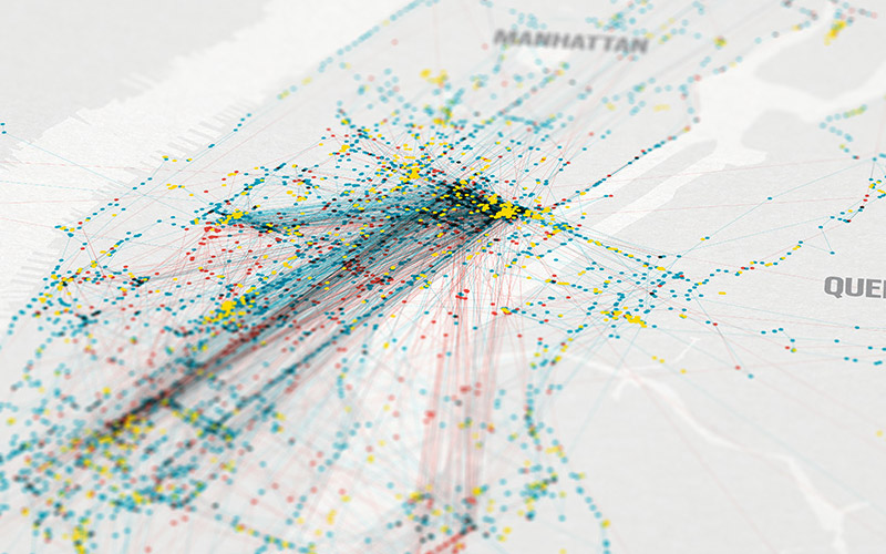
Reimagining Dusted Valley's (affectionately named) "little brother" label started with the winemaker's authentic story: an unquenchable thirst for adventure. Featuring vintage handcrafted maps, a true torn deckle edge (a unique feat, thanks to an excellent printer and paper supplier), and a bright metallic foils (ooh, shiny!) Boomtown found a new life on the shelf.We wanted the label to appeal to all audiences, and elevate the premium feel of the brand, while still feeling authentic. The final combination of an elegant paper stock with the natural (not die-cut) torn edge, foils, and matching white cap brought Boomtown a more modern feel, and plays off the excitement the name inspires.
Production Lesson(s)
Most wine labels with a "torn edge" look just go with a die cut these days, but we wanted this one to be different. Thanks to some back and forth with our printer and everyone clinging to one sample that we found and liked, we were able to source this special pressure-sensitive label stock with a natural edge. Testing followed to get an accurate flood tint, proper trim since the edge varied by about a quarter-inch, foil stamp pressure and registration, and checking the adhesion. Overall a long process, but we're really happy with the result!
Post Author

Kelly Cree
Writer for UnderConsideration LLC.
More: Online / On Twitter
Date Published
August 5, 2014
Filed Under
Foil stamp
Offset
Packaging
Tagged with
bottle
flood matte varnish
foil stamp
labels
wine


About
FPO (For Print Only), is a division of UnderConsideration, celebrating the reality that print is not dead by showcasing the most compelling printed projects.
FPO uses Fonts.com to render Siseriff and Avenir Next.
FPO is run with Six Apart’s MovableType
All comments, ideas and thoughts on FPO are property of their authors; reproduction without the author’s or FPO’s permission is strictly prohibited
Twitter @ucllc
Sign-up for Mailing List
Mailing list managed by MailChimp
Thanks to our advertisers
About UnderConsideration
UnderConsideration is a graphic design firm generating its own projects, initiatives, and content while taking on limited client work. Run by Bryony Gomez-Palacio and Armin Vit in Bloomington, IN. More…
blogs we publish
Brand New / Displaying opinions and focusing solely on corporate and brand identity work.
Art of the Menu / Cataloguing the underrated creativity of menus from around the world.
Quipsologies / Chronicling the most curious, creative, and notable projects, stories, and events of the graphic design industry on a daily basis.
products we sell
Flaunt: Designing effective, compelling and memorable portfolios of creative work.
Brand New Conference videos / Individual, downloadable videos of every presentation since 2010.
Prints / A variety of posters, the majority from our AIforGA series.
Other / Various one-off products.
events we organize
Brand New Conference / A two-day event on corporate and brand identity with some of today's most active and influential practitioners from around the world.
Brand Nieuwe Conference / Ditto but in Amsterdam.
Austin Initiative for Graphic Awesomeness / A speaker series in Austin, TX, featuring some of the graphic design industry's most awesome people.
also
Favorite Things we've Made / In our capacity as graphic designers.
Projects we've Concluded / Long- and short-lived efforts.
UCllc News / Updates on what's going at the corporate level of UnderConsideration.

Related entries
KitchenAid Limited Edition Cards
BOYCO Classpack® Book
Herbst & Spungen Wedding Invitation Suite
Fracas Productions Business Cards
Gunnel Wåhlstrand Exhibit Book