ADV @ UNDERCONSIDERATION Peek here for details
BROWSE
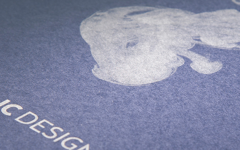
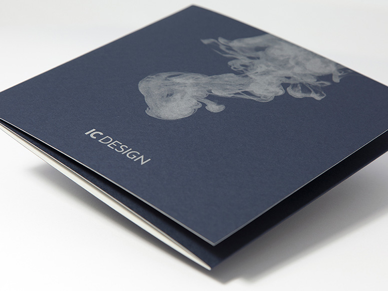
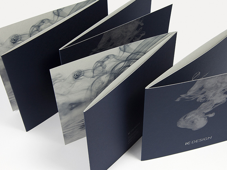
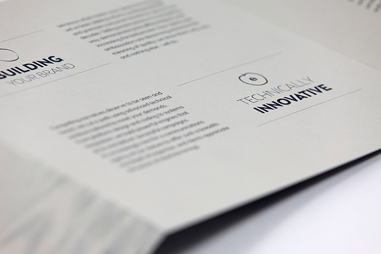
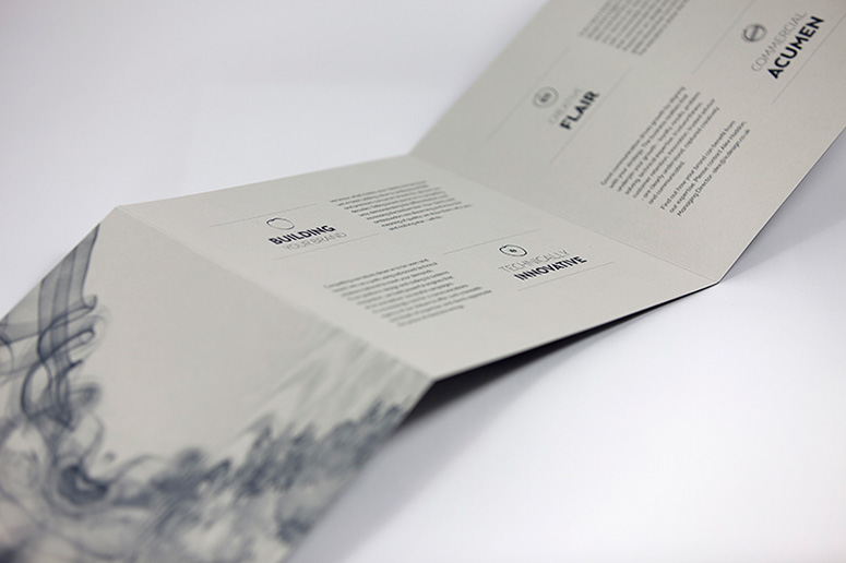
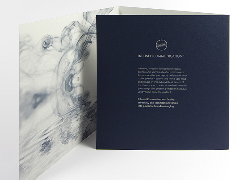
Printed on uncoated paper yet retaining its metallic shine, this brochure for London-based firm IC Design demonstrates patience and innovation in the corporate world.
Dimensions (Width × Height × Depth)
7.87 × 7.87 × 0.78 in
Page Count
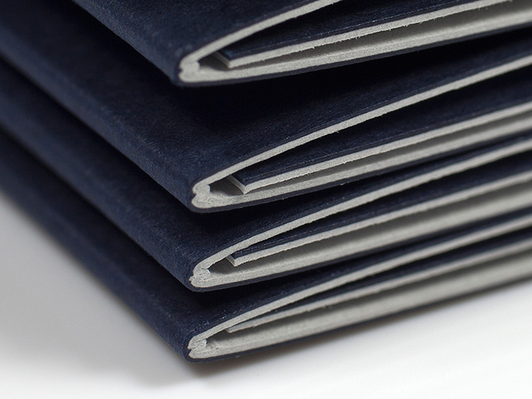
6
Paper Stock
Fedrigoni / Sirio / Dark Blue / 170gsm
Colorset / Light Grey / 270gsm
Number of Colors
2 (877U Silver, 289U)
Varnishes
–
Binding
–
Typography
Brooklyn Samuels in Thin, Light and Bold
Project Description
Following a strategic change in direction for the agency, we wanted to create a piece of print that would communicate our story to prospective clients. The decision was made early on that this story would be about the client journey in commissioning an agency, rather than showing off our portfolio. Something to hand out to symbolise proof of our delivery and authenticity. It would be more of a manifesto than a mailer, a leave-behind to capture the essence of how we work with our clients along with an explanation of our methodology. We wanted to set off the minimal design with a really rich visual and tactile experience, so looked at duplexing two different coloured stocks to get deep colours and a contrast in textures.Production Lesson(s)
When duplexing a 6 page roll-fold format, the paper weights had to be perfect - too thin and it causes problems with rippling and bubbles, too thick and it causes issues with folding. Downey ran some tests, creating two different thickness prototypes for us to choose from, to make sure the weights would work.We also wanted a metallic ink on an uncoated stock to match our brand colour to set off the design. We looked at several brands and were advised that the more porous the paper, the more chance of the colour sinking in, which would result in a flat effect, rather than the lustre we were after. Downey recommended Sirio Dark Blue as a good uncoated stock that would show off the metallic ink.

Post Author

Jessica Mullen
Writer for UnderConsideration LLC.
More: Online / On Twitter
Date Published
February 24, 2015
Filed Under
Brochures
Lithography
Tagged with
brochure
lithography


About
FPO (For Print Only), is a division of UnderConsideration, celebrating the reality that print is not dead by showcasing the most compelling printed projects.
FPO uses Fonts.com to render Siseriff and Avenir Next.
FPO is run with Six Apart’s MovableType
All comments, ideas and thoughts on FPO are property of their authors; reproduction without the author’s or FPO’s permission is strictly prohibited
Twitter @ucllc
Sign-up for Mailing List
Mailing list managed by MailChimp
Thanks to our advertisers
About UnderConsideration
UnderConsideration is a graphic design firm generating its own projects, initiatives, and content while taking on limited client work. Run by Bryony Gomez-Palacio and Armin Vit in Bloomington, IN. More…
blogs we publish
Brand New / Displaying opinions and focusing solely on corporate and brand identity work.
Art of the Menu / Cataloguing the underrated creativity of menus from around the world.
Quipsologies / Chronicling the most curious, creative, and notable projects, stories, and events of the graphic design industry on a daily basis.
products we sell
Flaunt: Designing effective, compelling and memorable portfolios of creative work.
Brand New Conference videos / Individual, downloadable videos of every presentation since 2010.
Prints / A variety of posters, the majority from our AIforGA series.
Other / Various one-off products.
events we organize
Brand New Conference / A two-day event on corporate and brand identity with some of today's most active and influential practitioners from around the world.
Brand Nieuwe Conference / Ditto but in Amsterdam.
Austin Initiative for Graphic Awesomeness / A speaker series in Austin, TX, featuring some of the graphic design industry's most awesome people.
also
Favorite Things we've Made / In our capacity as graphic designers.
Projects we've Concluded / Long- and short-lived efforts.
UCllc News / Updates on what's going at the corporate level of UnderConsideration.

Related entries
Elbow Grease Magazine
Novum Magazine
Hechizoo Stationery
The Hideout Stationery
Michelle Maguire Book