ADV @ UNDERCONSIDERATION Peek here for details
BROWSE
Synaesthesia Coasters
Production Method
Letterpress
Design
The Distillery
Creative Director: Daryl Prondoso
Director: Nathan Leong
Printing
The Distillery
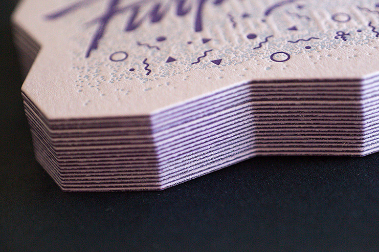
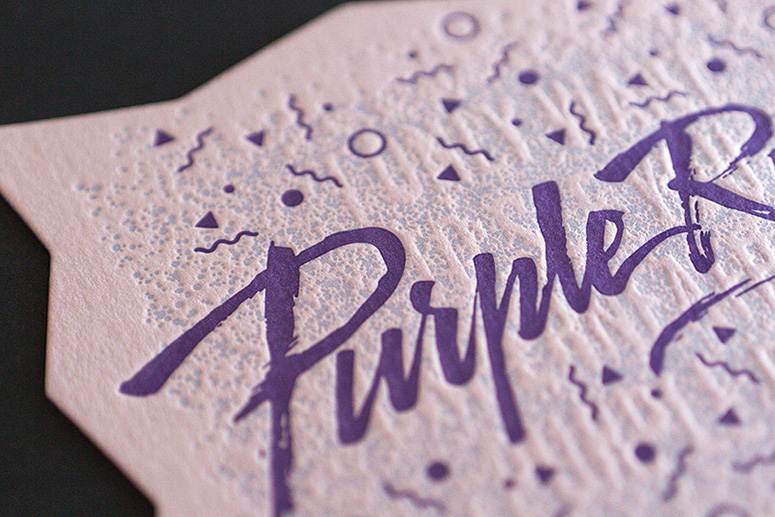
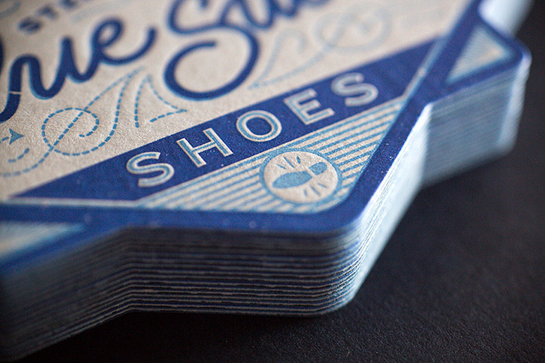
Synaesthesia is when two or more senses are joined together, and common forms are hearing colors or seeing sounds. If you’re not a synaesthete yourself, these musical coasters letterpressed on Colorplan paper can help you imagine the experience by seeing what the song looks like to Australian design studio The Distillery.
Dimensions (Width × Height × Depth)
100 × 100 mm (3.94 × 3.94 in)
Page Count
8
Paper Stock
GF Smith / Colorplan / Azure Blue & Adriatic, Lavender & Purple, Bright Red & Scarlet, Factory Yellow & Citrus / (270gsm + 270gsm)
Number of Colors
3
Varnishes
–
Binding
–
Typography
–
Project Description
On the 17th and 18th of October, 2013, The Distillery launched its second studio in Jakarta, Indonesia. Alongside our aim to spread the love of letterpress, was also to spread our love of paper--In particular, GF Smith’s range of Colorplan papers.Colorplan paper comes in 50 colours and holds letterpress impression beautifully. Its versatility and vibrancy makes it one of our favourite stocks for modern letterpress printing. We also love the challenge and creative possibilities with designing and printing with a background that isn’t white. For our launch, we wanted to show the attendees the possibilities of letterpress printing with Colorplan.
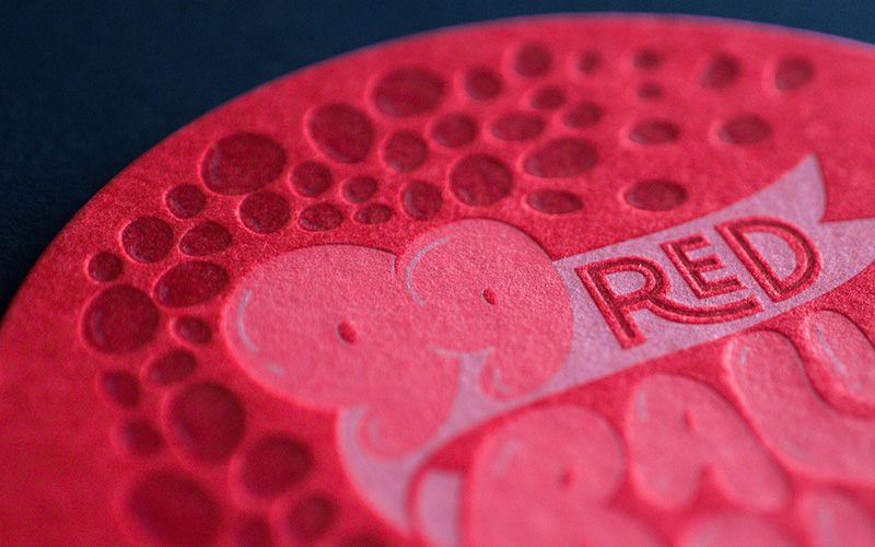
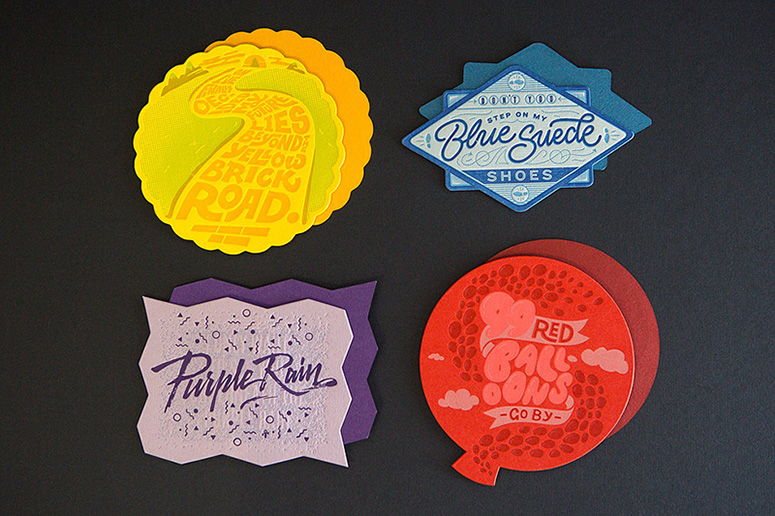
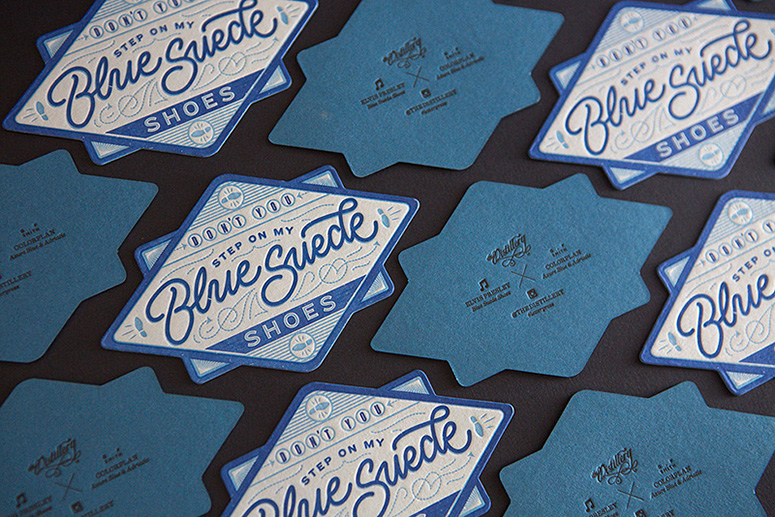
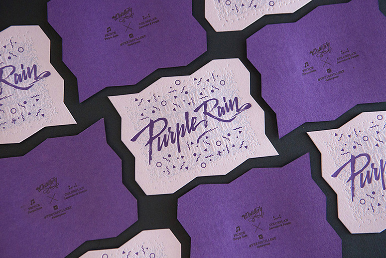
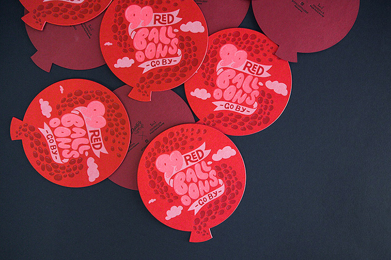
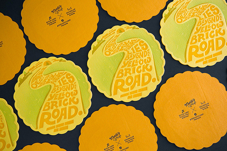
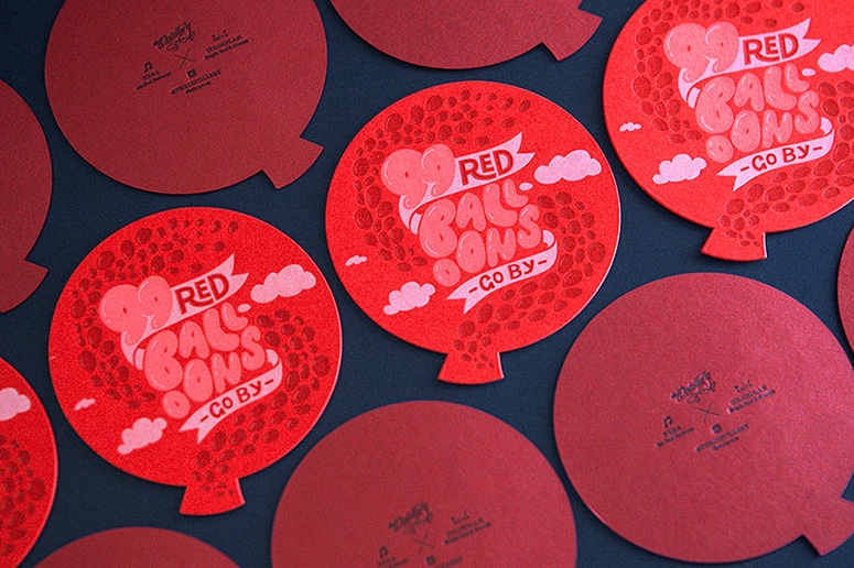
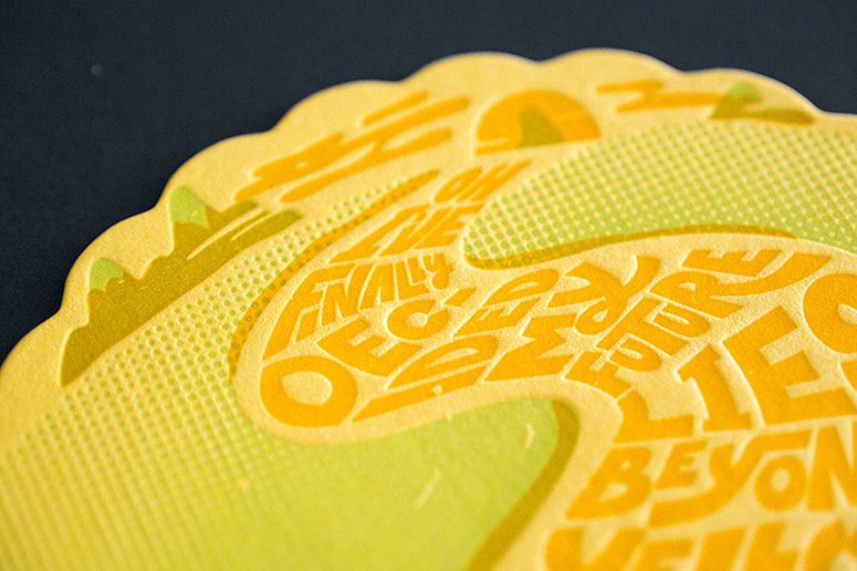
Being huge music fans at the studio, we wanted to expand on the idea of Synaesthesia for these pieces—by taking some of our favourite studio sounds, and creating typographic keepsakes based on them. We picked some of our favourite artists—Prince, Nena, Elton John and Elvis, to base these works around. After countless sketches and exploration, our idea was for each piece to have its own personality—and for it to capture the era and feeling of the song via typographic illustration.
To further showcase the colours, we decided each piece would have a different coloured stock on its front and back: Azure Blue & Adriatic, Lavender & Purple, Bright Red & Scarlet and Factory Yellow & Citrus. This effect not only doubles the thickness of the stock, but also gives the piece some striking depth and contrast. The colour combinations are almost endless, and if we had more time available, there would have definitely been a third colour stock too.
Production Lesson(s)
Since the rubber based inks we use for letterpress printing are transparent, it’s difficult to print lighter colours on darker stocks: The white plate on the 99 Red Balloons piece took 4 runs through the press!
Post Author

Jessica Mullen
Writer for UnderConsideration LLC.
More: Online / On Twitter
Date Published
March 10, 2015
Filed Under
Coasters
Letterpress
Tagged with
coaster
coasters
letterpress


About
FPO (For Print Only), is a division of UnderConsideration, celebrating the reality that print is not dead by showcasing the most compelling printed projects.
FPO uses Fonts.com to render Siseriff and Avenir Next.
FPO is run with Six Apart’s MovableType
All comments, ideas and thoughts on FPO are property of their authors; reproduction without the author’s or FPO’s permission is strictly prohibited
Twitter @ucllc
Sign-up for Mailing List
Mailing list managed by MailChimp
Thanks to our advertisers
About UnderConsideration
UnderConsideration is a graphic design firm generating its own projects, initiatives, and content while taking on limited client work. Run by Bryony Gomez-Palacio and Armin Vit in Bloomington, IN. More…
blogs we publish
Brand New / Displaying opinions and focusing solely on corporate and brand identity work.
Art of the Menu / Cataloguing the underrated creativity of menus from around the world.
Quipsologies / Chronicling the most curious, creative, and notable projects, stories, and events of the graphic design industry on a daily basis.
products we sell
Flaunt: Designing effective, compelling and memorable portfolios of creative work.
Brand New Conference videos / Individual, downloadable videos of every presentation since 2010.
Prints / A variety of posters, the majority from our AIforGA series.
Other / Various one-off products.
events we organize
Brand New Conference / A two-day event on corporate and brand identity with some of today's most active and influential practitioners from around the world.
Brand Nieuwe Conference / Ditto but in Amsterdam.
Austin Initiative for Graphic Awesomeness / A speaker series in Austin, TX, featuring some of the graphic design industry's most awesome people.
also
Favorite Things we've Made / In our capacity as graphic designers.
Projects we've Concluded / Long- and short-lived efforts.
UCllc News / Updates on what's going at the corporate level of UnderConsideration.

Related entries
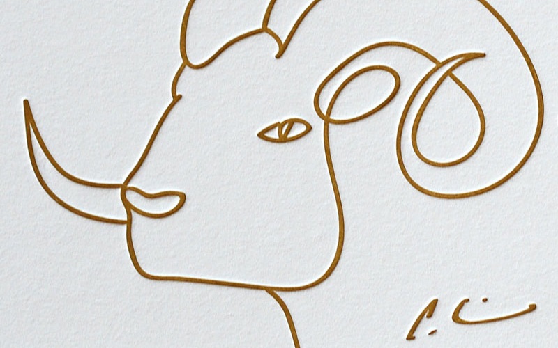
Black Sheep Studio Business Cards and Promotional Items
Herbst & Spungen Wedding Invitation Suite
Cranky Bucks Promotion
Seegno Business Cards
“Miniature Views” Promotion