ADV @ UNDERCONSIDERATION Peek here for details
BROWSE
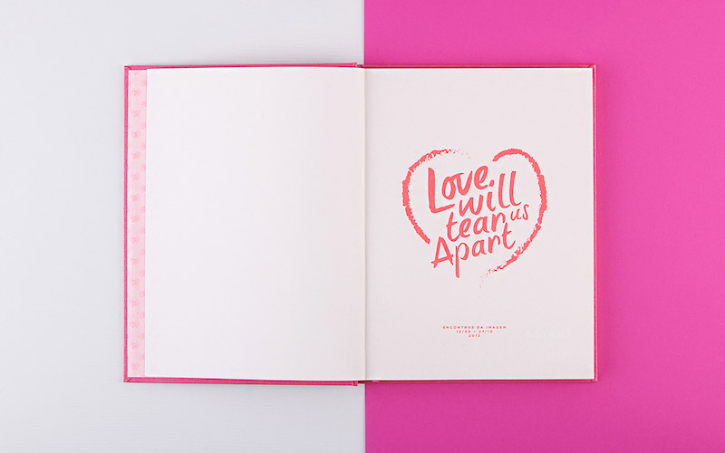
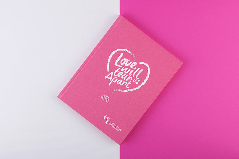
Love Will Tear Us Apart Book
Production Method
Offset
Design
João Loureiro
Printing
Gráfica Vilaverdense
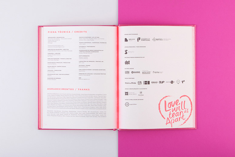
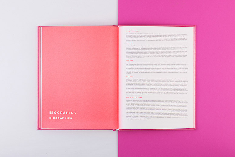
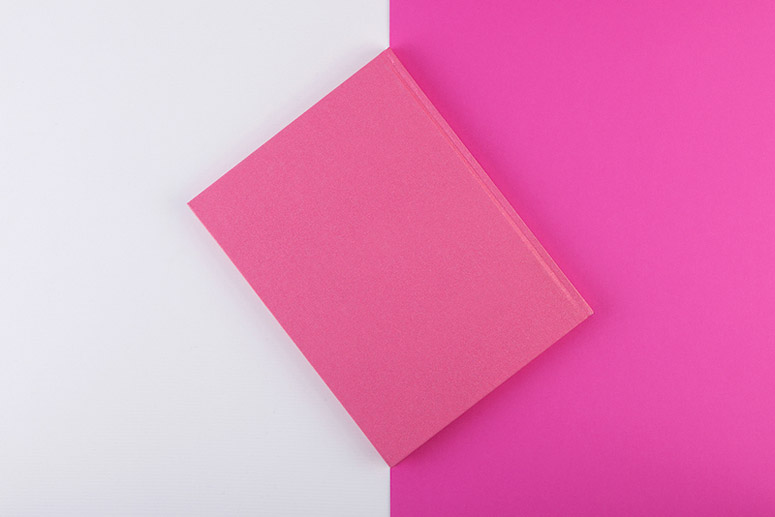
Designer João Loureiro’s exhibition book for the 2013 edition of Portuguese photography festival Encontros da Imagem proves that even though love may tear us apart, neon Pantone will bring us back together.
Dimensions (Width × Height × Depth)
–
Page Count
–
Paper Stock
–
Number of Colors
5
Varnishes
–
Binding
–
Typography
Gotham
Gotham Rounded
Project Description
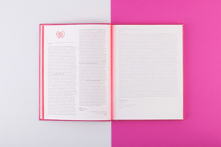
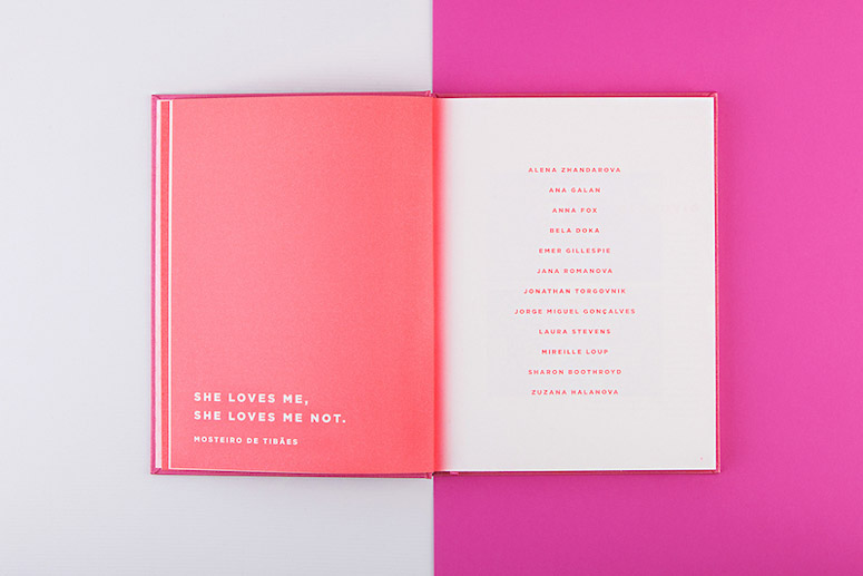
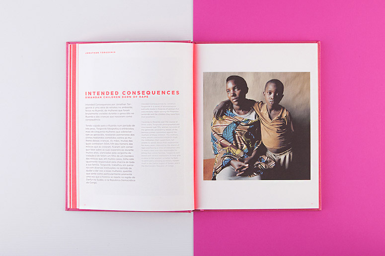
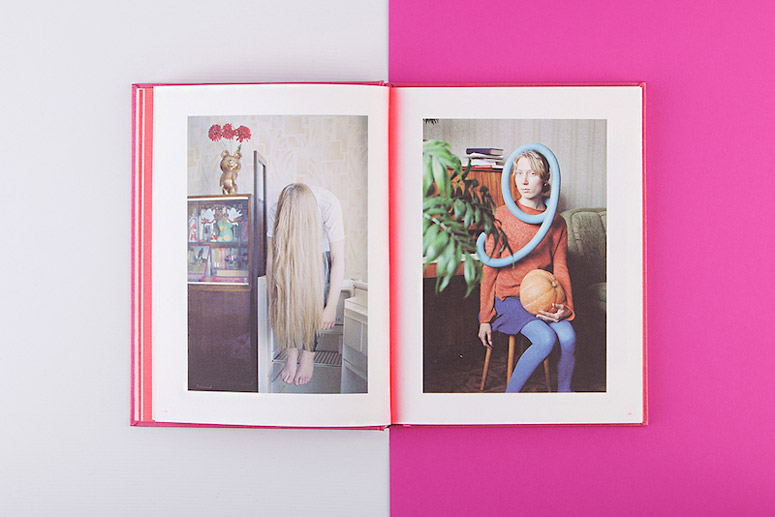
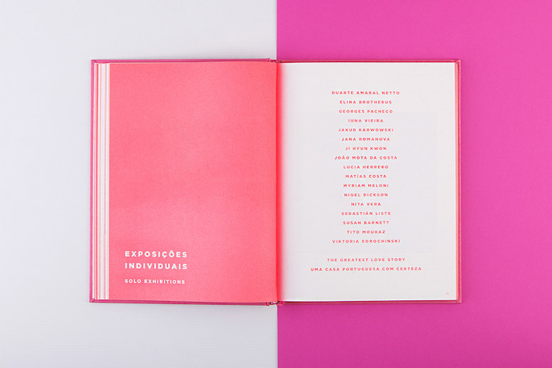
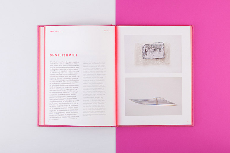
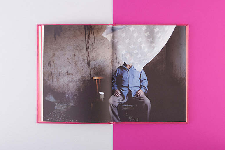
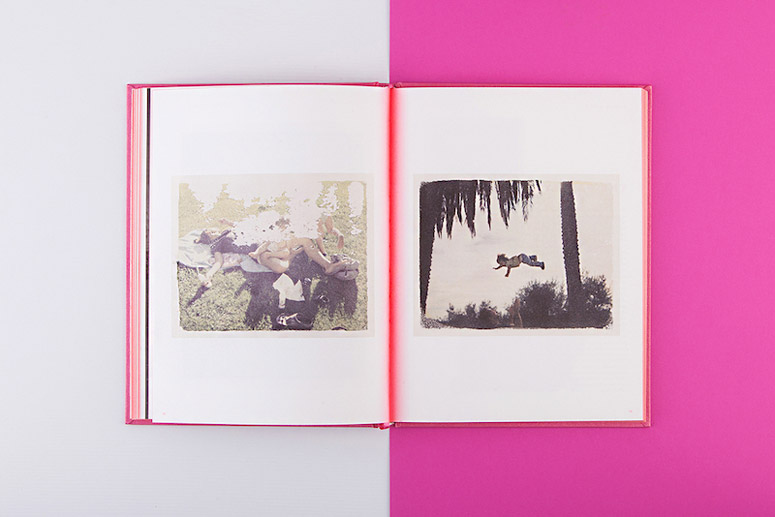
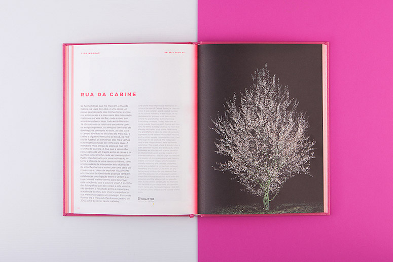
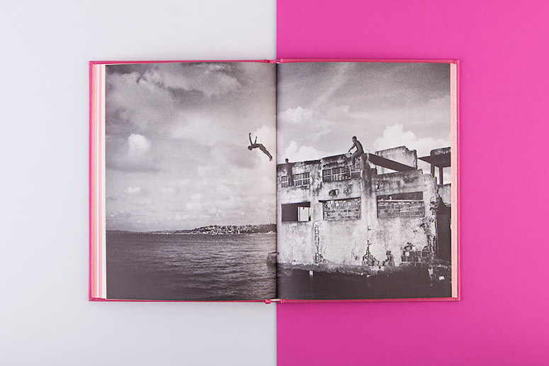
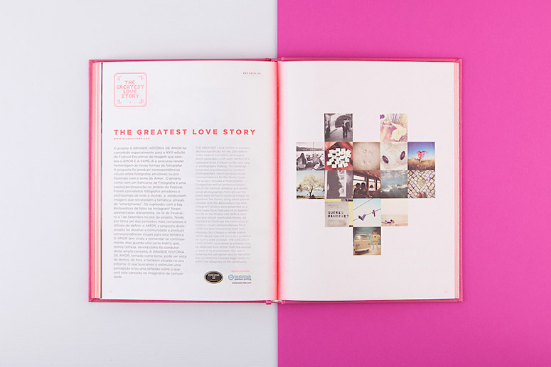
With 25 years of existence, Encontros da Imagem, International Photography Festival, presents 2013 next edition inspired by the generic concept of LOVE and FAMILY, under the theme "Love will tear us apart." In this project we exhibit authors from 11 European countries and a set of family pictures by photographic studios of the 30's, along with activities for the general public, that aim to involve the family core, as well as street projections and even a movie screening dedicated to the topic. This book is the result of all of the authors presented in 2013's edition.Production Lesson(s)
It was good exercise to explore the colors, using 5 (cymk + neon pantone) and the result was stunning! The client love it!
Post Author

Kelly Cree
Writer for UnderConsideration LLC.
More: Online / On Twitter
Date Published
June 4, 2015
Filed Under
Books
Offset
Tagged with
neon


About
FPO (For Print Only), is a division of UnderConsideration, celebrating the reality that print is not dead by showcasing the most compelling printed projects.
FPO uses Fonts.com to render Siseriff and Avenir Next.
FPO is run with Six Apart’s MovableType
All comments, ideas and thoughts on FPO are property of their authors; reproduction without the author’s or FPO’s permission is strictly prohibited
Twitter @ucllc
Sign-up for Mailing List
Mailing list managed by MailChimp
Thanks to our advertisers
About UnderConsideration
UnderConsideration is a graphic design firm generating its own projects, initiatives, and content while taking on limited client work. Run by Bryony Gomez-Palacio and Armin Vit in Bloomington, IN. More…
blogs we publish
Brand New / Displaying opinions and focusing solely on corporate and brand identity work.
Art of the Menu / Cataloguing the underrated creativity of menus from around the world.
Quipsologies / Chronicling the most curious, creative, and notable projects, stories, and events of the graphic design industry on a daily basis.
products we sell
Flaunt: Designing effective, compelling and memorable portfolios of creative work.
Brand New Conference videos / Individual, downloadable videos of every presentation since 2010.
Prints / A variety of posters, the majority from our AIforGA series.
Other / Various one-off products.
events we organize
Brand New Conference / A two-day event on corporate and brand identity with some of today's most active and influential practitioners from around the world.
Brand Nieuwe Conference / Ditto but in Amsterdam.
Austin Initiative for Graphic Awesomeness / A speaker series in Austin, TX, featuring some of the graphic design industry's most awesome people.
also
Favorite Things we've Made / In our capacity as graphic designers.
Projects we've Concluded / Long- and short-lived efforts.
UCllc News / Updates on what's going at the corporate level of UnderConsideration.

Related entries
2017 Brand New Conference Program
Severe(d): A Creepy Poetry Collection by Holly Riordan
Um Caminho para Santiago CD Package and Diary
BOYCO Classpack® Book
Antes de Perder la Esperanza Book